Simplify adding web parts with preconfigured entries
More complex SharePoint Framework client-side web parts likely have many properties that the user must configure. You can help users by adding preconfigured property entries for specific scenarios. A preconfigured entry initializes the web part with pre-set values.
Note
Before following the steps in this article, be sure to set up your SharePoint client-side web part development environment.
Warning
SPFx solutions targeting SharePoint Server 2016 are limited to setting only a single web part property as a preconfigured entry. For more information, see issue #5260.
Web part preconfigured entries
Each SharePoint Framework client-side web part consists of two pieces:
- The manifest that describes the web part
- The web part code
One of the properties specified in the web part manifest is the preconfiguredEntries property.
{
  "$schema": "https://developer.microsoft.com/json-schemas/spfx/client-side-web-part-manifest.schema.json",

  "id": "6737645a-4443-4210-a70e-e5e2a219133a",
  "alias": "GalleryWebPart",
  "componentType": "WebPart",
  "version": "0.0.1",
  "manifestVersion": 2,

  "preconfiguredEntries": [{
    "groupId": "1edbd9a8-0bfb-4aa2-9afd-14b8c45dd489", // Discovery
    "group": { "default": "Under Development" },
    "title": { "default": "Gallery" },
    "description": { "default": "Shows items from the selected list" },
    "officeFabricIconFontName": "Page",
    "properties": {
      "description": "Gallery"
    }
  }]
}
The preconfiguredEntries property provides information about your web part for use in the web part toolbox. When users add web parts to the page, the information from the preconfiguredEntries property is used to display the web part in the toolbox and define its default settings when it's added to the page.
If you've built classic web parts with full-trust solutions, you can think of each entry in the preconfiguredEntries array as corresponding to a *.webpart file. Just like a *.webpart file, each entry in the preconfiguredEntries property is linked to the web part code and specifies basic information about the web part, such as its title or description, and default values for its properties.
Properties of a preconfiguredEntries array item
Each item in the preconfiguredEntries array consists of several properties. The following table explains the purpose of each property.
| Property name | Value type | Required | Purpose | Sample value |
|---|---|---|---|---|
title |
ILocalizedString | yes | The web part title that is displayed in the toolbox. | "title": { "default": "Weather", "nl-nl": "Weerbericht" } |
description |
ILocalizedString | yes | The web part description that is displayed in the toolbox tooltips. | "description": { "default": "Shows weather in the given location", "nl-nl": "Toont weerbericht voor de opgegeven locatie" } |
officeFabricIconFontName |
string | no | The icon for the web part that is displayed in the toolbox. Its value must be one of the Office UI Fabric icon names. If this property has a value, the iconImageUrl property is ignored. |
"officeFabricIconFontName": "Sunny" |
iconImageUrl |
string | no | The icon for the web part that is displayed in the toolbox and is represented by an image URL. The image at the URL must be exactly 40x28 px. If the officeFabricIconName property doesn't have a value, this property must have a value. |
"iconImageUrl": "https://cdn.contoso.com/weather.png" |
groupId |
string | yes | The group ID to determine which modern group contains the web part in a modern site page. The SharePoint Framework reserves group IDs for predefined groups. The developer can pick one from those groups. If the developer fills an ID not in the predefined groups, it falls back to Other group. | "groupId": "1edbd9a8-0bfb-4aa2-9afd-14b8c45dd489" |
group |
ILocalizedString | no | The group name in the web part picker to contain the web part in the classic page. If no value is provided, the web part is displayed in the Miscellaneous group. | "group": { "default": "Content", "nl-nl": "Inhoud" } |
properties |
TProperties | yes | A key-value pair object with default values for web part properties. | "properties": { "location": "Redmond", "numberOfDays": 3, "showIcon": true } |
Some web part properties have a value of type ILocalizedString. This type is a key-value pair object that allows developers to specify strings for the different locales. At a minimum, a value of type ILocalizedString must contain the default value.
Optionally, developers can provide the translations of that value to the different locales that their web part supports. If the web part is placed on a page in a locale that isn't listed in the localized string, the default value is used instead.
Valid ILocalizedString values:
"title": {
  "default": "Weather",
  "nl-nl": "Weerbericht"
}
"title": {
  "default": "Weather"
}
An ILocalizedString value that isn't valid because the default key is missing:
"title": {
  "en-us": "Weather"
}
Predefined modern groups
There are seven out-of-the-box groups as shown in the following table. Use the group ID in the groupId property.
| Group name | ID | Group includes... |
|---|---|---|
| Text, media, and content | cf066440-0614-43d6-98ae-0b31cf14c7c3 |
Web parts that display text, multi-media, documents, information from the web, and other rich content. |
| Discovery | 1edbd9a8-0bfb-4aa2-9afd-14b8c45dd489 |
Web parts that organize, group, and filter content to help users discover information. |
| Communication and collaboration | 75e22ed5-fa14-4829-850a-c890608aca2d |
Web parts that facilitate information sharing, team work, and social interactions. |
| Planning and process | 1bc7927e-4a5e-4520-b540-71305c79c20a |
Web parts that empower team productivity with the use of planning and process tools. |
| Business and intelligence | 4aca9e90-eff5-4fa1-bac7-728f5f157b66 |
Web parts for tracking and analyzing data, and for integrating business flow with pages. |
| Site tools | 070951d7-94da-4db8-b06e-9d581f1f55b1 |
Web parts for site information and management. |
| Advanced | 5c03119e-3074-46fd-976b-c60198311f70 |
Web parts not in other groups. |
If the developer fills an ID not in the previous list, the web part falls back to the Advanced group.
To see how you can use preconfigured entries when building web parts, you'll build a sample gallery web part. Using several properties, users can configure this web part to show items from a selected list in a specific way. For brevity, you'll omit the actual implementation of the web part logic and will focus on using the preconfiguredEntries property to provide preconfigured versions of the gallery web part.
Create a new web part project
Start by creating a new folder for your project.
md react-preconfiguredentriesGo to the project folder.
cd react-preconfiguredentriesCreate a new project by running the Yeoman SharePoint Generator from within the new directory you created:
yo @microsoft/sharepointThe Yeoman SharePoint Generator will prompt you with a series of questions. For all questions, accept the default options except for the following questions:
- Which type of client-side component to create? WebPart
- What is your Web part name? Gallery
- Which template would you like to use? React
Open your project folder in your code editor. This article uses Visual Studio Code in the steps and screenshots, but you can use any editor you prefer.
Add web part properties
In the web part manifest, add web part properties so that users can configure the gallery web part.
In the code editor, open the ./src/webparts/gallery/GalleryWebPart.manifest.json file.
Replace the
propertiessection with the following JSON:{ //... "preconfiguredEntries": [{ //... "properties": { "listName": "", "order": "", "numberOfItems": 10, "style": "" } }] }Note the following about this code:
listName: specifies the name of the list from which list items should be displayed.order: specifies the order in which items should be shown, that is chronological, or reverse chronological order.numberOfItems: specifies how many items should be displayed.style: specifies how the items should be displayed, such as thumbnails, which is useful for showing images, or as a list, which is more suitable for documents.
Web part properties specified in the manifest must also be added to the web part properties interface.
In the code editor, open the ./src/webparts/gallery/IGalleryWebPartProps.ts file. Change its code to:
export interface IGalleryWebPartProps {
  listName: string;
  order: string;
  numberOfItems: number;
  style: string;
}
When building SharePoint Framework client-side web parts using React, after changing the web part properties interface, you need to update the web part's
render()method that uses that interface to create an instance of the main React component.In the code editor, open the ./src/webparts/gallery/GalleryWebPart.ts file. Change the web part
render()method to:export default class GalleryWebPart extends BaseClientSideWebPart<IGalleryWebPartProps> { // ... public render(): void { const element: React.ReactElement<IGalleryProps> = React.createElement(Gallery, { listName: this.properties.listName, order: this.properties.order, numberOfItems: this.properties.numberOfItems, style: this.properties.style }); ReactDom.render(element, this.domElement); } // ... }Update the main React component to display the values of the properties. If the web part hasn't been configured, show the standard web part placeholder. In the code editor, open the ./src/webparts/gallery/components/Gallery.tsx file, and change its code to:
import * as React from 'react';
import styles from './Gallery.module.scss';
import { IGalleryProps } from './IGalleryProps';

export default class Gallery extends React.Component<IGalleryProps, void> {
  public render(): JSX.Element {
    if (this.needsConfiguration()) {
      return <div className="ms-Grid" style={{ color: "#666", backgroundColor: "#f4f4f4", padding: "80px 0", alignItems: "center", boxAlign: "center" }}>
        <div className="ms-Grid-row" style={{ color: "#333" }}>
          <div className="ms-Grid-col ms-u-hiddenSm ms-u-md3"></div>
          <div className="ms-Grid-col ms-u-sm12 ms-u-md6" style={{ height: "100%", whiteSpace: "nowrap", textAlign: "center" }}>
            <i className="ms-fontSize-su ms-Icon ms-Icon--ThumbnailView" style={{ display: "inline-block", verticalAlign: "middle", whiteSpace: "normal" }}></i><span className="ms-fontWeight-light ms-fontSize-xxl" style={{ paddingLeft: "20px", display: "inline-block", verticalAlign: "middle", whiteSpace: "normal" }}>Gallery</span>
          </div>
          <div className="ms-Grid-col ms-u-hiddenSm ms-u-md3"></div>
        </div>
        <div className="ms-Grid-row" style={{ width: "65%", verticalAlign: "middle", margin: "0 auto", textAlign: "center" }}>
          <span style={{ color: "#666", fontSize: "17px", display: "inline-block", margin: "24px 0", fontWeight: 100 }}>Show items from the selected list</span>
        </div>
        <div className="ms-Grid-row"></div>
      </div>;
    }
    else {
      return (
        <div className={styles.gallery}>
          <div className={styles.container}>
            <div className={`ms-Grid-row ms-bgColor-themeDark ms-fontColor-white ${styles.row}`}>
              <div className='ms-Grid-col ms-u-lg10 ms-u-xl8 ms-u-xlPush2 ms-u-lgPush1'>
                <span className="ms-font-xl ms-fontColor-white">
                  Welcome to SharePoint!
                </span>
                <p className='ms-font-l ms-fontColor-white'>
                  Customize SharePoint experiences using web parts.
                </p>
                <p className='ms-font-l ms-fontColor-white'>
                  List: {this.props.listName}<br />
                  Order: {this.props.order}<br />
                  Number of items: {this.props.numberOfItems}<br />
                  Style: {this.props.style}
                </p>
                <a href="https://aka.ms/spfx" className={styles.button}>
                  <span className={styles.label}>Learn more</span>
                </a>
              </div>
            </div>
          </div>
        </div>
      );
    }
  }

  private needsConfiguration(): boolean {
    return Gallery.isEmpty(this.props.listName) ||
      Gallery.isEmpty(this.props.order) ||
      Gallery.isEmpty(this.props.style);
  }

  private static isEmpty(value: string): boolean {
    return value === undefined ||
      value === null ||
      value.length === 0;
  }
}
Update the main React component interface to match the web part property interface, because we're bypassing all the web part properties to this component. In the code editor, open the ./src/webparts/gallery/components/IGalleryProps.ts file, and change its code to:
import { IGalleryWebPartProps } from '../IGalleryWebPartProps';

export interface IGalleryProps extends IGalleryWebPartProps { }
Render web part properties in the property pane
For a user to use the newly defined properties to configure the web part, the properties must be displayed in the web part property pane.
In the code editor, open the ./src/webparts/gallery/GalleryWebPart.ts file. In the top section of the file, change the @microsoft/sp-webpart-base import statement to:
import {
  BaseClientSideWebPart
} from '@microsoft/sp-webpart-base';
import {
  IPropertyPaneConfiguration,
  PropertyPaneDropdown,
  PropertyPaneSlider,
  PropertyPaneChoiceGroup
} from '@microsoft/sp-property-pane';
Change the
propertyPaneSettingsto:export default class GalleryWebPart extends BaseClientSideWebPart<IGalleryWebPartProps> { // ... protected getPropertyPaneConfiguration(): IPropertyPaneConfiguration { return { pages: [ { header: { description: strings.PropertyPaneDescription }, groups: [ { groupName: strings.BasicGroupName, groupFields: [ PropertyPaneDropdown('listName', { label: strings.ListNameFieldLabel, options: [{ key: 'Documents', text: 'Documents' }, { key: 'Images', text: 'Images' }] }), PropertyPaneChoiceGroup('order', { label: strings.OrderFieldLabel, options: [{ key: 'chronological', text: strings.OrderFieldChronologicalOptionLabel }, { key: 'reversed', text: strings.OrderFieldReversedOptionLabel }] }), PropertyPaneSlider('numberOfItems', { label: strings.NumberOfItemsFieldLabel, min: 1, max: 10, step: 1 }), PropertyPaneChoiceGroup('style', { label: strings.StyleFieldLabel, options: [{ key: 'thumbnails', text: strings.StyleFieldThumbnailsOptionLabel }, { key: 'list', text: strings.StyleFieldListOptionLabel }] }) ] } ] } ] }; } }
In a real-life scenario, you would retrieve the list of lists from the current SharePoint site. For brevity, in this example, you use a fixed list instead.
Add localization labels
In the code editor, open the ./src/webparts/gallery/loc/mystrings.d.ts file. Change its code to:
declare interface IGalleryStrings {
  PropertyPaneDescription: string;
  BasicGroupName: string;
  ListNameFieldLabel: string;
  OrderFieldLabel: string;
  OrderFieldChronologicalOptionLabel: string;
  OrderFieldReversedOptionLabel: string;
  NumberOfItemsFieldLabel: string;
  StyleFieldLabel: string;
  StyleFieldThumbnailsOptionLabel: string;
  StyleFieldListOptionLabel: string;
}

declare module 'galleryStrings' {
  const strings: IGalleryStrings;
  export = strings;
}
Add the missing resource strings by opening the ./src/webparts/gallery/loc/en-us.js file and changing its code to:
define([], function() {
  return {
    "PropertyPaneDescription": "Description",
    "BasicGroupName": "Group Name",
    "ListNameFieldLabel": "List",
    "OrderFieldLabel": "Items order",
    "OrderFieldChronologicalOptionLabel": "chronological",
    "OrderFieldReversedOptionLabel": "reversed chronological",
    "NumberOfItemsFieldLabel": "Number of items to show",
    "StyleFieldLabel": "Items display style",
    "StyleFieldThumbnailsOptionLabel": "thumbnails",
    "StyleFieldListOptionLabel": "list"
  }
});
Confirm that the project is building by running the following command:
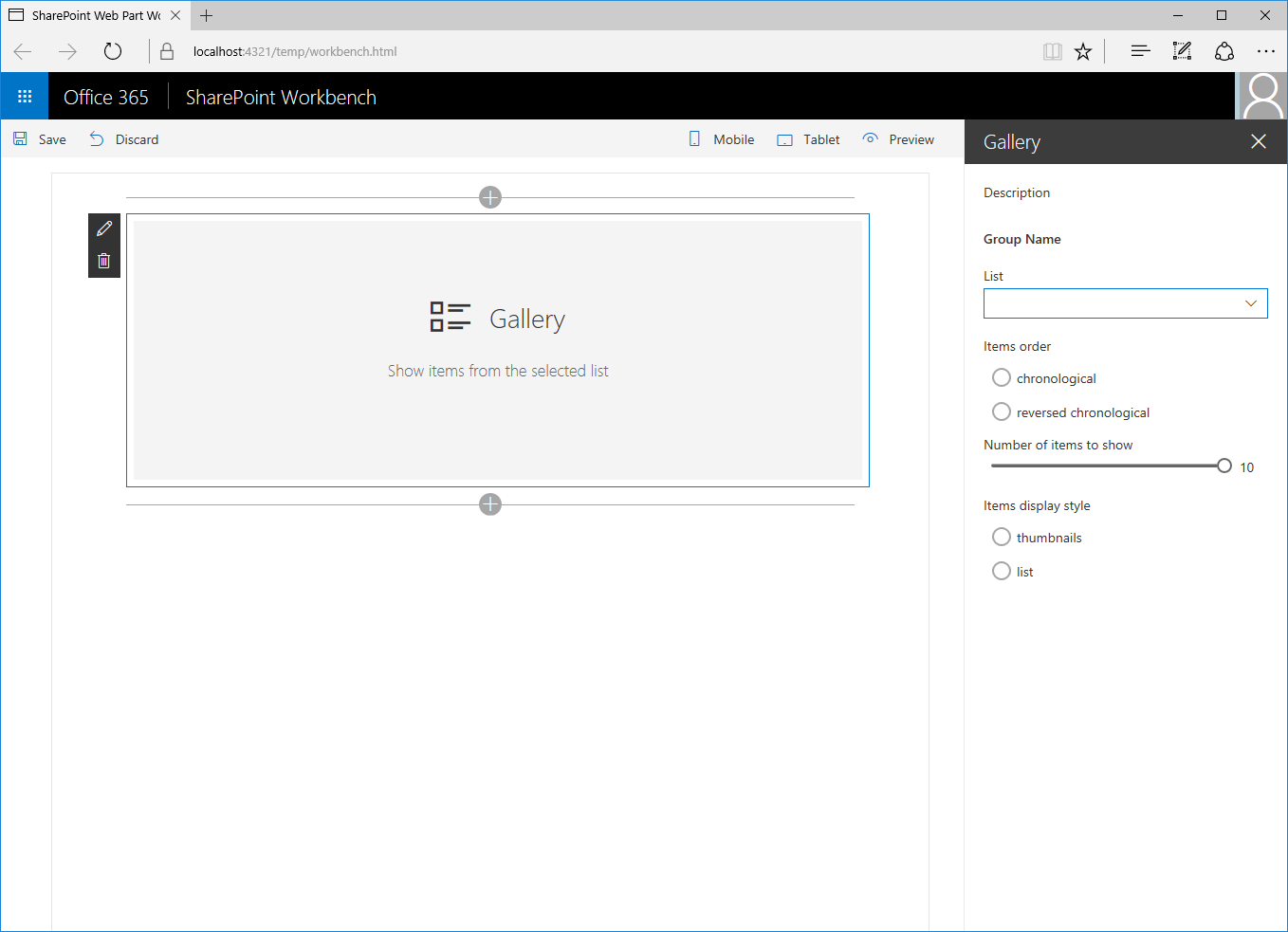
gulp serveIn the web browser, add the web part to the canvas and open its property pane. You should see all the properties available for users to configure.
Because you didn't specify any default values for the web part, every time users add the web part to the page, they have to configure it first. You can simplify this experience by providing default values for the most common scenarios.
Specify default values for the web part
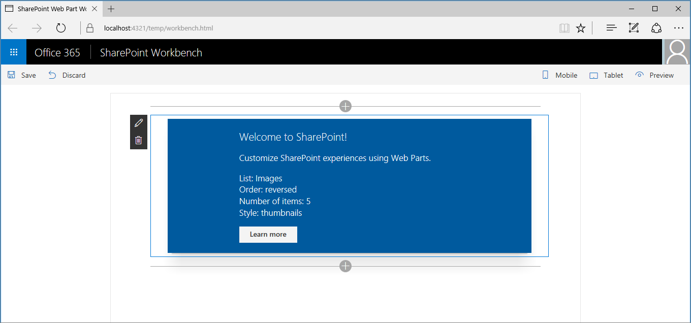
Imagine that users often use the gallery web part to show the five most recently added images. Rather than requiring users to configure the web part manually each time, you could provide them with a preconfigured version that uses the correct settings.
In the code editor, open the ./src/webparts/gallery/GalleryWebPart.manifest.json file. Change the existing entry in the
preconfiguredEntriesproperty to:{ // ... "preconfiguredEntries": [{ "groupId": "6737645a-4443-4210-a70e-e5e2a219133a", "group": { "default": "Content" }, "title": { "default": "Recent images" }, "description": { "default": "Shows 5 most recent images" }, "officeFabricIconFontName": "Picture", "properties": { "listName": "Images", "order": "reversed", "numberOfItems": 5, "style": "thumbnails" } }] }Start debugging the project by running the following command:
gulp serveNote
If you were debugging the project previously, stop debugging and start it again. Changes made to the web part manifest are not automatically reflected in the Workbench while debugging, and you have to rebuild the project to see them.
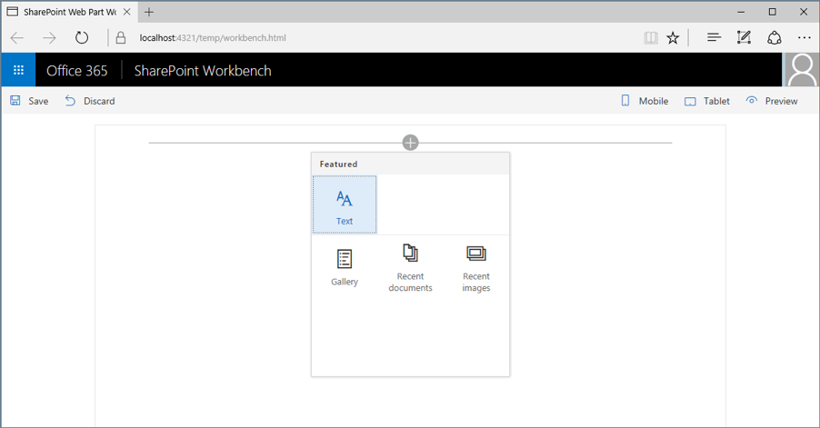
When you open the web part toolbox to add the web part to the canvas, you see that its name and icon changed to reflect the preconfigured settings.
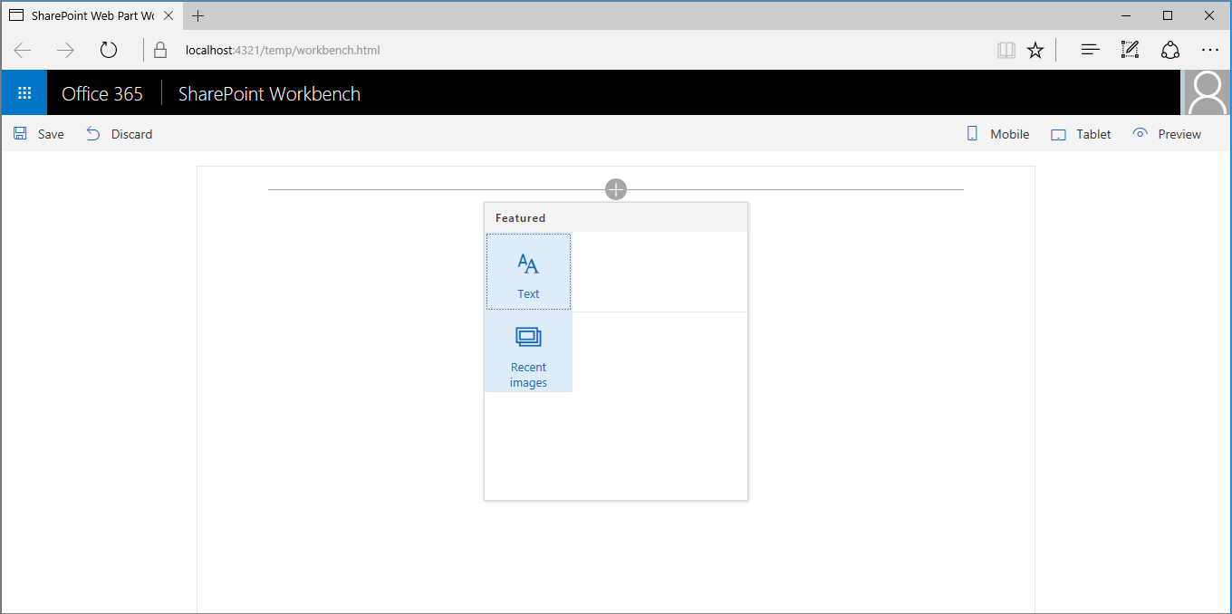
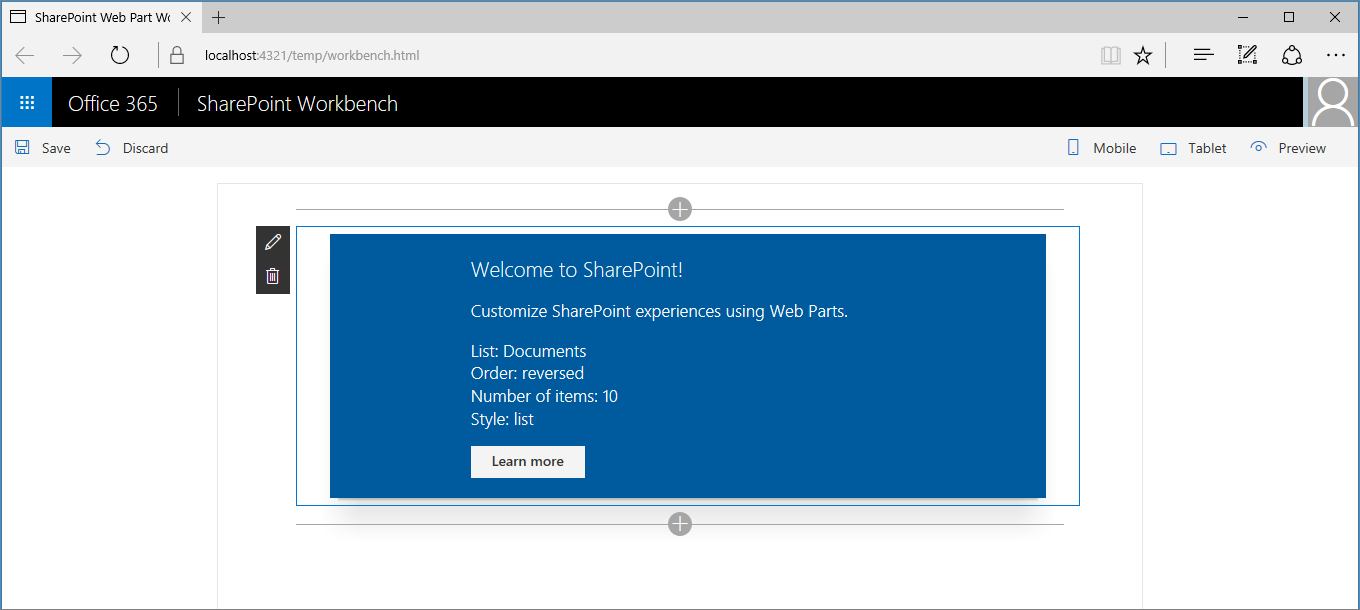
After adding the web part to the page, it works immediately by using the preconfigured settings.
Specify multiple preconfigured web part entries
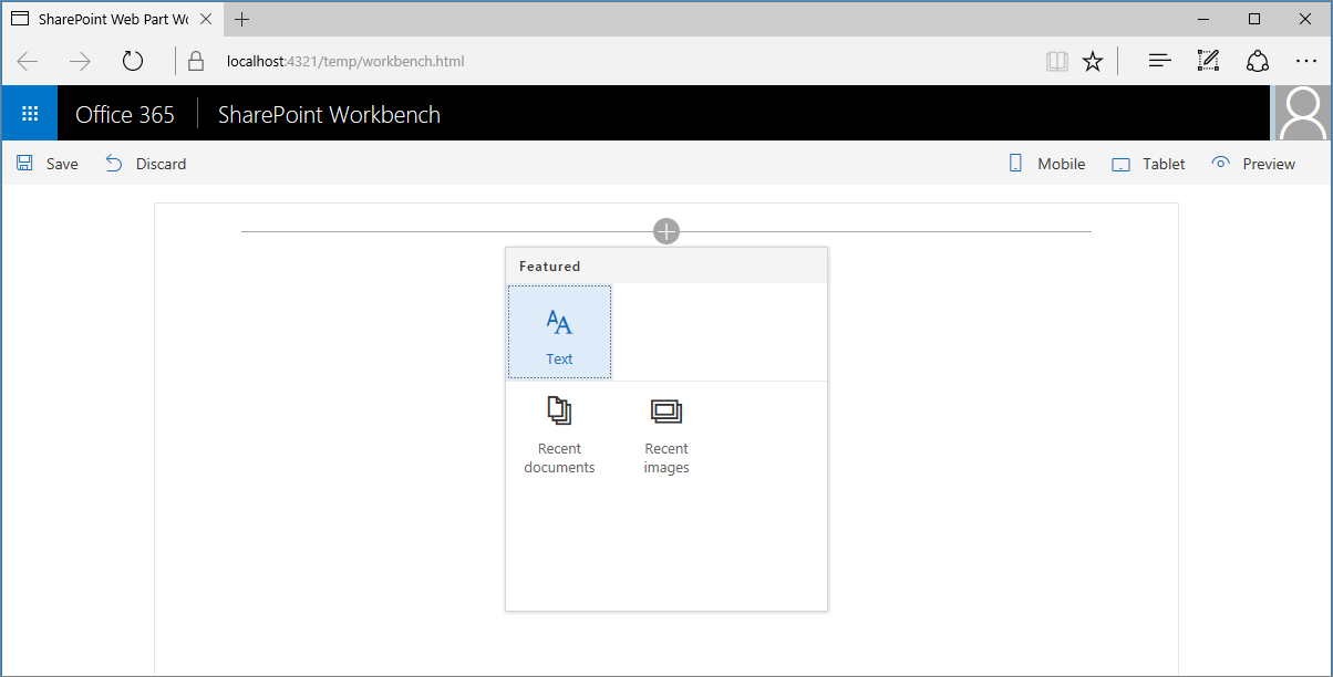
Imagine that another group of users often uses your gallery web part to show documents recently added to their site. To help them use your web part, you can add another set of presets that addresses their configuration needs.
In the code editor, open the ./src/webparts/gallery/GalleryWebPart.manifest.json file. Change the
preconfiguredEntriesproperty to:{ // ... "preconfiguredEntries": [{ "groupId": "6737645a-4443-4210-a70e-e5e2a219133a", "group": { "default": "Content" }, "title": { "default": "Recent images" }, "description": { "default": "Shows 5 most recent images" }, "officeFabricIconFontName": "Picture", "properties": { "listName": "Images", "order": "reversed", "numberOfItems": 5, "style": "thumbnails" } }, { "groupId": "6737645a-4443-4210-a70e-e5e2a219133a", "group": { "default": "Content" }, "title": { "default": "Recent documents" }, "description": { "default": "Shows 10 most recent documents" }, "officeFabricIconFontName": "Documentation", "properties": { "listName": "Documents", "order": "reversed", "numberOfItems": 10, "style": "list" } }] }Notice how you keep the previous preconfigured entry intact and add another one next to it by using different values for properties.
To see the result, start debugging the project by running the following command:
gulp serveWhen you open the web part toolbox to add the web part to the canvas, you see that there are two web parts for you to choose from.
After adding the Recent documents web part to the page, it works immediately by using its specific preconfigured settings.
Specify an unconfigured instance of the web part
When building web parts, there are often specific scenarios that the web part should support. Providing preconfigured entries for those scenarios makes it easier for users to use the web part.
Depending on how you build your web part, it could be possible that the web part can support other unforeseen scenarios as well. If you only provide specific preconfigured entries, users might not realize they can use your web part for a different scenario. It might be a good idea to provide a generic unconfigured variant of your web part as well.
In the code editor, open the ./src/webparts/gallery/GalleryWebPart.manifest.json file. Change the
preconfiguredEntriesproperty to:{ // ... "preconfiguredEntries": [{ "groupId": "6737645a-4443-4210-a70e-e5e2a219133a", "group": { "default": "Content" }, "title": { "default": "Recent images" }, "description": { "default": "Shows 5 most recent images" }, "officeFabricIconFontName": "Picture", "properties": { "listName": "Images", "order": "reversed", "numberOfItems": 5, "style": "thumbnails" } }, { "groupId": "6737645a-4443-4210-a70e-e5e2a219133a", "group": { "default": "Content" }, "title": { "default": "Recent documents" }, "description": { "default": "Shows 10 most recent documents" }, "officeFabricIconFontName": "Documentation", "properties": { "listName": "Documents", "order": "reversed", "numberOfItems": 10, "style": "list" } }, { "groupId": "6737645a-4443-4210-a70e-e5e2a219133a", "group": { "default": "Content" }, "title": { "default": "Gallery" }, "description": { "default": "Shows items from the selected list" }, "officeFabricIconFontName": "CustomList", "properties": { "listName": "", "order": "", "numberOfItems": 5, "style": "" } }] }Notice that the generic unconfigured version of the web part is added next to the configurations that target specific scenarios. This way, if there's no specific configuration addressing users' needs, they can always use the generic version and configure it according to their requirements.
To see the result, start debugging the project by running the following command:
gulp serveWhen you open the web part toolbox to add the web part to the canvas, you see that there are now three web parts that users can choose from.
Feedback
Coming soon: Throughout 2024 we will be phasing out GitHub Issues as the feedback mechanism for content and replacing it with a new feedback system. For more information see: https://aka.ms/ContentUserFeedback.
Submit and view feedback for