Use cascading dropdowns in web part properties
When designing the property pane for your SharePoint client-side web parts, you may have one web part property that displays its options based on the value selected in another property. This scenario typically occurs when implementing cascading dropdown controls. In this article, you learn how to create cascading dropdown controls in the web part property pane without developing a custom property pane control.

The source of the working web part is available on GitHub at sp-dev-fx-webparts/samples/react-cascadingdropdowns/.
Note
Before following the steps in this article, be sure to set up your SharePoint client-side web part development environment.
Create new project
Start by creating a new folder for your project:
md react-cascadingdropdownsGo to the project folder:
cd react-cascadingdropdownsIn the project folder, run the SharePoint Framework Yeoman generator to scaffold a new SharePoint Framework project:
yo @microsoft/sharepointWhen prompted, enter the following values (select the default option for all prompts omitted below):
- What is your solution name?: react-cascadingdropdowns
- Which type of client-side component to create?: WebPart
- What is your Web part name?: List items
- Which template would you like to use?: React
Open your project folder in your code editor. This article uses Visual Studio Code in the steps and screenshots, but you can use any editor that you prefer.
Define a web part property to store the selected list
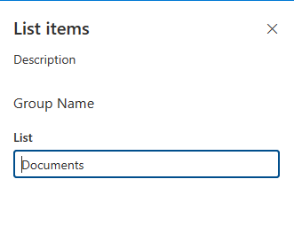
You'll build a web part that displays list items from a selected SharePoint list. Users can select a list in the web part property pane. To store the selected list, create a new web part property named listName.
In the code editor, open the src/webparts/listItems/ListItemsWebPartManifest.json file. Replace the default
descriptionproperty with a new property namedlistName.{ ... "preconfiguredEntries": [{ ... "properties": { "listName": "" } }] }Open the src/webparts/listItems/ListItemsWebPart.ts file, and replace the
IListItemsWebPartPropsinterface with the following:export interface IListItemsWebPartProps { listName: string; }In the src/webparts/listItems/ListItemsWebPart.ts file, change the
render()method to:export default class ListItemsWebPart extends BaseClientSideWebPart<IListItemsWebPartProps> { // ... public render(): void { const element: React.ReactElement<IListItemsProps> = React.createElement( ListItems, { listName: this.properties.listName, isDarkTheme: this._isDarkTheme, environmentMessage: this._environmentMessage, hasTeamsContext: !!this.context.sdks.microsoftTeams, userDisplayName: this.context.pageContext.user.displayName } ); ReactDom.render(element, this.domElement); } // ... }Update
getPropertyPaneConfiguration()to:export default class ListItemsWebPart extends BaseClientSideWebPart<IListItemsWebPartProps> { // ... protected getPropertyPaneConfiguration(): IPropertyPaneConfiguration { return { pages: [ { header: { description: strings.PropertyPaneDescription }, groups: [ { groupName: strings.BasicGroupName, groupFields: [ PropertyPaneTextField('listName', { label: strings.ListNameFieldLabel }) ] } ] } ] }; } // ... }In the src/webparts/listItems/loc/mystrings.d.ts file, change the
IListItemsStringsinterface to:declare interface IListItemsWebPartStrings { PropertyPaneDescription: string; BasicGroupName: string; ListNameFieldLabel: string; AppLocalEnvironmentSharePoint: string; AppLocalEnvironmentTeams: string; AppLocalEnvironmentOffice: string; AppLocalEnvironmentOutlook: string; AppSharePointEnvironment: string; AppTeamsTabEnvironment: string; AppOfficeEnvironment: string; AppOutlookEnvironment: string; UnknownEnvironment: string; }In the src/webparts/listItems/loc/en-us.js file, add the missing definition for the
ListNameFieldLabelstring:define([], function() { return { "PropertyPaneDescription": "Description", "BasicGroupName": "Group Name", "ListNameFieldLabel": "List", "AppLocalEnvironmentSharePoint": "The app is running on your local environment as SharePoint web part", "AppLocalEnvironmentTeams": "The app is running on your local environment as Microsoft Teams app", "AppLocalEnvironmentOffice": "The app is running on your local environment in office.com", "AppLocalEnvironmentOutlook": "The app is running on your local environment in Outlook", "AppSharePointEnvironment": "The app is running on SharePoint page", "AppTeamsTabEnvironment": "The app is running in Microsoft Teams", "AppOfficeEnvironment": "The app is running in office.com", "AppOutlookEnvironment": "The app is running in Outlook", "UnknownEnvironment": "The app is running in an unknown environment" } });In the src/webparts/listItems/components/ListItems.tsx file, change the contents of the
render()method to:public render(): JSX.Element { const { listName, isDarkTheme, environmentMessage, hasTeamsContext, userDisplayName } = this.props; return ( <section className={`${styles.listItems} ${hasTeamsContext ? styles.teams : ''}`}> <div className={styles.welcome}> <img alt="" src={isDarkTheme ? require('../assets/welcome-dark.png') : require('../assets/welcome-light.png')} className={styles.welcomeImage} /> <h2>Well done, {escape(userDisplayName)}!</h2> <div>{environmentMessage}</div> <div>List name: <strong>{escape(listName)}</strong></div> </div> </section> ); }In the src/webparts/listItems/components/IListItemsProps.ts file, change the
IListItemsPropsinterface to:export interface IListItemsProps { listName: string; isDarkTheme: boolean; environmentMessage: string; hasTeamsContext: boolean; userDisplayName: string; }Run the following command to verify that the project is running:
gulp serveNote
If this is your first time running the
gulp servecommand on your workstation, you may need to run thegulp trust-dev-certcommand first.In the web browser, add the List items web part to the canvas and open its properties. Verify that the value set for the List property is displayed in the web part body.
Populate the dropdown with SharePoint lists to choose from
At this point, a user specifies which list the web part should use by manually entering the list name. This is error-prone, and ideally you want users to choose one of the lists existing in the current SharePoint site.
Use dropdown control to render the listName property
In the
ListItemsWebPartclass, add a reference to thePropertyPaneDropdownclass in the top section of the web part. Replace the import clause that loads thePropertyPaneTextFieldclass with:import { IPropertyPaneConfiguration, PropertyPaneDropdown, IPropertyPaneDropdownOption } from '@microsoft/sp-property-pane';In the
ListItemsWebPartclass, add a new variable namedliststo store information about all available lists in the current site:export default class ListItemsWebPart extends BaseClientSideWebPart<IListItemsWebPartProps> { private lists: IPropertyPaneDropdownOption[]; // ... }Add a new class variable named
listsDropdownDisabled. This variable determines whether the list dropdown is enabled or not. Until the web part retrieves the information about the lists available in the current site, the dropdown should be disabled.export default class ListItemsWebPart extends BaseClientSideWebPart<IListItemsWebPartProps> { // ... private listsDropdownDisabled: boolean = true; // ... }Add a new class variable named
loadingIndicator. This variable determines whether the property pane should display a loading indicator. while the web part retrieves the information about the lists available in the current site, the loading indicator should be set totrue.export default class ListItemsWebPart extends BaseClientSideWebPart<IListItemsWebPartProps> { // ... private loadingIndicator: boolean = true; // ... }Change the
getPropertyPaneConfiguration()method to use the dropdown control to render thelistNameproperty:export default class ListItemsWebPart extends BaseClientSideWebPart<IListItemsWebPartProps> { // ... protected getPropertyPaneConfiguration(): IPropertyPaneConfiguration { return { showLoadingIndicator: this.loadingIndicator, pages: [ { header: { description: strings.PropertyPaneDescription }, groups: [ { groupName: strings.BasicGroupName, groupFields: [ PropertyPaneDropdown('listName', { label: strings.ListNameFieldLabel, options: this.lists, disabled: this.listsDropdownDisabled }) ] } ] } ] }; } }Run the following command to verify that it's working as expected:
gulp serve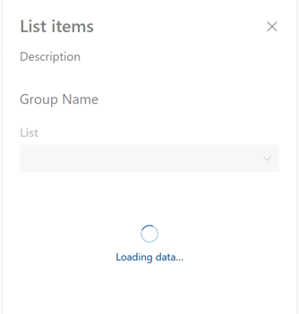
Show available lists in the list dropdown
Previously, you associated the dropdown control of the listName property with the lists class property. Because you haven't loaded any values into it yet, the List dropdown in the web part property pane remains disabled. In this section, you'll extend the web part to load the information about available lists.
In the
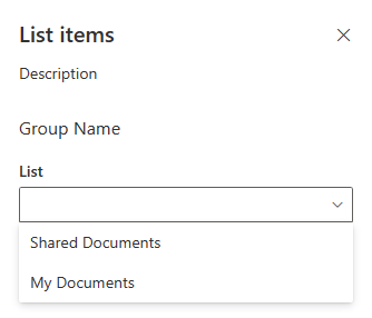
ListItemsWebPartclass, add a method to load available lists. You'll use mock data, but you could also call the SharePoint REST API to retrieve the list of available lists from the current web. To simulate loading options from an external service, the method uses a two-second delay.export default class ListItemsWebPart extends BaseClientSideWebPart<IListItemsWebPartProps> { // ... private async loadLists(): Promise<IPropertyPaneDropdownOption[]> { // eslint-disable-next-line @typescript-eslint/no-explicit-any return await new Promise<IPropertyPaneDropdownOption[]>((resolve: (options: IPropertyPaneDropdownOption[]) => void, _reject: (error: any) => void) => { setTimeout((): void => { resolve([{ key: 'sharedDocuments', text: 'Shared Documents' }, { key: 'myDocuments', text: 'My Documents' }]); }, 2000); }); } }Load information about available lists into the list dropdown. In the
ListItemsWebPartclass, override theonPropertyPaneConfigurationStart()method by using the following code:export default class ListItemsWebPart extends BaseClientSideWebPart<IListItemsWebPartProps> { // ... protected async onPropertyPaneConfigurationStart(): Promise<void> { // disable the item selector until lists have been loaded this.listsDropdownDisabled = !this.lists; // nothing to do until someone selects a list if (this.lists) { return; } // show a loading indicator in the property pane while loading lists and items this.loadingIndicator = true; this.context.propertyPane.refresh(); // load the lists from SharePoint const listOptions: IPropertyPaneDropdownOption[] = await this.loadLists(); this.lists = listOptions; this.listsDropdownDisabled = false; // remove the loading indicator this.loadingIndicator = false; this.context.propertyPane.refresh(); } // ... }The
onPropertyPaneConfigurationStart()method is called by the SharePoint Framework after the web part property pane for the web part has been opened.- First, the method checks if the information about the lists available in the current site has been loaded.
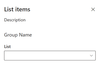
- If the list information is loaded, the list dropdown is enabled.
- If the list information about lists hasn't been loaded yet, the loading indicator is displayed in the property pane, which informs the user that the web part is loading information about lists.
After the information about available lists has been loaded, the method assigns the retrieved data to the
listsclass variable, from which it can be used by the list dropdown.Next, the dropdown is enabled allowing the user to select a list. By calling
this.context.propertyPane.refresh(), the web part property pane is refreshed and it reflects the latest changes to the list dropdown.After list information is loaded, the loading indicator is removed by a setting the
this.loadingIndicatortofalse. Because calling this method changes the property pane interface, thethis.context.propertyPane.refresh()method is called to force the property pane to re-render.Run the following command to confirm that everything is working as expected:
gulp serveWhen you add a web part to the canvas and open its property pane, you should see the lists dropdown filled with available lists for the user to choose from.
Allow users to select an item from the selected list
When building web parts, you often need to allow users to choose an option from a set of values determined by a previously selected value, such as choosing a country/region based on the selected continent, or choosing a list item from a selected list. This user experience is often referred to as cascading dropdowns. Using the standard SharePoint Framework client-side web parts capabilities, you can build cascading dropdowns in the web part property pane. To do this, you extend the previously built web part with the ability to choose a list item based on the previously selected list.
Add item web part property
In the code editor, open the src/webparts/listItems/ListItemsWebPart.manifest.json file. To the
propertiessection, add a new property nameditemNameso that it appears as follows:{ // ... "properties": { "listName": "", "itemName": "" } // ... }Change the code in the src/webparts/listItems/IListItemsWebPartProps.ts file to:
export interface IListItemsWebPartProps {
  listName: string;
  itemName: string;
}
Change the code in the src/webparts/listItems/components/IListItemsProps.ts file to:
export interface IListItemsProps {
  listName: string;
  itemName: string;
  isDarkTheme: boolean;
  environmentMessage: string;
  hasTeamsContext: boolean;
  userDisplayName: string;
}
In the src/webparts/listItems/ListItemsWebPart.ts file, change the code of the
render()method to:export default class ListItemsWebPart extends BaseClientSideWebPart<IListItemsWebPartProps> { // ... public render(): void { const element: React.ReactElement<IListItemsProps> = React.createElement( ListItems, { listName: this.properties.listName, itemName: this.properties.itemName, isDarkTheme: this._isDarkTheme, environmentMessage: this._environmentMessage, hasTeamsContext: !!this.context.sdks.microsoftTeams, userDisplayName: this.context.pageContext.user.displayName } ); ReactDom.render(element, this.domElement); } // ... }In the src/webparts/listItems/loc/mystrings.d.ts file, change the
IListItemsStringsinterface to:declare interface IListItemsWebPartStrings { PropertyPaneDescription: string; BasicGroupName: string; ListNameFieldLabel: string; ItemNameFieldLabel: string; AppLocalEnvironmentSharePoint: string; AppLocalEnvironmentTeams: string; AppLocalEnvironmentOffice: string; AppLocalEnvironmentOutlook: string; AppSharePointEnvironment: string; AppTeamsTabEnvironment: string; AppOfficeEnvironment: string; AppOutlookEnvironment: string; UnknownEnvironment: string; }In the src/webparts/listItems/loc/en-us.js file, add the missing definition for the
ItemNameFieldLabelstring.define([], function() { return { "PropertyPaneDescription": "Description", "BasicGroupName": "Group Name", "ListNameFieldLabel": "List", "ItemNameFieldLabel": "Item", "AppLocalEnvironmentSharePoint": "The app is running on your local environment as SharePoint web part", "AppLocalEnvironmentTeams": "The app is running on your local environment as Microsoft Teams app", "AppLocalEnvironmentOffice": "The app is running on your local environment in office.com", "AppLocalEnvironmentOutlook": "The app is running on your local environment in Outlook", "AppSharePointEnvironment": "The app is running on SharePoint page", "AppTeamsTabEnvironment": "The app is running in Microsoft Teams", "AppOfficeEnvironment": "The app is running in office.com", "AppOutlookEnvironment": "The app is running in Outlook", "UnknownEnvironment": "The app is running in an unknown environment" } });
Render the value of the item web part property
In the src/webparts/listItems/components/ListItems.tsx file, change the render() method to:
export default class ListItems extends React.Component<IListItemsProps, {}> {
  public render(): React.ReactElement<IListItemsProps> {
    const {
      listName,
      itemName,
      isDarkTheme,
      environmentMessage,
      hasTeamsContext,
      userDisplayName
    } = this.props;

    return (
      <section className={`${styles.listItems} ${hasTeamsContext ? styles.teams : ''}`}>
        <div className={styles.welcome}>
          <img alt="" src={isDarkTheme ? require('../assets/welcome-dark.png') : require('../assets/welcome-light.png')} className={styles.welcomeImage} />
          <h2>Well done, {escape(userDisplayName)}!</h2>
          <div>{environmentMessage}</div>
          <div>List name: <strong>{escape(listName)}</strong></div>
          <div>Item name: <strong>{escape(itemName)}</strong></div>
        </div>
      </section>
    );
  }
}
Allow users to choose the item from a list
Similar to how users can select a list by using a dropdown, they can select the item from the list of available items.
In the
ListItemsWebPartclass, add a new variable nameditems, which you use to store information about all available items in the currently selected list.export default class ListItemsWebPart extends BaseClientSideWebPart<IListItemsWebPartProps> { // ... private items: IPropertyPaneDropdownOption[]; // ... }Add a new class variable named
itemsDropdownDisabled. This variable determines whether the items dropdown should be enabled or not. Users can select an item only after they selected a list.export default class ListItemsWebPart extends BaseClientSideWebPart<IListItemsWebPartProps> { // ... private itemsDropdownDisabled: boolean = true; // ... }Change the
getPropertyPaneConfiguration()method to use the dropdown control to render theitemNameproperty.protected getPropertyPaneConfiguration(): IPropertyPaneConfiguration { return { showLoadingIndicator: this.loadingIndicator, pages: [ { header: { description: strings.PropertyPaneDescription }, groups: [ { groupName: strings.BasicGroupName, groupFields: [ PropertyPaneDropdown('listName', { label: strings.ListNameFieldLabel, options: this.lists, disabled: this.listsDropdownDisabled }), PropertyPaneDropdown('itemName', { label: strings.ItemNameFieldLabel, options: this.items, disabled: this.itemsDropdownDisabled, selectedKey: this.properties.itemName // don't forget to bind this property so it is refreshed when the parent property changes }) ] } ] } ] }; }Run the following command to verify that it's working as expected:
gulp serve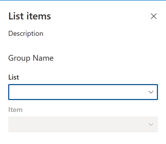
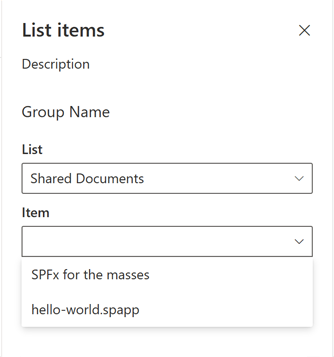
Show items available in the selected list in the item dropdown
Previously, you defined a dropdown control to render the itemName property in the web part property pane. Next, you extend the web part to load the information about items available in the selected list, and show the items in the item dropdown.
Add method to load list items. In the src/webparts/listItems/ListItemsWebPart.ts file, in the
ListItemsWebPartclass, add a new method to load available list items from the selected list. (Like the method for loading available lists, you use mock data.)private async loadItems(): Promise<IPropertyPaneDropdownOption[]> { if (!this.properties.listName) { // return empty options since no list has been selected return []; } // This is where you'd replace the mock data with the actual data from SharePoint // eslint-disable-next-line @typescript-eslint/no-explicit-any return await new Promise<IPropertyPaneDropdownOption[]>((resolve: (options: IPropertyPaneDropdownOption[]) => void, reject: (error: any) => void) => { // timeout to simulate async call setTimeout(() => { const items: { [key: string]: { key: string; text: string }[] } = { sharedDocuments: [ { key: 'spfx_presentation.pptx', text: 'SPFx for the masses' }, { key: 'hello-world.spapp', text: 'hello-world.spapp' } ], myDocuments: [ { key: 'isaiah_cv.docx', text: 'Isaiah CV' }, { key: 'isaiah_expenses.xlsx', text: 'Isaiah Expenses' } ] }; resolve(items[this.properties.listName]); }, 2000); }); }The
loadItems()method returns mock list items for the previously selected list. When no list has been selected, the method resolves the promise without any data.Load information about available items into the item dropdown. In the
ListItemsWebPartclass, extend theonPropertyPaneConfigurationStart()method to load items for the selected list:export default class ListItemsWebPart extends BaseClientSideWebPart<IListItemsWebPartProps> { // ... protected async onPropertyPaneConfigurationStart(): Promise<void> { // disable the item selector until lists have been loaded this.listsDropdownDisabled = !this.lists; // disable the item selector until items have been loaded or if the list has not been selected this.itemsDropdownDisabled = !this.properties.listName || !this.items; // nothing to do until someone selects a list if (this.lists) { return; } // show a loading indicator in the property pane while loading lists and items this.loadingIndicator = true; this.context.propertyPane.refresh(); // load the lists from SharePoint const listOptions: IPropertyPaneDropdownOption[] = await this.loadLists(); this.lists = listOptions; this.listsDropdownDisabled = false; // load the items from SharePoint const itemOptions: IPropertyPaneDropdownOption[] = await this.loadItems(); this.items = itemOptions; this.itemsDropdownDisabled = !this.properties.listName; // remove the loading indicator this.loadingIndicator = false; this.context.propertyPane.refresh(); } // ... }When initializing, the web part first determines if the items dropdown should be enabled or not. If the user previously selected a list, they can select an item from that list. If no list was selected, the item dropdown is disabled.
You extended the previously defined code, which loads the information about available lists, to load the information about items available in the selected list. The code then assigns the retrieved information to the
itemsclass variable for use by the item dropdown. Finally, the code clears the loading indicator and allows the user to start working with the web part.Run the following command to confirm that everything is working as expected:
gulp serveAs required, initially the item dropdown is disabled, requiring users to select a list first. But at this point, even after a list has been selected, the item dropdown remains disabled.
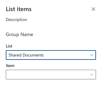
Update web part property pane after selecting a list. When a user selects a list in the property pane, the web part should update, enabling the item dropdown and showing the list of items available in the selected list.
In the ListItemsWebPart.ts file, in the
ListItemsWebPartclass, override theonPropertyPaneFieldChanged()method with the following code:export default class ListItemsWebPart extends BaseClientSideWebPart<IListItemsWebPartProps> { // ... // eslint-disable-next-line @typescript-eslint/no-explicit-any protected async onPropertyPaneFieldChanged(propertyPath: string, oldValue: any, newValue: any): Promise<void> { if (propertyPath === 'listName' && newValue) { // communicate loading items this.loadingIndicator = true; // push new list value super.onPropertyPaneFieldChanged(propertyPath, oldValue, newValue); // reset selected item this.properties.itemName = ''; // use empty string to force property pane to reset the selected item. undefined will not trigger the reset // disable item selector until new items are loaded this.itemsDropdownDisabled = true; // refresh the item selector control by repainting the property pane this.context.propertyPane.refresh(); // get new items const itemOptions: IPropertyPaneDropdownOption[] = await this.loadItems(); // store items this.items = itemOptions; // enable item selector this.itemsDropdownDisabled = false; // clear status indicator this.loadingIndicator = false; // refresh the item selector control by repainting the property pane this.context.propertyPane.refresh(); } else { super.onPropertyPaneFieldChanged(propertyPath, oldValue, newValue); } } // ... }After the user selects a list, the web part persists the newly selected value. Because the selected list changed, the web part resets the previously selected list item. Now that a list is selected, the web part property pane loads list items for that particular list. While loading items, the user can't select an item.
After the items for the selected list are loaded, they're assigned to the items class variable from where they can be referenced by the item dropdown. Now that the information about available list items is available, the item dropdown is enabled allowing users to choose an item. The loading indicator is removed, which clears the web part body that is why the web part should re-render. Finally, the web part property pane refreshes to reflect the latest changes.
This article demonstrated how to use cascading dropdowns in the web part property pane, using static values. In a real-world scenario, you might use an API to retrieve the dropdown choices in each dropdown. An example of a working web part which expands upon this article and loads dropdown choices using an API is available on GitHub at sp-dev-fx-webparts/samples/react-custompropertypanecontrols/..
See also
Feedback
Coming soon: Throughout 2024 we will be phasing out GitHub Issues as the feedback mechanism for content and replacing it with a new feedback system. For more information see: https://aka.ms/ContentUserFeedback.
Submit and view feedback for