SQL Server mobile reports: End-to-end walk-through
Note
SQL Server Mobile Report Publisher is deprecated for all releases of SQL Server Reporting Services after SQL Server Reporting Services 2019. It is discontinued starting in SQL Server Reporting Services 2022 and Power BI Report Server.
Walk through creating mobile reports for any screen size with SQL Server Mobile Report Publisher on the Reporting Services web portal, and viewing them in the Power BI mobile apps.
Create mobile reports on a design surface with adjustable grid rows and columns, and flexible mobile report elements. Connect to various on-premises data sources, or upload Excel workbooks to create mobile reports. Then save your reports to a Reporting Services web portal and view them in a browser, or in the Power BI mobile apps.
This article walks you through:
- Creating a shared data source and dataset on the Reporting Services web portal, using the AdventureWorks database as a sample data source
- Creating a Reporting Services mobile report in the Mobile Report Publisher
- Publishing the mobile report to the Reporting Services web portal
- Viewing the mobile report in the Power BI mobile app
Before we start
To follow along, you need these products:
- To create data sources and KPIs, and publish datasets and mobile reports, you need access to a Reporting Services native mode report server.
- To create shared datasets, install Report Builder.
- To create mobile reports, install SQL Server Mobile Report Publisher.
- AdventureWorks sample databases.
- OR: World Wide Importers sample database, available from the Microsoft SQL Server Samples page.
- To view the result:
- Sign up for the Power BI service and
- Download the Power BI mobile app to your mobile device: iOS, Android phone, or Windows device.
Create a shared data source
You can create a shared data source for your mobile reports from any of the data sources Reporting Services supports. For more information, see the list of supported data sources.
From your Reporting Services web portal, select New, and then choose Data Source.
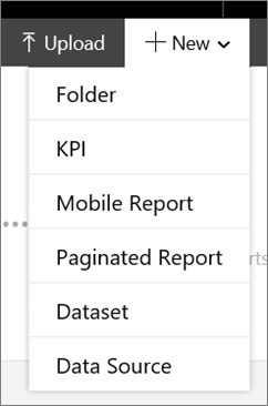
Enter your data source information, and then select OK.
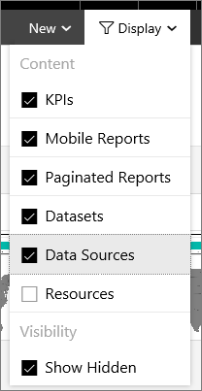
By default, data sources aren't displayed in the portal.
To view data sources, select Display, and then choose Data Source.
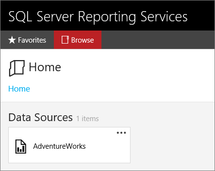
Now you see the data source in the Reporting Services portal.
For more information, see shared data sources in Reporting Services.
Create a shared dataset
Use an existing Reporting Services client tool, such as Report Designer in SQL Server Data Tools (SSDT), to create the shared dataset. This walkthrough uses Report Builder. Install Report Builder, or launch it from your web portal. You create three datasets, one each for: the KPI value, the KPI trend, and one with more fields for the Reporting Services mobile report.
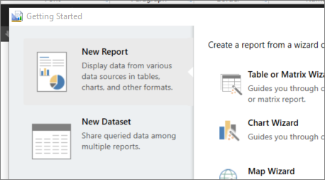
From your Reporting Services web portal, select New, then choose Paginated Report to start Report Builder.
Select New Dataset.
Select Browse other data sources.
In the Name field, enter the name of the server where you saved your data source, in this format:
Name:
https://*localhost*/ReportServer
Items of type:Data Sources (*.rsds)Select Open, and navigate to the data source you created on that server.
Choose your data source and select Open again.
Design your dataset in Report Builder.
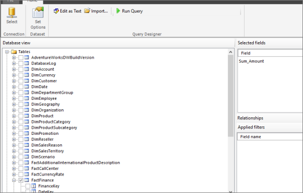
When complete, save the dataset to the SSRS report server.
Now you can use the dataset as the basis for your KPIs and mobile reports. You can create multiple datasets against the same data source. And you can create multiple KPIs and mobile reports against these shared datasets.
Create a KPI
You create KPIs right in the Reporting Services web portal.
In the web portal, select New, and then choose New KPI.
In the KPI creation screen, you can manually enter values, or to use a shared dataset.
Change Value from Set manually to Dataset field.
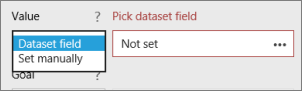
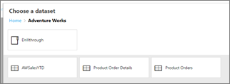
Select the ellipsis (...) in the Pick dataset field box, and select a dataset from the previous step.
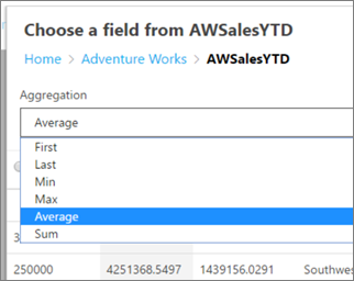
Choose the field in the dataset.
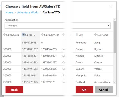
Choose the aggregation you want to view. KPIs can only display one number, so the field is aggregated to show that number.
Select OK.
In the Trend set box, select Dataset trend.
In the Pick dataset trend box, select the ellipsis (...).
Select a field and choose OK.

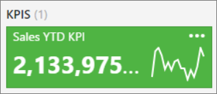
Give your KPI a name and pick a visualization type, and select Create.
The KPI appears on the Reporting Services web portal.
Create a Reporting Services mobile report
To create a Reporting Services mobile report, install SQL Server Mobile Report Publisher, or launch it from the Reporting Services web portal.
When you first open Mobile Report Publisher, you see a blank canvas where you can create your mobile report. You can start by creating visuals first, or start with your data. If you create the visuals first, Mobile Report Publisher automatically generates simulated data that is tied to the report and changes dynamically as you change your visual selections. Try this action yourself.
Start with the visuals
From your Reporting Services web portal, select New. Choose Mobile Report to start Mobile Report Publisher.
Mobile Report Publisher opens to the primary layout grid.
On the Layout tab, scroll down to the Charts section.
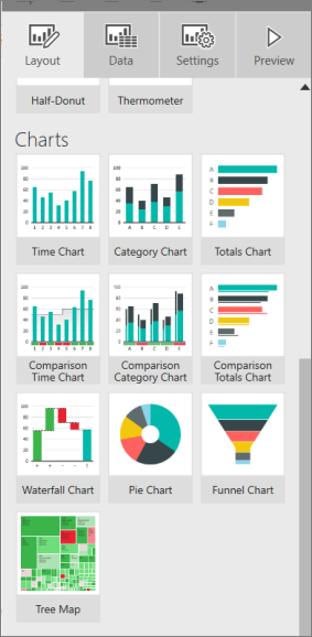
Drag the Tree Map to the grid, and drag the lower-right corner to make it three columns wide and three rows high.
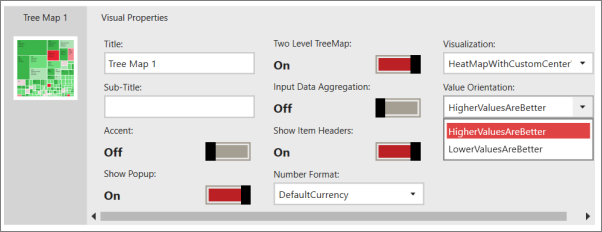
You can see its visual properties at the bottom. You might have to scroll sideways to see them all.
With the tree map visual selected, select the Data tab in the upper-left corner.
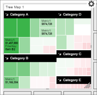
Now you see the simulated fields and values that Mobile Report Publisher generated, and see what the size and the color represent in the tree map.
Select the Layout tab.
Select the Options cog
 in the upper-right corner of the tree map to see the menu it contains.
Select the arrow in the middle of the wheel to close it.
Add your own data
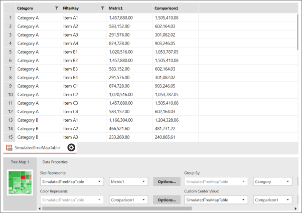
Switch to the Data tab.
To add your own data, select Add Data in the upper-right corner, and navigate to your data.
You could use data from a local Excel workbook, but in this case, it's from the shared dataset on your Reporting Services web portal. You see a "Server added" message.
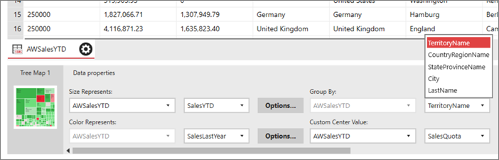
Select the server, then select the dataset you created.
Back on the Data tab, in the Data Properties pane change Size Represents, Color Represents, and other properties to fields in your own data.
- Size Represents, Color Represents, and Custom Center Value have to be fields with numeric values.
- Group By is a category, so it's a text field.
Select Preview to see the tree map updated with your data.
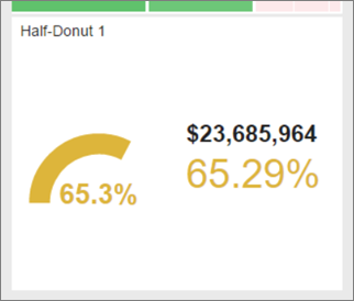
Add a gauge to your mobile report
Let's add a gauge to see how year-to-date sales compare to last year's sales, using the same dataset.
On the Layout tab, drag a Half-donut to the canvas. place it under the tree map and drag the lower-right corner to make it three squares wide by two squares high.
Again, it starts with simulated data.
In Visual properties, by default Higher values are better, and the Delta label is a Percentage of target. It has default Range stops you can change, but for now they're fine.
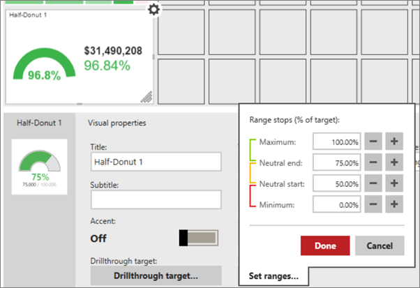
On the Data tab, select the table with your data and select the Main Value field and the field you want to compare it to in Comparison Value.
You can choose different aggregations to come up with one number for Main Value and one for Comparison Value. By default, it's a sum.

Select Preview to see how it looks.
Add a selection list as a filter
Selection lists act like slicers in Power BI and Excel. We can add one to filter the other visuals in the mobile report.
On the Layout tab, drag a selection list to the right of the tree map, and drag the lower-right corner to make it two squares wide and as tall as the canvas, five squares.
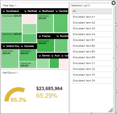
On the Data tab, Data properties, set Keys and Labels to a field in your data that you want to filter on.

Create a mobile report for phones
Now that you created visuals on the primary layout, you can create a mobile report with a layout optimized for your phone users.
In the upper-right corner, select the canvas icon, and then choose Phone.
On the Layout tab under Control Instances, you see the two charts you created.
Drag the tree map to the phone canvas and make it four columns wide and three rows high.
Save your mobile report
You can save your report locally or to a Reporting Services web portal. If you save it locally, Mobile Report Publisher saves it with cached data, so you can open it and continue working on it. But you can't view it on a mobile device.
Select the save icon in the upper-left corner.
To share it with others and view it on a mobile device, select Save to Server.
On the server, browse to the folder where you want to save your mobile report.
Select Choose Folder, and then choose Save.
You get a message confirming the report is saved.
After you save, you can return to the portal and see your mobile report thumbnail.
Tap the thumbnail to see the report in the web portal.
View your report on a mobile device
To view your Reporting Services report, you first need to:
- Sign up for the Power BI service, if you don't have an account. yet.
- Download the Power BI mobile app to your mobile device.
View your mobile report
Open and sign into the Power BI app on your mobile device.
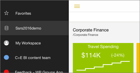
To view your Reporting Services mobile reports and KPIs, tap Reporting Services.
Tap the options icon
 in the upper-left corner, and tap Connect to Server.
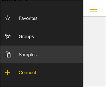
Give the server a name, and fill in the server address and your email address and password, in this format:
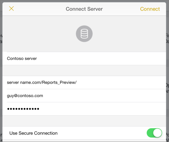
Now you see the server in the left navigation bar.
Tip
Tap the options icon
anytime to go between your Reporting Services mobile reports in the Reporting Services web portal and your dashboards in the Power BI service.
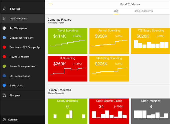
View KPIs and mobile reports in the Power BI app
Tap the KPIs or Mobile Reports tab.
Tap a KPI to see it in focus mode.
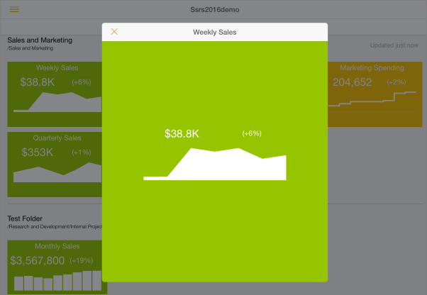
Tap a mobile report to open and interact with it in the Power BI app.
The KPIs and mobile reports are displayed in the same folders they're in on the Reporting Services web portal.
Related content
Feedback
Coming soon: Throughout 2024 we will be phasing out GitHub Issues as the feedback mechanism for content and replacing it with a new feedback system. For more information see: https://aka.ms/ContentUserFeedback.
Submit and view feedback for