Microsoft ClearType overview
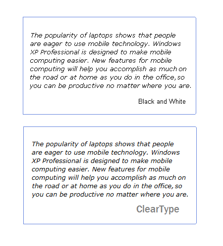
ClearType is a software technology developed by Microsoft that improves the readability of text on existing LCDs (Liquid Crystal Displays), such as laptop screens, Pocket PC screens, and flat panel monitors. With ClearType font technology, the words on your computer screen look almost as sharp and clear as those printed on a piece of paper.
ClearType works by accessing the individual vertical color stripe elements in every pixel of an LCD screen. Before ClearType, the smallest level of detail that a computer could display was a single pixel, but with ClearType running on an LCD monitor, we can now display features of text as small as a fraction of a pixel in width. The extra resolution increases the sharpness of the tiny details in text display, making it much easier to read over long durations.
How did Microsoft come to develop ClearType?
ClearType builds upon a tradition of dedication to high-quality font technology at Microsoft. Since the early nineties, Microsoft has continued to improve its display and font capabilities, including the further development of TrueType font technology originally licensed from Apple. Looking to further improve Microsoft's font rendering technology, Microsoft researchers spent more than two years sifting through a large amount of research related to both typography and the psychology of reading. They concluded that reading is a form of pattern recognition. People become immersed in reading only when word recognition is a subconscious task and the conscious mind is free to read the text for meaning.
What was discovered is that word recognition is only subconscious when typographical elements such as the shape and weight of letterforms, and the spacing between letters work together to present words as easily recognized patterns. With these findings in mind, Microsoft began taking a closer look literally at how type was being rendered on screens.
How does ClearType display technology work?
To understand how ClearType works, one first has to understand what makes an LCD screen different from other types of displays. Most screens created images made up of pixels, which when magnified look like single squares. The equivalent of one pixel on an LCD screen is actually composed of three sub-pixels: one red, one green, and one blue (R-G-B). Seen together, these sub-pixel triplets combine to be seen by the human eye as a single pixel.
If we were to look at a single pixel, our eye would see it as in the illustration above. However, if we were to magnify the image, we would see that each pixel is actually made up of three separate subpixels. And so, if when we see white on an LCD screen, we are really looking at red, green and blue stripes.

How does this help improve the quality of digital type display?
Traditional computer font rendering assumes that each pixel is either 'on' or 'off', appearing as tiny black squares. Letters appear jagged on the computer screen because they are formed from many of these tiny squares or pixels. Traditional grayscaling assumes that each pixel has no internal structure, so it smooths the jagged edges but sacrifices edge sharpness. ClearType knows that LCDs are made up of colored sub-pixels. ClearType uses a model of the human visual system to choose the brightness values of the sub-pixels. With ClearType, letters on the computer screen appear smooth, not jagged, yet the edges remain sharp.
ClearType font rendering

- This is how the lowercase 'm' looks in the original typeface outline.
- This is a close-up of the 'm' when rendered on screen without ClearType. Notice how the 'm' has hard, jagged stair-steps or 'jaggies' in the stems, or 'legs' of the 'm'.
- This is a close-up of the 'm' when rendered on screen with ClearType. Notice how the 'jaggies' are much more subtle and the letter is rendered more smoothly.
Frequently asked questions about ClearType
How does ClearType work?
ClearType is a form of sub-pixel font rendering that draws text using a pixel's red-green-blue (RGB) components separately instead of using the entire pixel. When the pixel is used in this way, horizontal resolution theoretically increases 300 percent.
Picture elements on an LCD screen are actually comprised of individual horizontally-oriented red, green and blue sub-pixels. For instance, an LCD screen that has a display resolution of 800x600 pixels actually has 2400x600 individual sub-pixels. The human eye is not capable of differentiating colors on such a small scale, so a combination of these three primary colors can emulate any intermediate color. Sub-pixel font rendering takes advantage of this by antialiasing at the sub-pixel level instead of at the pixel level.
Why should I tune my display?
No two screens are exactly the same and everyone perceives color in a slightly different way.
How can I tell if my laptop or flat panel display is set to its native resolution?
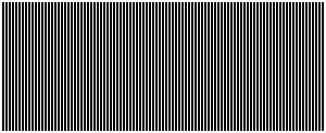
To see if your screen is set to its native resolution, try looking at the following eye test image. The image is made up of many vertical black lines. If you see alternating bands of white running vertically through this image, you are probably running at a non-native resolution.
I'm a type designer. How can I see how my fonts will render under ClearType without installing Windows?
Type designers can license our Visual TrueType (VTT) font hinting tool. VTT was updated to let designers proof their fonts under ClearType. See VTT for more information.
Feedback
Coming soon: Throughout 2024 we will be phasing out GitHub Issues as the feedback mechanism for content and replacing it with a new feedback system. For more information see: https://aka.ms/ContentUserFeedback.
Submit and view feedback for