Recommendation for TrueType Outlines of Cursive Script Typefaces
An issue with fonts that have connecting characters, like Arabic language fonts, is that an overlap of a minimal size is required. This overlap is necessary to avoid issues where rounding causes a column of pixels not to render, leaving a small gap in connection. This break between characters can be seen in Figure 1 below.

The purpose of this document is to recommend guidelines for font vendors to make fonts that avoid this issue.
Glyph Design
When designing connecting glyphs to avoid pixel dropout caused by rounding, it is necessary to provide for a minimum of a 70 font unit overlap when a 2048 em square (recommended value) is used for TrueType outlines. The amount of 70 units will allow for at least the width of the character to be maintained during the rasterization process at all PPEM sizes.
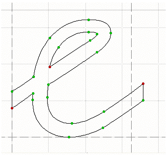
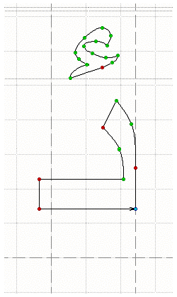
To make the overlap most effective, the overlap should be totally on either the left side of the glyph or the right side of the glyph. My recommendation would be that the overlap would be on the trailing side of the glyph. Thus, for a cursive English font, the overlap would be on the right side (see Figure 2). The overlap for a right-to-left language would be on the left side (see Figure 3).
Splitting the overlap to both sides of the font does not correctly resolve all situations where rounding is occurring, as each side may round down and cause a column of pixels to not render.
Feedback
Coming soon: Throughout 2024 we will be phasing out GitHub Issues as the feedback mechanism for content and replacing it with a new feedback system. For more information see: https://aka.ms/ContentUserFeedback.
Submit and view feedback for