Organize objects into layout containers in XAML Designer
This article describes layout panels and controls for XAML Designer.
Imagine where you'd like objects to appear on a page—objects such as images, buttons, and videos. Maybe you want them to appear in rows and columns, in a single line vertically or horizontally, or in fixed positions.
After you've had a chance to think about how the page might appear, choose a layout panel. All pages start with one because you need something to which you add your objects. By default it's a Grid, but you can change that.
Layout panels help you arrange objects on a page, but they do more than that. They help you design for different screen sizes and resolutions. When users run your app, everything in a layout panel resizes to match the screen real estate of their device. Of course, if you don't want your layout to do that, you can override that behavior for a part of the layout or the entire layout. You can use height and width properties to control that.
Layout panels
Start your page by choosing one of these layout panels. Your page can have more than one. For example, you might start with a Grid layout panel, and then add a StackPanel to an area in the Grid so that you can arrange controls vertically in that element.
The following layout panels are the most popularly used, but there are others. You can find them all in Toolbox in Visual Studio or the Assets panel in Blend for Visual Studio.
Grid
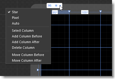
Arrange objects into rows and columns.
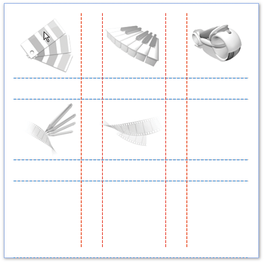
UniformGrid
Arrange objects into equal, or uniform, grid regions. This panel is great for arranging a list of images.
(Available only for WPF projects.)
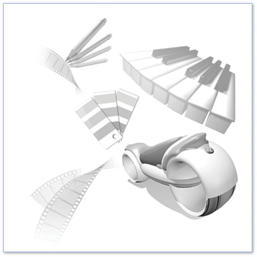
Canvas
Arrange objects any way you want. When users run your app, these elements will have fixed positions on the screen.
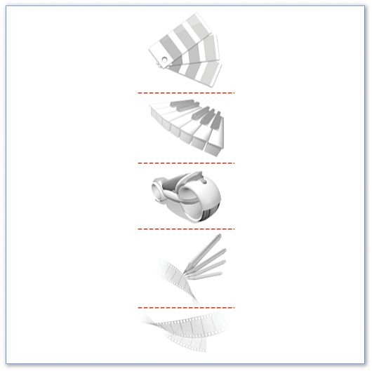
StackPanel
Arrange objects in a single line horizontally or vertically.
WrapPanel
Arrange objects sequentially from left to right. When the panel runs out of room at the far-right edge, it wraps the content to the next line, and so on from left-to-right, top-to-bottom. You can also make the orientation of a wrap panel vertical so that objects flow from top-to-bottom, left-to-right.
(Available only for WPF projects.)
DockPanel
Arrange objects so that they stay, or dock, to one edge of the panel.
(Available only for WPF projects.)
Watch a short video:  WPF - DockPanel
Layout controls
You can add your objects to layout controls as well. They aren't as feature-rich as a layout panel, but you might find them helpful for certain scenarios.
The following layout controls are the most popular, but there are others. You can find them all in Toolbox in Visual Studio or the Assets panel in Blend for Visual Studio.
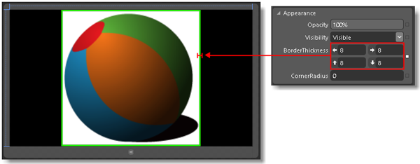
Border
Create a border, background, or both around an object. You can add only one object to a Border. If you want to apply a border or background for more than one object, add a layout panel to the Border. Then, add objects to that panel or control.
Popup
Show information or options to users in a window. You can add only one object to a Popup. By default, a Popup contains a Grid, but you can change that.
ScrollViewer
Enable users to scroll down a page or area of a page. You can add only one object to a ScrollViewer, so it makes sense to add a layout panel such as a Grid or StackPanel.

Viewbox
Scale objects much like you would with a zoom control. You can add only one object to a Viewbox. If you want to apply that effect to more than one object, add a layout panel to the ViewBox, and then add your controls to that layout panel.
Related content
Feedback
Coming soon: Throughout 2024 we will be phasing out GitHub Issues as the feedback mechanism for content and replacing it with a new feedback system. For more information see: https://aka.ms/ContentUserFeedback.
Submit and view feedback for