XAML Live Preview: Capture and edit desktop app UI
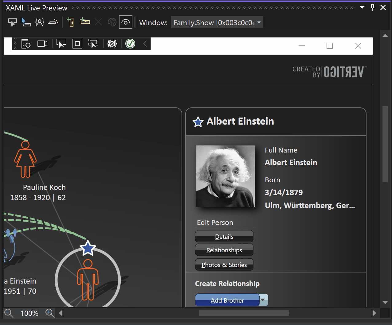
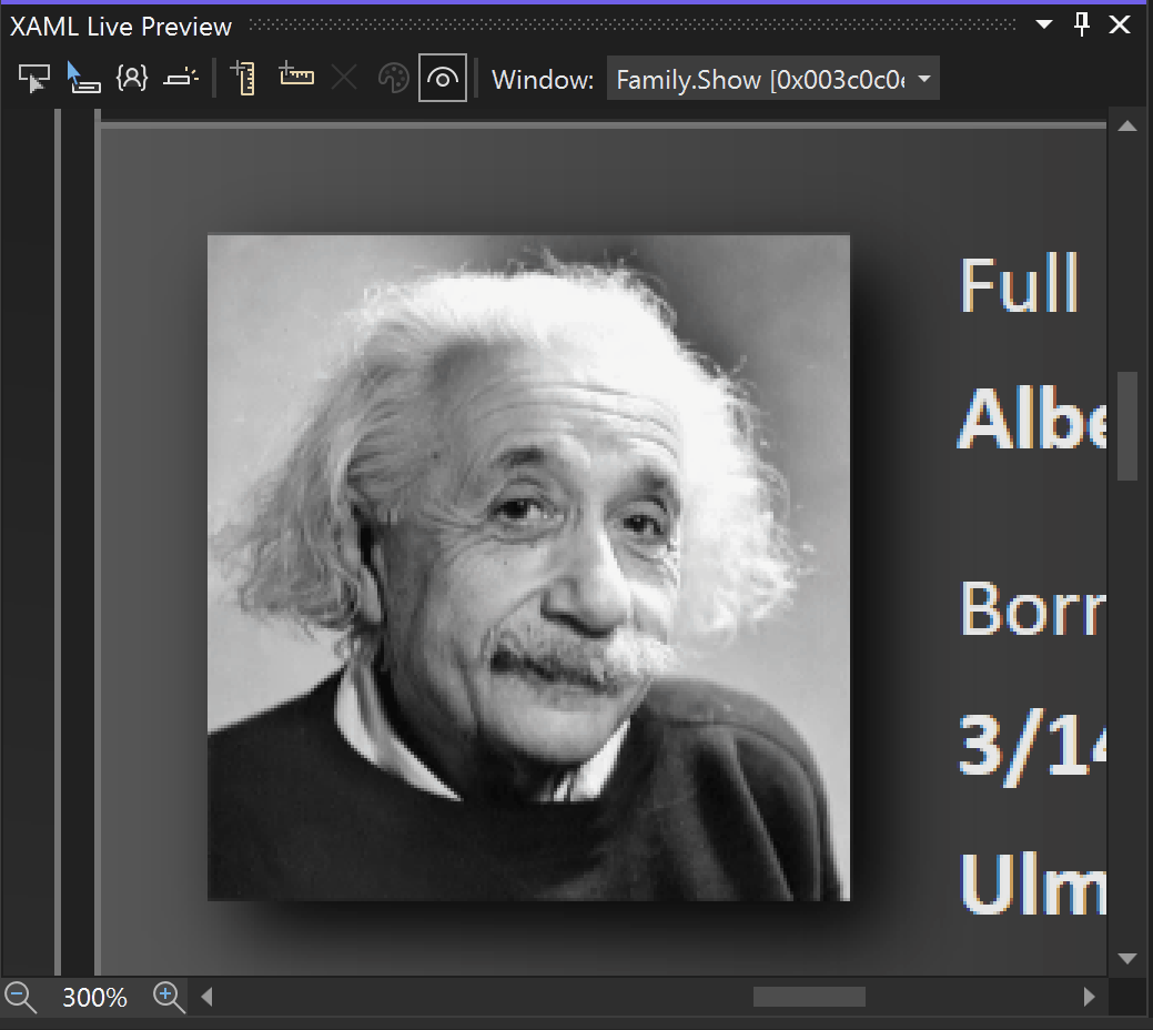
With XAML Live Preview, you can capture a desktop app's user interface (UI) and bring it into a docked window within Visual Studio, which makes it easier to use XAML Hot Reload to change the app and then view those changes in real time as you make them.
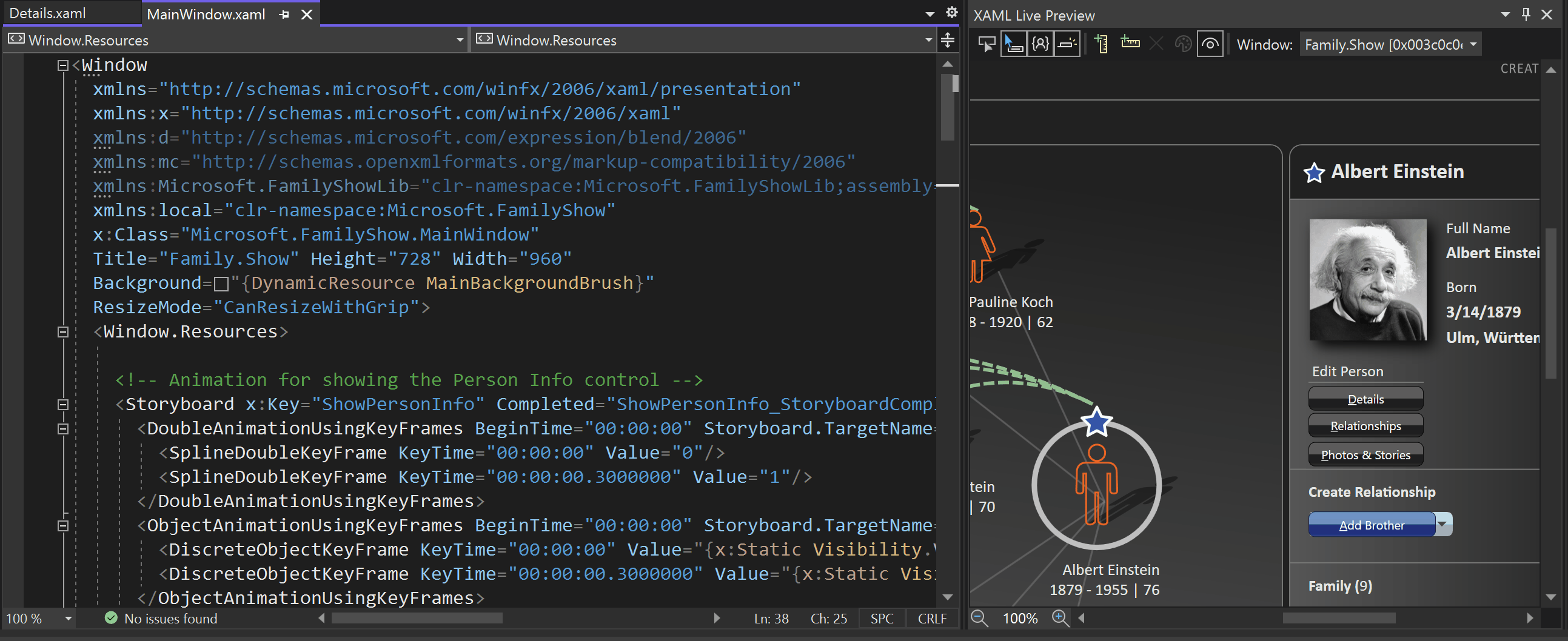
XAML Live Preview window
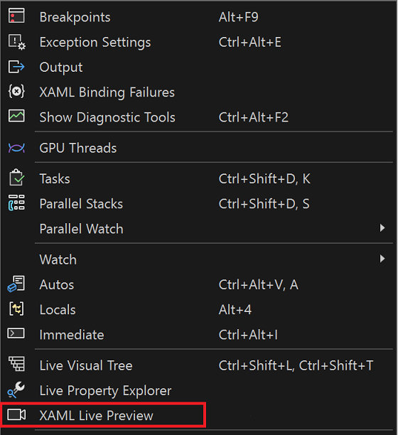
The XAML Live Preview window is available during debugging. To open it, go to Debug > Windows > XAML Live Preview.
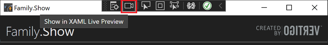
Or, select the Show in XAML Live Preview button in the application toolbar.
Scrolling and zooming
Besides scrolling with the scroll bars, you can also use the following interactions:
- A mouse wheel, both vertical and horizontal (if your mouse supports it).
- A touchpad two-finger scroll, both vertical and horizontal.
- A Ctrl key press paired with a mouse drag action.
As for zooming, you can also use the following interactions:
- The Zoom in/out buttons in the bottom-left corner.
- A Ctrl+plus sign (+) or Ctrl+minus sign (-) keyboard shortcut press, if you prefer using a keyboard.
- A Ctrl key press paired with a mouse wheel action, or a pinch to zoom action with touchpad. An extra bonus of using a mouse is maintaining an area of control.
Element selection
Element selection in XAML Live Preview is similar to selection in a running application. It allows you to find elements in either the Live Visual Tree or in source XAML.

Element selection is controlled by the first four toolbar buttons (from left to right).
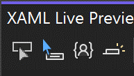
The toolbar buttons produce the following actions:
- Element selection starts the element selection action; in other words, it highlights elements as you move your mouse over application content in XAML Live Preview. When you click on an element, it's selected in Live Visual Tree. It also navigates to source if Preview Selected Element is enabled, and source XAML available. This behavior is the same as that in Live Visual Tree.
- Show element info during selection is a toggle button that controls the display of size, color, and font information about the element under your mouse.
- Just My XAML is a toggle button that controls which elements to highlight: all, or only those elements with source XAML available in solution. This behavior is the same as that in Live Visual Tree.
- Preview Selected Item is a toggle button that controls navigation to source XAML when an element is selected. It's off by default. This behavior is the same as that in Live Visual Tree.
Rulers
Rulers help you align elements in your application. They display distance, in application units, to previous ruler. In this way, they help verify distances between different parts of your application.

The second group of toolbar buttons control the rulers, as follows (from left to right):
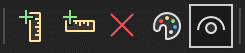
- Add vertical ruler. Adds a single vertical ruler. If you click this button few times in a row, it will place new rulers so that they don't overlap existing rulers.
- Add horizontal ruler. Adds a single horizontal ruler, similar to the vertical ruler.
- Remove all rulers. Removes all rulers at time.
- Select ruler color. Changes the color of the rulers.
- Toggle ruler visibility. Hides or shows all rulers with a single click.
Rulers are keyboard-friendly. You can tab around them. You can use arrow keys to move rulers one pixel at a time, or press Ctrl paired with arrow keys to move them by 10 app units at a time. The Del key deletes the currently selected ruler. You can also delete a ruler with a mouse by selecting the Delete Ruler button near the label.
You can also add rulers around an element while using Element Selection. A right-click adds vertical rulers. To add horizontal rulers, select and hold the Shift key while you right-click.
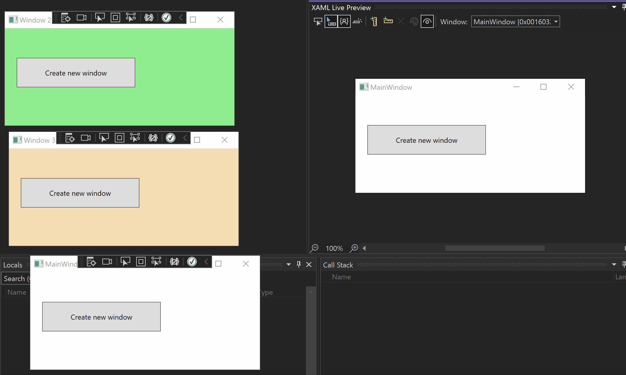
Multi-window applications
If your application has multiple windows, then you can choose which window to display by using the Window combo box. Or, use the Show in XAML Live Preview button in the application toolbar that's on the window you want to preview.
Supported platforms
The initial release of Visual Studio 2022 supports the following platforms and debugging scenarios.
| Platform | Element Selection & Info Tip | Rulers |
|---|---|---|
| WPF | Yes | Yes |
| UWP | Yes | Yes |
| WinUI3 desktop | Yes | Yes |
| .NET MAUI | Yes | Yes |
| Xamarin 5.0+ (Android Emulator) | No | Yes (px*) |
Note
In the preceding table, (px*) indicates rulers that display in pixels; all other platforms display info in platform units, which depend on a monitor's DPI.
Limitations
XAML Live Preview works by capturing an application screenshot several times a second, and uses available APIs like PrintWindow. It's subject to following limitations:
- If a part of an app window is off screen, then that part is not likely to display XAML Hot Reload changes.
- A window can opt out of screenshot capturing—and become unavailable for XAML Live Preview—by using SetWindowDisplayAffinity with WDA_EXCLUDEFROMCAPTURE or DwmSetWindowAttribute with DWMWA_CLOAK.
Next steps
Learn more about XAML Hot Reload, which pairs closely with XAML Live Preview.
Related content
Feedback
Coming soon: Throughout 2024 we will be phasing out GitHub Issues as the feedback mechanism for content and replacing it with a new feedback system. For more information see: https://aka.ms/ContentUserFeedback.
Submit and view feedback for