Porting Windows Phone Silverlight to UWP for form factor and UX
The previous topic was Porting business and data layers.
Windows apps share a common look-and-feel across PCs, mobile devices, and many other kinds of devices. The user interface, input, and interaction patterns are very similar, and a user moving between devices will welcome the familiar experience. Differences between devices such as physical size, default orientation, and effective pixel resolution factor into the way a Universal Windows Platform (UWP) app is rendered by Windows 10. The good news is that much of the heavy lifting is handled for you by the system using smart concepts such as effective pixels.
Different form factors and user experience
Different devices have multiple possible portrait and landscape resolutions, in a variety of aspect ratios. How will the visual aspects of its interface, text, and assets of your UWP app scale? How can you support touch as well as mouse and keyboard input? And with an app that supports touch on different-sized devices with different viewing distances, how can a control both be a right-sized touch target at different pixel densities and have its content readable at different distances? The following sections address the things you need to know.
What is the size of a screen, really?
The short answer is that it's subjective, because it depends not only on the objective size of the display but also on how far away from it you are. The subjectivity means that we have to put ourselves in the shoes of the user, and that's something that developers of good apps do in any case.
Objectively, a screen is measured in units of inches, and physical (raw) pixels. Knowing both of those metrics lets you know how many pixels fit into an inch. That's the pixel density, also known as DPI (dots per inch), also known as PPI (pixels per inch). And the reciprocal of the DPI is the physical size of the pixels as a fraction of an inch. Pixel density is also known as resolution, although that term is often used loosely to mean pixel count.
As viewing distance increases, all those objective metrics seem smaller, and they resolve into the screen's effective size, and its effective resolution. Your phone is usually held closest to your eye; your tablet then your PC monitor are next, and furthest away are Surface Hub devices and TVs. To compensate, devices tend to get objectively larger with viewing distance. When you set sizes on your UI elements, you are setting those sizes in units called effective pixels (epx). And Windows 10 will take into account DPI, and the typical viewing distance from a device, to calculate the best size of your UI elements in physical pixels to give the best viewing experience. See View/effective pixels, viewing distance, and scale factors.
Even so, we recommend that you test your app with many different devices so that you can confirm each experience for yourself.
Touch resolution and viewing resolution
Affordances (UI widgets) need to be the right size to touch. So, a touch target needs to more-or-less retain its physical size across different devices that might have different pixel densities. Effective pixels help you out here, too: they're scaled on different devices—taking pixel density into account—in order to achieve a more-or-less constant physical size that's ideal for touch targets.
Text needs to be the right size to read (12 point text at a 20 inch viewing distance is a good rule of thumb), and an image needs to be the right size and effective resolution, for the viewing distance. On different devices, that same effective pixel scaling keeps UI elements right-sized and readable. Text and other vector-based graphics scale automatically, and very well. Raster (bitmap)-based graphics are also scaled automatically if the developer provides an asset in a single, large size. But, it's preferable for the developer to provide each asset in a range of sizes so that the appropriate one for a target device's scaling factor can be automatically loaded. For more info on that, see View/effective pixels, viewing distance, and scale factors.
Layout, and adaptive Visual State Manager
We've described the factors involved in a meaningful understanding of screen size. Now, let's think about the layout of your app, and how to make use of extra screen real-estate when it's available. Consider this page from a very simple app that was designed to run on a narrow mobile device. What should this page look like on a larger screen?
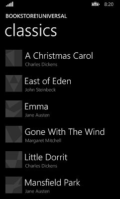
The mobile version is constrained to portrait-only orientation because that's the best aspect ratio for the book list; and we'd do the same for a page of text, which is best kept to a single column on mobile devices. But, PC and tablet screens are large in either orientation, so that mobile device constraint seems like an unnecessary limitation on larger devices.
Optically zooming the app to look like the mobile version, just bigger, doesn't take advantage of the device and its additional space, and that doesn't serve the user well. We should be thinking of showing more content, rather than the same content bigger. Even on a phablet, we could show some more rows of content. We could use extra space to display different content, such as ads, or we could change the list box into a list view and have it wrap items into multiple columns, when it can, to use the space that way. See Guidelines for list and grid view controls.
In addition to new controls such as list view and grid view, most of the established layout types from Windows Phone Silverlight have equivalents in the Universal Windows Platform (UWP). For example, Canvas, Grid, and StackPanel. Porting much of the UI that uses these types should be straightforward, but always look for ways to leverage the dynamic layout capabilities of these layout panels to automatically resize and re-lay out on devices of different sizes.
Going beyond the dynamic layout built into the system controls and layout panels, we can use a new Windows 10 feature called Adaptive Visual State Manager.
Input modalities
A Windows Phone Silverlight interface is touch-specific. And your ported app's interface should of course also support touch, but you can choose to support other input modalities in addition, such as mouse and keyboard. In the UWP, mouse, pen, and touch input are unified as pointer input. For more info, see Handle pointer input, and Keyboard interactions.
Maximizing markup and code re-use
Refer back to the maximizing markup and code reuse list for techniques on sharing your UI to target devices with a wide range of form factors.
More info and design guidelines
Related topics
Feedback
Coming soon: Throughout 2024 we will be phasing out GitHub Issues as the feedback mechanism for content and replacing it with a new feedback system. For more information see: https://aka.ms/ContentUserFeedback.
Submit and view feedback for