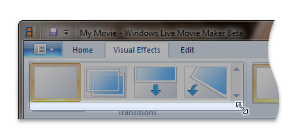
FlowMenuLayout element
Represents a horizontal layout with line breaks for items in a gallery.
Usage
<FlowMenuLayout
  Rows = "xs:integer"
  Columns = "xs:integer"
  Gripper = "xs:string"/>
Attributes
| Attribute | Type | Required | Description |
|---|---|---|---|
| Columns |
xs:integer |
No |
Specifies the number of items to display in a single row. The default is 2. |
| Gripper |
xs:string |
No |
A resizing handle attached to the gallery drop down.  Restricted to one of the following values: |
| Rows |
xs:integer |
No |
Specifies the number of item rows to be visible without scrolling. The default is -1 which specifies to display as many item rows as possible. |
Child elements
There are no child elements.
Parent elements
| Element |
|---|
| DropDownGallery.MenuLayout |
| InRibbonGallery.MenuLayout |
| SplitButtonGallery.MenuLayout |
Remarks
Required.
Either the VerticalMenuLayout or the FlowMenuLayout element must occur one time for each DropDownGallery.MenuLayout, InRibbonGallery.MenuLayout, or SplitButtonGallery.MenuLayout element.
Elements are arranged according to the line-break properties inherent to the row and column attributes. When content exceeds the length of a single line, the menu breaks lines, wraps lines, and aligns content appropriately.
Examples
The following example demonstrates the basic markup for the DropDownGallery.
This section of code shows the DropDownGallery.MenuLayout control declaration with a FlowMenuLayout specification.
<!-- DropDownGallery -->
<Group CommandName="cmdDropDownGalleryGroup">
  <DropDownGallery CommandName="cmdDropDownGallery"
                   TextPosition="Hide"
                   Type="Commands"
                   ItemHeight="32"
                   ItemWidth="32">
    <DropDownGallery.MenuLayout>
      <FlowMenuLayout Rows="2"
                      Columns="3"
                      Gripper="None"/>
    </DropDownGallery.MenuLayout>
    <DropDownGallery.MenuGroups>
      <MenuGroup>
        <Button CommandName="cmdButton1"></Button>
        <Button CommandName="cmdButton2"></Button>
       </MenuGroup>
       <MenuGroup>
        <Button CommandName="cmdButton3"></Button>
      </MenuGroup>
    </DropDownGallery.MenuGroups>
  </DropDownGallery>
</Group>
Element information
- Minimum supported system: Windows 7
- Can be empty: Yes
Feedback
Coming soon: Throughout 2024 we will be phasing out GitHub Issues as the feedback mechanism for content and replacing it with a new feedback system. For more information see: https://aka.ms/ContentUserFeedback.
Submit and view feedback for