Creating the Hover Image
[The feature associated with this page, Windows Media Player SDK, is a legacy feature. It has been superseded by MediaPlayer. MediaPlayer has been optimized for Windows 10 and Windows 11. Microsoft strongly recommends that new code use MediaPlayer instead of Windows Media Player SDK, when possible. Microsoft suggests that existing code that uses the legacy APIs be rewritten to use the new APIs if possible.]
The primary image of this skin is two buttons sitting on an oval. To give the user a clue on what to do, you can add hover images. These are alternate images that are displayed when the user hovers a mouse over a button. The hover buttons will also contain the play and stop VCR control symbols so that users will know exactly what they can do. Using hover images allows you to create complex, self-documenting, artistic skins.
To create the hover image, you will need to take the two buttons you created for the primary art file, copy them to new layers, and add further layers for the text. Use the following steps:
- Copy the Close button layer and rename it "Close hover".
- Use the Color Picker to create a foreground color of a light yellow (#CCFF33). This was chosen to contrast with the button colors. Then use the Paint Bucket tool to fill the inside of the circle in the Close hover layer.
- Copy the Play button layer and rename it "Play hover".
- Use the Paint Bucket tool to fill the inside of the circle in the Play hover layer with the same color as the Close hover circle.
- Create a new layer and name it "Close square". Use the Color Picker to create a foreground color of dark blue. Use the pen tool to draw a square, turn it into a selection, fill it, and delete the path. Using the Move tool, move the square and center it over the Close hover button.
- Create a new layer and name it "Play triangle". Use the pen tool to create the triangle for "Play" using the same techniques you did to create the Close square layer. Center it over the Play hover button.
You are now ready to create the hover art file. Hide all layers, and then show only the following layers, in this order (top to bottom):
Play triangle
Close square
Play hover
Close hover
Save to a new file using the Save a Copy command from the File menu. Select the BMP option in the Save As portion of the Save a Copy dialog box, and type a file name that you will refer to later in your skin definition file. Ideally you should save this in the same directory as your skin definition file. For example, you could call this hover.bmp. Choose the default settings and save the file.
Your hover art file should look like the following illustration.
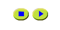
The yellow hover button will show in place of the normal button. If you hover over the right button in your skin, the yellow button labeled "Play" will appear, and if you hover over the left button, the user will see "Close". The two hover images will never both be displayed at the same time, because the mouse cannot hover over both buttons at the same time. You must turn hovering on and have a hover art file that matches the areas of the mapping files to areas of the hover file.
When you save your file, the file name you choose will later be used as the value for the hoverImage attribute of the BUTTONGROUP element in your skin definition file.
Related topics
Feedback
Coming soon: Throughout 2024 we will be phasing out GitHub Issues as the feedback mechanism for content and replacing it with a new feedback system. For more information see: https://aka.ms/ContentUserFeedback.
Submit and view feedback for