Procédure pas à pas : créer un contrôle qui tire parti des fonctionnalités au moment du design
L’expérience au moment du design pour un contrôle personnalisé peut être améliorée en créant un concepteur personnalisé associé.
Attention
Ce contenu a été écrit pour .NET Framework. Si vous utilisez .NET 6 ou une version ultérieure, utilisez ce contenu avec prudence. Le système de concepteur a changé pour Windows Forms et il est important de passer en revue les modifications apportées au Concepteur depuis l’article .NET Framework .
Cet article explique comment créer un concepteur personnalisé pour un contrôle personnalisé. Vous allez implémenter un MarqueeControl type et une classe de concepteur associée appelée MarqueeControlRootDesigner.
Le MarqueeControl type implémente un affichage similaire à un marquet de théâtre avec des lumières animées et du texte clignotant.
Le concepteur de ce contrôle interagit avec l’environnement de conception pour fournir une expérience personnalisée au moment du design. Avec le concepteur personnalisé, vous pouvez assembler une implémentation personnalisée MarqueeControl avec des lumières animées et du texte clignotant dans de nombreuses combinaisons. Vous pouvez utiliser le contrôle assemblé sur un formulaire comme n’importe quel autre contrôle Windows Forms.
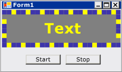
Une fois cette procédure pas à pas terminée, votre contrôle personnalisé ressemble à ce qui suit :
Pour obtenir la liste complète du code, consultez Guide pratique pour créer un contrôle Windows Forms qui tire parti des fonctionnalités au moment du design.
Prérequis
Pour effectuer cette procédure pas à pas, vous aurez besoin de Visual Studio.
Créer le projet
La première étape consiste à créer le projet d’application. Vous utiliserez ce projet pour générer l’application qui héberge le contrôle personnalisé.
Dans Visual Studio, créez un projet d’application Windows Forms et nommez-le MarqueeControlTest.
Créer le projet de bibliothèque de contrôles
Ajoutez un projet de bibliothèque de contrôles Windows Forms à la solution. Nommez le projet MarqueeControlLibrary.
À l’aide de Explorateur de solutions, supprimez le contrôle par défaut du projet en supprimant le fichier source nommé « UserControl1.cs » ou « UserControl1.vb », en fonction de votre langue de choix.
Ajoutez un nouvel UserControl élément au
MarqueeControlLibraryprojet. Donnez au nouveau fichier source un nom de base de MarqueeControl.À l’aide de Explorateur de solutions, créez un dossier dans le
MarqueeControlLibraryprojet.Cliquez avec le bouton droit sur le dossier Création et ajoutez une nouvelle classe. Nommez-le MarqueeControlRootDesigner.
Vous devez utiliser des types à partir de l’assembly System.Design. Ajoutez donc cette référence au
MarqueeControlLibraryprojet.
Référencer le projet de contrôle personnalisé
Vous allez utiliser le MarqueeControlTest projet pour tester le contrôle personnalisé. Le projet de test prend connaissance du contrôle personnalisé lorsque vous ajoutez une référence de projet à l’assembly MarqueeControlLibrary .
Dans le MarqueeControlTest projet, ajoutez une référence de projet à l’assembly MarqueeControlLibrary . Veillez à utiliser l’onglet Projets dans la boîte de dialogue Ajouter une référence au lieu de référencer l’assembly MarqueeControlLibrary directement.
Définir un contrôle personnalisé et son concepteur personnalisé
Votre contrôle personnalisé dérive de la UserControl classe. Cela permet à votre contrôle de contenir d’autres contrôles et donne à votre contrôle une grande quantité de fonctionnalités par défaut.
Votre contrôle personnalisé aura un concepteur personnalisé associé. Cela vous permet de créer une expérience de conception unique adaptée spécifiquement à votre contrôle personnalisé.
Vous associez le contrôle à son concepteur à l’aide de la DesignerAttribute classe. Étant donné que vous développez l’ensemble du comportement au moment de la conception de votre contrôle personnalisé, le concepteur personnalisé implémente l’interface IRootDesigner .
Pour définir un contrôle personnalisé et son concepteur personnalisé
Ouvrez le
MarqueeControlfichier source dans l’éditeur de code. En haut du fichier, importez les espaces de noms suivants :using System; using System.Collections; using System.ComponentModel; using System.ComponentModel.Design; using System.Drawing; using System.Windows.Forms; using System.Windows.Forms.Design;Imports System.Collections Imports System.ComponentModel Imports System.ComponentModel.Design Imports System.Drawing Imports System.Windows.Forms Imports System.Windows.Forms.DesignAjoutez la DesignerAttribute
MarqueeControldéclaration de classe. Cela associe le contrôle personnalisé à son concepteur.[Designer( typeof( MarqueeControlLibrary.Design.MarqueeControlRootDesigner ), typeof( IRootDesigner ) )] public class MarqueeControl : UserControl {<Designer(GetType(MarqueeControlLibrary.Design.MarqueeControlRootDesigner), _ GetType(IRootDesigner))> _ Public Class MarqueeControl Inherits UserControlOuvrez le
MarqueeControlRootDesignerfichier source dans l’éditeur de code. En haut du fichier, importez les espaces de noms suivants :using System; using System.Collections; using System.ComponentModel; using System.ComponentModel.Design; using System.Diagnostics; using System.Drawing.Design; using System.Windows.Forms; using System.Windows.Forms.Design;Imports System.Collections Imports System.ComponentModel Imports System.ComponentModel.Design Imports System.Diagnostics Imports System.Drawing.Design Imports System.Windows.Forms Imports System.Windows.Forms.DesignModifiez la déclaration de l’héritage
MarqueeControlRootDesignerde la DocumentDesigner classe. Appliquez l’option ToolboxItemFilterAttribute pour spécifier l’interaction du concepteur avec la boîte à outils.Remarque
La définition de la
MarqueeControlRootDesignerclasse a été placée entre un espace de noms appelé MarqueeControlLibrary.Design. Cette déclaration place le concepteur dans un espace de noms spécial réservé aux types liés à la conception.namespace MarqueeControlLibrary.Design { [ToolboxItemFilter("MarqueeControlLibrary.MarqueeBorder", ToolboxItemFilterType.Require)] [ToolboxItemFilter("MarqueeControlLibrary.MarqueeText", ToolboxItemFilterType.Require)] public class MarqueeControlRootDesigner : DocumentDesigner {Namespace MarqueeControlLibrary.Design <ToolboxItemFilter("MarqueeControlLibrary.MarqueeBorder", _ ToolboxItemFilterType.Require), _ ToolboxItemFilter("MarqueeControlLibrary.MarqueeText", _ ToolboxItemFilterType.Require)> _ Public Class MarqueeControlRootDesigner Inherits DocumentDesignerDéfinissez le constructeur pour la
MarqueeControlRootDesignerclasse. Insérez une WriteLine instruction dans le corps du constructeur. Cela sera utile pour le débogage.public MarqueeControlRootDesigner() { Trace.WriteLine("MarqueeControlRootDesigner ctor"); }Public Sub New() Trace.WriteLine("MarqueeControlRootDesigner ctor") End Sub
Créer une instance de votre contrôle personnalisé
Ajoutez un nouvel UserControl élément au
MarqueeControlTestprojet. Donnez au nouveau fichier source un nom de base de DemoMarqueeControl.Ouvrez le
DemoMarqueeControlfichier dans l’Éditeur de code. En haut du fichier, importez l’espaceMarqueeControlLibraryde noms :Imports MarqueeControlLibraryusing MarqueeControlLibrary;Modifiez la déclaration de l’héritage
DemoMarqueeControlde laMarqueeControlclasse.Créez le projet.
Ouvrez Form1 dans le Concepteur Windows Forms.
Recherchez l’onglet Composants MarqueeControlTest dans la boîte à outils et ouvrez-le. Faites glisser une
DemoMarqueeControlboîte à outils vers votre formulaire.Créez le projet.
Configurer le projet pour le débogage au moment du design
Lorsque vous développez une expérience de conception personnalisée, il sera nécessaire de déboguer vos contrôles et composants. Il existe un moyen simple de configurer votre projet pour permettre le débogage au moment du design. Pour plus d’informations, consultez Procédure pas à pas : débogage de contrôles Windows Forms personnalisés au moment du design.
Cliquez avec le bouton droit sur le
MarqueeControlLibraryprojet et sélectionnez Propriétés.Dans la boîte de dialogue Pages de propriétés MarqueeControlLibrary, sélectionnez la page Débogage .
Dans la section Démarrer l’action, sélectionnez Démarrer le programme externe. Vous allez déboguer une instance distincte de Visual Studio. Cliquez donc sur le bouton de sélection (
 ) pour rechercher l’IDE Visual Studio. Le nom du fichier exécutable est devenv.exe et, si vous avez installé à l’emplacement par défaut, son chemin est %ProgramFiles(x86)%\Microsoft Visual Studio\2019\<edition>\Common7\IDE\devenv.exe.
puis cliquez sur OK pour fermer la boîte de dialogue.
Cliquez avec le bouton droit sur le projet MarqueeControlLibrary et sélectionnez Définir comme projet de démarrage pour activer cette configuration de débogage.
Point de contrôle
Vous êtes maintenant prêt à déboguer le comportement au moment du design de votre contrôle personnalisé. Une fois que vous avez déterminé que l’environnement de débogage est configuré correctement, vous allez tester l’association entre le contrôle personnalisé et le concepteur personnalisé.
Pour tester l’environnement de débogage et l’association du concepteur
Ouvrez le fichier source MarqueeControlRootDesigner dans l’Éditeur de code et placez un point d’arrêt sur l’instructionWriteLine.
Appuyez sur F5 pour démarrer la session de débogage.
Une nouvelle instance de Visual Studio est créée.
Dans la nouvelle instance de Visual Studio, ouvrez la solution MarqueeControlTest. Vous pouvez facilement trouver la solution en sélectionnant Projets récents dans le menu Fichier . Le fichier de solution MarqueeControlTest.sln est répertorié comme le fichier le plus récemment utilisé.
Ouvrez le
DemoMarqueeControlconcepteur.L’instance de débogage de Visual Studio obtient le focus et l’exécution s’arrête à votre point d’arrêt. Appuyez sur F5 pour continuer la session de débogage.
À ce stade, tout est en place pour vous permettre de développer et de déboguer votre contrôle personnalisé et son concepteur personnalisé associé. Le reste de cet article se concentre sur les détails de l’implémentation des fonctionnalités du contrôle et du concepteur.
Implémenter le contrôle personnalisé
Il MarqueeControl s’agit d’un UserControl peu de personnalisation. Il expose deux méthodes : Start, qui démarre l’animation de marque et Stop, qui arrête l’animation. Étant donné que les MarqueeControl contrôles enfants qui implémentent l’interface IMarqueeWidget et StartStop énumèrent chaque contrôle enfant et appellent respectivement les StartMarquee contrôles et StopMarquee méthodes, sur chaque contrôle enfant qui implémente IMarqueeWidget.
L’apparence des contrôles et MarqueeText des MarqueeBorder contrôles dépend de la disposition, donc MarqueeControl remplace la OnLayout méthode et les appels PerformLayout sur les contrôles enfants de ce type.
Il s’agit de l’étendue MarqueeControl des personnalisations. Les fonctionnalités au moment de l’exécution sont implémentées par les MarqueeBorder contrôles et MarqueeText les fonctionnalités au moment du design sont implémentées par les classes et MarqueeControlRootDesigner les MarqueeBorderDesigner classes.
Pour implémenter votre contrôle personnalisé
Ouvrez le
MarqueeControlfichier source dans l’éditeur de code. Implémentez les méthodesStartetStop.public void Start() { // The MarqueeControl may contain any number of // controls that implement IMarqueeWidget, so // find each IMarqueeWidget child and call its // StartMarquee method. foreach( Control cntrl in this.Controls ) { if( cntrl is IMarqueeWidget ) { IMarqueeWidget widget = cntrl as IMarqueeWidget; widget.StartMarquee(); } } } public void Stop() { // The MarqueeControl may contain any number of // controls that implement IMarqueeWidget, so find // each IMarqueeWidget child and call its StopMarquee // method. foreach( Control cntrl in this.Controls ) { if( cntrl is IMarqueeWidget ) { IMarqueeWidget widget = cntrl as IMarqueeWidget; widget.StopMarquee(); } } }Public Sub Start() ' The MarqueeControl may contain any number of ' controls that implement IMarqueeWidget, so ' find each IMarqueeWidget child and call its ' StartMarquee method. Dim cntrl As Control For Each cntrl In Me.Controls If TypeOf cntrl Is IMarqueeWidget Then Dim widget As IMarqueeWidget = CType(cntrl, IMarqueeWidget) widget.StartMarquee() End If Next cntrl End Sub Public Sub [Stop]() ' The MarqueeControl may contain any number of ' controls that implement IMarqueeWidget, so find ' each IMarqueeWidget child and call its StopMarquee ' method. Dim cntrl As Control For Each cntrl In Me.Controls If TypeOf cntrl Is IMarqueeWidget Then Dim widget As IMarqueeWidget = CType(cntrl, IMarqueeWidget) widget.StopMarquee() End If Next cntrl End SubRemplacez la méthode OnLayout .
protected override void OnLayout(LayoutEventArgs levent)
{
    base.OnLayout (levent);

    // Repaint all IMarqueeWidget children if the layout
    // has changed.
    foreach( Control cntrl in this.Controls )
    {
        if( cntrl is IMarqueeWidget )
        {
            Control control = cntrl as Control;

            control.PerformLayout();
        }
    }
}
Protected Overrides Sub OnLayout(ByVal levent As LayoutEventArgs) MyBase.OnLayout(levent) ' Repaint all IMarqueeWidget children if the layout ' has changed. Dim cntrl As Control For Each cntrl In Me.Controls If TypeOf cntrl Is IMarqueeWidget Then Dim widget As IMarqueeWidget = CType(cntrl, IMarqueeWidget) cntrl.PerformLayout() End If Next cntrl End Sub
Créer un contrôle enfant pour votre contrôle personnalisé
Il MarqueeControl hébergera deux types de contrôle enfant : le MarqueeBorder contrôle et le MarqueeText contrôle.
MarqueeBorder: ce contrôle peint une bordure de « lumières » autour de ses bords. Les lumières clignotent en séquence, de sorte qu’elles semblent se déplacer autour de la bordure. Vitesse à laquelle les lumières clignotent est contrôlée par une propriété appeléeUpdatePeriod. Plusieurs autres propriétés personnalisées déterminent d’autres aspects de l’apparence du contrôle. Deux méthodes, appeléesStartMarqueeetStopMarquee, contrôlent quand l’animation démarre et s’arrête.MarqueeText: ce contrôle peint une chaîne flashing. Comme leMarqueeBordercontrôle, la vitesse à laquelle le texte clignote est contrôlée par laUpdatePeriodpropriété. LeMarqueeTextcontrôle a également les méthodes etStopMarqueelesStartMarqueeméthodes en commun avec leMarqueeBordercontrôle.
Au moment du design, ces MarqueeControlRootDesigner deux types de contrôle peuvent être ajoutés à une MarqueeControl combinaison quelconque.
Les fonctionnalités courantes des deux contrôles sont prises en compte dans une interface appelée IMarqueeWidget. Cela permet de MarqueeControl découvrir tous les contrôles enfants de Marquee et de leur donner un traitement spécial.
Pour implémenter la fonctionnalité d’animation périodique, vous allez utiliser des BackgroundWorker objets de l’espace System.ComponentModel de noms. Vous pouvez utiliser des Timer objets, mais lorsque de nombreux IMarqueeWidget objets sont présents, le thread d’interface utilisateur unique peut ne pas être en mesure de suivre l’animation.
Pour créer un contrôle enfant pour votre contrôle personnalisé
Ajoutez un nouvel élément de classe au
MarqueeControlLibraryprojet. Donnez au nouveau fichier source le nom de base « IMarqueeWidget ».Ouvrez le
IMarqueeWidgetfichier source dans l’Éditeurde code et remplacez la déclaration parclassinterface:// This interface defines the contract for any class that is to // be used in constructing a MarqueeControl. public interface IMarqueeWidget {' This interface defines the contract for any class that is to ' be used in constructing a MarqueeControl. Public Interface IMarqueeWidgetAjoutez le code suivant à l’interface
IMarqueeWidgetpour exposer deux méthodes et une propriété qui manipulent l’animation de marque :// This interface defines the contract for any class that is to // be used in constructing a MarqueeControl. public interface IMarqueeWidget { // This method starts the animation. If the control can // contain other classes that implement IMarqueeWidget as // children, the control should call StartMarquee on all // its IMarqueeWidget child controls. void StartMarquee(); // This method stops the animation. If the control can // contain other classes that implement IMarqueeWidget as // children, the control should call StopMarquee on all // its IMarqueeWidget child controls. void StopMarquee(); // This method specifies the refresh rate for the animation, // in milliseconds. int UpdatePeriod { get; set; } }' This interface defines the contract for any class that is to ' be used in constructing a MarqueeControl. Public Interface IMarqueeWidget ' This method starts the animation. If the control can ' contain other classes that implement IMarqueeWidget as ' children, the control should call StartMarquee on all ' its IMarqueeWidget child controls. Sub StartMarquee() ' This method stops the animation. If the control can ' contain other classes that implement IMarqueeWidget as ' children, the control should call StopMarquee on all ' its IMarqueeWidget child controls. Sub StopMarquee() ' This method specifies the refresh rate for the animation, ' in milliseconds. Property UpdatePeriod() As Integer End InterfaceAjoutez un nouvel élément de contrôle personnalisé au
MarqueeControlLibraryprojet. Donnez au nouveau fichier source un nom de base de « MarqueeText ».Faites glisser un BackgroundWorker composant de la boîte à outils vers votre
MarqueeTextcontrôle. Ce composant permet auMarqueeTextcontrôle de se mettre à jour de façon asynchrone.Dans la fenêtre Propriétés, définissez les propriétés et WorkerSupportsCancellation les propriétés du BackgroundWorker
WorkerReportsProgresscomposant sur true. Ces paramètres permettent au BackgroundWorker composant de déclencher régulièrement l’événement ProgressChanged et d’annuler les mises à jour asynchrones.Pour plus d’informations, consultez Le composant BackgroundWorker.
Ouvrez le
MarqueeTextfichier source dans l’éditeur de code. En haut du fichier, importez les espaces de noms suivants :using System; using System.ComponentModel; using System.ComponentModel.Design; using System.Diagnostics; using System.Drawing; using System.Threading; using System.Windows.Forms; using System.Windows.Forms.Design;Imports System.ComponentModel Imports System.ComponentModel.Design Imports System.Diagnostics Imports System.Drawing Imports System.Threading Imports System.Windows.Forms Imports System.Windows.Forms.DesignModifiez la déclaration de
MarqueeTextl’héritage Label et implémentez l’interfaceIMarqueeWidget:[ToolboxItemFilter("MarqueeControlLibrary.MarqueeText", ToolboxItemFilterType.Require)] public partial class MarqueeText : Label, IMarqueeWidget {<ToolboxItemFilter("MarqueeControlLibrary.MarqueeText", _ ToolboxItemFilterType.Require)> _ Partial Public Class MarqueeText Inherits Label Implements IMarqueeWidgetDéclarez les variables d’instance qui correspondent aux propriétés exposées et initialisez-les dans le constructeur. Le
isLitchamp détermine si le texte doit être peint dans la couleur donnée par laLightColorpropriété.// When isLit is true, the text is painted in the light color; // When isLit is false, the text is painted in the dark color. // This value changes whenever the BackgroundWorker component // raises the ProgressChanged event. private bool isLit = true; // These fields back the public properties. private int updatePeriodValue = 50; private Color lightColorValue; private Color darkColorValue; // These brushes are used to paint the light and dark // colors of the text. private Brush lightBrush; private Brush darkBrush; // This component updates the control asynchronously. private BackgroundWorker backgroundWorker1; public MarqueeText() { // This call is required by the Windows.Forms Form Designer. InitializeComponent(); // Initialize light and dark colors // to the control's default values. this.lightColorValue = this.ForeColor; this.darkColorValue = this.BackColor; this.lightBrush = new SolidBrush(this.lightColorValue); this.darkBrush = new SolidBrush(this.darkColorValue); }' When isLit is true, the text is painted in the light color; ' When isLit is false, the text is painted in the dark color. ' This value changes whenever the BackgroundWorker component ' raises the ProgressChanged event. Private isLit As Boolean = True ' These fields back the public properties. Private updatePeriodValue As Integer = 50 Private lightColorValue As Color Private darkColorValue As Color ' These brushes are used to paint the light and dark ' colors of the text. Private lightBrush As Brush Private darkBrush As Brush ' This component updates the control asynchronously. Private WithEvents backgroundWorker1 As BackgroundWorker Public Sub New() ' This call is required by the Windows.Forms Form Designer. InitializeComponent() ' Initialize light and dark colors ' to the control's default values. Me.lightColorValue = Me.ForeColor Me.darkColorValue = Me.BackColor Me.lightBrush = New SolidBrush(Me.lightColorValue) Me.darkBrush = New SolidBrush(Me.darkColorValue) End SubImplémentez l'interface
IMarqueeWidget.Les
StartMarqueeméthodes etStopMarqueeles méthodes appellent les BackgroundWorker méthodes et CancelAsync les composants pour démarrer et arrêter l’animationRunWorkerAsync.Les Category attributs et Browsable les attributs sont appliqués à la
UpdatePeriodpropriété pour qu’elle apparaisse dans une section personnalisée de l’Fenêtre Propriétés appelée « Marquee ».public virtual void StartMarquee() { // Start the updating thread and pass it the UpdatePeriod. this.backgroundWorker1.RunWorkerAsync(this.UpdatePeriod); } public virtual void StopMarquee() { // Stop the updating thread. this.backgroundWorker1.CancelAsync(); } [Category("Marquee")] [Browsable(true)] public int UpdatePeriod { get { return this.updatePeriodValue; } set { if (value > 0) { this.updatePeriodValue = value; } else { throw new ArgumentOutOfRangeException("UpdatePeriod", "must be > 0"); } } }Public Overridable Sub StartMarquee() _ Implements IMarqueeWidget.StartMarquee ' Start the updating thread and pass it the UpdatePeriod. Me.backgroundWorker1.RunWorkerAsync(Me.UpdatePeriod) End Sub Public Overridable Sub StopMarquee() _ Implements IMarqueeWidget.StopMarquee ' Stop the updating thread. Me.backgroundWorker1.CancelAsync() End Sub <Category("Marquee"), Browsable(True)> _ Public Property UpdatePeriod() As Integer _ Implements IMarqueeWidget.UpdatePeriod Get Return Me.updatePeriodValue End Get Set(ByVal Value As Integer) If Value > 0 Then Me.updatePeriodValue = Value Else Throw New ArgumentOutOfRangeException("UpdatePeriod", "must be > 0") End If End Set End PropertyImplémentez les accesseurs de propriété. Vous allez exposer deux propriétés aux clients :
LightColoretDarkColor. Les Category attributs et Browsable les attributs sont appliqués à ces propriétés, de sorte que les propriétés apparaissent dans une section personnalisée de l’Fenêtre Propriétés appelée « Marquee ».[Category("Marquee")] [Browsable(true)] public Color LightColor { get { return this.lightColorValue; } set { // The LightColor property is only changed if the // client provides a different value. Comparing values // from the ToArgb method is the recommended test for // equality between Color structs. if (this.lightColorValue.ToArgb() != value.ToArgb()) { this.lightColorValue = value; this.lightBrush = new SolidBrush(value); } } } [Category("Marquee")] [Browsable(true)] public Color DarkColor { get { return this.darkColorValue; } set { // The DarkColor property is only changed if the // client provides a different value. Comparing values // from the ToArgb method is the recommended test for // equality between Color structs. if (this.darkColorValue.ToArgb() != value.ToArgb()) { this.darkColorValue = value; this.darkBrush = new SolidBrush(value); } } }<Category("Marquee"), Browsable(True)> _ Public Property LightColor() As Color Get Return Me.lightColorValue End Get Set(ByVal Value As Color) ' The LightColor property is only changed if the ' client provides a different value. Comparing values ' from the ToArgb method is the recommended test for ' equality between Color structs. If Me.lightColorValue.ToArgb() <> Value.ToArgb() Then Me.lightColorValue = Value Me.lightBrush = New SolidBrush(Value) End If End Set End Property <Category("Marquee"), Browsable(True)> _ Public Property DarkColor() As Color Get Return Me.darkColorValue End Get Set(ByVal Value As Color) ' The DarkColor property is only changed if the ' client provides a different value. Comparing values ' from the ToArgb method is the recommended test for ' equality between Color structs. If Me.darkColorValue.ToArgb() <> Value.ToArgb() Then Me.darkColorValue = Value Me.darkBrush = New SolidBrush(Value) End If End Set End PropertyImplémentez les gestionnaires pour les BackgroundWorker événements et ProgressChanged les événements du DoWork composant.
Le DoWork gestionnaire d’événements veille pour le nombre de millisecondes spécifiées par
UpdatePeriodla suite déclenche l’événement ProgressChanged , jusqu’à ce que votre code arrête l’animation en appelant CancelAsync.Le ProgressChanged gestionnaire d’événements bascule le texte entre son état clair et sombre pour donner l’apparence du flashing.
// This method is called in the worker thread's context,
// so it must not make any calls into the MarqueeText control.
// Instead, it communicates to the control using the
// ProgressChanged event.
//
// The only work done in this event handler is
// to sleep for the number of milliseconds specified
// by UpdatePeriod, then raise the ProgressChanged event.
private void backgroundWorker1_DoWork(
    object sender,
    System.ComponentModel.DoWorkEventArgs e)
{
    BackgroundWorker worker = sender as BackgroundWorker;

    // This event handler will run until the client cancels
    // the background task by calling CancelAsync.
    while (!worker.CancellationPending)
    {
        // The Argument property of the DoWorkEventArgs
        // object holds the value of UpdatePeriod, which
        // was passed as the argument to the RunWorkerAsync
        // method.
        Thread.Sleep((int)e.Argument);

        // The DoWork eventhandler does not actually report
        // progress; the ReportProgress event is used to
        // periodically alert the control to update its state.
        worker.ReportProgress(0);
    }
}

// The ProgressChanged event is raised by the DoWork method.
// This event handler does work that is internal to the
// control. In this case, the text is toggled between its
// light and dark state, and the control is told to
// repaint itself.
private void backgroundWorker1_ProgressChanged(object sender, System.ComponentModel.ProgressChangedEventArgs e)
{
    this.isLit = !this.isLit;
    this.Refresh();
}
' This method is called in the worker thread's context, ' so it must not make any calls into the MarqueeText control. ' Instead, it communicates to the control using the ' ProgressChanged event. ' ' The only work done in this event handler is ' to sleep for the number of milliseconds specified ' by UpdatePeriod, then raise the ProgressChanged event. Private Sub backgroundWorker1_DoWork( _ ByVal sender As Object, _ ByVal e As System.ComponentModel.DoWorkEventArgs) _ Handles backgroundWorker1.DoWork Dim worker As BackgroundWorker = CType(sender, BackgroundWorker) ' This event handler will run until the client cancels ' the background task by calling CancelAsync. While Not worker.CancellationPending ' The Argument property of the DoWorkEventArgs ' object holds the value of UpdatePeriod, which ' was passed as the argument to the RunWorkerAsync ' method. Thread.Sleep(Fix(e.Argument)) ' The DoWork eventhandler does not actually report ' progress; the ReportProgress event is used to ' periodically alert the control to update its state. worker.ReportProgress(0) End While End Sub ' The ProgressChanged event is raised by the DoWork method. ' This event handler does work that is internal to the ' control. In this case, the text is toggled between its ' light and dark state, and the control is told to ' repaint itself. Private Sub backgroundWorker1_ProgressChanged( _ ByVal sender As Object, _ ByVal e As System.ComponentModel.ProgressChangedEventArgs) _ Handles backgroundWorker1.ProgressChanged Me.isLit = Not Me.isLit Me.Refresh() End SubRemplacez la OnPaint méthode pour activer l’animation.
protected override void OnPaint(PaintEventArgs e)
{
    // The text is painted in the light or dark color,
    // depending on the current value of isLit.
    this.ForeColor =
        this.isLit ? this.lightColorValue : this.darkColorValue;

    base.OnPaint(e);
}
Protected Overrides Sub OnPaint(ByVal e As PaintEventArgs) ' The text is painted in the light or dark color, ' depending on the current value of isLit. Me.ForeColor = IIf(Me.isLit, Me.lightColorValue, Me.darkColorValue) MyBase.OnPaint(e) End SubAppuyez sur F6 pour générer la solution.
Créer le contrôle enfant MarqueeBorder
Le MarqueeBorder contrôle est légèrement plus sophistiqué que le MarqueeText contrôle. Il a plus de propriétés et l’animation dans la OnPaint méthode est plus impliquée. En principe, il est tout à fait similaire au MarqueeText contrôle.
Étant donné que le MarqueeBorder contrôle peut avoir des contrôles enfants, il doit être conscient des Layout événements.
Pour créer le contrôle MarqueeBorder
Ajoutez un nouvel élément de contrôle personnalisé au
MarqueeControlLibraryprojet. Donnez au nouveau fichier source un nom de base de « MarqueeBorder ».Faites glisser un BackgroundWorker composant de la boîte à outils vers votre
MarqueeBordercontrôle. Ce composant permet auMarqueeBordercontrôle de se mettre à jour de façon asynchrone.Dans la fenêtre Propriétés, définissez les propriétés et WorkerSupportsCancellation les propriétés du BackgroundWorker
WorkerReportsProgresscomposant sur true. Ces paramètres permettent au BackgroundWorker composant de déclencher régulièrement l’événement ProgressChanged et d’annuler les mises à jour asynchrones. Pour plus d’informations, consultez Le composant BackgroundWorker.Dans la fenêtre Propriétés , sélectionnez le bouton Événements . Attachez des gestionnaires pour les événements et ProgressChanged les DoWork événements.
Ouvrez le
MarqueeBorderfichier source dans l’éditeur de code. En haut du fichier, importez les espaces de noms suivants :using System; using System.ComponentModel; using System.ComponentModel.Design; using System.Diagnostics; using System.Drawing; using System.Drawing.Design; using System.Threading; using System.Windows.Forms; using System.Windows.Forms.Design;Imports System.ComponentModel Imports System.ComponentModel.Design Imports System.Diagnostics Imports System.Drawing Imports System.Drawing.Design Imports System.Threading Imports System.Windows.Forms Imports System.Windows.Forms.DesignModifiez la déclaration de l’héritage
MarqueeBorderPanel et implémentez l’interfaceIMarqueeWidget.[Designer(typeof(MarqueeControlLibrary.Design.MarqueeBorderDesigner ))] [ToolboxItemFilter("MarqueeControlLibrary.MarqueeBorder", ToolboxItemFilterType.Require)] public partial class MarqueeBorder : Panel, IMarqueeWidget {<Designer(GetType(MarqueeControlLibrary.Design.MarqueeBorderDesigner)), _ ToolboxItemFilter("MarqueeControlLibrary.MarqueeBorder", _ ToolboxItemFilterType.Require)> _ Partial Public Class MarqueeBorder Inherits Panel Implements IMarqueeWidgetDéclarez deux énumérations pour gérer l’état
MarqueeBorderdu contrôle :MarqueeSpinDirection, qui détermine la direction dans laquelle les lumières « tournent » autour de la bordure etMarqueeLightShape, qui détermine la forme des lumières (carré ou circulaire). Placez ces déclarations avant la déclaration deMarqueeBorderclasse.// This defines the possible values for the MarqueeBorder // control's SpinDirection property. public enum MarqueeSpinDirection { CW, CCW } // This defines the possible values for the MarqueeBorder // control's LightShape property. public enum MarqueeLightShape { Square, Circle }' This defines the possible values for the MarqueeBorder ' control's SpinDirection property. Public Enum MarqueeSpinDirection CW CCW End Enum ' This defines the possible values for the MarqueeBorder ' control's LightShape property. Public Enum MarqueeLightShape Square Circle End EnumDéclarez les variables d’instance qui correspondent aux propriétés exposées et initialisez-les dans le constructeur.
public static int MaxLightSize = 10;

// These fields back the public properties.
private int updatePeriodValue = 50;
private int lightSizeValue = 5;
private int lightPeriodValue = 3;
private int lightSpacingValue = 1;
private Color lightColorValue;
private Color darkColorValue;
private MarqueeSpinDirection spinDirectionValue = MarqueeSpinDirection.CW;
private MarqueeLightShape lightShapeValue = MarqueeLightShape.Square;

// These brushes are used to paint the light and dark
// colors of the marquee lights.
private Brush lightBrush;
private Brush darkBrush;

// This field tracks the progress of the "first" light as it
// "travels" around the marquee border.
private int currentOffset = 0;

// This component updates the control asynchronously.
private System.ComponentModel.BackgroundWorker backgroundWorker1;

public MarqueeBorder()
{
    // This call is required by the Windows.Forms Form Designer.
    InitializeComponent();

    // Initialize light and dark colors
    // to the control's default values.
    this.lightColorValue = this.ForeColor;
    this.darkColorValue = this.BackColor;
    this.lightBrush = new SolidBrush(this.lightColorValue);
    this.darkBrush = new SolidBrush(this.darkColorValue);

    // The MarqueeBorder control manages its own padding,
    // because it requires that any contained controls do
    // not overlap any of the marquee lights.
    int pad = 2 * (this.lightSizeValue + this.lightSpacingValue);
    this.Padding = new Padding(pad, pad, pad, pad);

    SetStyle(ControlStyles.OptimizedDoubleBuffer, true);
}
Public Shared MaxLightSize As Integer = 10 ' These fields back the public properties. Private updatePeriodValue As Integer = 50 Private lightSizeValue As Integer = 5 Private lightPeriodValue As Integer = 3 Private lightSpacingValue As Integer = 1 Private lightColorValue As Color Private darkColorValue As Color Private spinDirectionValue As MarqueeSpinDirection = MarqueeSpinDirection.CW Private lightShapeValue As MarqueeLightShape = MarqueeLightShape.Square ' These brushes are used to paint the light and dark ' colors of the marquee lights. Private lightBrush As Brush Private darkBrush As Brush ' This field tracks the progress of the "first" light as it ' "travels" around the marquee border. Private currentOffset As Integer = 0 ' This component updates the control asynchronously. Private WithEvents backgroundWorker1 As System.ComponentModel.BackgroundWorker Public Sub New() ' This call is required by the Windows.Forms Form Designer. InitializeComponent() ' Initialize light and dark colors ' to the control's default values. Me.lightColorValue = Me.ForeColor Me.darkColorValue = Me.BackColor Me.lightBrush = New SolidBrush(Me.lightColorValue) Me.darkBrush = New SolidBrush(Me.darkColorValue) ' The MarqueeBorder control manages its own padding, ' because it requires that any contained controls do ' not overlap any of the marquee lights. Dim pad As Integer = 2 * (Me.lightSizeValue + Me.lightSpacingValue) Me.Padding = New Padding(pad, pad, pad, pad) SetStyle(ControlStyles.OptimizedDoubleBuffer, True) End SubImplémentez l'interface
IMarqueeWidget.Les
StartMarqueeméthodes etStopMarqueeles méthodes appellent les BackgroundWorker méthodes et CancelAsync les composants pour démarrer et arrêter l’animationRunWorkerAsync.Étant donné que le
MarqueeBordercontrôle peut contenir des contrôles enfants, laStartMarqueeméthode énumère tous les contrôles enfants et les appelsStartMarqueesur ceux qui implémententIMarqueeWidget. LaStopMarqueeméthode a une implémentation similaire.public virtual void StartMarquee() { // The MarqueeBorder control may contain any number of // controls that implement IMarqueeWidget, so find // each IMarqueeWidget child and call its StartMarquee // method. foreach (Control cntrl in this.Controls) { if (cntrl is IMarqueeWidget) { IMarqueeWidget widget = cntrl as IMarqueeWidget; widget.StartMarquee(); } } // Start the updating thread and pass it the UpdatePeriod. this.backgroundWorker1.RunWorkerAsync(this.UpdatePeriod); } public virtual void StopMarquee() { // The MarqueeBorder control may contain any number of // controls that implement IMarqueeWidget, so find // each IMarqueeWidget child and call its StopMarquee // method. foreach (Control cntrl in this.Controls) { if (cntrl is IMarqueeWidget) { IMarqueeWidget widget = cntrl as IMarqueeWidget; widget.StopMarquee(); } } // Stop the updating thread. this.backgroundWorker1.CancelAsync(); } [Category("Marquee")] [Browsable(true)] public virtual int UpdatePeriod { get { return this.updatePeriodValue; } set { if (value > 0) { this.updatePeriodValue = value; } else { throw new ArgumentOutOfRangeException("UpdatePeriod", "must be > 0"); } } }Public Overridable Sub StartMarquee() _ Implements IMarqueeWidget.StartMarquee ' The MarqueeBorder control may contain any number of ' controls that implement IMarqueeWidget, so find ' each IMarqueeWidget child and call its StartMarquee ' method. Dim cntrl As Control For Each cntrl In Me.Controls If TypeOf cntrl Is IMarqueeWidget Then Dim widget As IMarqueeWidget = CType(cntrl, IMarqueeWidget) widget.StartMarquee() End If Next cntrl ' Start the updating thread and pass it the UpdatePeriod. Me.backgroundWorker1.RunWorkerAsync(Me.UpdatePeriod) End Sub Public Overridable Sub StopMarquee() _ Implements IMarqueeWidget.StopMarquee ' The MarqueeBorder control may contain any number of ' controls that implement IMarqueeWidget, so find ' each IMarqueeWidget child and call its StopMarquee ' method. Dim cntrl As Control For Each cntrl In Me.Controls If TypeOf cntrl Is IMarqueeWidget Then Dim widget As IMarqueeWidget = CType(cntrl, IMarqueeWidget) widget.StopMarquee() End If Next cntrl ' Stop the updating thread. Me.backgroundWorker1.CancelAsync() End Sub <Category("Marquee"), Browsable(True)> _ Public Overridable Property UpdatePeriod() As Integer _ Implements IMarqueeWidget.UpdatePeriod Get Return Me.updatePeriodValue End Get Set(ByVal Value As Integer) If Value > 0 Then Me.updatePeriodValue = Value Else Throw New ArgumentOutOfRangeException("UpdatePeriod", _ "must be > 0") End If End Set End PropertyImplémentez les accesseurs de propriété. Le
MarqueeBordercontrôle a plusieurs propriétés pour contrôler son apparence.[Category("Marquee")] [Browsable(true)] public int LightSize { get { return this.lightSizeValue; } set { if (value > 0 && value <= MaxLightSize) { this.lightSizeValue = value; this.DockPadding.All = 2 * value; } else { throw new ArgumentOutOfRangeException("LightSize", "must be > 0 and < MaxLightSize"); } } } [Category("Marquee")] [Browsable(true)] public int LightPeriod { get { return this.lightPeriodValue; } set { if (value > 0) { this.lightPeriodValue = value; } else { throw new ArgumentOutOfRangeException("LightPeriod", "must be > 0 "); } } } [Category("Marquee")] [Browsable(true)] public Color LightColor { get { return this.lightColorValue; } set { // The LightColor property is only changed if the // client provides a different value. Comparing values // from the ToArgb method is the recommended test for // equality between Color structs. if (this.lightColorValue.ToArgb() != value.ToArgb()) { this.lightColorValue = value; this.lightBrush = new SolidBrush(value); } } } [Category("Marquee")] [Browsable(true)] public Color DarkColor { get { return this.darkColorValue; } set { // The DarkColor property is only changed if the // client provides a different value. Comparing values // from the ToArgb method is the recommended test for // equality between Color structs. if (this.darkColorValue.ToArgb() != value.ToArgb()) { this.darkColorValue = value; this.darkBrush = new SolidBrush(value); } } } [Category("Marquee")] [Browsable(true)] public int LightSpacing { get { return this.lightSpacingValue; } set { if (value >= 0) { this.lightSpacingValue = value; } else { throw new ArgumentOutOfRangeException("LightSpacing", "must be >= 0"); } } } [Category("Marquee")] [Browsable(true)] [EditorAttribute(typeof(LightShapeEditor), typeof(System.Drawing.Design.UITypeEditor))] public MarqueeLightShape LightShape { get { return this.lightShapeValue; } set { this.lightShapeValue = value; } } [Category("Marquee")] [Browsable(true)] public MarqueeSpinDirection SpinDirection { get { return this.spinDirectionValue; } set { this.spinDirectionValue = value; } }<Category("Marquee"), Browsable(True)> _ Public Property LightSize() As Integer Get Return Me.lightSizeValue End Get Set(ByVal Value As Integer) If Value > 0 AndAlso Value <= MaxLightSize Then Me.lightSizeValue = Value Me.DockPadding.All = 2 * Value Else Throw New ArgumentOutOfRangeException("LightSize", _ "must be > 0 and < MaxLightSize") End If End Set End Property <Category("Marquee"), Browsable(True)> _ Public Property LightPeriod() As Integer Get Return Me.lightPeriodValue End Get Set(ByVal Value As Integer) If Value > 0 Then Me.lightPeriodValue = Value Else Throw New ArgumentOutOfRangeException("LightPeriod", _ "must be > 0 ") End If End Set End Property <Category("Marquee"), Browsable(True)> _ Public Property LightColor() As Color Get Return Me.lightColorValue End Get Set(ByVal Value As Color) ' The LightColor property is only changed if the ' client provides a different value. Comparing values ' from the ToArgb method is the recommended test for ' equality between Color structs. If Me.lightColorValue.ToArgb() <> Value.ToArgb() Then Me.lightColorValue = Value Me.lightBrush = New SolidBrush(Value) End If End Set End Property <Category("Marquee"), Browsable(True)> _ Public Property DarkColor() As Color Get Return Me.darkColorValue End Get Set(ByVal Value As Color) ' The DarkColor property is only changed if the ' client provides a different value. Comparing values ' from the ToArgb method is the recommended test for ' equality between Color structs. If Me.darkColorValue.ToArgb() <> Value.ToArgb() Then Me.darkColorValue = Value Me.darkBrush = New SolidBrush(Value) End If End Set End Property <Category("Marquee"), Browsable(True)> _ Public Property LightSpacing() As Integer Get Return Me.lightSpacingValue End Get Set(ByVal Value As Integer) If Value >= 0 Then Me.lightSpacingValue = Value Else Throw New ArgumentOutOfRangeException("LightSpacing", _ "must be >= 0") End If End Set End Property <Category("Marquee"), Browsable(True), _ EditorAttribute(GetType(LightShapeEditor), _ GetType(System.Drawing.Design.UITypeEditor))> _ Public Property LightShape() As MarqueeLightShape Get Return Me.lightShapeValue End Get Set(ByVal Value As MarqueeLightShape) Me.lightShapeValue = Value End Set End Property <Category("Marquee"), Browsable(True)> _ Public Property SpinDirection() As MarqueeSpinDirection Get Return Me.spinDirectionValue End Get Set(ByVal Value As MarqueeSpinDirection) Me.spinDirectionValue = Value End Set End PropertyImplémentez les gestionnaires pour les BackgroundWorker événements et ProgressChanged les événements du DoWork composant.
Le DoWork gestionnaire d’événements veille pour le nombre de millisecondes spécifiées par
UpdatePeriodla suite déclenche l’événement ProgressChanged , jusqu’à ce que votre code arrête l’animation en appelant CancelAsync.Le ProgressChanged gestionnaire d’événements incrémente la position de la lumière « base », à partir de laquelle l’état clair/sombre des autres lumières est déterminé et appelle la méthode pour que le Refresh contrôle se repeint lui-même.
// This method is called in the worker thread's context,
// so it must not make any calls into the MarqueeBorder
// control. Instead, it communicates to the control using
// the ProgressChanged event.
//
// The only work done in this event handler is
// to sleep for the number of milliseconds specified
// by UpdatePeriod, then raise the ProgressChanged event.
private void backgroundWorker1_DoWork(object sender, System.ComponentModel.DoWorkEventArgs e)
{
    BackgroundWorker worker = sender as BackgroundWorker;

    // This event handler will run until the client cancels
    // the background task by calling CancelAsync.
    while (!worker.CancellationPending)
    {
        // The Argument property of the DoWorkEventArgs
        // object holds the value of UpdatePeriod, which
        // was passed as the argument to the RunWorkerAsync
        // method.
        Thread.Sleep((int)e.Argument);

        // The DoWork eventhandler does not actually report
        // progress; the ReportProgress event is used to
        // periodically alert the control to update its state.
        worker.ReportProgress(0);
    }
}

// The ProgressChanged event is raised by the DoWork method.
// This event handler does work that is internal to the
// control. In this case, the currentOffset is incremented,
// and the control is told to repaint itself.
private void backgroundWorker1_ProgressChanged(
    object sender,
    System.ComponentModel.ProgressChangedEventArgs e)
{
    this.currentOffset++;
    this.Refresh();
}
' This method is called in the worker thread's context, ' so it must not make any calls into the MarqueeBorder ' control. Instead, it communicates to the control using ' the ProgressChanged event. ' ' The only work done in this event handler is ' to sleep for the number of milliseconds specified ' by UpdatePeriod, then raise the ProgressChanged event. Private Sub backgroundWorker1_DoWork( _ ByVal sender As Object, _ ByVal e As System.ComponentModel.DoWorkEventArgs) _ Handles backgroundWorker1.DoWork Dim worker As BackgroundWorker = CType(sender, BackgroundWorker) ' This event handler will run until the client cancels ' the background task by calling CancelAsync. While Not worker.CancellationPending ' The Argument property of the DoWorkEventArgs ' object holds the value of UpdatePeriod, which ' was passed as the argument to the RunWorkerAsync ' method. Thread.Sleep(Fix(e.Argument)) ' The DoWork eventhandler does not actually report ' progress; the ReportProgress event is used to ' periodically alert the control to update its state. worker.ReportProgress(0) End While End Sub ' The ProgressChanged event is raised by the DoWork method. ' This event handler does work that is internal to the ' control. In this case, the currentOffset is incremented, ' and the control is told to repaint itself. Private Sub backgroundWorker1_ProgressChanged( _ ByVal sender As Object, _ ByVal e As System.ComponentModel.ProgressChangedEventArgs) _ Handles backgroundWorker1.ProgressChanged Me.currentOffset += 1 Me.Refresh() End SubImplémentez les méthodes d’assistance et
IsLitDrawLight.La
IsLitméthode détermine la couleur d’une lumière à une position donnée. Les lumières qui sont « allumées » sont dessinées dans la couleur donnée par laLightColorpropriété, et celles qui sont « sombres » sont dessinées dans la couleur donnée par laDarkColorpropriété.La
DrawLightméthode dessine une lumière à l’aide de la couleur, de la forme et de la position appropriées.// This method determines if the marquee light at lightIndex // should be lit. The currentOffset field specifies where // the "first" light is located, and the "position" of the // light given by lightIndex is computed relative to this // offset. If this position modulo lightPeriodValue is zero, // the light is considered to be on, and it will be painted // with the control's lightBrush. protected virtual bool IsLit(int lightIndex) { int directionFactor = (this.spinDirectionValue == MarqueeSpinDirection.CW ? -1 : 1); return ( (lightIndex + directionFactor * this.currentOffset) % this.lightPeriodValue == 0 ); } protected virtual void DrawLight( Graphics g, Brush brush, int xPos, int yPos) { switch (this.lightShapeValue) { case MarqueeLightShape.Square: { g.FillRectangle(brush, xPos, yPos, this.lightSizeValue, this.lightSizeValue); break; } case MarqueeLightShape.Circle: { g.FillEllipse(brush, xPos, yPos, this.lightSizeValue, this.lightSizeValue); break; } default: { Trace.Assert(false, "Unknown value for light shape."); break; } } }' This method determines if the marquee light at lightIndex ' should be lit. The currentOffset field specifies where ' the "first" light is located, and the "position" of the ' light given by lightIndex is computed relative to this ' offset. If this position modulo lightPeriodValue is zero, ' the light is considered to be on, and it will be painted ' with the control's lightBrush. Protected Overridable Function IsLit(ByVal lightIndex As Integer) As Boolean Dim directionFactor As Integer = _ IIf(Me.spinDirectionValue = MarqueeSpinDirection.CW, -1, 1) Return (lightIndex + directionFactor * Me.currentOffset) Mod Me.lightPeriodValue = 0 End Function Protected Overridable Sub DrawLight( _ ByVal g As Graphics, _ ByVal brush As Brush, _ ByVal xPos As Integer, _ ByVal yPos As Integer) Select Case Me.lightShapeValue Case MarqueeLightShape.Square g.FillRectangle( _ brush, _ xPos, _ yPos, _ Me.lightSizeValue, _ Me.lightSizeValue) Exit Select Case MarqueeLightShape.Circle g.FillEllipse( _ brush, _ xPos, _ yPos, _ Me.lightSizeValue, _ Me.lightSizeValue) Exit Select Case Else Trace.Assert(False, "Unknown value for light shape.") Exit Select End Select End SubRemplacez les méthodes OnLayout et OnPaint.
La OnPaint méthode dessine les lumières le long des bords du
MarqueeBordercontrôle.Étant donné que la OnPaint méthode dépend des dimensions du
MarqueeBordercontrôle, vous devez l’appeler chaque fois que la disposition change. Pour ce faire, remplacez OnLayout et appelez Refresh.protected override void OnLayout(LayoutEventArgs levent) { base.OnLayout(levent); // Repaint when the layout has changed. this.Refresh(); } // This method paints the lights around the border of the // control. It paints the top row first, followed by the // right side, the bottom row, and the left side. The color // of each light is determined by the IsLit method and // depends on the light's position relative to the value // of currentOffset. protected override void OnPaint(PaintEventArgs e) { Graphics g = e.Graphics; g.Clear(this.BackColor); base.OnPaint(e); // If the control is large enough, draw some lights. if (this.Width > MaxLightSize && this.Height > MaxLightSize) { // The position of the next light will be incremented // by this value, which is equal to the sum of the // light size and the space between two lights. int increment = this.lightSizeValue + this.lightSpacingValue; // Compute the number of lights to be drawn along the // horizontal edges of the control. int horizontalLights = (this.Width - increment) / increment; // Compute the number of lights to be drawn along the // vertical edges of the control. int verticalLights = (this.Height - increment) / increment; // These local variables will be used to position and // paint each light. int xPos = 0; int yPos = 0; int lightCounter = 0; Brush brush; // Draw the top row of lights. for (int i = 0; i < horizontalLights; i++) { brush = IsLit(lightCounter) ? this.lightBrush : this.darkBrush; DrawLight(g, brush, xPos, yPos); xPos += increment; lightCounter++; } // Draw the lights flush with the right edge of the control. xPos = this.Width - this.lightSizeValue; // Draw the right column of lights. for (int i = 0; i < verticalLights; i++) { brush = IsLit(lightCounter) ? this.lightBrush : this.darkBrush; DrawLight(g, brush, xPos, yPos); yPos += increment; lightCounter++; } // Draw the lights flush with the bottom edge of the control. yPos = this.Height - this.lightSizeValue; // Draw the bottom row of lights. for (int i = 0; i < horizontalLights; i++) { brush = IsLit(lightCounter) ? this.lightBrush : this.darkBrush; DrawLight(g, brush, xPos, yPos); xPos -= increment; lightCounter++; } // Draw the lights flush with the left edge of the control. xPos = 0; // Draw the left column of lights. for (int i = 0; i < verticalLights; i++) { brush = IsLit(lightCounter) ? this.lightBrush : this.darkBrush; DrawLight(g, brush, xPos, yPos); yPos -= increment; lightCounter++; } } }Protected Overrides Sub OnLayout(ByVal levent As LayoutEventArgs) MyBase.OnLayout(levent) ' Repaint when the layout has changed. Me.Refresh() End Sub ' This method paints the lights around the border of the ' control. It paints the top row first, followed by the ' right side, the bottom row, and the left side. The color ' of each light is determined by the IsLit method and ' depends on the light's position relative to the value ' of currentOffset. Protected Overrides Sub OnPaint(ByVal e As PaintEventArgs) Dim g As Graphics = e.Graphics g.Clear(Me.BackColor) MyBase.OnPaint(e) ' If the control is large enough, draw some lights. If Me.Width > MaxLightSize AndAlso Me.Height > MaxLightSize Then ' The position of the next light will be incremented ' by this value, which is equal to the sum of the ' light size and the space between two lights. Dim increment As Integer = _ Me.lightSizeValue + Me.lightSpacingValue ' Compute the number of lights to be drawn along the ' horizontal edges of the control. Dim horizontalLights As Integer = _ (Me.Width - increment) / increment ' Compute the number of lights to be drawn along the ' vertical edges of the control. Dim verticalLights As Integer = _ (Me.Height - increment) / increment ' These local variables will be used to position and ' paint each light. Dim xPos As Integer = 0 Dim yPos As Integer = 0 Dim lightCounter As Integer = 0 Dim brush As Brush ' Draw the top row of lights. Dim i As Integer For i = 0 To horizontalLights - 1 brush = IIf(IsLit(lightCounter), Me.lightBrush, Me.darkBrush) DrawLight(g, brush, xPos, yPos) xPos += increment lightCounter += 1 Next i ' Draw the lights flush with the right edge of the control. xPos = Me.Width - Me.lightSizeValue ' Draw the right column of lights. 'Dim i As Integer For i = 0 To verticalLights - 1 brush = IIf(IsLit(lightCounter), Me.lightBrush, Me.darkBrush) DrawLight(g, brush, xPos, yPos) yPos += increment lightCounter += 1 Next i ' Draw the lights flush with the bottom edge of the control. yPos = Me.Height - Me.lightSizeValue ' Draw the bottom row of lights. 'Dim i As Integer For i = 0 To horizontalLights - 1 brush = IIf(IsLit(lightCounter), Me.lightBrush, Me.darkBrush) DrawLight(g, brush, xPos, yPos) xPos -= increment lightCounter += 1 Next i ' Draw the lights flush with the left edge of the control. xPos = 0 ' Draw the left column of lights. 'Dim i As Integer For i = 0 To verticalLights - 1 brush = IIf(IsLit(lightCounter), Me.lightBrush, Me.darkBrush) DrawLight(g, brush, xPos, yPos) yPos -= increment lightCounter += 1 Next i End If End Sub
Créer un concepteur personnalisé pour les propriétés d’ombre et de filtre
La MarqueeControlRootDesigner classe fournit l’implémentation du concepteur racine. En plus de ce concepteur, qui fonctionne sur le MarqueeControl, vous aurez besoin d’un concepteur personnalisé spécifiquement associé au MarqueeBorder contrôle. Ce concepteur fournit un comportement personnalisé approprié dans le contexte du concepteur racine personnalisé.
Plus précisément, l MarqueeBorderDesigner '« ombre » et filtre certaines propriétés sur le MarqueeBorder contrôle, en modifiant leur interaction avec l’environnement de conception.
L’interception des appels à l’accesseur de propriété d’un composant est appelée « ombre ». Il permet à un concepteur de suivre la valeur définie par l’utilisateur et éventuellement de passer cette valeur au composant en cours de conception.
Pour cet exemple, les propriétés et Enabled les Visible propriétés seront ombrées par l’utilisateurMarqueeBorderDesigner, ce qui empêche l’utilisateur de rendre le contrôle invisible ou désactivé pendant le MarqueeBorder temps de conception.
Les concepteurs peuvent également ajouter et supprimer des propriétés. Pour cet exemple, la Padding propriété est supprimée au moment du design, car le MarqueeBorder contrôle définit par programme le remplissage en fonction de la taille des lumières spécifiées par la LightSize propriété.
La classe de base pour MarqueeBorderDesigner laquelle est ComponentDesigner, qui a des méthodes qui peuvent modifier les attributs, les propriétés et les événements exposés par un contrôle au moment du design :
Lorsque vous modifiez l’interface publique d’un composant à l’aide de ces méthodes, procédez comme suit :
Ajouter ou supprimer des éléments dans les
PreFilterméthodes uniquementModifier les éléments existants dans les
PostFilterméthodes uniquementAppelez toujours l’implémentation de base en premier dans les
PreFilterméthodesAppelez toujours l’implémentation de base en dernier dans les
PostFilterméthodes
L’adhésion à ces règles garantit que tous les concepteurs de l’environnement au moment du design ont une vue cohérente de tous les composants conçus.
La ComponentDesigner classe fournit un dictionnaire pour gérer les valeurs des propriétés ombrées, ce qui vous permet de réduire la nécessité de créer des variables d’instance spécifiques.
Pour créer un concepteur personnalisé pour masquer et filtrer les propriétés
Cliquez avec le bouton droit sur le dossier Création et ajoutez une nouvelle classe. Donnez au fichier source un nom de base de MarqueeBorderDesigner.
Ouvrez le fichier source MarqueeBorderDesigner dans l’éditeur de code. En haut du fichier, importez les espaces de noms suivants :
using System;
using System.Collections;
using System.ComponentModel;
using System.ComponentModel.Design;
using System.Diagnostics;
using System.Windows.Forms;
using System.Windows.Forms.Design;
Imports System.Collections Imports System.ComponentModel Imports System.ComponentModel.Design Imports System.Diagnostics Imports System.Windows.Forms Imports System.Windows.Forms.DesignModifiez la déclaration d’hériter
MarqueeBorderDesignerde ParentControlDesigner.Étant donné que le
MarqueeBordercontrôle peut contenir des contrôles enfants,MarqueeBorderDesignerhérite de ParentControlDesigner, qui gère l’interaction parent-enfant.namespace MarqueeControlLibrary.Design { public class MarqueeBorderDesigner : ParentControlDesigner {Namespace MarqueeControlLibrary.Design Public Class MarqueeBorderDesigner Inherits ParentControlDesignerRemplacez l’implémentation de base de PreFilterProperties.
protected override void PreFilterProperties(IDictionary properties)
{
    base.PreFilterProperties(properties);

    if (properties.Contains("Padding"))
    {
        properties.Remove("Padding");
    }

    properties["Visible"] = TypeDescriptor.CreateProperty(
        typeof(MarqueeBorderDesigner),
        (PropertyDescriptor)properties["Visible"],
        new Attribute[0]);

    properties["Enabled"] = TypeDescriptor.CreateProperty(
        typeof(MarqueeBorderDesigner),
        (PropertyDescriptor)properties["Enabled"],
        new Attribute[0]);
}
Protected Overrides Sub PreFilterProperties( _ ByVal properties As IDictionary) MyBase.PreFilterProperties(properties) If properties.Contains("Padding") Then properties.Remove("Padding") End If properties("Visible") = _ TypeDescriptor.CreateProperty(GetType(MarqueeBorderDesigner), _ CType(properties("Visible"), PropertyDescriptor), _ New Attribute(-1) {}) properties("Enabled") = _ TypeDescriptor.CreateProperty(GetType(MarqueeBorderDesigner), _ CType(properties("Enabled"), _ PropertyDescriptor), _ New Attribute(-1) {}) End SubImplémentez les propriétés Enabled et Visible. Ces implémentations ombrent les propriétés du contrôle.
public bool Visible
{
    get
    {
        return (bool)ShadowProperties["Visible"];
    }
    set
    {
        this.ShadowProperties["Visible"] = value;
    }
}

public bool Enabled
{
    get
    {
        return (bool)ShadowProperties["Enabled"];
    }
    set
    {
        this.ShadowProperties["Enabled"] = value;
    }
}
Public Property Visible() As Boolean Get Return CBool(ShadowProperties("Visible")) End Get Set(ByVal Value As Boolean) Me.ShadowProperties("Visible") = Value End Set End Property Public Property Enabled() As Boolean Get Return CBool(ShadowProperties("Enabled")) End Get Set(ByVal Value As Boolean) Me.ShadowProperties("Enabled") = Value End Set End Property
Gérer les modifications des composants
La MarqueeControlRootDesigner classe fournit l’expérience personnalisée au moment du design pour vos MarqueeControl instances. La plupart des fonctionnalités au moment du design sont héritées de la DocumentDesigner classe. Votre code implémente deux personnalisations spécifiques : la gestion des modifications de composant et l’ajout de verbes de concepteur.
Lorsque les utilisateurs conçoivent leurs MarqueeControl instances, votre concepteur racine effectue le suivi des modifications apportées aux contrôles enfants et aux MarqueeControl contrôles enfants. L’environnement au moment du design offre un service pratique, IComponentChangeServicepour le suivi des modifications apportées à l’état des composants.
Vous obtenez une référence à ce service en interrogeant l’environnement avec la GetService méthode. Si la requête réussit, votre concepteur peut attacher un gestionnaire pour l’événement et effectuer les tâches requises pour maintenir un état cohérent au moment du ComponentChanged design.
Dans le cas de la MarqueeControlRootDesigner classe, vous allez appeler la Refresh méthode sur chaque IMarqueeWidget objet contenu par le MarqueeControl. Cela entraîne la modification de l’objet IMarqueeWidget lorsque les propriétés comme celles de Size son parent sont modifiées.
Pour gérer les modifications des composants
Ouvrez le
MarqueeControlRootDesignerfichier source dans l’Éditeur de code et remplacez la Initialize méthode. Appelez l’implémentation de base de Initialize la requête et de la requête pour le IComponentChangeService.base.Initialize(component); IComponentChangeService cs = GetService(typeof(IComponentChangeService)) as IComponentChangeService; if (cs != null) { cs.ComponentChanged += new ComponentChangedEventHandler(OnComponentChanged); }MyBase.Initialize(component) Dim cs As IComponentChangeService = _ CType(GetService(GetType(IComponentChangeService)), _ IComponentChangeService) If (cs IsNot Nothing) Then AddHandler cs.ComponentChanged, AddressOf OnComponentChanged End IfImplémentez le gestionnaire d’événements OnComponentChanged . Testez le type du composant d’envoi et, s’il s’agit d’un
IMarqueeWidgetcomposant, appelez sa Refresh méthode.private void OnComponentChanged( object sender, ComponentChangedEventArgs e) { if (e.Component is IMarqueeWidget) { this.Control.Refresh(); } }Private Sub OnComponentChanged( _ ByVal sender As Object, _ ByVal e As ComponentChangedEventArgs) If TypeOf e.Component Is IMarqueeWidget Then Me.Control.Refresh() End If End Sub
Ajouter des verbes de concepteur à votre concepteur personnalisé
Un verbe de concepteur est une commande de menu liée à un gestionnaire d'événements. Les verbes du concepteur sont ajoutés au menu contextuel d’un composant au moment du design. Pour plus d’informations, consultez DesignerVerb.
Vous allez ajouter deux verbes de concepteur à vos concepteurs : Exécuter le test et arrêter le test. Ces verbes vous permettent d’afficher le comportement au moment de l’exécution du moment du MarqueeControl design. Ces verbes seront ajoutés à MarqueeControlRootDesigner.
Lorsque Run Test est appelé, le gestionnaire d’événements verbe appelle la StartMarquee méthode sur le MarqueeControl. Lorsque Stop Test est appelé, le gestionnaire d’événements verbe appelle la StopMarquee méthode sur le MarqueeControl. L’implémentation des méthodes et StopMarquee les StartMarquee méthodes appellent ces méthodes sur les contrôles contenus qui implémentent IMarqueeWidget, de sorte que tous les contrôles contenus IMarqueeWidget participeront également au test.
Pour ajouter des verbes de concepteur à vos concepteurs personnalisés
Dans la
MarqueeControlRootDesignerclasse, ajoutez des gestionnaires d’événements nommésOnVerbRunTestetOnVerbStopTest.private void OnVerbRunTest(object sender, EventArgs e) { MarqueeControl c = this.Control as MarqueeControl; c.Start(); } private void OnVerbStopTest(object sender, EventArgs e) { MarqueeControl c = this.Control as MarqueeControl; c.Stop(); }Private Sub OnVerbRunTest( _ ByVal sender As Object, _ ByVal e As EventArgs) Dim c As MarqueeControl = CType(Me.Control, MarqueeControl) c.Start() End Sub Private Sub OnVerbStopTest( _ ByVal sender As Object, _ ByVal e As EventArgs) Dim c As MarqueeControl = CType(Me.Control, MarqueeControl) c.Stop() End SubConnecter ces gestionnaires d’événements à leurs verbes de concepteur correspondants.
MarqueeControlRootDesignerhérite d’une DesignerVerbCollection classe de base. Vous allez créer deux nouveaux DesignerVerb objets et les ajouter à cette collection dans la Initialize méthode.this.Verbs.Add( new DesignerVerb("Run Test", new EventHandler(OnVerbRunTest)) ); this.Verbs.Add( new DesignerVerb("Stop Test", new EventHandler(OnVerbStopTest)) );Me.Verbs.Add(New DesignerVerb("Run Test", _ New EventHandler(AddressOf OnVerbRunTest))) Me.Verbs.Add(New DesignerVerb("Stop Test", _ New EventHandler(AddressOf OnVerbStopTest)))
Créer un UITypeEditor personnalisé
Lorsque vous créez une expérience personnalisée au moment du design pour les utilisateurs, il est souvent souhaitable de créer une interaction personnalisée avec le Fenêtre Propriétés. Pour ce faire, vous pouvez créer un UITypeEditor.
Le MarqueeBorder contrôle expose plusieurs propriétés dans la Fenêtre Propriétés. Deux de ces propriétés sont MarqueeSpinDirectionMarqueeLightShape représentées par des énumérations. Pour illustrer l’utilisation d’un éditeur de type d’interface utilisateur, la MarqueeLightShape propriété aura une classe associée UITypeEditor .
Pour créer un éditeur de type d’interface utilisateur personnalisé
Ouvrez le
MarqueeBorderfichier source dans l’éditeur de code.Dans la définition de la
MarqueeBorderclasse, déclarez une classe appeléeLightShapeEditorqui dérive de UITypeEditor.// This class demonstrates the use of a custom UITypeEditor. // It allows the MarqueeBorder control's LightShape property // to be changed at design time using a customized UI element // that is invoked by the Properties window. The UI is provided // by the LightShapeSelectionControl class. internal class LightShapeEditor : UITypeEditor {' This class demonstrates the use of a custom UITypeEditor. ' It allows the MarqueeBorder control's LightShape property ' to be changed at design time using a customized UI element ' that is invoked by the Properties window. The UI is provided ' by the LightShapeSelectionControl class. Friend Class LightShapeEditor Inherits UITypeEditorDéclarez une variable d’instance IWindowsFormsEditorService appelée
editorService.private IWindowsFormsEditorService editorService = null;Private editorService As IWindowsFormsEditorService = NothingRemplacez la méthode GetEditStyle . Cette implémentation retourne DropDown, qui indique à l’environnement de conception comment afficher le
LightShapeEditor.public override UITypeEditorEditStyle GetEditStyle( System.ComponentModel.ITypeDescriptorContext context) { return UITypeEditorEditStyle.DropDown; }Public Overrides Function GetEditStyle( _ ByVal context As System.ComponentModel.ITypeDescriptorContext) _ As UITypeEditorEditStyle Return UITypeEditorEditStyle.DropDown End FunctionRemplacez la méthode EditValue . Cette implémentation interroge l’environnement de conception d’un IWindowsFormsEditorService objet. Si elle réussit, elle crée un
LightShapeSelectionControl. La DropDownControl méthode est appelée pour démarrer leLightShapeEditor. La valeur de retour de cet appel est retournée à l’environnement de conception.public override object EditValue( ITypeDescriptorContext context, IServiceProvider provider, object value) { if (provider != null) { editorService = provider.GetService( typeof(IWindowsFormsEditorService)) as IWindowsFormsEditorService; } if (editorService != null) { LightShapeSelectionControl selectionControl = new LightShapeSelectionControl( (MarqueeLightShape)value, editorService); editorService.DropDownControl(selectionControl); value = selectionControl.LightShape; } return value; }Public Overrides Function EditValue( _ ByVal context As ITypeDescriptorContext, _ ByVal provider As IServiceProvider, _ ByVal value As Object) As Object If (provider IsNot Nothing) Then editorService = _ CType(provider.GetService(GetType(IWindowsFormsEditorService)), _ IWindowsFormsEditorService) End If If (editorService IsNot Nothing) Then Dim selectionControl As _ New LightShapeSelectionControl( _ CType(value, MarqueeLightShape), _ editorService) editorService.DropDownControl(selectionControl) value = selectionControl.LightShape End If Return value End Function
Créer un contrôle d’affichage pour votre UITypeEditor personnalisé
La MarqueeLightShape propriété prend en charge deux types de formes légères : Square et Circle. Vous allez créer un contrôle personnalisé utilisé uniquement à des fins d’affichage graphique de ces valeurs dans le Fenêtre Propriétés. Ce contrôle personnalisé sera utilisé par votre UITypeEditor utilisateur pour interagir avec le Fenêtre Propriétés.
Pour créer un contrôle d’affichage pour votre éditeur de type d’interface utilisateur personnalisé
Ajoutez un nouvel UserControl élément au
MarqueeControlLibraryprojet. Donnez au nouveau fichier source un nom de base de LightShapeSelectionControl.Faites glisser deux Panel contrôles de la boîte à outils sur le
LightShapeSelectionControl. Nommez-lessquarePaneletcirclePanel. Organisez-les côte à côte. Définissez la Size propriété des deux Panel contrôles sur (60, 60). Définissez la Location propriété dusquarePanelcontrôle sur (8, 10). Définissez la Location propriété ducirclePanelcontrôle sur (80, 10). Enfin, définissez la Size propriété surLightShapeSelectionControl(150, 80).Ouvrez le
LightShapeSelectionControlfichier source dans l’éditeur de code. En haut du fichier, importez l’espace System.Windows.Forms.Design de noms :Imports System.Windows.Forms.Designusing System.Windows.Forms.Design;Implémentez Click des gestionnaires d’événements pour les contrôles et
circlePanellessquarePanelcontrôles. Ces méthodes appellent CloseDropDown pour mettre fin à la session d’édition personnalisée UITypeEditor .private void squarePanel_Click(object sender, EventArgs e) { this.lightShapeValue = MarqueeLightShape.Square; this.Invalidate( false ); this.editorService.CloseDropDown(); } private void circlePanel_Click(object sender, EventArgs e) { this.lightShapeValue = MarqueeLightShape.Circle; this.Invalidate( false ); this.editorService.CloseDropDown(); }Private Sub squarePanel_Click( _ ByVal sender As Object, _ ByVal e As EventArgs) Me.lightShapeValue = MarqueeLightShape.Square Me.Invalidate(False) Me.editorService.CloseDropDown() End Sub Private Sub circlePanel_Click( _ ByVal sender As Object, _ ByVal e As EventArgs) Me.lightShapeValue = MarqueeLightShape.Circle Me.Invalidate(False) Me.editorService.CloseDropDown() End SubDéclarez une variable d’instance IWindowsFormsEditorService appelée
editorService.Private editorService As IWindowsFormsEditorServiceprivate IWindowsFormsEditorService editorService;Déclarez une variable d’instance
MarqueeLightShapeappeléelightShapeValue.private MarqueeLightShape lightShapeValue = MarqueeLightShape.Square;Private lightShapeValue As MarqueeLightShape = MarqueeLightShape.SquareDans le
LightShapeSelectionControlconstructeur, attachez les Click gestionnaires d’événements auxsquarePanelévénements etcirclePanelaux événements des Click contrôles. Définissez également une surcharge de constructeur qui affecte laMarqueeLightShapevaleur de l’environnement de conception aulightShapeValuechamp.// This constructor takes a MarqueeLightShape value from the // design-time environment, which will be used to display // the initial state. public LightShapeSelectionControl( MarqueeLightShape lightShape, IWindowsFormsEditorService editorService ) { // This call is required by the designer. InitializeComponent(); // Cache the light shape value provided by the // design-time environment. this.lightShapeValue = lightShape; // Cache the reference to the editor service. this.editorService = editorService; // Handle the Click event for the two panels. this.squarePanel.Click += new EventHandler(squarePanel_Click); this.circlePanel.Click += new EventHandler(circlePanel_Click); }' This constructor takes a MarqueeLightShape value from the ' design-time environment, which will be used to display ' the initial state. Public Sub New( _ ByVal lightShape As MarqueeLightShape, _ ByVal editorService As IWindowsFormsEditorService) ' This call is required by the Windows.Forms Form Designer. InitializeComponent() ' Cache the light shape value provided by the ' design-time environment. Me.lightShapeValue = lightShape ' Cache the reference to the editor service. Me.editorService = editorService ' Handle the Click event for the two panels. AddHandler Me.squarePanel.Click, AddressOf squarePanel_Click AddHandler Me.circlePanel.Click, AddressOf circlePanel_Click End SubDans la Dispose méthode, détachez les Click gestionnaires d’événements.
protected override void Dispose( bool disposing )
{
    if( disposing )
    {
        // Be sure to unhook event handlers
        // to prevent "lapsed listener" leaks.
        this.squarePanel.Click -=
            new EventHandler(squarePanel_Click);
        this.circlePanel.Click -=
            new EventHandler(circlePanel_Click);

        if(components != null)
        {
            components.Dispose();
        }
    }
    base.Dispose( disposing );
}
Protected Overrides Sub Dispose(ByVal disposing As Boolean) If disposing Then ' Be sure to unhook event handlers ' to prevent "lapsed listener" leaks. RemoveHandler Me.squarePanel.Click, AddressOf squarePanel_Click RemoveHandler Me.circlePanel.Click, AddressOf circlePanel_Click If (components IsNot Nothing) Then components.Dispose() End If End If MyBase.Dispose(disposing) End SubDans l’Explorateur de solutions, cliquez sur le bouton Afficher tous les fichiers. Ouvrez le fichier LightShapeSelectionControl.Designer.cs ou LightShapeSelectionControl.Designer.vb, puis supprimez la définition par défaut de la Dispose méthode.
Implémentez la propriété
LightShape.// LightShape is the property for which this control provides // a custom user interface in the Properties window. public MarqueeLightShape LightShape { get { return this.lightShapeValue; } set { if( this.lightShapeValue != value ) { this.lightShapeValue = value; } } }' LightShape is the property for which this control provides ' a custom user interface in the Properties window. Public Property LightShape() As MarqueeLightShape Get Return Me.lightShapeValue End Get Set(ByVal Value As MarqueeLightShape) If Me.lightShapeValue <> Value Then Me.lightShapeValue = Value End If End Set End PropertyRemplacez la méthode OnPaint . Cette implémentation dessine un carré et un cercle remplis. Elle met également en surbrillance la valeur sélectionnée en dessinant une bordure autour d’une forme ou de l’autre.
protected override void OnPaint(PaintEventArgs e)
{
    base.OnPaint (e);

    using(
        Graphics gSquare = this.squarePanel.CreateGraphics(),
        gCircle = this.circlePanel.CreateGraphics() )
    {
        // Draw a filled square in the client area of
        // the squarePanel control.
        gSquare.FillRectangle(
            Brushes.Red,
            0,
            0,
            this.squarePanel.Width,
            this.squarePanel.Height
            );

        // If the Square option has been selected, draw a
        // border inside the squarePanel.
        if( this.lightShapeValue == MarqueeLightShape.Square )
        {
            gSquare.DrawRectangle(
                Pens.Black,
                0,
                0,
                this.squarePanel.Width-1,
                this.squarePanel.Height-1);
        }

        // Draw a filled circle in the client area of
        // the circlePanel control.
        gCircle.Clear( this.circlePanel.BackColor );
        gCircle.FillEllipse(
            Brushes.Blue,
            0,
            0,
            this.circlePanel.Width,
            this.circlePanel.Height
            );

        // If the Circle option has been selected, draw a
        // border inside the circlePanel.
        if( this.lightShapeValue == MarqueeLightShape.Circle )
        {
            gCircle.DrawRectangle(
                Pens.Black,
                0,
                0,
                this.circlePanel.Width-1,
                this.circlePanel.Height-1);
        }
    }
}
Protected Overrides Sub OnPaint(ByVal e As PaintEventArgs) MyBase.OnPaint(e) Dim gCircle As Graphics = Me.circlePanel.CreateGraphics() Try Dim gSquare As Graphics = Me.squarePanel.CreateGraphics() Try ' Draw a filled square in the client area of ' the squarePanel control. gSquare.FillRectangle( _ Brushes.Red, _ 0, _ 0, _ Me.squarePanel.Width, _ Me.squarePanel.Height) ' If the Square option has been selected, draw a ' border inside the squarePanel. If Me.lightShapeValue = MarqueeLightShape.Square Then gSquare.DrawRectangle( _ Pens.Black, _ 0, _ 0, _ Me.squarePanel.Width - 1, _ Me.squarePanel.Height - 1) End If ' Draw a filled circle in the client area of ' the circlePanel control. gCircle.Clear(Me.circlePanel.BackColor) gCircle.FillEllipse( _ Brushes.Blue, _ 0, _ 0, _ Me.circlePanel.Width, _ Me.circlePanel.Height) ' If the Circle option has been selected, draw a ' border inside the circlePanel. If Me.lightShapeValue = MarqueeLightShape.Circle Then gCircle.DrawRectangle( _ Pens.Black, _ 0, _ 0, _ Me.circlePanel.Width - 1, _ Me.circlePanel.Height - 1) End If Finally gSquare.Dispose() End Try Finally gCircle.Dispose() End Try End Sub
Tester votre contrôle personnalisé dans le Concepteur
À ce stade, vous pouvez générer le MarqueeControlLibrary projet. Testez votre implémentation en créant un contrôle qui hérite de la classe et en l’utilisant MarqueeControl sur un formulaire.
Pour créer une implémentation MarqueeControl personnalisée
Ouvrez
DemoMarqueeControldans le Concepteur Windows Forms. Cela crée une instance duDemoMarqueeControltype et l’affiche dans une instance duMarqueeControlRootDesignertype.Dans la boîte à outils, ouvrez l’onglet Composants MarqueeControlLibrary. Vous verrez les contrôles et
MarqueeTextlesMarqueeBordercontrôles disponibles pour la sélection.Faites glisser une instance du
MarqueeBordercontrôle sur l’aire deDemoMarqueeControlconception. Ancrez ceMarqueeBordercontrôle sur le contrôle parent.Faites glisser une instance du
MarqueeTextcontrôle sur l’aire deDemoMarqueeControlconception.Générez la solution.
Cliquez avec le bouton droit sur le
DemoMarqueeControlmenu contextuel et sélectionnez l’option Exécuter le test pour démarrer l’animation. Cliquez sur Arrêter le test pour arrêter l’animation.Ouvrez Form1 en mode Création.
Placez deux Button contrôles sur le formulaire. Nommez-les
startButtonetstopButtonremplacez les valeurs de Text propriété par Start et Stop, respectivement.Implémentez Click des gestionnaires d’événements pour les deux Button contrôles.
Dans la boîte à outils, ouvrez l’onglet Composants MarqueeControlTest. Vous verrez la
DemoMarqueeControlsélection disponible.Faites glisser une instance sur l’aire de
DemoMarqueeControlconception Form1.Dans les Click gestionnaires d’événements, appelez les méthodes et
StoplesStartméthodes sur leDemoMarqueeControl.Private Sub startButton_Click(sender As Object, e As System.EventArgs) Me.demoMarqueeControl1.Start() End Sub 'startButton_Click Private Sub stopButton_Click(sender As Object, e As System.EventArgs) Me.demoMarqueeControl1.Stop() End Sub 'stopButton_Clickprivate void startButton_Click(object sender, System.EventArgs e) { this.demoMarqueeControl1.Start(); } private void stopButton_Click(object sender, System.EventArgs e) { this.demoMarqueeControl1.Stop(); }Définissez le
MarqueeControlTestprojet comme projet de démarrage et exécutez-le. Vous verrez le formulaire affichant votreDemoMarqueeControl. Sélectionnez le bouton Démarrer pour démarrer l’animation. Vous devriez voir le texte clignoter et les lumières se déplacent autour de la bordure.
Étapes suivantes
L’exemple MarqueeControlLibrary illustre une implémentation simple de contrôles personnalisés et de concepteurs associés. Vous pouvez rendre cet exemple plus sophistiqué de plusieurs façons :
Modifiez les valeurs de propriété pour le
DemoMarqueeControlconcepteur. Ajoutez d’autresMarqueBordercontrôles et ancrez-les dans leurs instances parentes pour créer un effet imbriqué. Expérimentez des paramètres différents pour les propriétés liées à laUpdatePeriodlumière et celles-ci.Créez vos propres implémentations de
IMarqueeWidget. Vous pouvez, par exemple, créer un « signe néon » clignotant ou un signe animé avec plusieurs images.Personnalisez davantage l’expérience au moment du design. Vous pouvez essayer d’ombrer plus de propriétés que Enabled et Visible, et vous pouvez ajouter de nouvelles propriétés. Ajoutez de nouveaux verbes de concepteur pour simplifier les tâches courantes telles que l’ancrage des contrôles enfants.
Licence le
MarqueeControl.Contrôlez la façon dont vos contrôles sont sérialisés et comment le code est généré pour eux. Pour plus d’informations, consultez Génération et compilation de code source dynamique.
Voir aussi
.NET Desktop feedback
Commentaires
Bientôt disponible : Tout au long de 2024, nous allons supprimer progressivement GitHub Issues comme mécanisme de commentaires pour le contenu et le remplacer par un nouveau système de commentaires. Pour plus d’informations, consultez https://aka.ms/ContentUserFeedback.
Envoyer et afficher des commentaires pour