Add gauges to mobile reports
Note
SQL Server Mobile Report Publisher is deprecated for all releases of SQL Server Reporting Services after SQL Server Reporting Services 2019. It is discontinued starting in SQL Server Reporting Services 2022 and Power BI Report Server.
Gauges are the most basic and widely used visuals in mobile reports. They display a single value in a dataset. This value is just the value or the value compared to a goal.
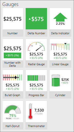
Gauge visualizations in the Layout tab
All gauges in SQL Server Mobile Report Publisher have at least one property in common: a main value, set to a numeric field in one of the data tables in the mobile report.
All the gauges except the Number gauge can also display a comparison, or delta, value. The comparison value shows the relationship between the main and a comparison value. The comparison value is often the goal, and the gauge is a visual indicator of progress to that goal, or the delta between the actual and the goal.
Gauges can only represent one aggregated value for their main value and one aggregated value for their comparison value. Gauge aggregations are standard, for example, sum, average, minimum, maximum, and so on. By default, the gauge value is a sum, which displays the total of all values contained within the current filtered data available to the gauge control.
You can filter gauge values by connecting them to navigators on the mobile report.
Set the main and comparison values for a gauge
Drag a gauge from the Layout tab to the design grid and make it the size you want.
Select the Data tab, and in the Data properties pane, under Main Value select a data table and a numeric field.
In any gauge except the Number gauge, in the Data properties pane, under Comparison Value select a data table and a numeric field.
Optionally, to change the aggregation, select Options, and choose a different aggregation.
Note
When you change the aggregation for the main value, you probably also want to change the aggregation for the comparison value, though in some cases you may want to mix aggregation methods.
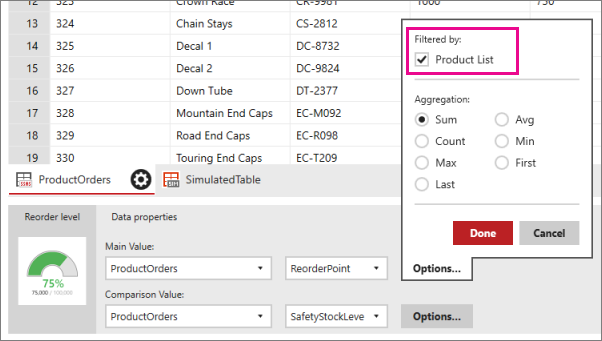
Filter a gauge
If the mobile report has any navigators, you can bind a gauge to one or more of them to filter it. You can bind a gauge's value and comparison value to one or more different navigators, leading to almost endless options for gauges.
Select a gauge, and on the Data tab in the Data properties pane, select Options next to Main Value or Comparison Value.
Under Filtered by, select the navigator you want to filter the gauge.
Set visual properties for a gauge
Along with the data properties that connect gauge elements to data fields, you can also customize many functional and visual properties.
Set value direction: High or low is better
- Select a gauge, and on the Layout tab in the Visual properties pane, set Value direction to either Higher values are better or Lower values are better.
Higher values are better colors the positive values green, indicating a desirable change for the better, or lower values red, indicating an undesirable change for the worse.
The colors for Lower values are better are the opposite.
The value direction property relates only to Gauge elements that support a comparison value. The delta integer and the value direction property setting determine the color of the gauge.
Set range stops for a gauge
The second gauge-specific nondata property is range stops.
- Select a gauge, and on the Layout tab in the Visual properties pane, select Range stops.
With range stops, you set at what percentage of the comparison value visualization should be presented as on-target (green), neutral (amber), or off-target (red). The gauge's comparison value is the target. Again, only gauges with comparison values support range stops.
Format the numbers in the gauge
Another nondata property of gauge element, and one shared by many other elements, is number format.
- Select a gauge, and on the Layout tab in the Visual properties pane, select Range stops.
It determines how numbers displayed in the gauge are formatted, for example, currency, percentage, time, or general. You set number formatting on each element of the mobile report.
Related content
Visszajelzés
Hamarosan elérhető: 2024-ben fokozatosan kivezetjük a GitHub-problémákat a tartalom visszajelzési mechanizmusaként, és lecseréljük egy új visszajelzési rendszerre. További információ: https://aka.ms/ContentUserFeedback.
Visszajelzés küldése és megtekintése a következőhöz: