Group data by columns or rows in a mobile report | Reporting Services
Note
SQL Server Mobile Report Publisher is deprecated for all releases of SQL Server Reporting Services after SQL Server Reporting Services 2019. It is discontinued starting in SQL Server Reporting Services 2022 and Power BI Report Server.
You can organize data by columns or by rows in many types of charts in Mobile Report Publisher. Follow along in this step-by-step article.
In time, totals, pie, and funnel charts, you can organize the data by rows or by columns.
- Organizing by columns is useful if a table has several columns of data you'd like to compare.
- Organizing by rows works better if one column in the table contains the names of the different categories.
The following steps use a comparison totals table with the simulated data in Mobile Report Publisher to illustrate the difference between structuring the data by rows or by columns in a chart.
Drag a Comparison totals chart from the Layout tab to the design surface and make it bigger.
Select the Data tab. You see the SimulatedTable table contains a series of columns, Metric1 through Metric5 and Comparison1 through Comparison5.

In the Data properties pane, Main Series is SimulatedTable. Select the arrow in the box next to Main Series, and you see Metric1 through Metric5 selected.
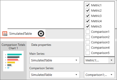
You see same for Comparison Series. Comparison1 through Comparison5 are selected.
Select Preview.
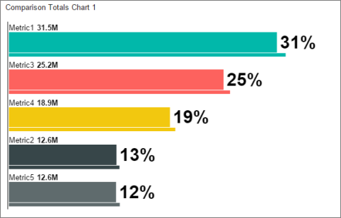
Each bar in the chart represents one column in the table. The thicker bars are the Metrics columns and the thinner bars are the Comparison columns.
Select the back arrow in the upper-left corner to leave preview mode.
On the Layout tab, in the Visual properties pane change Data structure from By columns to By rows.
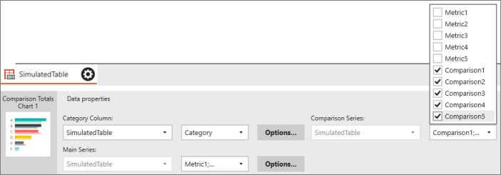
Select the Data tab. Now the SimulatedTable table has a Category column along with the Metric and Comparison columns, with Category A through E.

In the Data properties pane, there's now a Category Column box, which lists the Category column from SimulatedTable. In Main Series, you can pick which column to use for the values. By default, Mobile Report Publisher selects Metric1 through Metric5 for the Main Series and Comparison1 through Comparison5 for the Comparison Series.
Select Preview.

Now each bar in the chart represents the values for each category in the Category column.
Related content
Visszajelzés
Hamarosan elérhető: 2024-ben fokozatosan kivezetjük a GitHub-problémákat a tartalom visszajelzési mechanizmusaként, és lecseréljük egy új visszajelzési rendszerre. További információ: https://aka.ms/ContentUserFeedback.
Visszajelzés küldése és megtekintése a következőhöz: