Introduzione alla libreria dell'interfaccia utente di Servizi di comunicazione di Azure alle app vocali di Teams
Questo progetto mira a guidare gli sviluppatori a avviare una chiamata dal Servizi di comunicazione di Azure Calling Web SDK to Teams Call Queue and Auto Attendant using the Azure Communication UI Library (Libreria dell'interfaccia utente di comunicazione di Azure).
In base alle esigenze, potrebbe essere necessario offrire ai clienti un modo semplice per contattare l'utente senza alcuna configurazione complessa.
La chiamata alla coda di chiamate di Teams e all'operatore automatico è un concetto semplice ma efficace che facilita l'interazione immediata con il supporto clienti, consulente finanziario e altri team rivolti ai clienti. L'obiettivo di questa esercitazione è aiutare l'utente ad avviare interazioni con i clienti quando fa clic su un pulsante sul Web.
Se si vuole provarlo, è possibile scaricare il codice da GitHub.
Dopo questa esercitazione:
- Consente di controllare l'esperienza audio e video dei clienti a seconda dello scenario del cliente
- Informazioni su come creare un widget per avviare le chiamate nell'app Web usando la libreria dell'interfaccia utente.
Prerequisiti
Questi passaggi sono necessari per seguire questa esercitazione. Contattare l'amministratore di Teams per verificare che gli ultimi due elementi siano configurati in modo appropriato.
- Visual Studio Code in una delle piattaforme supportate.
- Node.js, è consigliabile usare Active LTS (Long Term Support) e le versioni Node 18. Usare il comando
node --versionper controllare la versione in uso. - Risorsa Servizi di comunicazione di Azure. Creare una risorsa di comunicazione
- Completare la configurazione del tenant di Teams nelle code di chiamate di Teams
- Uso delle code di chiamata di Teams e delle Servizi di comunicazione di Azure.
- Uso degli operatori automatici di Teams e delle Servizi di comunicazione di Azure.
Configurare il progetto
Usare questo passaggio solo se si sta creando una nuova applicazione.
Per configurare l'app react, si usa lo strumento da create-react-app riga di comando. Questo strumento crea un'applicazione TypeScript facile da eseguire con Tecnologia React.
Per assicurarsi che Node sia installato nel computer, eseguire questo comando in PowerShell o nel terminale per visualizzare la versione del nodo:
node -v
Se non create-react-app è installato nel computer, eseguire il comando seguente per installarlo come comando globale:
npm install -g create-react-app
Dopo aver installato questo comando, eseguire questo comando successivo per creare una nuova applicazione react per compilare l'esempio in:
# Create an Azure Communication Services App powered by React.
npx create-react-app ui-library-calling-widget-app --template typescript

# Change to the directory of the newly created App.
cd ui-library-calling-widget-app
Ottenere le dipendenze
È quindi necessario aggiornare la matrice di dipendenze in package.json per includere alcuni pacchetti di Servizi di comunicazione di Azure per l'esperienza del widget che verrà compilata per funzionare:
"@azure/communication-calling": "1.22.1",
"@azure/communication-chat": "1.4.0",
"@azure/communication-react": "1.13.0",
"@azure/communication-calling-effects": "1.0.1",
"@azure/communication-common": "2.3.0",
"@fluentui/react-icons": "~2.0.203",
"@fluentui/react": "~8.98.3",
Dopo aver aggiunto questi pacchetti al , package.jsonè tutto pronto per iniziare a lavorare al nuovo progetto. In questa esercitazione verranno modificati i file nella src directory .
Configurazione iniziale dell'app
Per iniziare, sostituire il contenuto fornito App.tsx con una pagina principale che:
- Archiviare tutte le informazioni di comunicazione di Azure necessarie per creare un CallAdapter per sfruttare l'esperienza di chiamata
- Visualizzare il widget esposto all'utente finale.
Il App.tsx file dovrebbe essere simile al seguente:
src/App.tsx
import "./App.css";
import {
  CommunicationIdentifier,
  MicrosoftTeamsAppIdentifier,
} from "@azure/communication-common";
import {
  Spinner,
  Stack,
  initializeIcons,
  registerIcons,
  Text,
} from "@fluentui/react";
import { CallAdd20Regular, Dismiss20Regular } from "@fluentui/react-icons";
import logo from "./logo.svg";

import { CallingWidgetComponent } from "./components/CallingWidgetComponent";

registerIcons({
  icons: { dismiss: <Dismiss20Regular />, callAdd: <CallAdd20Regular /> },
});
initializeIcons();
function App() {
  /**
   * Token for local user.
   */
  const token = "<Enter your ACS Token here>";

  /**
   * User identifier for local user.
   */
  const userId: CommunicationIdentifier = {
    communicationUserId: "Enter your ACS Id here",
  };

  /**
   * Enter your Teams voice app identifier from the Teams admin center here
   */
  const teamsAppIdentifier: MicrosoftTeamsAppIdentifier = {
    teamsAppId: "<Enter your Teams Voice app id here>",
    cloud: "public",
  };

  const widgetParams = {
    userId,
    token,
    teamsAppIdentifier,
  };

  if (!token || !userId || !teamsAppIdentifier) {
    return (
      <Stack verticalAlign="center" style={{ height: "100%", width: "100%" }}>
        <Spinner
          label={"Getting user credentials from server"}
          ariaLive="assertive"
          labelPosition="top"
        />
        ;
      </Stack>
    );
  }

  return (
    <Stack
      style={{ height: "100%", width: "100%", padding: "3rem" }}
      tokens={{ childrenGap: "1.5rem" }}
    >
      <Stack tokens={{ childrenGap: "1rem" }} style={{ margin: "auto" }}>
        <Stack
          style={{ padding: "3rem" }}
          horizontal
          tokens={{ childrenGap: "2rem" }}
        >
          <Text style={{ marginTop: "auto" }} variant="xLarge">
            Welcome to a Calling Widget sample
          </Text>
          <img
            style={{ width: "7rem", height: "auto" }}
            src={logo}
            alt="logo"
          />
        </Stack>

        <Text>
          Welcome to a Calling Widget sample for the Azure Communication
          Services UI Library. Sample has the ability to connect you through
          Teams voice apps to a agent to help you.
        </Text>
        <Text>
          As a user all you need to do is click the widget below, enter your
          display name for the call - this will act as your caller id, and
          action the <b>start call</b> button.
        </Text>
      </Stack>
      <Stack
        horizontal
        tokens={{ childrenGap: "1.5rem" }}
        style={{ overflow: "hidden", margin: "auto" }}
      >
        <CallingWidgetComponent
          widgetAdapterArgs={widgetParams}
          onRenderLogo={() => {
            return (
              <img
                style={{ height: "4rem", width: "4rem", margin: "auto" }}
                src={logo}
                alt="logo"
              />
            );
          }}
        />
      </Stack>
    </Stack>
  );
}

export default App;
In questo frammento di codice vengono registrate due nuove icone <Dismiss20Regular/> e <CallAdd20Regular>. Queste nuove icone vengono usate all'interno del componente widget che verrà creato nella sezione successiva.
Creare il widget
È ora necessario creare un widget che può essere visualizzato in tre modalità diverse:
- In attesa: questo stato del widget è il modo in cui il componente sarà in prima e dopo che viene effettuata una chiamata
- Configurazione: questo stato è quando il widget richiede informazioni all'utente, ad esempio il nome.
- In a call: The widget is replaced here with the UI library Call Composite. Questa modalità widget è quando l'utente chiama l'app Voce o comunica con un agente.
Consente di creare una cartella denominata src/components. In questa cartella creare un nuovo file denominato CallingWidgetComponent.tsx. Questo file dovrebbe essere simile al frammento di codice seguente:
CallingWidgetComponent.tsx
import {
  IconButton,
  PrimaryButton,
  Stack,
  TextField,
  useTheme,
  Checkbox,
  Icon,
  Spinner,
} from "@fluentui/react";
import React, { useEffect, useRef, useState } from "react";
import {
  callingWidgetSetupContainerStyles,
  checkboxStyles,
  startCallButtonStyles,
  callingWidgetContainerStyles,
  callIconStyles,
  logoContainerStyles,
  collapseButtonStyles,
} from "../styles/CallingWidgetComponent.styles";

import {
  AzureCommunicationTokenCredential,
  CommunicationUserIdentifier,
  MicrosoftTeamsAppIdentifier,
} from "@azure/communication-common";
import {
  CallAdapter,
  CallAdapterState,
  CallComposite,
  CommonCallAdapterOptions,
  StartCallIdentifier,
  createAzureCommunicationCallAdapter,
} from "@azure/communication-react";
// lets add to our react imports as well
import { useMemo } from "react";

import { callingWidgetInCallContainerStyles } from "../styles/CallingWidgetComponent.styles";

/**
 * Properties needed for our widget to start a call.
 */
export type WidgetAdapterArgs = {
  token: string;
  userId: CommunicationUserIdentifier;
  teamsAppIdentifier: MicrosoftTeamsAppIdentifier;
};

export interface CallingWidgetComponentProps {
  /**
   *  arguments for creating an AzureCommunicationCallAdapter for your Calling experience
   */
  widgetAdapterArgs: WidgetAdapterArgs;
  /**
   * Custom render function for displaying logo.
   * @returns
   */
  onRenderLogo?: () => JSX.Element;
}

/**
 * Widget for Calling Widget
 * @param props
 */
export const CallingWidgetComponent = (
  props: CallingWidgetComponentProps
): JSX.Element => {
  const { onRenderLogo, widgetAdapterArgs } = props;

  const [widgetState, setWidgetState] = useState<"new" | "setup" | "inCall">(
    "new"
  );
  const [displayName, setDisplayName] = useState<string>();
  const [consentToData, setConsentToData] = useState<boolean>(false);
  const [useLocalVideo, setUseLocalVideo] = useState<boolean>(false);
  const [adapter, setAdapter] = useState<CallAdapter>();

  const callIdRef = useRef<string>();

  const theme = useTheme();

  // add this before the React template
  const credential = useMemo(() => {
    try {
      return new AzureCommunicationTokenCredential(widgetAdapterArgs.token);
    } catch {
      console.error("Failed to construct token credential");
      return undefined;
    }
  }, [widgetAdapterArgs.token]);

  const adapterOptions: CommonCallAdapterOptions = useMemo(
    () => ({
      callingSounds: {
        callEnded: { url: "/sounds/callEnded.mp3" },
        callRinging: { url: "/sounds/callRinging.mp3" },
        callBusy: { url: "/sounds/callBusy.mp3" },
      },
    }),
    []
  );

  const callAdapterArgs = useMemo(() => {
    return {
      userId: widgetAdapterArgs.userId,
      credential: credential,
      targetCallees: [
        widgetAdapterArgs.teamsAppIdentifier,
      ] as StartCallIdentifier[],
      displayName: displayName,
      options: adapterOptions,
    };
  }, [
    widgetAdapterArgs.userId,
    widgetAdapterArgs.teamsAppIdentifier.teamsAppId,
    credential,
    displayName,
  ]);

  useEffect(() => {
    if (adapter) {
      adapter.on("callEnded", () => {
        /**
         * We only want to reset the widget state if the call that ended is the same as the current call.
         */
        if (
          adapter.getState().acceptedTransferCallState &&
          adapter.getState().acceptedTransferCallState?.id !== callIdRef.current
        ) {
          return;
        }
        setDisplayName(undefined);
        setWidgetState("new");
        setConsentToData(false);
        setAdapter(undefined);
        adapter.dispose();
      });

      adapter.on("transferAccepted", (e) => {
        console.log("transferAccepted", e);
      });

      adapter.onStateChange((state: CallAdapterState) => {
        if (state?.call?.id && callIdRef.current !== state?.call?.id) {
          callIdRef.current = state?.call?.id;
          console.log(`Call Id: ${callIdRef.current}`);
        }
      });
    }
  }, [adapter]);

  /** widget template for when widget is open, put any fields here for user information desired */
  if (widgetState === "setup") {
    return (
      <Stack
        styles={callingWidgetSetupContainerStyles(theme)}
        tokens={{ childrenGap: "1rem" }}
      >
        <IconButton
          styles={collapseButtonStyles}
          iconProps={{ iconName: "Dismiss" }}
          onClick={() => {
            setDisplayName(undefined);
            setConsentToData(false);
            setUseLocalVideo(false);
            setWidgetState("new");
          }}
        />
        <Stack tokens={{ childrenGap: "1rem" }} styles={logoContainerStyles}>
          <Stack style={{ transform: "scale(1.8)" }}>
            {onRenderLogo && onRenderLogo()}
          </Stack>
        </Stack>
        <TextField
          label={"Name"}
          required={true}
          placeholder={"Enter your name"}
          onChange={(_, newValue) => {
            setDisplayName(newValue);
          }}
        />
        <Checkbox
          styles={checkboxStyles(theme)}
          label={
            "Use video - Checking this box will enable camera controls and screen sharing"
          }
          onChange={(_, checked?: boolean | undefined) => {
            setUseLocalVideo(!!checked);
            setUseLocalVideo(true);
          }}
        ></Checkbox>
        <Checkbox
          required={true}
          styles={checkboxStyles(theme)}
          disabled={displayName === undefined}
          label={
            "By checking this box, you are consenting that we will collect data from the call for customer support reasons"
          }
          onChange={async (_, checked?: boolean | undefined) => {
            setConsentToData(!!checked);
            if (callAdapterArgs && callAdapterArgs.credential) {
              setAdapter(
                await createAzureCommunicationCallAdapter({
                  displayName: displayName ?? "",
                  userId: callAdapterArgs.userId,
                  credential: callAdapterArgs.credential,
                  targetCallees: callAdapterArgs.targetCallees,
                  options: callAdapterArgs.options,
                })
              );
            }
          }}
        ></Checkbox>
        <PrimaryButton
          styles={startCallButtonStyles(theme)}
          onClick={() => {
            if (displayName && consentToData && adapter) {
              setWidgetState("inCall");
              adapter?.startCall(callAdapterArgs.targetCallees, {
                audioOptions: { muted: false },
              });
            }
          }}
        >
          {!consentToData && `Enter your name`}
          {consentToData && !adapter && (
            <Spinner ariaLive="assertive" labelPosition="top" />
          )}
          {consentToData && adapter && `StartCall`}
        </PrimaryButton>
      </Stack>
    );
  }

  if (widgetState === "inCall" && adapter) {
    return (
      <Stack styles={callingWidgetInCallContainerStyles(theme)}>
        <CallComposite
          adapter={adapter}
          options={{
            callControls: {
              cameraButton: useLocalVideo,
              screenShareButton: useLocalVideo,
              moreButton: false,
              peopleButton: false,
              displayType: "compact",
            },
            localVideoTile: !useLocalVideo ? false : { position: "floating" },
          }}
        />
      </Stack>
    );
  }

  return (
    <Stack
      horizontalAlign="center"
      verticalAlign="center"
      styles={callingWidgetContainerStyles(theme)}
      onClick={() => {
        setWidgetState("setup");
      }}
    >
      <Stack
        horizontalAlign="center"
        verticalAlign="center"
        style={{
          height: "4rem",
          width: "4rem",
          borderRadius: "50%",
          background: theme.palette.themePrimary,
        }}
      >
        <Icon iconName="callAdd" styles={callIconStyles(theme)} />
      </Stack>
    </Stack>
  );
};
Stile del widget
È necessario scrivere alcuni stili per assicurarsi che il widget abbia un aspetto appropriato e che possa contenere la chiamata composita. Questi stili devono essere già usati nel widget se si copia il frammento di codice aggiunto al file CallingWidgetComponent.tsx.
Consente di creare una nuova cartella denominata src/styles in questa cartella, creare un file denominato CallingWidgetComponent.styles.ts. Il file dovrebbe essere simile al frammento di codice seguente:
import {
  IButtonStyles,
  ICheckboxStyles,
  IIconStyles,
  IStackStyles,
  Theme,
} from "@fluentui/react";

export const checkboxStyles = (theme: Theme): ICheckboxStyles => {
  return {
    label: {
      color: theme.palette.neutralPrimary,
    },
  };
};

export const callingWidgetContainerStyles = (theme: Theme): IStackStyles => {
  return {
    root: {
      width: "5rem",
      height: "5rem",
      padding: "0.5rem",
      boxShadow: theme.effects.elevation16,
      borderRadius: "50%",
      bottom: "1rem",
      right: "1rem",
      position: "absolute",
      overflow: "hidden",
      cursor: "pointer",
      ":hover": {
        boxShadow: theme.effects.elevation64,
      },
    },
  };
};

export const callingWidgetSetupContainerStyles = (
  theme: Theme
): IStackStyles => {
  return {
    root: {
      width: "18rem",
      minHeight: "20rem",
      maxHeight: "25rem",
      padding: "0.5rem",
      boxShadow: theme.effects.elevation16,
      borderRadius: theme.effects.roundedCorner6,
      bottom: 0,
      right: "1rem",
      position: "absolute",
      overflow: "hidden",
      cursor: "pointer",
      background: theme.palette.white,
    },
  };
};

export const callIconStyles = (theme: Theme): IIconStyles => {
  return {
    root: {
      paddingTop: "0.2rem",
      color: theme.palette.white,
      transform: "scale(1.6)",
    },
  };
};

export const startCallButtonStyles = (theme: Theme): IButtonStyles => {
  return {
    root: {
      background: theme.palette.themePrimary,
      borderRadius: theme.effects.roundedCorner6,
      borderColor: theme.palette.themePrimary,
    },
    textContainer: {
      color: theme.palette.white,
    },
  };
};

export const logoContainerStyles: IStackStyles = {
  root: {
    margin: "auto",
    padding: "0.2rem",
    height: "5rem",
    width: "10rem",
    zIndex: 0,
  },
};

export const collapseButtonStyles: IButtonStyles = {
  root: {
    position: "absolute",
    top: "0.2rem",
    right: "0.2rem",
    zIndex: 1,
  },
};

export const callingWidgetInCallContainerStyles = (
  theme: Theme
): IStackStyles => {
  return {
    root: {
      width: "35rem",
      height: "25rem",
      padding: "0.5rem",
      boxShadow: theme.effects.elevation16,
      borderRadius: theme.effects.roundedCorner6,
      bottom: 0,
      right: "1rem",
      position: "absolute",
      overflow: "hidden",
      cursor: "pointer",
      background: theme.semanticColors.bodyBackground,
    },
  };
};
Scambia segnaposto per gli identificatori
Prima di eseguire l'app, passare a App.tsx e sostituire i valori segnaposto con le identità Servizi di comunicazione di Azure e l'identificatore per l'applicazione Teams Voice. Di seguito sono riportati i valori di input per , tokenuserId e teamsAppIdentifier.
./src/App.tsx
/**
 * Token for local user.
 */
const token = "<Enter your ACS Token here>";

/**
 * User identifier for local user.
 */
const userId: CommunicationIdentifier = {
  communicationUserId: "Enter your ACS Id here",
};

/**
 * Enter your Teams voice app identifier from the Teams admin center here
 */
const teamsAppIdentifier: MicrosoftTeamsAppIdentifier = {
  teamsAppId: "<Enter your Teams Voice app id here>",
  cloud: "public",
};
Eseguire l'app
Infine, è possibile eseguire l'applicazione per effettuare le chiamate. Eseguire i comandi seguenti per installare le dipendenze ed eseguire l'app.
# Install the newe dependencies
npm install

# run the React app
npm run start
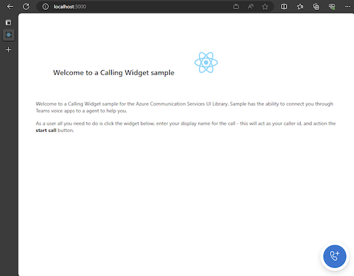
Una volta eseguita l'app, è possibile visualizzarla http://localhost:3000 nel browser. Verrà visualizzata la schermata iniziale seguente:
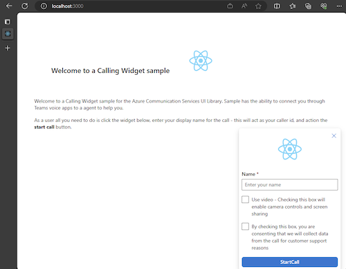
Quindi, quando si esegue l'azione del pulsante del widget, verrà visualizzato un piccolo menu:
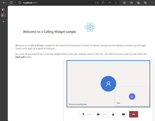
Dopo aver compilato il nome, fare clic su Avvia chiamata e iniziare la chiamata. Il widget dovrebbe essere simile al seguente dopo l'avvio di una chiamata:
Passaggi successivi
Per altre informazioni sulle applicazioni vocali di Teams, vedere la documentazione sugli operatori automatici di Teams e sulle code delle chiamate di Teams.
Guida introduttiva: Aggiungere l'app chiamante a una coda di chiamate di Teams
Guida introduttiva: Aggiungere l'app chiamante a un operatore automatico di Teams