コントロール テンプレート
 サンプルを参照する
.NET Multi-platform App UI (.NET MAUI) のコントロール テンプレートを使うと、ContentView 派生カスタム コントロールと ContentPage 派生ページのビジュアル構造を定義できます。 コントロール テンプレートを使うと、カスタム コントロールまたはページのユーザー インターフェイス (UI) を、コントロールまたはページを実装するロジックから分離できます。 また、事前に定義した場所にあるテンプレート化されたカスタム コントロールまたはテンプレート化されたページに追加のコンテンツを挿入することもできます。
たとえば、カスタム コントロールで提供された UI を再定義するコントロール テンプレートを作成できます。 コントロール テンプレートは、必要なカスタム コントロール インスタンスで使用できます。 または、アプリの複数のページで使用される共通の UI を定義するコントロール テンプレートを作成することもできます。 コントロール テンプレートを複数のページに使用し、さらに各ページに固有のコンテンツを表示することができます。
ControlTemplate の作成
次の例は、CardView カスタム コントロールのコードを示しています。
public class CardView : ContentView
{
    public static readonly BindableProperty CardTitleProperty =
        BindableProperty.Create(nameof(CardTitle), typeof(string), typeof(CardView), string.Empty);
    public static readonly BindableProperty CardDescriptionProperty =
        BindableProperty.Create(nameof(CardDescription), typeof(string), typeof(CardView), string.Empty);

    public string CardTitle
    {
        get => (string)GetValue(CardTitleProperty);
        set => SetValue(CardTitleProperty, value);
    }

    public string CardDescription
    {
        get => (string)GetValue(CardDescriptionProperty);
        set => SetValue(CardDescriptionProperty, value);
    }
    ...
}
ContentView クラスから派生した CardView クラスは、カードのようなレイアウトでデータを表示するカスタム コントロールを表します。 このクラスには、表示されるデータのプロパティが含まれており、バインド可能なプロパティに基づいています。 ただし、CardView クラスを使って UI を定義することはできません。 代わりに、コントロール テンプレートを使って UI を定義します。 ContentView 派生カスタム コントロールの作成の詳細については、「 ContentView」を参照してください。
コントロール テンプレートは、ControlTemplate 型を使用して作成されます。 ControlTemplate を作成するときは、View オブジェクトを組み合わせてカスタム コントロールまたはページの UI を構築します。 ControlTemplate は、ルート要素として View を 1 つだけ持つ必要があります。 ただし、通常、ルート要素には他の View オブジェクトが含まれます。 複数のオブジェクトを組み合わせて、コントロールの視覚的な構造を構成します。
ControlTemplate をインラインで定義することはできますが、リソース ディクショナリのリソースとして ControlTemplate を宣言する方法が一般的です。 コントロール テンプレートはリソースなので、すべてのリソースに適用されるものと同じスコープ規則に従います。 たとえば、アプリ レベルのリソース ディクショナリでコントロール テンプレートを宣言すると、そのテンプレートはアプリのどこでも使用できます。 ページでテンプレートを定義すると、そのページでのみ、コントロール テンプレートを使用できます。 リソースの詳細については、「リソース ディクショナリ」をご覧ください。
次の XAML の例は、CardView オブジェクトの ControlTemplate を示しています。
<ContentPage xmlns="http://schemas.microsoft.com/dotnet/2021/maui"
             xmlns:x="http://schemas.microsoft.com/winfx/2009/xaml"
             ...>
    <ContentPage.Resources>
      <ControlTemplate x:Key="CardViewControlTemplate">
          <Frame BindingContext="{Binding Source={RelativeSource TemplatedParent}}"
                 BackgroundColor="{Binding CardColor}"
                 BorderColor="{Binding BorderColor}"
                 ...>
              <!-- UI objects that define the CardView visual structure -->
          </Frame>
      </ControlTemplate>
    </ContentPage.Resources>
    ...
</ContentPage>
ControlTemplate がリソースとして宣言される場合、リソース ディクショナリで識別できるように、x:Key 属性を使用して指定したキーが必要です。 この例では、CardViewControlTemplate のルート要素は Frame オブジェクトです。 Frame オブジェクトでは、RelativeSource マークアップ拡張機能を使用して、その BindingContext をテンプレートが適用されるランタイム オブジェクト インスタンスに設定します。これは、"テンプレート化された親" と呼ばれます。 Frame オブジェクトは、コントロールの組み合わせを使って、CardView オブジェクトの視覚的な構造を定義します。 このようなオブジェクトのバインド式を使うと、ルート Frame エレメントから BindingContext が継承されるため、CardView プロパティに対して解決されます。 RelativeSource マークアップ拡張機能の詳細については、「相対的なバインディング」をご覧ください。
ControlTemplate を使用する
ControlTemplate を ContentView 派生カスタム コントロールに適用するには、その ControlTemplate プロパティをコントロール テンプレート オブジェクトに設定します。 同様に、ControlTemplate を ContentPage 派生ページに適用するには、その ControlTemplate プロパティをコントロール テンプレート オブジェクトに設定します。 実行時に ControlTemplate が適用されると、ControlTemplate で定義されたすべてのコントロールがテンプレート化されたカスタム コントロールまたはテンプレート化されたページのビジュアル ツリーに追加されます。
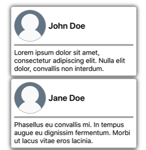
次の例は、2 つの CardView オブジェクトの ControlTemplate プロパティに割り当てられている CardViewControlTemplate を示しています。
<ContentPage xmlns="http://schemas.microsoft.com/dotnet/2021/maui"
             xmlns:x="http://schemas.microsoft.com/winfx/2009/xaml"
             xmlns:controls="clr-namespace:ControlTemplateDemos.Controls"
             ...>
    <StackLayout Margin="30">
        <controls:CardView BorderColor="DarkGray"
                           CardTitle="John Doe"
                           CardDescription="Lorem ipsum dolor sit amet, consectetur adipiscing elit. Nulla elit dolor, convallis non interdum."
                           IconBackgroundColor="SlateGray"
                           IconImageSource="user.png"
                           ControlTemplate="{StaticResource CardViewControlTemplate}" />
        <controls:CardView BorderColor="DarkGray"
                           CardTitle="Jane Doe"
                           CardDescription="Phasellus eu convallis mi. In tempus augue eu dignissim fermentum. Morbi ut lacus vitae eros lacinia."
                           IconBackgroundColor="SlateGray"
                           IconImageSource="user.png"
                           ControlTemplate="{StaticResource CardViewControlTemplate}" />
    </StackLayout>
</ContentPage>
この例では、CardViewControlTemplate のコントロールは各 CardView オブジェクトのビジュアルツリーの一部になります。 コントロール テンプレートのルート Frame オブジェクトによって、その BindingContext はテンプレート化された親に設定されるため、Frame とその子では、各 CardView オブジェクトのプロパティに対するバインディング式は解決されます。
次のスクリーンショットは、CardView オブジェクトに適用された CardViewControlTemplate を示しています。
重要
ControlTemplate がコントロール インスタンスに適用された時点を検出するには、テンプレート化されたカスタム コントロールまたはテンプレート化されたページで OnApplyTemplate メソッドをオーバーライドします。 詳細については、「テンプレートから名前付き要素を取得する」を参照してください。
TemplateBinding を使用してパラメーターを渡す
TemplateBinding マークアップ拡張機能を使うと、ControlTemplate 内にある要素のプロパティを、テンプレート化されたカスタム コントロールまたはテンプレート化されたページによって定義されたパブリック プロパティにバインドできます。 TemplateBinding を使うと、コントロールのプロパティをテンプレートのパラメーターとして機能させることができます。 そのため、テンプレート化されたカスタム コントロールまたはテンプレート化されたページのプロパティを設定すると、TemplateBinding が指定された要素にその値が渡されます。
重要
TemplateBinding マークアップ式を使用すると、前のコントロール テンプレートからの RelativeSource バインドを削除し、Binding 式を置き換えることができます。
TemplateBinding マークアップ拡張機能を使うと、次のプロパティを定義できます。
- Path (
string型)。プロパティのパス。 - Mode (BindingMode 型)。"ソース" と "ターゲット" の間で変更が反映される方向。
- Converter (IValueConverter 型)。バインディング値コンバーター。
- ConverterParameter (
object型)。バインディング値コンバーターへのパラメーター。 - StringFormat (
string型)。バインディングの文字列形式。
TemplateBinding マークアップ拡張機能の ContentProperty は Path です。 そのため、マークアップ拡張機能の "Path =" 部分は、そのパスが TemplateBinding 式の最初の項目である場合、省略できます。 バインディング式でこれらのプロパティを使用することの詳細については、「データ バインディング」をご覧ください。
警告
TemplateBinding マークアップ拡張機能は、ControlTemplate 内でのみ使用することをお勧めします。 ただし、ControlTemplate の外部で TemplateBinding 式を使用しようとしても、ビルド エラーや例外はスローされません。
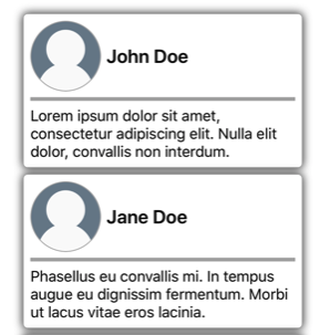
次の XAML の例は、TemplateBinding マークアップ拡張機能を使用する CardView オブジェクトの ControlTemplate を示します。
<ContentPage xmlns="http://schemas.microsoft.com/dotnet/2021/maui"
             xmlns:x="http://schemas.microsoft.com/winfx/2009/xaml"
             ...>
    <ContentPage.Resources>
        <ControlTemplate x:Key="CardViewControlTemplate">
            <Frame BackgroundColor="{TemplateBinding CardColor}"
                   BorderColor="{TemplateBinding BorderColor}"
                   ...>
                <!-- UI objects that define the CardView visual structure -->
            </Frame>
        </ControlTemplate>
    </ContentPage.Resources>
    ...
</ContentPage>
この例では、TemplateBinding マークアップ拡張機能によって、各 CardView オブジェクトのプロパティに対するバインド式が解決されます。 次のスクリーンショットは、CardView オブジェクトに適用された CardViewControlTemplate を示します。
重要
TemplateBinding マークアップ拡張機能を使用することは、テンプレートのルート要素の BindingContext を RelativeSource マークアップ拡張機能を使用してテンプレート化された親に設定し、Binding マークアップ拡張機能を使用して子オブジェクトのバインドを解決することと同等です。 実際、TemplateBinding マークアップ拡張機能を使用すると、Source が RelativeBindingSource.TemplatedParent である Binding が作成されます。
スタイルを使用して ControlTemplate を適用する
コントロール テンプレートは、スタイルを使用して適用することもできます。 これを実行するには、ControlTemplate を使用する "暗黙的" または "明示的" なスタイルを作成します。
次の XAML の例は、CardViewControlTemplate を使用する "暗黙的" なスタイルを示します。
<ContentPage xmlns="http://schemas.microsoft.com/dotnet/2021/maui"
             xmlns:x="http://schemas.microsoft.com/winfx/2009/xaml"
             xmlns:controls="clr-namespace:ControlTemplateDemos.Controls"
             ...>
    <ContentPage.Resources>
        <ControlTemplate x:Key="CardViewControlTemplate">
            ...
        </ControlTemplate>

        <Style TargetType="controls:CardView">
            <Setter Property="ControlTemplate"
                    Value="{StaticResource CardViewControlTemplate}" />
        </Style>
    </ContentPage.Resources>
    <StackLayout Margin="30">
        <controls:CardView BorderColor="DarkGray"
                           CardTitle="John Doe"
                           CardDescription="Lorem ipsum dolor sit amet, consectetur adipiscing elit. Nulla elit dolor, convallis non interdum."
                           IconBackgroundColor="SlateGray"
                           IconImageSource="user.png" />
        ...
    </StackLayout>
</ContentPage>
この例では、暗黙的なStyle は、各 CardView オブジェクトに自動的に適用され、各 .CardView の ControlTemplate プロパティは CardViewControlTemplate に設定されます。
スタイルの詳細については、 のスタイルに関するページを参照してください。
コントロールの UI を再定義する
ControlTemplate がインスタンス化され、ContentView 派生カスタム コントロールまたは ContentPage 派生ページの ControlTemplate プロパティに割り当てられると、カスタム コントロールまたはページに定義されたビジュアル構造は、ControlTemplate で定義されたビジュアル構造に置き換えられます。
たとえば、CardViewUI カスタム コントロールでは、次の XAML を使用してユーザー インターフェイスを定義します。
<ContentView xmlns="http://schemas.microsoft.com/dotnet/2021/maui"
             xmlns:x="http://schemas.microsoft.com/winfx/2009/xaml"
             x:Class="ControlTemplateDemos.Controls.CardViewUI"
             x:Name="this">
    <Frame BindingContext="{x:Reference this}"
           BackgroundColor="{Binding CardColor}"
           BorderColor="{Binding BorderColor}"
           ...>
        <!-- UI objects that define the CardView visual structure -->
    </Frame>
</ContentView>
ただし、この UI を構成するコントロールは、ControlTemplate で新しいビジュアル構造を定義し、それを CardViewUI オブジェクトの ControlTemplate プロパティに割り当てることで置き換えることができます。
<ContentPage xmlns="http://schemas.microsoft.com/dotnet/2021/maui"
xmlns:x="http://schemas.microsoft.com/winfx/2009/xaml"
...>
<ContentPage.Resources>
<ControlTemplate x:Key="CardViewCompressed">
<Grid RowDefinitions="100"
ColumnDefinitions="100, *">
<Image Source="{TemplateBinding IconImageSource}"
BackgroundColor="{TemplateBinding IconBackgroundColor}"
...>
<!-- Other UI objects that define the CardView visual structure -->
</Grid>
</ControlTemplate>
</ContentPage.Resources>
<StackLayout Margin="30">
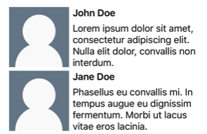
<controls:CardViewUI BorderColor="DarkGray"
CardTitle="John Doe"
CardDescription="Lorem ipsum dolor sit amet, consectetur adipiscing elit. Nulla elit dolor, convallis non interdum."
IconBackgroundColor="SlateGray"
IconImageSource="user.png"
ControlTemplate="{StaticResource CardViewCompressed}" />
...
</StackLayout>
</ContentPage>
この例では、CardViewUI オブジェクトのビジュアル構造が ControlTemplate で再定義され、要約リストに適した、よりコンパクトなビジュアル構造になります。
コンテンツを ContentPresenter に置き換える
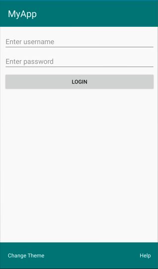
ContentPresenter をコントロール テンプレートに配置して、テンプレート化されたカスタム コントロールまたはテンプレート化されたページに表示されるコンテンツが表示される場所をマークすることができます。 カスタム コントロールまたはコントロール テンプレートを使用するページを使うと、ContentPresenter によって表示されるコンテンツを定義できます。 次の図は、青い四角形でマークされた ContentPresenter を含め、多数のコントロールがあるページの ControlTemplate を示しています。

次の XAML は、ビジュアル構造に ContentPresenter を含む TealTemplate というコントロール テンプレートを示します。
<ControlTemplate x:Key="TealTemplate">
    <Grid RowDefinitions="0.1*, 0.8*, 0.1*">
        <BoxView Color="Teal" />
        <Label Margin="20,0,0,0"
               Text="{TemplateBinding HeaderText}"
               ... />
        <ContentPresenter Grid.Row="1" />
        <BoxView Grid.Row="2"
                 Color="Teal" />
        <Label x:Name="changeThemeLabel"
               Grid.Row="2"
               Margin="20,0,0,0"
               Text="Change Theme"
               ...>
            <Label.GestureRecognizers>
                <TapGestureRecognizer Tapped="OnChangeThemeLabelTapped" />
            </Label.GestureRecognizers>
        </Label>
        <controls:HyperlinkLabel Grid.Row="2"
                                 Margin="0,0,20,0"
                                 Text="Help"
                                 Url="https://learn.microsoft.com/dotnet/maui/"
                                 ... />
    </Grid>
</ControlTemplate>
次の例は、ContentPage 派生ページの ControlTemplate プロパティに割り当てられた TealTemplate を示します。
<controls:HeaderFooterPage xmlns="http://schemas.microsoft.com/dotnet/2021/maui"
                           xmlns:x="http://schemas.microsoft.com/winfx/2009/xaml"
                           xmlns:controls="clr-namespace:ControlTemplateDemos.Controls"
                           ControlTemplate="{StaticResource TealTemplate}"
                           HeaderText="MyApp"
                           ...>
    <StackLayout Margin="10">
        <Entry Placeholder="Enter username" />
        <Entry Placeholder="Enter password"
               IsPassword="True" />
        <Button Text="Login" />
    </StackLayout>
</controls:HeaderFooterPage>
実行時に TealTemplate がページに適用されると、ページ コンテンツがコントロール テンプレートに定義されている ContentPresenter に置き換えられます。
テンプレートから名前付き要素を取得する
コントロール テンプレート内の名前付き要素は、テンプレート化されたカスタム コントロールまたはテンプレート化されたページから取得できます。 これは GetTemplateChild メソッドを使って実行できます。これを使うと、インスタンス化された ControlTemplate ビジュアル ツリーの名前付き要素が返されます (見つかった場合)。 それ以外の場合は nullを返します。
コントロール テンプレートがインスタンス化された後、テンプレートの OnApplyTemplate メソッドが呼び出されます。 そのため、GetTemplateChild メソッドは、テンプレート コントロールまたはテンプレート ページの OnApplyTemplate オーバーライドから呼び出す必要があります。
重要
GetTemplateChild メソッドは、OnApplyTemplate メソッドを呼び出した後にのみ呼び出す必要があります。
次の XAML は、ContentPage 派生ページに適用できる TealTemplate というコントロール テンプレートを示します。
<ControlTemplate x:Key="TealTemplate">
    <Grid>
        ...
        <Label x:Name="changeThemeLabel"
               Text="Change Theme"
               ...>
            <Label.GestureRecognizers>
                <TapGestureRecognizer Tapped="OnChangeThemeLabelTapped" />
            </Label.GestureRecognizers>
        </Label>
        ...
    </Grid>
</ControlTemplate>
この例では、Label 要素には名前が付けられており、テンプレート化されたページのコードで取得できます。 これを実行するには、テンプレート化されたページの OnApplyTemplate オーバーライドから GetTemplateChild メソッドを呼び出します。
public partial class AccessTemplateElementPage : HeaderFooterPage
{
    Label themeLabel;

    public AccessTemplateElementPage()
    {
        InitializeComponent();
    }

    protected override void OnApplyTemplate()
    {
        base.OnApplyTemplate();
        themeLabel = (Label)GetTemplateChild("changeThemeLabel");
        themeLabel.Text = OriginalTemplate ? "Aqua Theme" : "Teal Theme";
    }
}
この例では、ControlTemplate がインスタンス化されると、changeThemeLabel という Label オブジェクトが取得されます。 これで、AccessTemplateElementPage クラスで changeThemeLabel にアクセスしたり操作したりできるようになります。 次のスクリーンショットは、Label によって表示されるテキストが変更されたことを示します。

viewmodel にバインドする
ControlTemplate がテンプレート化された親 (テンプレートが適用されるランタイム オブジェクト インスタンス) にバインドされている場合でも、ControlTemplate を使うとデータを viewmodel にバインドできます。
次の XAML の例は、PeopleViewModel という viewmodel を使用するページを示します。
<ContentPage xmlns="http://schemas.microsoft.com/dotnet/2021/maui"
             xmlns:x="http://schemas.microsoft.com/winfx/2009/xaml"
             xmlns:local="clr-namespace:ControlTemplateDemos"
             xmlns:controls="clr-namespace:ControlTemplateDemos.Controls"
             ...>
    <ContentPage.BindingContext>
        <local:PeopleViewModel />
    </ContentPage.BindingContext>

    <ContentPage.Resources>
        <DataTemplate x:Key="PersonTemplate">
            <controls:CardView BorderColor="DarkGray"
                               CardTitle="{Binding Name}"
                               CardDescription="{Binding Description}"
                               ControlTemplate="{StaticResource CardViewControlTemplate}" />
        </DataTemplate>
    </ContentPage.Resources>

    <StackLayout Margin="10"
                 BindableLayout.ItemsSource="{Binding People}"
                 BindableLayout.ItemTemplate="{StaticResource PersonTemplate}" />
</ContentPage>
この例では、ページの BindingContext が PeopleViewModel インスタンスに設定されています。 この viewmodel では、People コレクションと、DeletePersonCommand という名前の ICommand が公開されています。 ページ上の StackLayout では、バインド可能なレイアウトを使用して People コレクションにデータをバインドします。また、バインド可能なレイアウトの ItemTemplate は PersonTemplate リソースに設定されます。 この DataTemplate は、People コレクションの各項目が CardView オブジェクトを使用して表示されるように指定しています。 CardView オブジェクトのビジュアル構造は、CardViewControlTemplate という ControlTemplate を使用して定義されます。
<ControlTemplate x:Key="CardViewControlTemplate">
    <Frame BindingContext="{Binding Source={RelativeSource TemplatedParent}}"
           BackgroundColor="{Binding CardColor}"
           BorderColor="{Binding BorderColor}"
           ...>
        <!-- UI objects that define the CardView visual structure -->
    </Frame>
</ControlTemplate>
この例では、ControlTemplate のルート要素は Frame オブジェクトです。 Frame オブジェクトでは、RelativeSource マークアップ拡張機能を使用して、その BindingContext をテンプレート化された親に設定します。 BindingContext はルートの Frame 要素から継承されるため、Frame オブジェクトとその子のバインディング式は、CardView プロパティに対して解決されます。 次のスクリーンショットは、People コレクションを表示するページを示します。

ControlTemplate のオブジェクトはテンプレート化された親のプロパティにバインドされますが、コントロール テンプレート内の Button は、テンプレート化された親と、viewmodel 内の DeletePersonCommand の両方にバインドされます。 これは、バインディング コンテキストの種類が PeopleViewModel (StackLayout) である祖先のバインディング コンテキストになるように、Button.Command プロパティによってバインディング ソースが再定義されているためです。 そのため、バインディング式の Path 部分によって DeletePersonCommand プロパティを解決できます。 ただし、Button.CommandParameter プロパティによってバインディング ソースが変更されることはなく、代わりに ControlTemplate の親から継承されます。 そのため、CommandParameter プロパティは CardView の CardTitle プロパティにバインドされます。
Button のバインディングの全体的な効果として、Button がタップされると、PeopleViewModel クラスの DeletePersonCommand が実行され、CardName プロパティの値が DeletePersonCommand に渡されるようになります。 その結果、指定された CardView がバインド可能なレイアウトから削除されます。
相対的なバインディングの詳細については、「相対的なバインディング」をご覧ください。
.NET MAUI
フィードバック
以下は間もなく提供いたします。2024 年を通じて、コンテンツのフィードバック メカニズムとして GitHub の issue を段階的に廃止し、新しいフィードバック システムに置き換えます。 詳細については、「https://aka.ms/ContentUserFeedback」を参照してください。
フィードバックの送信と表示