ContentView
.NET マルチプラットフォーム アプリ UI (.NET MAUI) ContentView は、再利用可能なカスタム コントロールの作成を可能にするコントロールです。
ContentView クラスは、ContentView のコンテンツを表す View 型の Content プロパティを定義します。 これらのプロパティは、BindableProperty オブジェクトが基になっています。つまり、データ バインディングの対象にして、スタイルを設定できます。
ContentView クラスは、バインド可能な ControlTemplate プロパティを定義する TemplatedView クラスから派生します。これは、コントロールの外観を定義する ControlTemplate 型です。 ControlTemplate プロパティの詳細については、「ControlTemplate を使用して外観をカスタマイズする」をご覧ください。
Note
ContentView には、1 つの子のみを含めることができます。
カスタム コントロールの作成
ContentView クラスは単独ではほとんど機能しませんが、カスタム コントロールを作成するために使用できます。 カスタム コントロールを作成するプロセスは次のとおりです。
- ContentView クラスから派生するクラスを作成します。
- カスタム コントロールの分離コード ファイルでコントロールのプロパティまたはイベントを定義します。
- カスタム コントロールの UI を定義します。
この記事では、イメージ、タイトル、説明をカードのようなレイアウトで表示する UI 要素である CardView コントロールを作成する方法について説明します。
ContentView 派生クラスを作成する
ContentView 派生クラスは、Visual Studio の ContentView 項目テンプレートを使用して作成できます。 このテンプレートは、カスタム コントロールの UI を定義できる XAML ファイルと、コントロールのプロパティ、イベント、その他のロジックを定義できる分離コード ファイルを作成します。
コントロールのプロパティの定義
コントロールのプロパティ、イベント、その他のロジックは、ContentView 派生クラスの分離コード ファイルで定義する必要があります。
CardView カスタム コントロールは、次のプロパティを定義します。
string型のCardTitleは、カードに表示されるタイトルを表します。string型のCardDescriptionは、カードに表示される説明を表します。- ImageSource 型の
IconImageSourceは、カードに表示される画像を表します。 - Color 型の
IconBackgroundColorは、カードに表示される画像の背景色を表します。 - Color 型の
BorderColorは、カードの境界線、画像の境界線、区切り線の色を表します。 - Color 型の
CardColorは、カードの背景色を表します。
各プロパティは、BindableProperty インスタンスによってサポートされます。
次の例は、CardView クラスの分離コード ファイル内のバインド可能な CardTitle プロパティを示しています。
public partial class CardView : ContentView
{
    public static readonly BindableProperty CardTitleProperty = BindableProperty.Create(nameof(CardTitle), typeof(string), typeof(CardView), string.Empty);

    public string CardTitle
    {
        get => (string)GetValue(CardView.CardTitleProperty);
        set => SetValue(CardView.CardTitleProperty, value);
    }
    // ...

    public CardView()
    {
        InitializeComponent();
    }
}
BindableProperty オブジェクトの詳細については、「バインド可能プロパティ」をご覧ください。
UI を定義する
カスタム コントロール UI は、コントロールのルート要素として ContentView を使用する ContentView 派生クラスの XAML ファイルで、次のように定義できます。
<ContentView ...
             x:Name="this"
             x:Class="CardViewDemo.Controls.CardView">
    <Frame BindingContext="{x:Reference this}"
           BackgroundColor="{Binding CardColor}"
           BorderColor="{Binding BorderColor}"
            ...>
        <Grid>
            ...
            <Frame BorderColor="{Binding BorderColor, FallbackValue='Black'}"
                   BackgroundColor="{Binding IconBackgroundColor, FallbackValue='Grey'}"
                   ...>
                <Image Source="{Binding IconImageSource}"
                       .. />
            </Frame>
            <Label Text="{Binding CardTitle, FallbackValue='Card Title'}"
                   ... />
            <BoxView BackgroundColor="{Binding BorderColor, FallbackValue='Black'}"
                     ... />
            <Label Text="{Binding CardDescription, FallbackValue='Card description text.'}"
                   ... />
        </Grid>
    </Frame>
</ContentView>
ContentView 要素は、CardView インスタンスにバインドされているオブジェクトにアクセスするために使用できる x:Name プロパティを this に設定します。 レイアウト内の要素は、バインドされたオブジェクトで定義された値へのプロパティのバインドを設定します。 データ バインディングの詳細については、「データ バインディング」をご覧ください。
Note
Binding 式の FallbackValue プロパティは、バインディングが null の場合の既定値を提供します。
カスタム コントロールをインスタンス化する
カスタム コントロール名前空間への参照を、カスタム コントロールをインスタンス化するページに追加する必要があります。 参照が追加されたら、CardView をインスタンス化し、そのプロパティを定義できます。
<ContentPage xmlns="http://schemas.microsoft.com/dotnet/2021/maui"
             xmlns:x="http://schemas.microsoft.com/winfx/2009/xaml"
             xmlns:controls="clr-namespace:CardViewDemo.Controls"
             x:Class="CardViewDemo.CardViewXamlPage">
   <ScrollView>
       <StackLayout>
           <controls:CardView BorderColor="DarkGray"
                              CardTitle="Slavko Vlasic"
                              CardDescription="Lorem ipsum dolor sit amet, consectetur adipiscing elit. Nulla elit dolor, convallis non interdum."
                              IconBackgroundColor="SlateGray"
                              IconImageSource="user.png" />
            <!-- More CardView objects -->
       </StackLayout>
   </ScrollView>
</ContentPage>
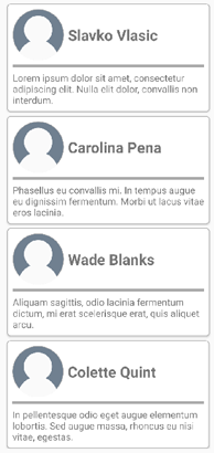
次のスクリーンショットは、複数の CardView オブジェクトを示しています。
ControlTemplate を使用して外観をカスタマイズする
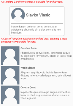
ContentView クラスから派生したカスタム コントロールは、XAML またはコードを使用してその UI を定義することも、その UI をまったく定義しないこともできます。 ControlTemplate を使用すると、その外観の定義方法に関係なく、コントロールの外観をオーバーライドできます。
たとえば、CardView のレイアウトの領域が多すぎる場合があります。 ControlTemplate を使用すると、CardView レイアウトをオーバーライドして、圧縮されたリストに適した、よりコンパクトなビューを提供できます。
<ContentPage.Resources>
    <ResourceDictionary>
        <ControlTemplate x:Key="CardViewCompressed">
            <Grid>
                <Grid.RowDefinitions>
                    <RowDefinition Height="100" />
                </Grid.RowDefinitions>
                <Grid.ColumnDefinitions>
                    <ColumnDefinition Width="100" />
                    <ColumnDefinition Width="100*" />
                </Grid.ColumnDefinitions>
                <Image Source="{TemplateBinding IconImageSource}"
                       BackgroundColor="{TemplateBinding IconBackgroundColor}"
                       WidthRequest="100"
                       HeightRequest="100"
                       Aspect="AspectFill"
                       HorizontalOptions="Center"
                       VerticalOptions="Center" />
                <StackLayout Grid.Column="1">
                    <Label Text="{TemplateBinding CardTitle}"
                           FontAttributes="Bold" />
                    <Label Text="{TemplateBinding CardDescription}" />
                </StackLayout>
            </Grid>
        </ControlTemplate>
    </ResourceDictionary>
</ContentPage.Resources>
ControlTemplate のデータ バインディングでは、TemplateBinding マークアップ拡張機能を使用してバインディングを指定します。 その後、x:Key 値を使用して、定義された ControlTemplate オブジェクトに ControlTemplate プロパティを設定できます。 次の例では、ControlTemplate プロパティを CardView インスタンスに設定します。
<controls:CardView ControlTemplate="{StaticResource CardViewCompressed}" />
次のスクリーンショットは、標準の CardView インスタンスと、コントロール テンプレートがオーバーライドされた複数の CardView インスタンスを示しています。
コントロール テンプレートの詳細については、「 コントロール テンプレート」を参照してください。
.NET MAUI
フィードバック
以下は間もなく提供いたします。2024 年を通じて、コンテンツのフィードバック メカニズムとして GitHub の issue を段階的に廃止し、新しいフィードバック システムに置き換えます。 詳細については、「https://aka.ms/ContentUserFeedback」を参照してください。
フィードバックの送信と表示