アダプティブ タイルの作成
アダプティブ タイル テンプレートは Windows 10 の新機能であり、シンプルで柔軟なマークアップ言語を使って、さまざまな画面密度に合わせて変化する独自のタイル通知コンテンツをデザインできるようになります。 この記事では、Windows アプリのアダプティブ ライブ タイルを作成する方法について説明します。 アダプティブ タイルのすべての要素と属性の一覧については、「アダプティブ タイルのスキーマ」をご覧ください
(必要に応じて、Windows 10 の通知をデザインするときは、Windows 8 タイル テンプレート カタログのプリセット テンプレートを引き続き使えます)。
作業の開始
Notifications ライブラリをインストールします。 XML の代わりに C# を使って通知を生成する場合は、Microsoft.Toolkit.Uwp.Notifications という名前の NuGet パッケージをインストールします (「notifications uwp」を検索してください)。 この記事で示している C# のサンプルでは、NuGet パッケージの Version 1.0.0 を使っています。
Notifications Visualizer をインストールします。 この無料の Windows アプリは、Visual Studio の XAML エディターまたはデザイン ビューと同様、タイルの編集時に視覚的なプレビューが即座に表示されるため、アダプティブ ライブ タイルのデザインに便利です。 詳しくは、「Notifications Visualizer」をご覧になるか、Notifications Visualizer を Microsoft Store からダウンロードしてください。
タイル通知を送信する方法
詳しくは、「Quickstart on sending local tile notifications (ローカル タイル通知の送信に関するクイックスタート)」をご覧ください。 以下では、アダプティブ タイルを使って作成できるあらゆる視覚的 UI について説明します。
使い方のガイダンス
アダプティブ テンプレートはさまざまな種類のフォーム ファクターと通知で動作するようにデザインされています。 グループやサブグループのような要素はコンテンツと共にリンクされますが、それらのグループ自体には特に視覚的な動作はありません。 通知の最終的な外観は、表示先のデバイスがスマートフォン、タブレット、デスクトップ、その他のデバイスのいずれであっても、特定のデバイスに基づきます。
hint は、特定の視覚的な動作を実現するために要素に追加できる省略可能な属性です。 デバイス固有または通知固有の hint を追加できます。
基本的な例
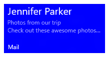
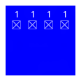
次の例では、アダプティブ タイル テンプレートで何を作成できるかを示しています。
<tile>
  <visual>

    <binding template="TileMedium">
      ...
    </binding>

    <binding template="TileWide">
      <text hint-style="subtitle">Jennifer Parker</text>
      <text hint-style="captionSubtle">Photos from our trip</text>
      <text hint-style="captionSubtle">Check out these awesome photos I took while in New Zealand!</text>
    </binding>

    <binding template="TileLarge">
      ...
    </binding>

  </visual>
</tile>
TileContent content = new TileContent()
{
    Visual = new TileVisual()
    {
        TileMedium = ...

        TileWide = new TileBinding()
        {
            Content = new TileBindingContentAdaptive()
            {
                Children =
                {
                    new AdaptiveText()
                    {
                        Text = "Jennifer Parker",
                        HintStyle = AdaptiveTextStyle.Subtitle
                    },

                    new AdaptiveText()
                    {
                        Text = "Photos from our trip",
                        HintStyle = AdaptiveTextStyle.CaptionSubtle
                    },

                    new AdaptiveText()
                    {
                        Text = "Check out these awesome photos I took while in New Zealand!",
                        HintStyle = AdaptiveTextStyle.CaptionSubtle
                    }
                }
            }
        },

        TileLarge = ...
    }
};
結果:
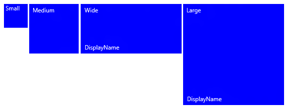
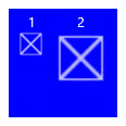
タイルのサイズ
各タイル サイズのコンテンツは XML ペイロード内でそれぞれ個別の TileBinding 要素で指定します。 template 属性を次のいずれかの値に設定することで、目的のサイズを選びます。
- TileSmall
- TileMedium
- TileWide
- TileLarge (デスクトップの場合のみ)
次の例では、1 つのタイル通知 XML ペイロード内で、サポートする各タイル サイズを <binding> 要素で指定しています。
<tile>
  <visual>

    <binding template="TileSmall">
      <text>Small</text>
    </binding>

    <binding template="TileMedium">
      <text>Medium</text>
    </binding>

    <binding template="TileWide">
      <text>Wide</text>
    </binding>

    <binding template="TileLarge">
      <text>Large</text>
    </binding>

  </visual>
</tile>
TileContent content = new TileContent()
{
    Visual = new TileVisual()
    {
        TileSmall = new TileBinding()
        {
            Content = new TileBindingContentAdaptive()
            {
                Children =
                {
                    new AdaptiveText() { Text = "Small" }
                }
            }
        },

        TileMedium = new TileBinding()
        {
            Content = new TileBindingContentAdaptive()
            {
                Children =
                {
                    new AdaptiveText() { Text = "Medium" }
                }
            }
        },

        TileWide = new TileBinding()
        {
            Content = new TileBindingContentAdaptive()
            {
                Children =
                {
                    new AdaptiveText() { Text = "Wide" }
                }
            }
        },

        TileLarge = new TileBinding()
        {
            Content = new TileBindingContentAdaptive()
            {
                Children =
                {
                    new AdaptiveText() { Text = "Large" }
                }
            }
        }
    }
};
結果:
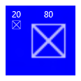
ブランド化
通知ペイロード内で branding 属性を使って、ライブ タイルの下部でブランディング (表示名とコーナー ロゴ) を制御できます。 表示なし ("none")、名前のみ表示 ("name")、ロゴのみ表示 ("logo")、名前とロゴの両方を表示 ("nameAndLogo") のいずれかを選べます。
注 Windows Mobile では、コーナー ロゴはサポートされていないため、携帯電話で "logo" と "nameAndLogo" は "name" に既定で設定されます。
<visual branding="logo">
  ...
</visual>
new TileVisual()
{
    Branding = TileBranding.Logo,
    ...
}
結果:

ブランディングは次の 2 つのいずれかの方法で特定のタイル サイズに合わせて適用できます。
- その属性を TileBinding 要素で適用する。
- その属性を TileVisual 要素で適用する。通知ペイロード全体に影響を与えます。binding 要素でブランディングを指定しない場合は、visual 要素で指定したブランディングが使われます。
<tile>
  <visual branding="nameAndLogo">

    <binding template="TileMedium" branding="logo">
      ...
    </binding>

    <!--Inherits branding from visual-->
    <binding template="TileWide">
      ...
    </binding>

  </visual>
</tile>
TileContent content = new TileContent()
{
    Visual = new TileVisual()
    {
        Branding = TileBranding.NameAndLogo,

        TileMedium = new TileBinding()
        {
            Branding = TileBranding.Logo,
            ...
        },

        // Inherits branding from Visual
        TileWide = new TileBinding()
        {
            ...
        }
    }
};
既定のブランディングの結果:
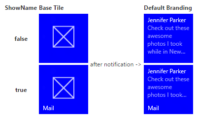
通知ペイロード内でブランディングを指定しない場合は、ベース タイルのプロパティによってブランディングが決まります。 ベース タイルに表示名が表示されている場合、ブランドは既定で "name" になります。それ以外の場合、表示名が表示されない場合、ブランドは既定で "none" になります。
注 これは、既定のブランディングが "logo" であった Windows 8.x からの変更点です。
表示名
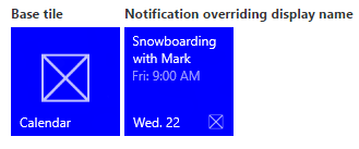
displayName 属性に任意のテキスト文字列を入力することで、通知の表示名を上書きすることができます。 ブランディングと同様、通知ペイロード全体に影響を与える TileVisual 要素で、または個々のタイルにのみ影響を与える TileBinding 要素で、表示名を指定できます。
既知の問題 Windows Mobile でタイルの ShortName を指定した場合、通知で提供される表示名は使用されません (ShortName が常に表示されます)。
<tile>
  <visual branding="nameAndLogo" displayName="Wednesday 22">

    <binding template="TileMedium" displayName="Wed. 22">
      ...
    </binding>

    <!--Inherits displayName from visual-->
    <binding template="TileWide">
      ...
    </binding>

  </visual>
</tile>
TileContent content = new TileContent()
{
    Visual = new TileVisual()
    {
        Branding = TileBranding.NameAndLogo,
        DisplayName = "Wednesday 22",

        TileMedium = new TileBinding()
        {
            DisplayName = "Wed. 22",
            ...
        },

        // Inherits DisplayName from Visual
        TileWide = new TileBinding()
        {
            ...
        }
    }
};
結果:
Text
テキストの表示には、AdaptiveText 要素を使用します。 hint を使うと、テキストの表示方法を変更できます。
<text>This is a line of text</text>
new AdaptiveText()
{
    Text = "This is a line of text"
};
結果:

テキストの折り返し
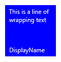
既定では、テキストは折り返されず、タイルの端からはみ出します。 hint-wrap 属性を使って、text 要素のテキストの折り返しを設定します。 また、hint-minLines と hint-maxLines (正の整数のみを受け取り) を使って、行の最小数と最大数を制御することもできます。
<text hint-wrap="true">This is a line of wrapping text</text>
new AdaptiveText()
{
    Text = "This is a line of wrapping text",
    HintWrap = true
};
結果:
テキスト スタイル
スタイルを使って、text 要素のフォントのサイズ、色、太さを制御します。 多数のスタイルを使えます。たとえば、各スタイルの "Subtle" バリエーションを使って、テキストの不透明度を 60% に設定して、テキストの色を淡い灰色で暗くすることができます。
<text hint-style="base">Header content</text>
<text hint-style="captionSubtle">Subheader content</text>
new AdaptiveText()
{
    Text = "Header content",
    HintStyle = AdaptiveTextStyle.Base
},

new AdaptiveText()
{
    Text = "Subheader content",
    HintStyle = AdaptiveTextStyle.CaptionSubtle
}
結果:
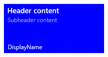
注 hint-style を指定しない場合、スタイルは既定で caption に設定されます。
基本的なテキスト スタイル
| <text hint-style="*" /> | フォントの高さ | フォントの太さ |
|---|---|---|
| caption | 12 epx (有効ピクセル) | 通常 |
| body | 15 epx | 通常 |
| base | 15 epx | 中太字 |
| subtitle | 20 epx | 通常 |
| title | 24 epx | Semilight |
| subheader | 34 epx | 白 |
| header | 46 epx | 白 |
テキスト スタイルの Numeral バリエーション
次のバリエーションでは、テキストに上下のコンテンツが近づくように、行の高さを減らすことができます。
titleNumeral
subheaderNumeral
headerNumeral
テキスト スタイルの Subtle バリエーション
各スタイルの "Subtle" バリエーションでは、テキストの不透明度を 60% に設定して、テキストの色を淡い灰色で暗くすることができます。
captionSubtle
bodySubtle
baseSubtle
subtitleSubtle
titleSubtle
titleNumeralSubtle
subheaderSubtle
subheaderNumeralSubtle
headerSubtle
headerNumeralSubtle
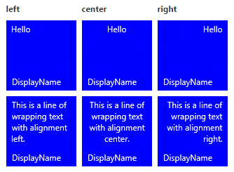
テキストの配置
テキストは、横方向の配置 (左揃え、中央揃え、または右揃え) を設定できます。 英語のように左から右へと表記される言語では、テキストは既定で左揃えになります。 アラビア語のように右から左へと表記される言語では、テキストは既定で右揃えになります。 テキストの配置は要素の hint-align 属性で手動で設定できます。
<text hint-align="center">Hello</text>
new AdaptiveText()
{
    Text = "Hello",
    HintAlign = AdaptiveTextAlign.Center
};
結果:
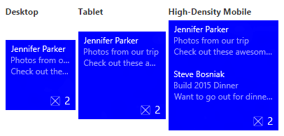
グループとサブグループ
グループを使って、グループ内のコンテンツが互いに関連していて意味をなすまとまりで表示される必要があることを宣言できます。 たとえば、2 つの text 要素、1 つのヘッダー、1 つのサブヘッダーがあるとすると、ヘッダーのみが表示されても意味をなしません。 要素をサブグループにまとめることで、それらの要素はすべて表示されるか (画面に収まる場合)、まったく表示されません (画面に収まらない場合)。
デバイスや画面間でのエクスペリエンスを最大限に高めるには、複数のグループを用意します。 複数のグループを使うと、タイルをより大きい画面に合わせて調整できます。
注 グループの有効な子は、サブグループのみです。
<binding template="TileWide" branding="nameAndLogo">
  <group>
    <subgroup>
      <text hint-style="subtitle">Jennifer Parker</text>
      <text hint-style="captionSubtle">Photos from our trip</text>
      <text hint-style="captionSubtle">Check out these awesome photos I took while in New Zealand!</text>
    </subgroup>
  </group>

  <text />

  <group>
    <subgroup>
      <text hint-style="subtitle">Steve Bosniak</text>
      <text hint-style="captionSubtle">Build 2015 Dinner</text>
      <text hint-style="captionSubtle">Want to go out for dinner after Build tonight?</text>
    </subgroup>
  </group>
</binding>
TileWide = new TileBinding()
{
    Branding = TileBranding.NameAndLogo,
    Content = new TileBindingContentAdaptive()
    {
        Children =
        {
            CreateGroup(
                from: "Jennifer Parker",
                subject: "Photos from our trip",
                body: "Check out these awesome photos I took while in New Zealand!"),

            // For spacing
            new AdaptiveText(),

            CreateGroup(
                from: "Steve Bosniak",
                subject: "Build 2015 Dinner",
                body: "Want to go out for dinner after Build tonight?")
        }
    }
}

...

private static AdaptiveGroup CreateGroup(string from, string subject, string body)
{
    return new AdaptiveGroup()
    {
        Children =
        {
            new AdaptiveSubgroup()
            {
                Children =
                {
                    new AdaptiveText()
                    {
                        Text = from,
                        HintStyle = AdaptiveTextStyle.Subtitle
                    },
                    new AdaptiveText()
                    {
                        Text = subject,
                        HintStyle = AdaptiveTextStyle.CaptionSubtle
                    },
                    new AdaptiveText()
                    {
                        Text = body,
                        HintStyle = AdaptiveTextStyle.CaptionSubtle
                    }
                }
            }
        }
    };
}
結果:
サブグループ (列)
サブグループを使って、グループのデータを意味をなすまとまりに分けることもできます。 ライブ タイルの場合、このまとまりは視覚的には列になります。
hint-weight 属性を使うと、列の幅を制御できます。 hint-weight の値は、空いているスペースに適用される重みとして表され、GridUnitType.Star と同じ動作になります。 各列の幅を同じにする場合は、各列に 1 の重みを割り当てます。
| hint-weight | 幅の割合 |
| 1 | 25% |
| 1 | 25% |
| 1 | 25% |
| 1 | 25% |
| 重み合計: 4 |
ある列の幅を別の列の幅の 2 倍にするには、狭い方の列に 1 の重みを割り当て、広い方の列に 2 の重みを割り当てます。
| hint-weight | 幅の割合 |
| 1 | 33.3% |
| 2 | 66.7% |
| 重み合計: 3 |
最初の列が全体の幅の 80% を占め、2 番目の列が全体の幅の 20% を占めるようにする場合は、最初の列に 20 の重みを割り当て、2 番目の列に 80 の重みを割り当てます。 重み合計が 100 に等しい場合、重みの値はパーセンテージとして扱われます。
| hint-weight | 幅の割合 |
| 20 | 20% |
| 80 | 80% |
| 重み合計: 100 |
注 8 ピクセルの余白が列の間に自動的に追加されます。
サブグループが 3 つ以上あるときは、正の整数のみを受け取る hint-weight を指定する必要があります。 1 番目のサブグループの hint-weight を指定しない場合、そのサブグループには 50 の重みが割り当てられます。 hint-weight を指定していない次のサブグループには、100 から前の重みの合計を引いた値に等しい重みが割り当てられます。または、引いた結果がゼロであれば、1 が割り当てられます。 hint-weight を指定していない残りのサブグループには、1 の重みが割り当てられます。
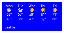
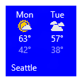
ここで示しているのは、天気タイルのサンプル コードで、等幅の 5 つの列で構成されたタイルになります。
<binding template="TileWide" displayName="Seattle" branding="name">
  <group>
    <subgroup hint-weight="1">
      <text hint-align="center">Mon</text>
      <image src="Assets\Weather\Mostly Cloudy.png" hint-removeMargin="true"/>
      <text hint-align="center">63°</text>
      <text hint-align="center" hint-style="captionsubtle">42°</text>
    </subgroup>
    <subgroup hint-weight="1">
      <text hint-align="center">Tue</text>
      <image src="Assets\Weather\Cloudy.png" hint-removeMargin="true"/>
      <text hint-align="center">57°</text>
      <text hint-align="center" hint-style="captionsubtle">38°</text>
    </subgroup>
    <subgroup hint-weight="1">
      <text hint-align="center">Wed</text>
      <image src="Assets\Weather\Sunny.png" hint-removeMargin="true"/>
      <text hint-align="center">59°</text>
      <text hint-align="center" hint-style="captionsubtle">43°</text>
    </subgroup>
    <subgroup hint-weight="1">
      <text hint-align="center">Thu</text>
      <image src="Assets\Weather\Sunny.png" hint-removeMargin="true"/>
      <text hint-align="center">62°</text>
      <text hint-align="center" hint-style="captionsubtle">42°</text>
    </subgroup>
    <subgroup hint-weight="1">
      <text hint-align="center">Fri</text>
      <image src="Assets\Weather\Sunny.png" hint-removeMargin="true"/>
      <text hint-align="center">71°</text>
      <text hint-align="center" hint-style="captionsubtle">66°</text>
    </subgroup>
  </group>
</binding>
TileWide = new TileBinding()
{
    DisplayName = "Seattle",
    Branding = TileBranding.Name,
    Content = new TileBindingContentAdaptive()
    {
        Children =
        {
            new AdaptiveGroup()
            {
                Children =
                {
                    CreateSubgroup("Mon", "Mostly Cloudy.png", "63°", "42°"),
                    CreateSubgroup("Tue", "Cloudy.png", "57°", "38°"),
                    CreateSubgroup("Wed", "Sunny.png", "59°", "43°"),
                    CreateSubgroup("Thu", "Sunny.png", "62°", "42°"),
                    CreateSubgroup("Fri", "Sunny.png", "71°", "66°")
                }
            }
        }
    }
}

...

private static AdaptiveSubgroup CreateSubgroup(string day, string image, string highTemp, string lowTemp)
{
    return new AdaptiveSubgroup()
    {
        HintWeight = 1,
        Children =
        {
            new AdaptiveText()
            {
                Text = day,
                HintAlign = AdaptiveTextAlign.Center
            },
            new AdaptiveImage()
            {
                Source = "Assets/Weather/" + image,
                HintRemoveMargin = true
            },
            new AdaptiveText()
            {
                Text = highTemp,
                HintAlign = AdaptiveTextAlign.Center
            },
            new AdaptiveText()
            {
                Text = lowTemp,
                HintAlign = AdaptiveTextAlign.Center,
                HintStyle = AdaptiveTextStyle.CaptionSubtle
            }
        }
    };
}
結果:
イメージ
<image> 要素を使って、タイル通知に画像を表示します。 画像はタイル コンテンツ (既定) 内に、背景画像としてか、タイルでアニメーション化されるプレビュー画像として、インラインで配置できます。
注意
画像は、アプリのパッケージ、アプリのローカル ストレージ、または Web から使用できます。 Fall Creators Update の時点で、Web 画像の上限は通常の接続で 3 MB、従量制課金接続で 1 MB です。 まだ Fall Creators Update を実行していないデバイスでは、Web イメージは 200 KB を上限とします。
特に動作が指定されていないと、画像は一様に拡大縮小されて、空いている幅が埋められます。 次のサンプルでは、2 列とインライン画像を使用したタイルを示しています。 インライン画像は列幅に合わせて拡大されます。
<binding template="TileMedium" displayName="Seattle" branding="name">
  <group>
    <subgroup>
      <text hint-align="center">Mon</text>
      <image src="Assets\Apps\Weather\Mostly Cloudy.png" hint-removeMargin="true"/>
      <text hint-align="center">63°</text>
      <text hint-style="captionsubtle" hint-align="center">42°</text>
    </subgroup>
    <subgroup>
      <text hint-align="center">Tue</text>
      <image src="Assets\Apps\Weather\Cloudy.png" hint-removeMargin="true"/>
      <text hint-align="center">57°</text>
      <text hint-style="captionSubtle" hint-align="center">38°</text>
    </subgroup>
  </group>
</binding>
TileMedium = new TileBinding()
{
    DisplayName = "Seattle",
    Branding = TileBranding.Name,
    Content = new TileBindingContentAdaptive()
    {
        Children =
        {
            new AdaptiveGroup()
            {
                Children =
                {
                    CreateSubgroup("Mon", "Mostly Cloudy.png", "63°", "42°"),
                    CreateSubgroup("Tue", "Cloudy.png", "57°", "38°")
                }
            }
        }
    }
}
...
private static AdaptiveSubgroup CreateSubgroup(string day, string image, string highTemp, string lowTemp)
{
    return new AdaptiveSubgroup()
    {
        Children =
        {
            new AdaptiveText()
            {
                Text = day,
                HintAlign = AdaptiveTextAlign.Center
            },
            new AdaptiveImage()
            {
                Source = "Assets/Weather/" + image,
                HintRemoveMargin = true
            },
            new AdaptiveText()
            {
                Text = highTemp,
                HintAlign = AdaptiveTextAlign.Center
            },
            new AdaptiveText()
            {
                Text = lowTemp,
                HintAlign = AdaptiveTextAlign.Center,
                HintStyle = AdaptiveTextStyle.CaptionSubtle
            }
        }
    };
}
結果:
<binding> のルート、つまり最初のグループに配置された画像も、空いている高さに合わせて拡大されます。
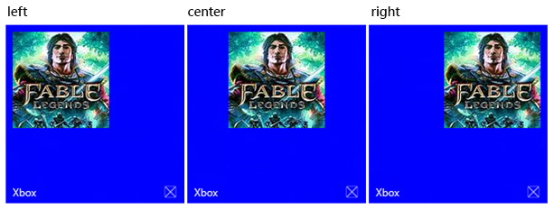
画像の配置
画像は、hint-align 属性を使って、左揃え、中央揃え、または右揃えに設定できます。 また、これにより画像は、幅を埋めるように拡大されずに、ネイティブの解像度で表示されます。
<binding template="TileLarge">
  <image src="Assets/fable.jpg" hint-align="center"/>
</binding>
TileLarge = new TileBinding()
{
    Content = new TileBindingContentAdaptive()
    {
        Children =
        {
            new AdaptiveImage()
            {
                Source = "Assets/fable.jpg",
                HintAlign = AdaptiveImageAlign.Center
            }
        }
    }
}
結果:
画像の余白
既定では、インライン画像の上または下には、コンテンツとの間に 8 ピクセルの余白が追加されます。 この余白は、画像の hint-removeMargin 属性を使って削除できます。 ただし、画像では常にタイルの端から 8 ピクセルの余白が保持され、サブグループ (列) では常に列の間に 8 ピクセルのパディングが保持されます。
<binding template="TileMedium" branding="none">
  <group>
    <subgroup>
      <text hint-align="center">Mon</text>
      <image src="Assets\Numbers\4.jpg" hint-removeMargin="true"/>
      <text hint-align="center">63°</text>
      <text hint-style="captionsubtle" hint-align="center">42°</text>
    </subgroup>
    <subgroup>
      <text hint-align="center">Tue</text>
      <image src="Assets\Numbers\3.jpg" hint-removeMargin="true"/>
      <text hint-align="center">57°</text>
      <text hint-style="captionsubtle" hint-align="center">38°</text>
    </subgroup>
  </group>
</binding>
TileMedium = new TileBinding()
{
    Branding = TileBranding.None,
    Content = new TileBindingContentAdaptive()
    {
        Children =
        {
            new AdaptiveGroup()
            {
                Children =
                {
                    CreateSubgroup("Mon", "4.jpg", "63°", "42°"),
                    CreateSubgroup("Tue", "3.jpg", "57°", "38°")
                }
            }
        }
    }
}

...

private static AdaptiveSubgroup CreateSubgroup(string day, string image, string highTemp, string lowTemp)
{
    return new AdaptiveSubgroup()
    {
        HintWeight = 1,
        Children =
        {
            new AdaptiveText()
            {
                Text = day,
                HintAlign = AdaptiveTextAlign.Center
            },
            new AdaptiveImage()
            {
                Source = "Assets/Numbers/" + image,
                HintRemoveMargin = true
            },
            new AdaptiveText()
            {
                Text = highTemp,
                HintAlign = AdaptiveTextAlign.Center
            },
            new AdaptiveText()
            {
                Text = lowTemp,
                HintAlign = AdaptiveTextAlign.Center,
                HintStyle = AdaptiveTextStyle.CaptionSubtle
            }
        }
    };
}

画像のトリミング
hint-crop 属性を使って、画像を円形にトリミングできます。現時点では、"none" (既定) または "circle" のみがサポートされています。
<binding template="TileLarge" hint-textStacking="center">
  <group>
    <subgroup hint-weight="1"/>
    <subgroup hint-weight="2">
      <image src="Assets/Apps/Hipstame/hipster.jpg" hint-crop="circle"/>
    </subgroup>
    <subgroup hint-weight="1"/>
  </group>

  <text hint-style="title" hint-align="center">Hi,</text>
  <text hint-style="subtitleSubtle" hint-align="center">MasterHip</text>
</binding>
TileLarge = new TileBinding()
{
    Content = new TileBindingContentAdaptive()
    {
        TextStacking = TileTextStacking.Center,
        Children =
        {
            new AdaptiveGroup()
            {
                Children =
                {
                    new AdaptiveSubgroup() { HintWeight = 1 },
                    new AdaptiveSubgroup()
                    {
                        HintWeight = 2,
                        Children =
                        {
                            new AdaptiveImage()
                            {
                                Source = "Assets/Apps/Hipstame/hipster.jpg",
                                HintCrop = AdaptiveImageCrop.Circle
                            }
                        }
                    },
                    new AdaptiveSubgroup() { HintWeight = 1 }
                }
            },
            new AdaptiveText()
            {
                Text = "Hi,",
                HintStyle = AdaptiveTextStyle.Title,
                HintAlign = AdaptiveTextAlign.Center
            },
            new AdaptiveText()
            {
                Text = "MasterHip",
                HintStyle = AdaptiveTextStyle.SubtitleSubtle,
                HintAlign = AdaptiveTextAlign.Center
            }
        }
    }
}
結果:

バックグラウンド画像
背景画像を設定するには、<binding> のルートに image 要素を追加し、placement 属性を "background" に設定します。
<binding template="TileWide">
  <image src="Assets\Mostly Cloudy-Background.jpg" placement="background"/>
  <group>
    <subgroup hint-weight="1">
      <text hint-align="center">Mon</text>
      <image src="Assets\Weather\Mostly Cloudy.png" hint-removeMargin="true"/>
      <text hint-align="center">63°</text>
      <text hint-align="center" hint-style="captionsubtle">42°</text>
    </subgroup>
    ...
  </group>
</binding>
TileWide = new TileBinding()
{
    Content = new TileBindingContentAdaptive()
    {
        BackgroundImage = new TileBackgroundImage()
        {
            Source = "Assets/Mostly Cloudy-Background.jpg"
        },

        Children =
        {
            new AdaptiveGroup()
            {
                Children =
                {
                    CreateSubgroup("Mon", "Mostly Cloudy.png", "63°", "42°")
                    ...
                }
            }
        }
    }
}

...

private static AdaptiveSubgroup CreateSubgroup(string day, string image, string highTemp, string lowTemp)
{
    return new AdaptiveSubgroup()
    {
        HintWeight = 1,
        Children =
        {
            new AdaptiveText()
            {
                Text = day,
                HintAlign = AdaptiveTextAlign.Center
            },
            new AdaptiveImage()
            {
                Source = "Assets/Weather/" + image,
                HintRemoveMargin = true
            },
            new AdaptiveText()
            {
                Text = highTemp,
                HintAlign = AdaptiveTextAlign.Center
            },
            new AdaptiveText()
            {
                Text = lowTemp,
                HintAlign = AdaptiveTextAlign.Center,
                HintStyle = AdaptiveTextStyle.CaptionSubtle
            }
        }
    };
}
結果:

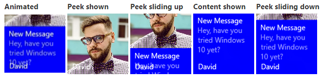
プレビュー画像
タイルでアニメーション化されるプレビュー画像を指定できます。 プレビュー画像はタイルでアニメーション化されます。コンテンツが下にスライドしてプレビューが現れ、上にスライドしてプレビューが隠れます。 プレビュー画像を設定するには、<binding> のルートに image 要素を追加し、placement 属性を "peek" に設定します。
<binding template="TileMedium" branding="name">
  <image placement="peek" src="Assets/Apps/Hipstame/hipster.jpg"/>
  <text>New Message</text>
  <text hint-style="captionsubtle" hint-wrap="true">Hey, have you tried Windows 10 yet?</text>
</binding>
TileWide = new TileBinding()
{
    Branding = TileBranding.Name,
    Content = new TileBindingContentAdaptive()
    {
        PeekImage = new TilePeekImage()
        {
            Source = "Assets/Apps/Hipstame/hipster.jpg"
        },
        Children =
        {
            new AdaptiveText()
            {
                Text = "New Message"
            },
            new AdaptiveText()
            {
                Text = "Hey, have you tried Windows 10 yet?",
                HintStyle = AdaptiveTextStyle.CaptionSubtle,
                HintWrap = true
            }
        }
    }
}
プレビュー画像と背景画像の円トリミング
円トリミングを行うには、プレビュー画像と背景画像で hint-crop 属性を使用します。
<image placement="peek" hint-crop="circle" src="Assets/Apps/Hipstame/hipster.jpg"/>
new TilePeekImage()
{
    HintCrop = TilePeekImageCrop.Circle,
    Source = "Assets/Apps/Hipstame/hipster.jpg"
}
結果は次のようになります。

プレビュー画像と背景画像の両方を使用
タイル通知でプレビュー画像と背景画像の両方を使用するには、通知ペイロードでプレビュー画像と背景画像の両方を指定します。
結果は次のようになります。

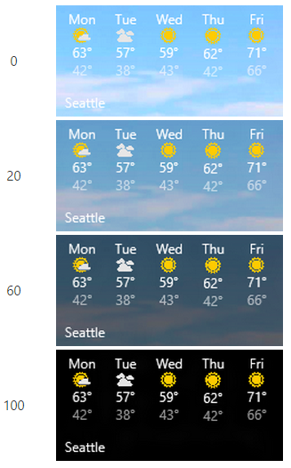
プレビュー画像と背景画像のオーバーレイ
hint-overlay を使って、背景画像とプレビュー画像上に黒のオーバーレイを設定できます。この属性は 0 ~ 100 の整数を受け取ります。0 はオーバーレイなし、100 は完全な黒のオーバーレイを表します。 オーバーレイを使うことで、タイル上のテキストを読みやすく表示できます。
背景画像での hint-overlay の使用
ペイロードにテキスト要素が含まれている場合、背景画像のオーバーレイは既定で 20% です (そうでない場合、既定のオーバーレイは 0% です)。
<binding template="TileWide">
  <image placement="background" hint-overlay="60" src="Assets\Mostly Cloudy-Background.jpg"/>
  ...
</binding>
TileWide = new TileBinding()
{
    Content = new TileBindingContentAdaptive()
    {
        BackgroundImage = new TileBackgroundImage()
        {
            Source = "Assets/Mostly Cloudy-Background.jpg",
            HintOverlay = 60
        },

        ...
    }
}
結果:
プレビュー画像での hint-overlay の使用
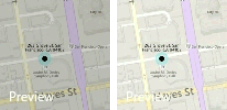
Windows 10 Version 1511 では、背景画像と同様、プレビュー画像のオーバーレイもサポートされています。 プレビュー画像要素の hint-overlay には、0 ~ 100 の整数を指定します。 プレビュー画像の既定のオーバーレイは、0 (オーバーレイなし) です。
<binding template="TileMedium">
  <image hint-overlay="20" src="Assets\Map.jpg" placement="peek"/>
  ...
</binding>
TileMedium = new TileBinding()
{
    Content = new TileBindingContentAdaptive()
    {
        PeekImage = new TilePeekImage()
        {
            Source = "Assets/Map.jpg",
            HintOverlay = 20
        },
        ...
    }
}
以下の例では、20% の不透明度 (左) と 0% の不透明度 (右) のプレビュー画像を示しています。
縦方向の配置 (テキストの積み重ね)
TileBinding 要素と AdaptiveSubgroup 要素のいずれに対しても hint-textStacking 属性を使って、タイルのコンテンツの縦方向の配置を制御できます。 既定では、コンテンツは上揃えになりますが、下揃えまたは中央揃えに設定することもできます。
binding 要素でのテキストの積み重ね
テキストの積み重ねを TileBinding レベルで適用すると、ブランディング/バッジ領域の上にある縦方向のスペースに収まるように、通知コンテンツ全体の縦方向の配置が設定されます。
<binding template="TileMedium" hint-textStacking="center" branding="logo">
  <text hint-style="base" hint-align="center">Hi,</text>
  <text hint-style="captionSubtle" hint-align="center">MasterHip</text>
</binding>
TileMedium = new TileBinding()
{
    Branding = TileBranding.Logo,
    Content = new TileBindingContentAdaptive()
    {
        TextStacking = TileTextStacking.Center,
        Children =
        {
            new AdaptiveText()
            {
                Text = "Hi,",
                HintStyle = AdaptiveTextStyle.Base,
                HintAlign = AdaptiveTextAlign.Center
            },

            new AdaptiveText()
            {
                Text = "MasterHip",
                HintStyle = AdaptiveTextStyle.CaptionSubtle,
                HintAlign = AdaptiveTextAlign.Center
            }
        }
    }
}

subgroup 要素でのテキストの積み重ね
テキストの積み重ねを AdaptiveSubgroup レベルで適用すると、そのグループ内の縦方向のスペースに収まるように、サブグループ (列) コンテンツの縦方向の配置が設定されます。
<binding template="TileWide" branding="nameAndLogo">
  <group>
    <subgroup hint-weight="33">
      <image src="Assets/Apps/Hipstame/hipster.jpg" hint-crop="circle"/>
    </subgroup>
    <subgroup hint-textStacking="center">
      <text hint-style="subtitle">Hi,</text>
      <text hint-style="bodySubtle">MasterHip</text>
    </subgroup>
  </group>
</binding>
TileWide = new TileBinding()
{
    Branding = TileBranding.NameAndLogo,
    Content = new TileBindingContentAdaptive()
    {
        Children =
        {
            new AdaptiveGroup()
            {
                Children =
                {
                    // Image column
                    new AdaptiveSubgroup()
                    {
                        HintWeight = 33,
                        Children =
                        {
                            new AdaptiveImage()
                            {
                                Source = "Assets/Apps/Hipstame/hipster.jpg",
                                HintCrop = AdaptiveImageCrop.Circle
                            }
                        }
                    },

                    // Text column
                    new AdaptiveSubgroup()
                    {
                        // Vertical align its contents
                        TextStacking = TileTextStacking.Center,
                        Children =
                        {
                            new AdaptiveText()
                            {
                                Text = "Hi,",
                                HintStyle = AdaptiveTextStyle.Subtitle
                            },

                            new AdaptiveText()
                            {
                                Text = "MasterHip",
                                HintStyle = AdaptiveTextStyle.BodySubtle
                            }
                        }
                    }
                }
            }
        }
    }
}
関連トピック
- タイルのコンテンツのスキーマ
- ローカル タイル通知の送信
- 特別なタイル テンプレート
- UWP コミュニティ ツールキット - Notifications
- GitHub の Windows Notifications

Windows developer
フィードバック
以下は間もなく提供いたします。2024 年を通じて、コンテンツのフィードバック メカニズムとして GitHub の issue を段階的に廃止し、新しいフィードバック システムに置き換えます。 詳細については、「https://aka.ms/ContentUserFeedback」を参照してください。
フィードバックの送信と表示