CSS 템플릿 참조 가이드
사용자 로그인 프로세스에 대한 회사 브랜딩을 구성하면 Microsoft Entra ID를 ID 및 액세스 관리 서비스로 사용하는 애플리케이션에서 원활한 환경이 제공됩니다. CSS 템플릿을 회사 브랜딩 사용자 지정 프로세스의 일부로 사용하는 경우 이 CSS 참조 가이드를 사용합니다.
HTML 선택기
다음 CSS 스타일은 전체 페이지의 기본 본문 및 링크 스타일이 됩니다. 다른 링크 또는 텍스트에 스타일을 적용하면 CSS 선택기가 재정의됩니다.
body- 전체 페이지의 스타일- 링크 스타일:
a, a:link- 모든 링크a:hover- 마우스를 링크 위로 가져간 경우a:focus- 링크에 포커스가 있는 경우a:focus:hover- 링크에 포커스가 ‘있고’ 마우스를 링크 위로 가져간 경우a:active- 링크를 클릭한 경우
Microsoft Entra CSS 선택기
다음 CSS 선택기를 사용하여 로그인 환경의 세부 정보를 구성합니다.
.ext-background-image- 기본 라이트박스 템플릿에 배경 이미지가 포함된 컨테이너.ext-header- 컨테이너 맨 위에 있는 헤더.ext-header-logo- 컨테이너 맨 위에 있는 헤더 로고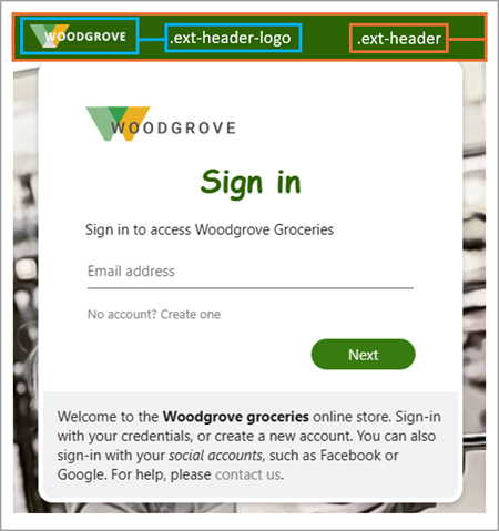
.ext-middle- 로그인 상자를 세로로 가운데에 정렬하고 가로로 중앙에 맞추는 전체 화면 배경 스타일.ext-vertical-split-main-section- 로그인 상자와 배경이 모두 포함된 세로 분할 템플릿의 부분 화면 배경 컨테이너의 스타일. 이 스타일을 ADFS(Active Directory Federation Services) 템플릿이라고도 합니다..ext-vertical-split-background-image-container- 세로 분할/ADFS 템플릿의 로그인 상자 배경.ext-sign-in-box- 로그인 상자 컨테이너.ext-title- 제목 텍스트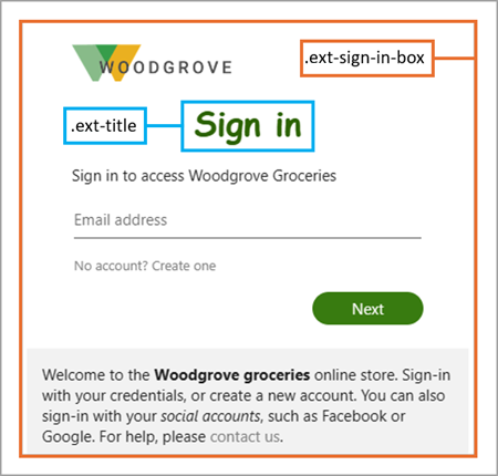
.ext-subtitle- 부제목 텍스트기본 단추의 스타일:
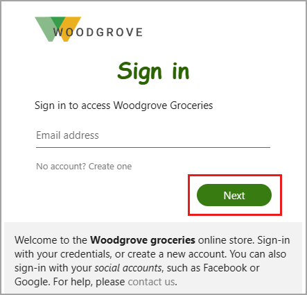
.ext-button.ext-primary- 기본 단추 기본 스타일.ext-button.ext-primary:hover- 마우스를 단추 위로 가져간 경우.ext-button.ext-primary:focus- 단추에 포커스가 있는 경우.ext-button.ext-primary:focus:hover- 단추에 포커스가 ‘있고’ 마우스를 단추 위로 가져간 경우.ext-button.ext-primary:active- 단추를 클릭한 경우
보조 단추의 스타일:
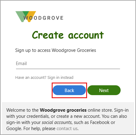
.ext-button.ext-secondary- 보조 단추.ext-button.ext-secondary:hover- 마우스를 단추 위로 가져간 경우.ext-button.ext-secondary:focus- 단추에 포커스가 있는 경우.ext-button.ext-secondary:focus:hover- 단추에 포커스가 ‘있고’ 마우스를 단추 위로 가져간 경우.ext-button.ext-secondary:active- 단추를 클릭한 경우
.ext-error- 오류 텍스트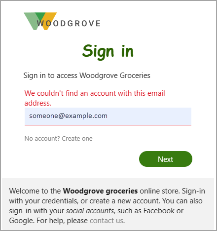
텍스트 상자의 스타일:
.ext-input.ext-text-box- 텍스트 상자.ext-input.ext-text-box.ext-has-error- 텍스트 상자와 연결된 유효성 검사 오류가 있는 경우.ext-input.ext-text-box:hover- 마우스를 텍스트 상자 위로 가져간 경우.ext-input.ext-text-box:focus- 텍스트 상자에 포커스가 있는 경우.ext-input.ext-text-box:focus:hover- 텍스트 상자에 포커스가 ‘있고’ 마우스를 텍스트 상자 위로 가져간 경우
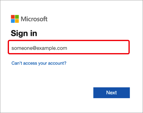
.ext-boilerplate-text- 로그인 상자 아래쪽에 있는 사용자 지정 메시지 텍스트.ext-promoted-fed-cred-box- 로그인 옵션 텍스트 상자
바닥글의 스타일:
.ext-footer- 페이지 아래쪽의 바닥글 영역.ext-footer-links- 페이지 아래쪽 바닥글의 링크 영역.ext-footer-item- 페이지 아래쪽 바닥글에 항목(예: "사용 약관" 또는 "개인 정보 및 쿠키")을 연결합니다..ext-debug-item- 페이지 아래쪽에 있는 바닥글의 디버그 세부 정보 줄임표