ListView 셀 모양 사용자 지정
클래스 Xamarin.FormsListView 는 요소를 사용하여 ViewCell 사용자 지정할 수 있는 스크롤 가능한 목록을 표시하는 데 사용됩니다. ViewCell 요소는 텍스트와 이미지를 표시하고, true/false 상태를 나타내며, 사용자 입력을 받을 수 있습니다.
기본 제공 셀
Xamarin.Forms 는 많은 애플리케이션에서 작동하는 기본 제공 셀과 함께 제공됩니다.
TextCell컨트롤은 세부 텍스트에 대한 선택적 두 번째 줄이 있는 텍스트를 표시하는 데 사용됩니다.ImageCell컨트롤은 s와TextCell비슷하지만 텍스트 왼쪽에 이미지를 포함합니다.SwitchCell컨트롤은 켜기/끄기 또는 true/false 상태를 표시하고 캡처하는 데 사용됩니다.EntryCell컨트롤은 사용자가 편집할 수 있는 텍스트 데이터를 표시하는 데 사용됩니다.
SwitchCell 및 EntryCell 컨트롤은 .의 TableView컨텍스트에서 더 일반적으로 사용됩니다.
TextCell
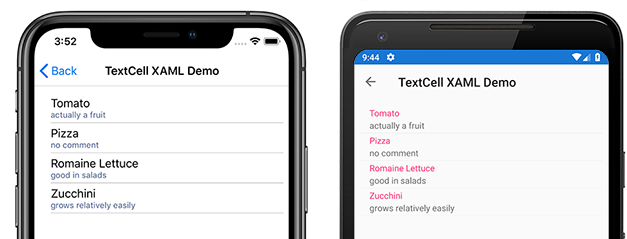
TextCell 는 필요에 따라 두 번째 줄을 세부 텍스트로 사용하여 텍스트를 표시하기 위한 셀입니다. 다음 스크린샷은 iOS 및 Android의 항목을 보여줍니다 TextCell .
TextCell은 런타임에 네이티브 컨트롤로 렌더링되므로 사용자 지정 ViewCell에 비해 성능이 매우 좋습니다. TextCell은 사용자 지정할 수 있으므로 다음 속성을 설정할 수 있습니다.
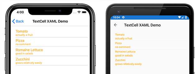
Text– 첫 번째 줄에 큰 글꼴로 표시된 텍스트입니다.Detail– 첫 번째 줄 아래에 작은 글꼴로 표시되는 텍스트입니다.TextColor– 텍스트의 색입니다.DetailColor– 세부 정보 텍스트의 색
다음 스크린샷은 사용자 지정된 색 속성이 있는 항목을 보여줍니다 TextCell .
ImageCell
ImageCell예를 TextCell들어 텍스트 및 보조 세부 정보 텍스트를 표시하는 데 사용할 수 있으며 각 플랫폼의 네이티브 컨트롤을 사용하여 뛰어난 성능을 제공합니다. ImageCellTextCell 는 텍스트의 왼쪽에 이미지를 표시한다는 점에서 다릅니다.
다음 스크린샷은 iOS 및 Android의 항목을 보여줍니다 ImageCell . 
ImageCell 는 연락처 또는 영화 목록과 같은 시각적 측면이 있는 데이터 목록을 표시해야 하는 경우에 유용합니다. ImageCells는 사용자 지정할 수 있으므로 다음을 설정할 수 있습니다.
Text– 첫 번째 줄에 큰 글꼴로 표시된 텍스트Detail– 첫 번째 줄 아래에 작은 글꼴로 표시되는 텍스트TextColor– 텍스트의 색DetailColor– 세부 정보 텍스트의 색ImageSource– 텍스트 옆에 표시할 이미지
다음 스크린샷은 사용자 지정된 색 속성이 있는 항목을 보여줍니다 ImageCell . 
사용자 지정 셀
사용자 지정 셀을 사용하면 기본 제공 셀에서 지원하지 않는 셀 레이아웃을 만들 수 있습니다. 예를 들어 가중치가 같은 두 개의 레이블이 있는 셀을 표시할 수 있습니다. A TextCell 는 더 작은 레이블이 하나 있기 때문에 TextCell 충분하지 않습니다. 대부분의 셀 사용자 지정은 추가 읽기 전용 데이터(예: 추가 레이블, 이미지 또는 기타 표시 정보)를 추가합니다.
모든 사용자 지정 셀은 모든 기본 제공 셀 형식에서 사용하는 것과 동일한 기본 클래스에서 ViewCell파생되어야 합니다.
Xamarin.Forms 는 컨트롤에 대한 캐싱 동작 을 ListView 제공하여 일부 유형의 사용자 지정 셀에 대한 스크롤 성능을 향상시킬 수 있습니다.
다음 스크린샷은 사용자 지정 셀의 예를 보여줍니다.

XAML
이전 스크린샷에 표시된 사용자 지정 셀은 다음 XAML을 사용하여 만들 수 있습니다.
<?xml version="1.0" encoding="UTF-8"?>
<ContentPage xmlns="http://xamarin.com/schemas/2014/forms"
xmlns:x="http://schemas.microsoft.com/winfx/2009/xaml"
x:Class="demoListView.ImageCellPage">
    <ContentPage.Content>
        <ListView  x:Name="listView">
            <ListView.ItemTemplate>
                <DataTemplate>
                    <ViewCell>
                        <StackLayout BackgroundColor="#eee"
                        Orientation="Vertical">
                            <StackLayout Orientation="Horizontal">
                                <Image Source="{Binding image}" />
                                <Label Text="{Binding title}"
                                TextColor="#f35e20" />
                                <Label Text="{Binding subtitle}"
                                HorizontalOptions="EndAndExpand"
                                TextColor="#503026" />
                            </StackLayout>
                        </StackLayout>
                    </ViewCell>
                </DataTemplate>
            </ListView.ItemTemplate>
        </ListView>
    </ContentPage.Content>
</ContentPage>
XAML은 다음과 같이 작동합니다.
- 사용자 지정 셀은 내부에
ListView.ItemTemplate있는 내부에 중첩DataTemplate됩니다. 이는 기본 제공 셀을 사용하는 것과 동일한 프로세스입니다. ViewCell는 사용자 지정 셀의 형식입니다. 요소의DataTemplate자식은 클래스이거나 클래스에서ViewCell파생되어야 합니다.- 내부 레이아웃은
ViewCell모든 Xamarin.Forms 레이아웃에서 관리할 수 있습니다. 이 예제에서는 배경색을StackLayout사용자 지정할 수 있는 레이아웃이 관리됩니다.
참고 항목
바인딩할 수 있는 모든 속성 StackLayout 은 사용자 지정 셀 내에 바인딩할 수 있습니다. 그러나 이 기능은 XAML 예제에 표시되지 않습니다.
코드
코드에서 사용자 지정 셀을 만들 수도 있습니다. 먼저 파생되는 사용자 지정 클래스를 ViewCell 만들어야 합니다.
public class CustomCell : ViewCell
    {
        public CustomCell()
        {
            //instantiate each of our views
            var image = new Image ();
            StackLayout cellWrapper = new StackLayout ();
            StackLayout horizontalLayout = new StackLayout ();
            Label left = new Label ();
            Label right = new Label ();

            //set bindings
            left.SetBinding (Label.TextProperty, "title");
            right.SetBinding (Label.TextProperty, "subtitle");
            image.SetBinding (Image.SourceProperty, "image");

            //Set properties for desired design
            cellWrapper.BackgroundColor = Color.FromHex ("#eee");
            horizontalLayout.Orientation = StackOrientation.Horizontal;
            right.HorizontalOptions = LayoutOptions.EndAndExpand;
            left.TextColor = Color.FromHex ("#f35e20");
            right.TextColor = Color.FromHex ("503026");

            //add views to the view hierarchy
            horizontalLayout.Children.Add (image);
            horizontalLayout.Children.Add (left);
            horizontalLayout.Children.Add (right);
            cellWrapper.Children.Add (horizontalLayout);
            View = cellWrapper;
        }
    }
페이지 생성자에서 ListView의 ItemTemplate 속성은 지정된 형식의 CustomCell 속성 DataTemplate 으로 설정됩니다.
public partial class ImageCellPage : ContentPage
    {
        public ImageCellPage ()
        {
            InitializeComponent ();
            listView.ItemTemplate = new DataTemplate (typeof(CustomCell));
        }
    }
바인딩 컨텍스트 변경 내용
사용자 지정 셀 형식의 인스턴스에 바인딩할 때 값을 표시하는 BindableProperty UI 컨트롤은 다음 코드 예제와 같이 재정의 BindableProperty 를 사용하여 OnBindingContextChanged 셀 생성자가 아닌 각 셀에 표시되도록 데이터를 설정해야 합니다.
public class CustomCell : ViewCell
{
    Label nameLabel, ageLabel, locationLabel;

    public static readonly BindableProperty NameProperty =
        BindableProperty.Create ("Name", typeof(string), typeof(CustomCell), "Name");
    public static readonly BindableProperty AgeProperty =
        BindableProperty.Create ("Age", typeof(int), typeof(CustomCell), 0);
    public static readonly BindableProperty LocationProperty =
        BindableProperty.Create ("Location", typeof(string), typeof(CustomCell), "Location");

    public string Name
    {
        get { return(string)GetValue (NameProperty); }
        set { SetValue (NameProperty, value); }
    }

    public int Age
    {
        get { return(int)GetValue (AgeProperty); }
        set { SetValue (AgeProperty, value); }
    }

    public string Location
    {
        get { return(string)GetValue (LocationProperty); }
        set { SetValue (LocationProperty, value); }
    }
    ...

    protected override void OnBindingContextChanged ()
    {
        base.OnBindingContextChanged ();

        if (BindingContext != null)
        {
            nameLabel.Text = Name;
            ageLabel.Text = Age.ToString ();
            locationLabel.Text = Location;
        }
    }
}
OnBindingContextChanged 속성 변경 값에 BindingContextChanged 대한 응답으로 이벤트가 발생할 때 재정의가 BindingContext 호출됩니다. 따라서 변경되면 BindingContext 값을 표시하는 UI 컨트롤이 BindableProperty 해당 데이터를 설정해야 합니다. BindingContext 가비지 수집에 대해 설정할 Xamarin.Forms 수 있으므로 값에 대해 null 검사 합니다. 그러면 재정의가 OnBindingContextChanged 호출됩니다.
또는 UI 컨트롤을 인스턴스에 바인딩하여 BindableProperty 값을 표시할 수 있으므로 메서드를 재정 OnBindingContextChanged 의할 필요가 없습니다.
참고 항목
재정의할 OnBindingContextChanged때 등록된 대리자가 이벤트를 받을 BindingContextChanged 수 있도록 기본 클래스의 OnBindingContextChanged 메서드가 호출되는지 확인합니다.
XAML에서는 다음 코드 예제와 같이 사용자 지정 셀 형식을 데이터에 바인딩할 수 있습니다.
<ListView x:Name="listView">
    <ListView.ItemTemplate>
        <DataTemplate>
            <local:CustomCell Name="{Binding Name}" Age="{Binding Age}" Location="{Binding Location}" />
        </DataTemplate>
    </ListView.ItemTemplate>
</ListView>
이렇게 하면 인스턴스의 Name바인딩 Age가능한 속성과 Location 기본 컬렉션에 있는 CustomCell 각 개체의 속성 Age및 Location 속성Name이 바인딩됩니다.
C#의 해당 바인딩은 다음 코드 예제에 나와 있습니다.
var customCell = new DataTemplate (typeof(CustomCell));
customCell.SetBinding (CustomCell.NameProperty, "Name");
customCell.SetBinding (CustomCell.AgeProperty, "Age");
customCell.SetBinding (CustomCell.LocationProperty, "Location");

var listView = new ListView
{
    ItemsSource = people,
    ItemTemplate = customCell
};
iOS 및 Android에서 요소를 재활용하고 사용자 지정 셀이 사용자 지정 렌더러를 사용하는 경우 ListView 사용자 지정 렌더러는 속성 변경 알림을 올바르게 구현해야 합니다. 셀을 다시 사용하면 바인딩 컨텍스트가 사용 가능한 셀의 값으로 PropertyChanged 업데이트될 때 해당 속성 값이 변경되고 이벤트가 발생합니다. 자세한 내용은 ViewCell 사용자 지정을 참조하세요. 셀 재활용에 대한 자세한 내용은 캐싱 전략을 참조 하세요.