Composite Patterns for Visual Studio
Applies to: ![]() Visual Studio
Visual Studio ![]() Visual Studio for Mac
Visual Studio for Mac
Note
This article applies to Visual Studio 2017. If you're looking for the latest Visual Studio documentation, see Visual Studio documentation. We recommend upgrading to the latest version of Visual Studio. Download it here
Composite patterns combine interaction and design elements in distinct configurations. Some of the most important composite patterns in Visual Studio with regard to consistency include:
Data visualization
Overview
Charts are a visual way to aggregate and visualize data in order to enhance decision-making. They can help users faced with a lot of data but little meaning see what deserves attention and what might need an action.
The user will benefit from a chart if any of the following conditions are true:
Will the chart help users identify tasks they can act on?
Will the chart enable users to forecast consequences of potential changes?
Will the chart help users discover trends and identify patterns?
Will the chart allow users to make better decisions?
Will the chart help answer a specific question that users may have in the given context?
General rules for charts
Clearly label data. Illustrations without explanation are just pretty pictures.
Start axes at zero to avoid skewing proportions. Line length and bar size are important visual cues to understanding the relationships between data points.
Create charts, not infographics. Infographics are artistic representations of data, and their primary goal is visual storytelling. Charts can (and should) be visually appealing, but let the data speak for itself.
Avoid skeumorphism, pictorial bar graphs, contrast hashmarks, and other infographic touches.
Do not use 3D effects as a decorative element. Use them only if they truly integral to the user's ability to comprehend the information.
Avoid using multiple lines and fills, as more than two colors can make this type of chart difficult to read and interpret correctly.
Do not use a chart (or any illustration) as the sole means of understanding a concept or interacting with data. This presents difficulties for users with visual impairments.
Do not use charts as gratuitous or decorative elements on a page. In other words, if a chart doesn't add any value or help users solve a problem, don't use it.
Chart types
Types of charts used in Visual Studio include bar charts, line charts, a modified pie chart known as a ring chart or "donut chart," timelines, scatter plots (also called "cluster charts"), and Gantt charts. Each type of chart is useful for communicating a different type of information.
Other charting considerations
Color
There is a specific palette of charting colors defined for use in Visual Studio. The palette is accessible for the major types of color blindness, and the colors can be differentiated even when used as very narrow slices of color. You can use these colors in any combination for any type of chart or graph in your UI. You do not need to use all seven colors if you do not need that many distinct colors. These colors were not designed to be used with any foreground elements, so do not place text or glyphs on top of these colors. These hues should be hard-coded and exposed to user customization under Tools > Options (see Exposing colors for end users).
| Swatch | Hex | RGB |
|---|---|---|
 |
#71B252 | 113,178,82 |
 |
#BF3F00 | 191,63,0 |
 |
#FCB714 | 252,183,20 |
 |
#903F8B | 144,63,139 |
 |
#117AD1 | 17,122,209 |
 |
#79D7F2 | 121,215,242 |
 |
#B5B5B5 | 181,181,181 |
On-object UI and peeking
This section gives context to peeking, also known as code peek view, a type of on-object UI unique to Visual Studio.
Overview
On-object UI should give the user more information or interactivity without detracting from their main task.
The main pattern for on-object UI in Visual Studio is known as "information at the point of attention."
On-object UI in Visual Studio is either inline or floating and either durable or transient.
Code peek view, a type of on-object UI in Visual Studio, is inline and durable.
CodeLens, a type of on-object UI in Visual Studio, is floating and transient
Understanding how a piece of code works, or finding details about that code, often requires a developer to switch context and go to other content or another window. These context shifts can be disruptive, because users can lose focus on their original task if they leave their main window. Furthermore, getting that original context back can be difficult, especially if switching windows caused their original code to be obscured by other UI.
On-object UI follows a pattern called "information at the point of attention." These messages, pop-up windows, and dialog boxes give users additional, relevant information that adds clarification or interactivity without losing focus on their main task. Examples of on-object UI include pop-up windows that appear when a user hovers their pointer over an icon in the notification area, the red squiggle under a misspelled word, and the peek view introduced in Visual Studio 2013.
Decision points
Within Visual Studio, there are several ways to use this pattern of information at the point of attention. Choosing the right mechanism and implementing it in a consistent, predictable way is essential to the overall experience. Otherwise, users might be presented with a confusing or inconsistent experience that detracts focus from the content itself.
Relationships between master and detail content
Information at the point of attention is used to display a relationship between content that the user is focused on (the "master" content) and additional related content (the "detail" content). In this pattern, the detail content is clearly related to the content the user is working with and can be displayed close to the master content. Supplemental information or information that cannot be summarized without overwhelming the master content should follow another pattern, such as a tool window.
Always display the detail content in close proximity to the master content.
Always ensure that the detail content still enables a user to remain focused on the master content. Often, the best way to achieve this is to render the detail content as close to the master content as possible. This can be done by rendering the detail content in a pop-up window next to the master content, or by rendering the detail content inline underneath the master content.
Never use information at the point of attention that takes the user away from the master content. If users need to view the detail content separately, expose an explicit action that enables the user to do this.
Design details
Once you have determined that on-object UI is the right choice, there are four main design considerations:
Persistence: is the content expected to be durable or transient? Will users want to keep the information visible to refer to or interact with? Or will users want to quickly glance at the information and then continue with their main task?
Content type: will the content be informational, actionable, or navigational? Does the user need additional detail about the master content? Does the user need to complete a task that affects the master content? Or does the user need to be directed to another resource?
Indicator type: does an ambient indicator make sense? Can the information be summarized in a useful way and displayed without overwhelming the master content?
Gestures: what gestures will be used to invoke and dismiss the UI? How will the user bring up the detail content and send it away? Is there value in adding a gesture such as pinning to switch between transient and durable states?
Each of these four decision points will have an impact on the major components of on-object UI.
On-object UI components
Container (content presenter) type
Floating
Inline
Content type
Informational: data that might be static or dynamic
Actionable: commands that change the master content
Navigational: links that take the user to another window or application, such as MSDN
Gestures
Invocation
Dismissal
Pinning
Other interactions
Persistence and commit model
Transient
Durable
Automatic
On-demand
Ambient indicators (optional)
Squiggle underline
Smart tag icon
Other ambient indicators
Container (content presenter) type
There are two major options available to present content at the point of attention:
Inline: an inline presenter, such as the peek view that was introduced in the Visual Studio 2013 Code Editor, makes space for new content by shifting existing content.
Prefer inline presenters if you expect users will want to spend a significant amount of time referring to or interacting with the content you present.
Avoid inline presenters if you expect users will want to glance at the information you present, then continue with their main task with minimal disruption.
Floating: a floating presenter is positioned as close to the selected content as possible but does not alter the layout of the existing content. Various strategies can be employed, such as displaying a floating content panel over the nearest available white space to the selected symbol.
Prefer floating presenters if you expect users will want to glance at the information you present, then continue with their main task with minimal disruption.
Avoid floating presenters if you expect users will want to spend a significant amount of time referring to or interacting with the content you present.
Content type
There are three main types of content that can be displayed inside any on-object UI container. Any combination of these types of information can be shown. The three types are:
Informational: most on-object UI containers will display some kind of informational content. The content can represent information about the present state of the environment or it may represent information about a potential future state of the environment. For example, it could be used to show the effect of a particular command, such as a refactoring, on the existing code.
Always use the canonical representation of the information that you display. For example, code should look like code, complete with syntax highlighting, and should respect whatever font and other environment settings the user has set.
Always consider supporting any actions over the informational content that would be possible if that same information is presented as master content. For example, if presenting existing code inside an on-object UI container, strongly consider supporting the ability to browse and modify that code.
Always consider using a different background color if presenting informational content that represents a potential future state.
Actionable: some on-object UI containers will provide the ability to perform some action over the master content, such as performing a refactoring operation.
Always position actionable commands separately from the informational content.
Always enable and disable actions when appropriate.
Always refer to the standard guidelines for representing commands inside dialog boxes.
Always keep the number of actions that are exposed in an on-object UI container to an absolute minimum. Interacting with on-object UI should be a lightweight, fast experience. The user should not have to expend energy on managing the on-object UI container itself.
Always consider how and when an on-object UI container will be closed or dismissed. As a best practice, any action that concludes the dialog between the master and detail content should also close the on-object UI container when that action is invoked.
Navigational: some on-object UI containers include links that take the user to another window or application, such as opening an MSDN article in the user's web browser.
Always prepend any navigational link with "Open" so that users will not be surprised by being navigated to some other content.
Always separate navigational links from actionable links.
Ambient indicators (optional)
Ambient indicators can be subtle, including text presented in a contrasting color from the rest of the code, or obvious, including tickler symbols such as squiggle underlines and smart tag icons. Ambient indicators communicate the availability of additional, relevant information. Ideally, they provide useful information even without requiring the user to interact with them.
Always position an ambient indicator so that it does not distract or overwhelm the user. If it is impossible to position an ambient indicator in such a way, consider another solution.
Always position the ambient indicator as close as possible to the content that it's related to.
Always try to create an indicator that summarizes the information it makes available. Consider providing a count of the number of data items available (for example, "3 references" instead of simply "References") or think of some other way to summarize the data.
- In cases where the data for an indicator cannot always be computed and displayed, immediately consider providing progressive feedback as the values are computed. For example, consider animating changes that reflect updates to the available data, similar to the way the email live tile on Windows Phone refreshes as the number of unread emails increases.
Never add more indicators than a user can reasonably take in for a given piece of content. Ambient indicators should be useful without requiring any interaction from the user. Indicators lose their ambience if they require overflow and other management controls to bring them into view.
Gestures
A key aspect of allowing the user to maintain focus on the master content is by supporting the right gestures to open and dismiss the additional detail content.
Always require the user to perform some explicit gesture to open the additional content. Common open gestures include:
Hover: tooltips or non-interactive informational content
Explicit command: inline presenter
Double-click the ambient indicator: CodeLens pop-up window
Always dismiss the detail content whenever the user presses the Esc key.
Always consider the context of the on-object UI. For content presenters that allow for interaction within the container, carefully consider whether to show additional information on hover, which is likely to be disruptive to the user's workflow.
Never display content on hover that appears to be editable or invites user interaction. This behavior can frustrate users if they try to move the cursor over the detail content, as the standard behavior for a tooltip is to immediately dismiss when the cursor is no longer over the master content that produced it.
Selection models
Overview
A selection model is the mechanism used to indicate and confirm operations on one or more objects of interest within the user interface. This topic discusses selection interaction patterns within Visual Studio document editors: text editors, design surfaces, and modeling surfaces.
Users must have a way of indicating to Visual Studio what they are working on, and Visual Studio must respond predictably with feedback to users about what it is operating on. Differences or a miscommunication between the user and the user interface can result in the user not noticing an action, which can have unintended consequences. Often, the error goes unnoticed until the user sees that something is missing or has changed. Selection models are therefore one of the most critical pieces of user interface design. Although selection models in Visual Studio are consistent with Windows, there are slight variations.
In Visual Studio, as in Windows, selection models differ depending on the context in which the interaction occurs. Selections can occur in four types of objects:
Text
Graphical objects
Lists and trees
Grids
Within these objects, there are three types of selections:
Contiguous
Disjoint
Region
Scope
The most important component of selection is ensuring that the user knows in which window they are working (activation) and where the focus is located (selection). Visual Studio extends the window management functionality in Windows, but the activation scheme is the same: interacting with a window brings focus to the window. Visual Studio has two indicators for activation: one for document windows, and one for tool windows.
For document windows, the active window is indicated by a document window tab coming to the front and changing its background color:

Active tab selection
For tool windows, the active window is indicated by a change in the color of the title bar area of the tool window:
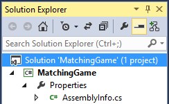
Active tool window showing primary selection of a node
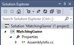
Inactive tool window, showing latent selection of node
Once a window is active, its focus is indicated according to the selection models outlined in this section of the guidelines.
Context
Visual Studio was designed to retain a strong concept of context, keeping track of where the user is working. Only one window is active, whether it is a tool or document window. However, the topmost document window always retains a latent selection. Although the focus might be in a tool window, the document window that was last active displays a selection, even in an inactive state. This is done to retain the user's context in the document they were editing, showing them that Visual Studio has retained their state so that they can return and shift seamlessly between tool windows and document windows.
Text selection
Visual Studio editors that are strictly textual, such as the built-in text editor, use the same text selection model and appearance described in the Mouse and Pointers page of the Windows User Experience Interaction Guidelines on MSDN. The input focus in the text editor is indicated by a vertical bar called the insertion point. The insertion point is a single pixel thick and colored as the inverse of whatever appears behind it. It blinks according to the rate set by the Cursor blink rate setting in the Speed tab of the Keyboard applet in Control Panel.
Contiguous and disjoint selection
Selection within the text editor is contiguous only. Disjoint text selections are not permitted, but should be addressed in graphical object editors. When the user's mouse pointer is over a text area, the cursor changes to an I-beam. A single click places the insertion point in the text editor at the click location. Holding the mouse button down starts a selection highlight and releasing the mouse button ends the selection highlight.
Region selection (box selection)
Visual Studio supports region selections in the text editor, and this is called box selection. Box selection allows the user to select a region of text that does not follow the regular text stream. As with standard text selection, the selection must be contiguous. Box selection is initiated by holding down the Alt key while dragging with the mouse. Box selection can also be initiated by holding down the Alt and Shift keys while using the arrow keys to indicate the region of selection. Box selection uses the normal selection highlight and shows the insertion point cursor blinking at the end of the selection area.
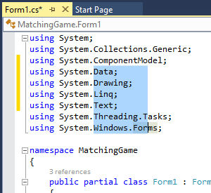
Region (box) selection in Visual Studio
Text selection appearance
The colors used for active and inactive selection in the editor can be customized. To customize the visual appearance of the editor, a user can go to Tools > Options, and then look under Environment > Fonts and Colors > Text Editor.
Graphical selection
Interaction
Graphical object selection can be complex and depends upon a number of factors:
The editor's primary selection model. Editors that contain graphical objects can also be used to edit text or grids. For example, the editor might be a text-based editor that also supports the placement of graphical objects, such as the Visual Studio XAML designer. Supporting multiple object types can affect how the user selects groups made up of different types of objects.
Support for primary and secondary selection states. An editor can provide primary and secondary selection states so that objects can be edited in unison, aligned with each other, resized together, and so on.
In-place editing support. Editors can also allow the contents of their graphical objects to be edited. For example, a rectangle shape might also contain text on the inside that can be changed by the user. In addition, that text could be centered or justified. In-place editing involves a more detailed level of user interaction and therefore requires an appropriate set of visual cues for presenting state information to the user.
Mouse interaction
| Input | Result |
|---|---|
| Click an unselected object | Selects the object and displays a dashed line and selection handles, if the object is resizable. |
| Click a selected object | Activates in-place editing if the object supports it. Clicking outside the object deactivates the in-place editing mode. |
| Double-click an object | Opens the code behind the object for editing, and might insert a default event handler, if appropriate. |
| Point to an object | Changes the pointer to the move cursor. The object's appearance, such as its luminosity or color, might change. |
| Point to a selection handle | Changes the pointer to the resize cursor. For objects that support rotation, some selection handles might change the pointer to a rotate cursor as the pointer is positioned differently (for example, moved farther away) with respect to the selection handle. |
| Drag | Even if the object is not previously selected, changes the pointer to the move cursor and moves the object. |
| Editor loses focus | Deactivates in-place editing mode, although the object retains the content and appearance it had during its last operation/selection state. |
| Object selection | Indicated by a border, dotted line, or other visually distinct treatment to highlight the boundary of the object. |
| Resize a selected object | Indicated by selection handles. A resizable object has eight handles, representing each direction in which it can be resized. Fewer handles may be used if the object can only be resized in certain directions. When the user sizes an object down to where eight handles would not be interactive, then four handles may be used. Handle sizes should be tied to the window border and edge metrics with the GetSystemMetrics API function to size in proportion to the display resolution.  |
| Rotate a selected object | 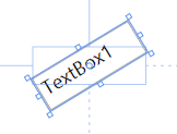 |
Keyboard interaction
| Input | Result |
|---|---|
| Tab | Moves the focus indicator among the logical order of objects in the editor. This may be left-to-right or top-to-bottom depending on TabIndex (or equivalent) property value, order of object creation, and the overall purpose of the editor. Shift+Tab reverses the direction of the focus indicator. |
| Spacebar | Activates panning mode while keystroke is maintained. Additional mouse input is required to pan the viewport position. |
| Ctrl+Spacebar | Activates zoom mode while keystroke is maintained. Additional mouse input is required to increase and decrease the zoom factor. |
| Ctrl+Alt+Minus Sign | Decreases the zoom factor by one level. |
| Ctrl+Alt+Plus Sign | Increases the zoom factor by one level. |
| Shift OR Ctrl | Adds the object to the selection group. Ctrl also allows you to remove objects individually from the selection group. |
| Enter | Performs the default command for the object (usually Open or Edit). |
| F2 | Activates in-place editing for the object. |
| Arrow keys | Moves the selected object(s) in the direction of the arrow key pressed, in small increments (for example, 1 pixel at a time) |
| Ctrl+arrow keys | Moves the selected object(s) in the direction of the arrow key pressed, in larger increments (for example, 10 pixels at a time) |
| Shift+arrow keys | Resizes the selected object(s) in the respective direction, in small increments (for example, 1 pixel at a time) |
| Ctrl+Shift+arrow keys | Resizes the selected object(s) in the respective direction, in larger increments (for example, 10 pixels at a time) |
When users edit controls in place, it might make sense for objects to automatically resize with user input. For example, if the user edits a label control, then the label should grow to display the text that the user just typed. If this is not done, the user must resize the control manually after editing the text. If the user has a lot of controls, this becomes a rote and unproductive task.
Graphical containers
In some cases, graphical editors provide containers for other graphical objects, such as the Windows Forms Panel control or the Grid Layout control in the HTML designer. If your editor provides containers for other graphical objects, then the following selection model should be used for the container only (objects within the container follow the standard model as described above):
| Input | Result |
|---|---|
| Single-click on the container | Selects the container object without directly selecting any of the contained objects. The container may be moved and/or resized with standard mouse and keyboard input (as described above). Contained objects are moved in relation to the container, but contained objects are not resized unless they are also directly selected. |
| Hover over the container's boundary region | Turns the mouse into the move cursor, indicating that the container can be moved. |
| Drag the container's boundary region | Changes the mouse to the move cursor and moves the container (and the contained objects within). The container cannot be moved without first being selected with a single click. |
| Single-click on an object within the container | Deselects the container (if selected) and selects only the clicked object. |
| Shift+click OR Ctrl+click on a contained object and/or container | Adds the clicked object to an existing selection or selection group. If the clicked object is already a member of the selection group, it is removed from the selection group. |
The contained objects should adhere to the basic selection model as described in the previous section. From usability testing of the Windows Forms designer, users expected seamless access to the contained objects without intervening steps (imposed by the containment object).
Disjoint and region selections
Graphical object editors should support disjoint selections. Please note that this graphic does not show the control appearance for Visual Studio. See Graphical object selection appearance for detailed visual specifications.
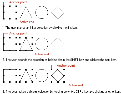
Disjoint selection
Graphical editors should also provide region selections with a marquee-type selection indicator. If the graphical editor supports other object types (such as text), then region selections might not be possible depending on the constraints of those other object types.
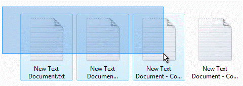
Marquee selection
Primary and secondary selections
Some graphical object editors allow the user to edit or align objects in groups. In this case, the concept of primary and secondary selections needs to be introduced. The primary selection is the object to which all other objects respond for group operations. The object that the user selects first becomes the primary control, and subsequent selections become the secondary selections. The primary selection has a distinct visual treatment from the secondary selection(s) to indicate which object is primary:

Primary selection with two secondary selections
Graphical object selection appearance
The selection handles are squares drawn in a rectangular pattern around the bounding box of the object. The chart below shows examples of the various states that a graphical object can have with handle, sizing, and in-place editing appearance. The size of the handles should be tied to window border and edge metrics using the GetSystemMetrics API.
| State | Appearance | Visual details |
|---|---|---|
| Unselected | Default |  |
| Primary selection | Resizable |  |
| Primary selection | Not resizable |  |
| Primary selection | Locked |  |
| Secondary selection | Resizable |  |
| Secondary selection | Not resizable |  |
| Secondary selection | Locked |  |
| UI active | Default |  |
View selection models
Tree view
Selection in a tree view is shown with a simple highlight. If the user clicks on a node name or a node icon, the node becomes selected. The triangular glyphs to the left of the node expand or contract the tree control but do not affect the user's selection, with one exception: upon collapsing a parent node when the selection is on a child of that node, the selection moves to the parent.
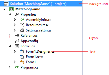
Typical tree view in Visual Studio
Tree views can support contiguous and disjoint selections, even across multiple levels in the tree. Contiguous or disjoint multiple selections must be made on visible tree nodes. If a node is collapsed, the disjoint selection is lost and the node that was collapsed obtains the selection. In this way, the user can see the nodes that will be affected by an operation. When nodes are collapsed, it becomes unclear which nodes might be affected.
When a parent node is selected, the operation should apply to the parent, though there may be cases where it makes sense for an operation to apply to the parent and all of its children. In this case, provide additional UI during the operation, such as a check box or confirmation dialog to make the "apply to all children" option explicit to the user.
Renaming
If nodes in the tree support renaming, renaming should be done in place. The in-place operation should be the standard across all tree controls in Visual Studio. Provide a rename command that immediately activates the in-place editing mode, with the text selection covering the entire name of the node, ready to accept user input. If the node represents a file, the filename should contain the extension. The selection highlight should include only the body of the filename and not the extension.
| Input | Result |
|---|---|
| Enter key | Commits the rename operation |
| Esc key | Cancels the rename operation |
| Clicking outside the in-place edit region | Commits the rename operation |
| Undo | Provide easy undo to cancel the rename operation |
Selection within lists and grid controls
The key concept in list selection is that it is row-based, meaning that when a selection is made the whole row is selected as a unit. By contrast, grids can allow specific cells to be selected without affecting any other aspect of the row. Grids might also contain a hierarchy of nested rows (such as in a TreeGrid) that allow entire branches of the hierarchy to be selected and deselected by interacting with the parent rows. Selection in lists is shown by a simple highlight color on the entire row of data. Focus is shown by a single-pixel dotted border around the current editable row or cell (row if all cells are read-only).
Note
Focus and selection are different concepts. Focus is an indication of which UI element is targeted to receive input not explicitly directed at another object, while selection refers to the state of an object's inclusion in a set of objects on which subsequent operations may take place.
Selections in lists may be contiguous, disjoint, or region. When multiple selections are allowed, contiguous and disjoint selection should always be supported, while support for region (box) selections is optional. Region selections are initiated by dragging in the white space of the list body.
| Object | Selection |
|---|---|
| List | Contiguous |
| List | Disjoint |
| List | Region |
Clicking once on a list selects the row where the click occurred. If the user happens to click in a list cell that supports in-place editing, the cell is also immediately activated for in-place editing. Otherwise, the whole row is immediately selected and shows a highlight.
Dragging in the list body does one of three things:
Initiates a region selection if the list supports it and the mouse-down is in white space
Initiates a drag/drop operation if the list cell or row supports being a drag source
Selects the current row
In-place editing
When in-place editing is allowed, there are two basic models: simple edit control and property picker. With a simple edit control, the content is highlighted and ready for user input as soon as in-place editing is activated. Where a property picker is implemented, the button that invokes the property picker is displayed once in-place editing mode is activated, and the current selection is not highlighted. The picker button should be right-justified in the cell. For in-place editing examples, see the Properties Window and Task List in Visual Studio.
Keyboard support
Keyboard support for selection in lists and grids follows the standard Windows conventions:
Arrow keys navigate the list, selecting each row/cell as the focus is moved.
Shift + arrow performs a contiguous selection in the direction of the arrow keys.
Ctrl + arrow followed by Spacebar toggles between adding and removing list items from the selection, creating a disjoint selection.
For grids that contain nested hierarchies, the Right Arrow key expands a parent row, and the Left Arrow key collapses one.
The Tab key moves focus among the cells in the current row if the cells are editable.
The Enter key performs the default command on the item in the list (often Open).
The F2 key activates in-place editing for the currently selected cell.
Persistence and saving settings
Overview
Although each software component in Visual Studio is usually responsible for its own state and persistence, Visual Studio automatically saves settings in some cases, such as with window sizes and positions. The table below is a combination of settings saved automatically and settings that require an explicit user or programmed action to be taken.
| Object | What to save | When to save | Where to save |
|---|---|---|---|
| Selectable object (for example, a line of code) | A breakpoint on a line of code A user shortcut associated with the line of code |
When the project is saved | The user options (.suo) file for the project |
| Dialog | The location of the dialog, if it had been moved The view that the user last used in the dialog |
When the dialog closes When the Visual Studio session ends |
In memory Registry in HKEY_Current_User |
| Window | The size and location of the window | When the window closes When the Visual Studio mode changes When the Visual Studio session ends |
The user options (.suo) file for the project Custom options file for window settings |
| Document | The current selection in the document The view of the document The last several places the user visited |
When the document is saved | The user options (.suo) file for the project |
| Project | References to files References to directories on disk References to other software Components State information about the project itself |
When the project is saved | The project file |
| Solution | References to projects References to files |
When the project or solution is saved | The solution (.sln) file |
| Settings in Tools > Options | Keyboard customizations Toolbar customizations Color schemes |
When the Tools > Options dialog closes When the Visual Studio session ends |
Registry in HKEY_Current_User |
What the user is doing, and when they are doing it, dictates whether a setting is being saved in memory (during the session), saved to disk (across sessions as a registry setting), as part of the project or solution file itself, as a part of the solution options (.suo) file, or as a custom settings file that only that software component knows about. The table above shows several events at which settings can be saved. However, there are other times in which you might want to save state:
When the user changes location within a dialog or window
When the user transfers focus to another window
When the user switches from design to debug mode
When the user logs off their account
When the computer goes into hibernation or shuts down
When the computer/hard drive is about to be reformatted and set up again
Window configurations
A window configuration is the basic presentation of the development environment - it is a scheme consisting of the list of tool windows present and the way in which they are arranged. For windows managed by the IDE (IDE windows), layout information is persisted per user, so when a user launches the IDE, the window layout appears the same as when they last exited Visual Studio. The state and position of IDE windows is persisted in a custom options file in XML format. Tool windows that are created by packages loaded into the IDE persist their state information in the registry and may or may not be per user.
Profile-specific layouts
Each profile includes tool window layouts, organized in a manner familiar to specific developer personas (Visual C++ developers expect to see the Solution Explorer on the left side of the IDE, while C# developers expect to see the Solution Explorer on the right). Profile-specific window layouts are loaded after the user chooses a profile on startup. A package author should determine the window layout most suitable for their customer's experience, knowing that changes that the user makes to the window configuration will then be persisted.
Touch input
Users are increasingly using Microsoft development products on touch devices. However, there are barriers that make it difficult to use development tools on touch devices. Users will expect our products to provide a reliable and precise touch experience. The intent of these guidelines is to inform decisions about which touch capabilities to incorporate and to encourage a consistent touch experience across Visual Studio and related products.
Levels of experience
The following levels of experience are intended to serve as a guide to help teams decide which touch capabilities to offer based on their desired level of investment interest in touch.
The basic experience is for teams that want to provide touch capabilities so there are no dead ends throughout their work.
The optimized experience is for teams that want to provide the most common touch capabilities (for example, those typically available in internet browser applications).
The elevated experience is for teams that want to add capabilities such as gestures or other optional capabilities that can make their application touch-first friendly.
| Basic experience | Optimized experience | Elevated experience | |
|---|---|---|---|
| Enables users to ... | Fix code and solution/project-level reading without dead ends | Perform maintenance, refactors, and navigation tasks | Operate in a consistent, intuitive, and fluid experience with confidence |
| Editor | Touch panning and selection Scrollbar touch to jump and press+drag |
Pinch zoom Fast scroll Selection Easy use of context menu |
|
| Top tool windows | List panning Item selection Scrollbar touch to jump and press+drag |
Easy item scrolling and selection | |
| Windowing | Resize window Quick access |
||
| Document well | Easy navigation between open files | ||
| Gestures | Ensure common gestures work across the IDE | Gesture-based actions Support drag-and-drop and designers |
|
| Other considerations | Custom onscreen keyboard |
Gestures
Gestures provide users a shortcut to commands that might otherwise require a more complicated interaction. Refer to the Windows guidelines on common touch gestures for Desktop Applications, and follow this guidance for most gestures, including simple gestures such as panning and zooming.