Xamarin.Forms IndicatorView
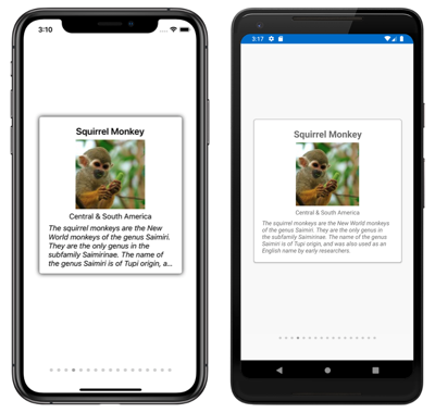
The IndicatorView is a control that displays indicators that represent the number of items, and current position, in a CarouselView:
IndicatorView defines the following properties:
Count, of typeint, the number of indicators.HideSingle, of typebool, indicates whether the indicator should be hidden when only one exists. The default value istrue.IndicatorColor, of typeColor, the color of the indicators.IndicatorSize, of typedouble, the size of the indicators. The default value is 6.0.IndicatorLayout, of typeLayout<View>, defines the layout class used to render theIndicatorView. This property is set by Xamarin.Forms, and does not typically need to be set by developers.IndicatorTemplate, of typeDataTemplate, the template that defines the appearance of each indicator.IndicatorsShape, of typeIndicatorShape, the shape of each indicator.ItemsSource, of typeIEnumerable, the collection that indicators will be displayed for. This property will automatically be set when theCarouselView.IndicatorViewproperty is set.MaximumVisible, of typeint, the maximum number of visible indicators. The default value isint.MaxValue.Position, of typeint, the currently selected indicator index. This property uses aTwoWaybinding. This property will automatically be set when theCarouselView.IndicatorViewproperty is set.SelectedIndicatorColor, of typeColor, the color of the indicator that represents the current item in theCarouselView.
These properties are backed by BindableProperty objects, which means that they can be targets of data bindings, and styled.
Create an IndicatorView
The following example shows how to instantiate an IndicatorView in XAML:
<StackLayout>
    <CarouselView ItemsSource="{Binding Monkeys}"
                  IndicatorView="indicatorView">
        <CarouselView.ItemTemplate>
            <!-- DataTemplate that defines item appearance -->
        </CarouselView.ItemTemplate>
    </CarouselView>
    <IndicatorView x:Name="indicatorView"
                   IndicatorColor="LightGray"
                   SelectedIndicatorColor="DarkGray"
                   HorizontalOptions="Center" />
</StackLayout>
In this example, the IndicatorView is rendered beneath the CarouselView, with an indicator for each item in the CarouselView. The IndicatorView is populated with data by setting the CarouselView.IndicatorView property to the IndicatorView object. Each indicator is a light gray circle, while the indicator that represents the current item in the CarouselView is dark gray.
Important
Setting the CarouselView.IndicatorView property results in the IndicatorView.Position property binding to the CarouselView.Position property, and the IndicatorView.ItemsSource property binding to the CarouselView.ItemsSource property.
Change indicator shape
The IndicatorView class has an IndicatorsShape property, which determines the shape of the indicators. This property can be set to one of the IndicatorShape enumeration members:
Circlespecifies that the indicator shapes will be circular. This is the default value of theIndicatorView.IndicatorsShapeproperty.Squareindicates that the indicator shapes will be square.
The following example shows an IndicatorView configured to use square indicators:
<IndicatorView x:Name="indicatorView"
               IndicatorsShape="Square"
               IndicatorColor="LightGray"
               SelectedIndicatorColor="DarkGray" />
Change indicator size
The IndicatorView class has an IndicatorSize property, of type double, which determines the size of the indicators in device-independent units. The default value of this property is 6.0.
The following example shows an IndicatorView configured to display larger indicators:
<IndicatorView x:Name="indicatorView"
               IndicatorSize="18" />
Limit the number of indicators displayed
The IndicatorView class has a MaximumVisible property, of type int, which determines the maximum number of visible indicators.
The following example shows an IndicatorView configured to display a maximum of six indicators:
<IndicatorView x:Name="indicatorView"
               MaximumVisible="6" />
Define indicator appearance
The appearance of each indicator can be defined by setting the IndicatorView.IndicatorTemplate property to a DataTemplate:
<StackLayout>
<CarouselView ItemsSource="{Binding Monkeys}"
IndicatorView="indicatorView">
<CarouselView.ItemTemplate>
<!-- DataTemplate that defines item appearance -->
</CarouselView.ItemTemplate>
</CarouselView>
<IndicatorView x:Name="indicatorView"
Margin="0,0,0,40"
IndicatorColor="Transparent"
SelectedIndicatorColor="Transparent"
HorizontalOptions="Center">
<IndicatorView.IndicatorTemplate>
<DataTemplate>
<Label Text=""
FontFamily="{OnPlatform iOS=Ionicons, Android=ionicons.ttf#}, Size=12}" />
</DataTemplate>
</IndicatorView.IndicatorTemplate>
</IndicatorView>
</StackLayout>
The elements specified in the DataTemplate define the appearance of each indicator. In this example, each indicator is a Label that displays a font icon.
The following screenshots show indicators rendered using a font icon:
Set visual states
IndicatorView has a Selected visual state that can be used to initiate a visual change to the indicator for the current position in the IndicatorView. A common use case for this VisualState is to change the color of the indicator that represents the current position:
<ContentPage ...>
<ContentPage.Resources>
<Style x:Key="IndicatorLabelStyle"
TargetType="Label">
<Setter Property="VisualStateManager.VisualStateGroups">
<VisualStateGroupList>
<VisualStateGroup x:Name="CommonStates">
<VisualState x:Name="Normal">
<VisualState.Setters>
<Setter Property="TextColor"
Value="LightGray" />
</VisualState.Setters>
</VisualState>
<VisualState x:Name="Selected">
<VisualState.Setters>
<Setter Property="TextColor"
Value="Black" />
</VisualState.Setters>
</VisualState>
</VisualStateGroup>
</VisualStateGroupList>
</Setter>
</Style>
</ContentPage.Resources>
<StackLayout>
...
<IndicatorView x:Name="indicatorView"
Margin="0,0,0,40"
IndicatorColor="Transparent"
SelectedIndicatorColor="Transparent"
HorizontalOptions="Center">
<IndicatorView.IndicatorTemplate>
<DataTemplate>
<Label Text=""
FontFamily="{OnPlatform iOS=Ionicons, Android=ionicons.ttf#}, Size=12}"
Style="{StaticResource IndicatorLabelStyle}" />
</DataTemplate>
</IndicatorView.IndicatorTemplate>
</IndicatorView>
</StackLayout>
</ContentPage>
In this example, the Selected visual state specifies that the indicator that represents the current position will have its TextColor set to black. Otherwise the TextColor of the indicator will be light gray:

For more information about visual states, see Xamarin.Forms Visual State Manager.
 Download the sample
