扩展器概述
通过 Expander 控件可以在类似于窗口并包括一个标头的可展开区域中提供内容。
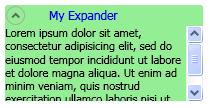
创建简单的 Expander
以下示例演示如何创建一个简单的 Expander 控件。 此示例创建与上图类似的 Expander。
<Expander Name="myExpander" Background="Tan"
          HorizontalAlignment="Left" Header="My Expander"
          ExpandDirection="Down" IsExpanded="True" Width="100">
  <TextBlock TextWrapping="Wrap">
    Lorem ipsum dolor sit amet, consectetur
    adipisicing elit, sed do eiusmod tempor incididunt ut
    labore et dolore magna aliqua
  </TextBlock>
</Expander>
Expander 的 Content 和 Header 还可包含复杂内容,例如 RadioButton 和 Image 对象。
设置展开内容区域的方向
通过使用 ExpandDirection 属性,可将一个 Expander 控件的内容区域设置为在四个方向的其中一个方向上展开(Down、Up、Left 或 Right)。 当内容区域处于折叠状态时,仅显示 ExpanderHeader 及其切换按钮。 显示方向箭头的 Button 控件可用作展开或折叠内容区域的切换按钮。 展开时,Expander 将尝试在类似于窗口的区域中显示其所有内容。
在面板中控制 Expander 的大小
如果 Expander 控件位于继承自 Panel(例如 StackPanel)的布局控件内,当 ExpandDirection 属性设置为 Down 或 Up 时,不要在 Expander 上指定 Height。 同样,当 ExpandDirection 属性设置为 Left 或 Right 时,不要在 Expander 上指定 Width。
当在 Expander 控件上以显示展开内容的方向设置大小维度时,Expander 将控制内容使用的区域,并在内容周围显示一个边框。 即使内容已折叠,也会显示该边框。 若要设置展开内容区域的大小,请在 Expander 的内容上设置大小维度,或者如果需要滚动功能,请在包含内容的 ScrollViewer 上设置大小维度。
当 Expander 控件为 DockPanel 中的最后一个元素时,Windows Presentation Foundation (WPF) 会自动将 Expander 维度设置为与 DockPanel 的其余区域相等。 若要防止此默认行为,将 DockPanel 对象上的 LastChildFill 属性设置为 false,或确保该 Expander 不是 DockPanel 中的最后一个元素。
创建可滚动内容
如果内容对于内容区域的大小而言过大,可在 ScrollViewer 中换行显示 Expander 的内容,以提供可滚动内容。 Expander 控件不自动提供滚动功能。 下图显示了包含 ScrollViewer 控件的 Expander 控件。
ScrollViewer 中的 Expander
将 Expander 控件置于 ScrollViewer 中时,将与 Expander 的内容展开方向对应的 ScrollViewer 维度属性设置为 Expander 内容区域的大小。 例如,如果将 Expander 上的 ExpandDirection 属性设置为 Down(内容区域向下展开),则将 ScrollViewer 控件上的 Height 属性设置为内容区域的必需高度。 如果设置的是内容本身的高度维度,ScrollViewer 不会识别此设置,因此也不会提供可滚动内容。
以下示例演示如何创建一个具有复杂内容并包含 ScrollViewer 控件的 Expander 控件。 此示例将创建一个类似于本部分开头图示的 Expander。
void MakeExpander()
{
  //Create containing stack panel and assign to Grid row/col
  StackPanel sp = new StackPanel();
  Grid.SetRow(sp, 0);
  Grid.SetColumn(sp, 1);
  sp.Background = Brushes.LightSalmon;

  //Create column title
  TextBlock colTitle = new TextBlock();
  colTitle.Text = "EXPANDER CREATED FROM CODE";
  colTitle.HorizontalAlignment= HorizontalAlignment.Center;
  colTitle.Margin.Bottom.Equals(20);
  sp.Children.Add(colTitle);

  //Create Expander object
  Expander exp = new Expander();

  //Create Bullet Panel for Expander Header
  BulletDecorator bp = new BulletDecorator();
  Image i = new Image();
  BitmapImage bi= new BitmapImage();
  bi.UriSource = new Uri(@"pack://application:,,/images/icon.jpg");
  i.Source = bi;
  i.Width = 10;
  bp.Bullet = i;
  TextBlock tb = new TextBlock();
  tb.Text = "My Expander";
  tb.Margin = new Thickness(20,0,0,0);
  bp.Child = tb;
  exp.Header = bp;

  //Create TextBlock with ScrollViewer for Expander Content
  StackPanel spScroll = new StackPanel();
  TextBlock tbc = new TextBlock();
  tbc.Text =
          "Lorem ipsum dolor sit amet, consectetur adipisicing elit," +
          "sed do eiusmod tempor incididunt ut labore et dolore magna" +
          "aliqua. Ut enim ad minim veniam, quis nostrud exercitation" +
          "ullamco laboris nisi ut aliquip ex ea commodo consequat." +
          "Duis aute irure dolor in reprehenderit in voluptate velit" +
          "esse cillum dolore eu fugiat nulla pariatur. Excepteur sint" +
          "occaecat cupidatat non proident, sunt in culpa qui officia" +
          "deserunt mollit anim id est laborum.";
  tbc.TextWrapping = TextWrapping.Wrap;

  spScroll.Children.Add(tbc);
  ScrollViewer scr = new ScrollViewer();
  scr.Content = spScroll;
  scr.Height = 50;
  exp.Content = scr;

  exp.Width=200;
  exp.HorizontalContentAlignment= HorizontalAlignment.Stretch;
  //Insert Expander into the StackPanel and add it to the
  //Grid
  sp.Children.Add(exp);
  myGrid.Children.Add(sp);
}
Sub MakeExpander()

    'Create containing stack panel and assign to Grid row/col
    Dim sp As StackPanel = New StackPanel()
    Grid.SetRow(sp, 0)
    Grid.SetColumn(sp, 1)
    sp.Background = Brushes.LightSalmon

    'Create column title
    Dim colTitle As TextBlock = New TextBlock()
    colTitle.Text = "EXPANDER CREATED FROM CODE"
    colTitle.HorizontalAlignment = HorizontalAlignment.Center
    colTitle.Margin.Bottom.Equals(20)
    sp.Children.Add(colTitle)

    'Create Expander object
    Dim exp As Expander = New Expander()

    'Create Bullet Panel for Expander Header
    Dim bp As BulletDecorator = New BulletDecorator()
    Dim i As Image = New Image()
    Dim bi As BitmapImage = New BitmapImage()
    bi.UriSource = New Uri("pack://application:,,./images/icon.jpg")
    i.Source = bi
    i.Width = 10
    bp.Bullet = i
    Dim tb As TextBlock = New TextBlock()
    tb.Text = "My Expander"
    tb.Margin = New Thickness(20, 0, 0, 0)
    bp.Child = tb
    exp.Header = bp

    'Create TextBlock with ScrollViewer for Expander Content
    Dim spScroll As StackPanel = New StackPanel()
    Dim tbc As TextBlock = New TextBlock()
    tbc.Text = _
            "Lorem ipsum dolor sit amet, consectetur adipisicing elit," + _
            "sed do eiusmod tempor incididunt ut labore et dolore magna" + _
            "aliqua. Ut enim ad minim veniam, quis nostrud exercitation" + _
            "ullamco laboris nisi ut aliquip ex ea commodo consequat." + _
            "Duis aute irure dolor in reprehenderit in voluptate velit" + _
            "esse cillum dolore eu fugiat nulla pariatur. Excepteur sint" + _
            "occaecat cupidatat non proident, sunt in culpa qui officia" + _
            "deserunt mollit anim id est laborum."
    tbc.TextWrapping = TextWrapping.Wrap

    spScroll.Children.Add(tbc)
    Dim scr As ScrollViewer = New ScrollViewer()
    scr.Content = spScroll
    scr.Height = 50
    exp.Content = scr

    'Insert Expander into the StackPanel and add it to the
    'Grid
    exp.Width = 200
    exp.HorizontalContentAlignment = HorizontalAlignment.Stretch
    sp.Children.Add(exp)
    myGrid.Children.Add(sp)
End Sub
<Expander Width="200" HorizontalContentAlignment="Stretch">
   <Expander.Header>
     <BulletDecorator>
       <BulletDecorator.Bullet>
         <Image Width="10" Source="images\icon.jpg"/>
       </BulletDecorator.Bullet>
       <TextBlock Margin="20,0,0,0">My Expander</TextBlock>
     </BulletDecorator>
   </Expander.Header>
   <Expander.Content>
     <ScrollViewer Height="50">
       <TextBlock TextWrapping="Wrap">
         Lorem ipsum dolor sit amet, consectetur adipisicing elit,
         sed do eiusmod tempor incididunt ut labore et dolore magna
         aliqua. Ut enim ad minim veniam, quis nostrud exercitation
         ullamco laboris nisi ut aliquip ex ea commodo consequat.
         Duis aute irure dolor in reprehenderit in voluptate velit
         esse cillum dolore eu fugiat nulla pariatur. Excepteur sint
         occaecat cupidatat non proident, sunt in culpa qui officia
         deserunt mollit anim id est laborum.
       </TextBlock>
     </ScrollViewer>
   </Expander.Content>
 </Expander>
使用对齐属性
可通过在 Expander 控件上设置 HorizontalContentAlignment 和 VerticalContentAlignment 属性来对齐内容。 当设置这些属性时,对齐将同时应用于标头和展开的内容。
另请参阅
反馈
即将发布:在整个 2024 年,我们将逐步淘汰作为内容反馈机制的“GitHub 问题”,并将其取代为新的反馈系统。 有关详细信息,请参阅:https://aka.ms/ContentUserFeedback。
提交和查看相关反馈