.NET MAUI Shell 浮出控件
 浏览示例
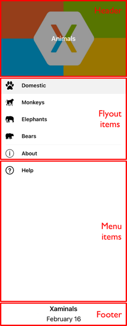
浏览示例.NET Multi-platform App UI (.NET MAUI) Shell 提供的导航体验以浮出控件和选项卡为基础。 浮出控件是 Shell 应用的可选根菜单,可完全自定义。 可以通过图标或从屏幕的一侧轻扫来访问它。 浮出控件由可选标头、浮出控件项、可选菜单项和可选页脚组成:
浮出控件项
可以将一个或多个浮出控件项添加到浮出控件中,每个浮出控件项都由 FlyoutItem 对象表示。 每个 FlyoutItem 对象应是子类化的 Shell 对象的子对象。 当浮出控件标头不存在时,浮出控件项会显示在浮出控件顶部。
以下示例创建包含两个浮出控件项的浮出控件:
<Shell xmlns="http://schemas.microsoft.com/dotnet/2021/maui"
       xmlns:x="http://schemas.microsoft.com/winfx/2009/xaml"
       xmlns:controls="clr-namespace:Xaminals.Controls"
       xmlns:views="clr-namespace:Xaminals.Views"
       x:Class="Xaminals.AppShell">
    <FlyoutItem Title="Cats"
                Icon="cat.png">
       <Tab>
           <ShellContent ContentTemplate="{DataTemplate views:CatsPage}" />
       </Tab>
    </FlyoutItem>
    <FlyoutItem Title="Dogs"
                Icon="dog.png">
       <Tab>
           <ShellContent ContentTemplate="{DataTemplate views:DogsPage}" />
       </Tab>
    </FlyoutItem>
</Shell>
FlyoutItem.Title 属性,类型为 string,可定义浮出控件项的标题。 FlyoutItem.Icon 属性,类型为 ImageSource,可定义浮出控件项的图标:
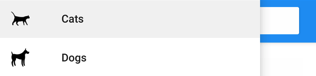
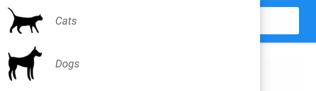
在此示例中,只能通过浮出控件项访问每个 ShellContent,而不能通过选项卡进行访问。 这是因为默认情况下,仅当浮出控件项包含多个选项卡时才会显示选项卡。
重要
在 Shell 应用中,页面会按需创建,以响应导航。 这是通过使用 DataTemplate 标记扩展将每个 ShellContent 对象的 ContentTemplate 属性设置为 ContentPage 对象来实现的。
Shell 具有隐式转换运算符,可以简化 Shell 的视觉层次结构,而无需在可视化树中引入额外的视图。 这是可能的,因为子类化的 Shell 对象只能包含 FlyoutItem 对象或 TabBar 对象,它们只能包含 Tab 对象,而此对象只能包含 ShellContent 对象。 这些隐式转换运算符可用于从前面的示例中删除 FlyoutItem 和 Tab 对象:
<Shell xmlns="http://schemas.microsoft.com/dotnet/2021/maui"
       xmlns:x="http://schemas.microsoft.com/winfx/2009/xaml"
       xmlns:controls="clr-namespace:Xaminals.Controls"
       xmlns:views="clr-namespace:Xaminals.Views"
       x:Class="Xaminals.AppShell">
   <ShellContent Title="Cats"
                 Icon="cat.png"
                 ContentTemplate="{DataTemplate views:CatsPage}" />
   <ShellContent Title="Dogs"
                 Icon="dog.png"
                 ContentTemplate="{DataTemplate views:DogsPage}" />
</Shell>
此隐式转换自动将每个 ShellContent 对象包装在 Tab 对象中,后者包装在 FlyoutItem 对象中。
注意
子类化的 Shell 对象中的所有 FlyoutItem 对象都会自动添加到 Shell.FlyoutItems 集合,该集合定义将在浮出控件中显示的项的列表。
浮出控件显示选项
FlyoutItem.FlyoutDisplayOptions 属性配置浮出控件项及其子级在浮出控件中的显示方式。 应将此属性设置为 FlyoutDisplayOptions 枚举成员:
AsSingleItem,指示项将作为单个项显示。 这是 FlyoutDisplayOptions 属性的默认值。AsMultipleItems,指示项及其直接子项将作为一组项显示在浮出控件中。
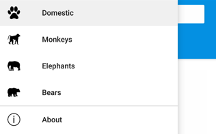
通过将 FlyoutItem.FlyoutDisplayOptions 属性设置为 AsMultipleItems,可以显示 FlyoutItem 中每个 Tab 对象的浮出控件项:
<Shell xmlns="http://schemas.microsoft.com/dotnet/2021/maui"
       xmlns:x="http://schemas.microsoft.com/winfx/2009/xaml"
       xmlns:controls="clr-namespace:Xaminals.Controls"
       xmlns:views="clr-namespace:Xaminals.Views"
       FlyoutHeaderBehavior="CollapseOnScroll"
       x:Class="Xaminals.AppShell">

    <FlyoutItem FlyoutDisplayOptions="AsMultipleItems">
        <Tab Title="Domestic"
             Icon="paw.png">
            <ShellContent Title="Cats"
                          Icon="cat.png"
                          ContentTemplate="{DataTemplate views:CatsPage}" />
            <ShellContent Title="Dogs"
                          Icon="dog.png"
                          ContentTemplate="{DataTemplate views:DogsPage}" />
        </Tab>
        <ShellContent Title="Monkeys"
                      Icon="monkey.png"
                      ContentTemplate="{DataTemplate views:MonkeysPage}" />
        <ShellContent Title="Elephants"
                      Icon="elephant.png"
                      ContentTemplate="{DataTemplate views:ElephantsPage}" />
        <ShellContent Title="Bears"
                      Icon="bear.png"
                      ContentTemplate="{DataTemplate views:BearsPage}" />
    </FlyoutItem>

    <ShellContent Title="About"
                  Icon="info.png"
                  ContentTemplate="{DataTemplate views:AboutPage}" />
</Shell>
在此示例中,将为 Tab 对象(FlyoutItem 对象的子对象)以及 ShellContent 对象(FlyoutItem 对象的子对象)创建浮出控件项。 发生这种情况是因为作为 FlyoutItem 对象子对象的每个 ShellContent 对象自动包装在 Tab 对象中。 此外,将为最终的 ShellContent 对象创建浮出控件项,该对象自动包装在 Tab 对象中,然后包装在 FlyoutItem 对象中。
注意
当 FlyoutItem 包含多个 ShellContent 对象时,将显示选项卡。
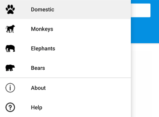
这将生成以下浮出控件项:
定义 FlyoutItem 外观
通过将 Shell.ItemTemplate 附加属性设置为 DataTemplate 可自定义每个 FlyoutItem 的外观:
<Shell ...>
    ...
    <Shell.ItemTemplate>
        <DataTemplate>
            <Grid ColumnDefinitions="0.2*,0.8*">
                <Image Source="{Binding FlyoutIcon}"
                       Margin="5"
                       HeightRequest="45" />
                <Label Grid.Column="1"
                       Text="{Binding Title}"
                       FontAttributes="Italic"
                       VerticalTextAlignment="Center" />
            </Grid>
        </DataTemplate>
    </Shell.ItemTemplate>
</Shell>
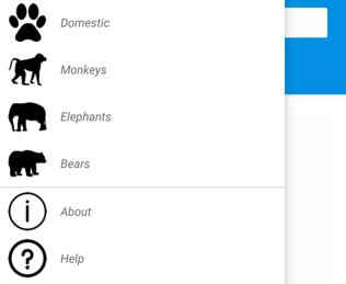
此示例以斜体显示每个 FlyoutItem 对象的标题:
Shell.ItemTemplate 是一个附加属性,因此可将不同的模板附加到特定的 FlyoutItem 对象。
注意
Shell 向 ItemTemplate 的 BindingContext 提供 Title 和 FlyoutIcon 属性。
此外,Shell 还包括三个可自动应用于 FlyoutItem 对象的样式类。 有关详细信息,请参阅样式 FlyoutItem 和 MenuItem 对象。
FlyoutItem 的默认模板
用于每个 FlyoutItem 的默认 DataTemplate 如下所示:
<DataTemplate x:Key="FlyoutTemplate">
    <Grid x:Name="FlyoutItemLayout"
          HeightRequest="{OnPlatform 44, Android=50}"
          ColumnSpacing="{OnPlatform WinUI=0}"
          RowSpacing="{OnPlatform WinUI=0}">
        <VisualStateManager.VisualStateGroups>
            <VisualStateGroupList>
                <VisualStateGroup x:Name="CommonStates">
                    <VisualState x:Name="Normal">
                        <VisualState.Setters>
                            <Setter Property="BackgroundColor"
                                    Value="Transparent" />
                        </VisualState.Setters>
                    </VisualState>
                    <VisualState x:Name="Selected">
                        <VisualState.Setters>
                            <Setter Property="BackgroundColor"
                                    Value="{AppThemeBinding Light=Black, Dark=White}" />
                        </VisualState.Setters>
                    </VisualState>
                </VisualStateGroup>
            </VisualStateGroupList>
        </VisualStateManager.VisualStateGroups>
        <Grid.ColumnDefinitions>
            <ColumnDefinition Width="{OnPlatform Android=54, iOS=50, WinUI=Auto}" />
            <ColumnDefinition Width="*" />
        </Grid.ColumnDefinitions>
        <Image x:Name="FlyoutItemImage"
               Source="{Binding FlyoutIcon}"
               VerticalOptions="Center"
               HorizontalOptions="{OnPlatform Default=Center, WinUI=Start}"
               HeightRequest="{OnPlatform Android=24, iOS=22, WinUI=16}"
               WidthRequest="{OnPlatform Android=24, iOS=22, WinUI=16}">
            <Image.Margin>
                <OnPlatform x:TypeArguments="Thickness">
                    <OnPlatform.Platforms>
                        <On Platform="WinUI"
                            Value="12,0,12,0" />
                    </OnPlatform.Platforms>
                </OnPlatform>
            </Image.Margin>
        </Image>
        <Label x:Name="FlyoutItemLabel"
               Grid.Column="1"
               Text="{Binding Title}"
               FontSize="{OnPlatform Android=14, iOS=14}"
               FontAttributes="{OnPlatform iOS=Bold}"
               HorizontalOptions="{OnPlatform WinUI=Start}"
               HorizontalTextAlignment="{OnPlatform WinUI=Start}"
               VerticalTextAlignment="Center">
            <Label.TextColor>
                <OnPlatform x:TypeArguments="Color">
                    <OnPlatform.Platforms>
                        <On Platform="Android"
                            Value="{AppThemeBinding Light=Black, Dark=White}" />
                    </OnPlatform.Platforms>
                </OnPlatform>
            </Label.TextColor>
            <Label.Margin>
                <OnPlatform x:TypeArguments="Thickness">
                    <OnPlatform.Platforms>
                        <On Platform="Android"
                            Value="20, 0, 0, 0" />
                    </OnPlatform.Platforms>
                </OnPlatform>
            </Label.Margin>
            <Label.FontFamily>
                <OnPlatform x:TypeArguments="x:String">
                    <OnPlatform.Platforms>
                        <On Platform="Android"
                            Value="sans-serif-medium" />
                    </OnPlatform.Platforms>
                </OnPlatform>
            </Label.FontFamily>
        </Label>
    </Grid>
</DataTemplate>
此模板可用作对现有浮出控件布局进行更改的基础,还显示了为浮出控件项实现的视觉状态。
此外,Grid、Image 和 Label 元素都具有 x:Name 值,因此它们可作为可视状态管理器的目标。 有关详细信息,请参阅设置多个元素的状态。
注意
还可将同一模板用于 MenuItem 对象。
替换浮出控件内容
浮出项表示浮出控件内容,可以选择将其替换为你自己的内容,方法是将 Shell.FlyoutContent 可绑定属性设置为 object:
<Shell ...
       x:Name="shell">
    ...
    <Shell.FlyoutContent>
        <CollectionView BindingContext="{x:Reference shell}"
                        IsGrouped="True"
                        ItemsSource="{Binding FlyoutItems}">
            <CollectionView.ItemTemplate>
                <DataTemplate>
                    <Label Text="{Binding Title}"
                           TextColor="White"
                           FontSize="18" />
                </DataTemplate>
            </CollectionView.ItemTemplate>
        </CollectionView>
    </Shell.FlyoutContent>
</Shell>
在此示例中,将浮出控件内容替换为 CollectionView,它显示了 FlyoutItems 集合中每个项的标题。
注意
Shell 类中的 FlyoutItems 属性是浮出控件项的只读集合。
此外,可以通过将 Shell.FlyoutContentTemplate 可绑定属性设置为 DataTemplate 来定义浮出控件内容:
<Shell ...
       x:Name="shell">
    ...
    <Shell.FlyoutContentTemplate>
        <DataTemplate>
            <CollectionView BindingContext="{x:Reference shell}"
                            IsGrouped="True"
                            ItemsSource="{Binding FlyoutItems}">
                <CollectionView.ItemTemplate>
                    <DataTemplate>
                        <Label Text="{Binding Title}"
                               TextColor="White"
                               FontSize="18" />
                    </DataTemplate>
                </CollectionView.ItemTemplate>
            </CollectionView>
        </DataTemplate>
    </Shell.FlyoutContentTemplate>
</Shell>
重要
可以选择在浮出控件内容上方显示浮出控件标头,还可以选择在浮出控件内容下显示浮出控件页脚。 如果浮出控件内容可滚动,Shell 将尝试遵循浮出控件标头的滚动行为。
菜单项
可以有选择性地将菜单项添加到浮出控件中,每个菜单项都由 MenuItem 对象表示。 浮出控件上 MenuItem 对象的位置取决于其在 Shell 视觉对象层次结构中的声明顺序。 因此,在 FlyoutItem 对象之前声明的任何 MenuItem 对象都将出现在浮出控件中的 FlyoutItem 对象之前,在 FlyoutItem 对象之后声明的任何 MenuItem 对象都将出现在浮出控件中的 FlyoutItem 对象之后。
MenuItem 类具有 Clicked 事件和 Command 属性。 因此,MenuItem 对象支持以下场景:执行一个操作以响应被点击的 MenuItem。
可将 MenuItem 对象添加到浮出控件,如下面的示例所示:
<Shell ...>
    ...
    <MenuItem Text="Help"
              IconImageSource="help.png"
              Command="{Binding HelpCommand}"
              CommandParameter="https://learn.microsoft.com/dotnet/maui/fundamentals/shell" />
</Shell>
此示例在所有浮出控件项下方,向浮出控件添加一个 MenuItem 对象:
MenuItem 对象执行名为 HelpCommand 的 ICommand,这将在系统 Web 浏览器中打开由 CommandParameter 属性指定的 URL。
定义 MenuItem 外观
通过将 Shell.MenuItemTemplate 附加属性设置为 DataTemplate 可自定义每个 MenuItem 的外观:
<Shell ...>
    <Shell.MenuItemTemplate>
        <DataTemplate>
            <Grid ColumnDefinitions="0.2*,0.8*">
                <Image Source="{Binding Icon}"
                       Margin="5"
                       HeightRequest="45" />
                <Label Grid.Column="1"
                       Text="{Binding Text}"
                       FontAttributes="Italic"
                       VerticalTextAlignment="Center" />
            </Grid>
        </DataTemplate>
    </Shell.MenuItemTemplate>
    ...
    <MenuItem Text="Help"
              IconImageSource="help.png"
              Command="{Binding HelpCommand}"
              CommandParameter="https://learn.microsoft.com/xamarin/xamarin-forms/app-fundamentals/shell" />
</Shell>
此示例会将 DataTemplate 附加到每个 MenuItem 对象,以斜体显示 MenuItem 对象的标题:
Shell.MenuItemTemplate 是一个附加属性,因此可将不同的模板附加到特定的 MenuItem 对象。
注意
Shell 向 MenuItemTemplate 的 BindingContext 提供 Text 和 IconImageSource 属性。 也可使用 Title 代替 Text 并使用 Icon 代替 IconImageSource,这样便可对菜单项和浮出控件项重复使用相同的模板。
FlyoutItem 对象的默认模板还可用于 MenuItem 对象。 有关详细信息,请参阅 FlyoutItem 的默认模板。
样式 FlyoutItem 和 MenuItem 对象
Shell 包括三个可自动应用于 FlyoutItem 和 MenuItem 对象的样式类。 样式类名为 FlyoutItemLabelStyle、FlyoutItemImageStyle 和 FlyoutItemLayoutStyle。
以下 XAML 演示一个示例,该示例定义了这些样式类的样式:
<Style TargetType="Label"
       Class="FlyoutItemLabelStyle">
    <Setter Property="TextColor"
            Value="Black" />
    <Setter Property="HeightRequest"
            Value="100" />
</Style>

<Style TargetType="Image"
       Class="FlyoutItemImageStyle">
    <Setter Property="Aspect"
            Value="Fill" />
</Style>

<Style TargetType="Layout"
       Class="FlyoutItemLayoutStyle"
       ApplyToDerivedTypes="True">
    <Setter Property="BackgroundColor"
            Value="Teal" />
</Style>
这些样式可自动应用于 FlyoutItem 和 MenuItem 对象,而无需将其 StyleClass 属性设置为样式类名。
此外,还可以定义自定义样式类并将其应用于 FlyoutItem 和 MenuItem 对象。 有关样式类的详细信息,请参阅样式类。
浮出控件标头
浮出控件标头是根据需要显示在浮出控件顶部的内容,使用可通过 Shell.FlyoutHeader 可绑定属性设置的 object 定义其外观:
<Shell ...>
    <Shell.FlyoutHeader>
        <controls:FlyoutHeader />
    </Shell.FlyoutHeader>
</Shell>
FlyoutHeader 类型如以下示例所示:
<ContentView xmlns="http://schemas.microsoft.com/dotnet/2021/maui"
             xmlns:x="http://schemas.microsoft.com/winfx/2009/xaml"
             x:Class="Xaminals.Controls.FlyoutHeader"
             HeightRequest="200">
    <Grid BackgroundColor="Black">
        <Image Aspect="AspectFill"
               Source="store.jpg"
               Opacity="0.6" />
        <Label Text="Animals"
               TextColor="White"
               FontAttributes="Bold"
               HorizontalTextAlignment="Center"
               VerticalTextAlignment="Center" />
    </Grid>
</ContentView>
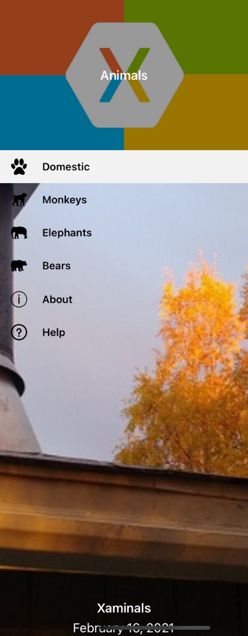
这将生成以下浮出控件标头:

还可以通过将 Shell.FlyoutHeaderTemplate 可绑定属性设置为 DataTemplate 的方式来定义浮出控件标头的外观:
<Shell ...>
    <Shell.FlyoutHeaderTemplate>
        <DataTemplate>
            <Grid BackgroundColor="Black"
                  HeightRequest="200">
                <Image Aspect="AspectFill"
                       Source="store.jpg"
                       Opacity="0.6" />
                <Label Text="Animals"
                       TextColor="White"
                       FontAttributes="Bold"
                       HorizontalTextAlignment="Center"
                       VerticalTextAlignment="Center" />
            </Grid>
        </DataTemplate>
    </Shell.FlyoutHeaderTemplate>
</Shell>
默认情况下,在浮出控件中,浮出控件标头是固定的,在有足够的项时会滚动其下方的内容。 但是,通过将 Shell.FlyoutHeaderBehavior 可绑定属性设置为 FlyoutHeaderBehavior 枚举成员之一可以更改此行为:
Default– 指示将使用的平台的默认行为。 这是FlyoutHeaderBehavior属性的默认值。Fixed– 指示浮出控件标头始终保持可见且不变。Scroll– 指示当用户滚动项时,浮出控件标头将卷出视图外。CollapseOnScroll– 指示当用户滚动项时,浮出控件标头将仅折叠到标题。
以下示例演示如何在用户滚动时折叠浮出控件标头:
<Shell ...
       FlyoutHeaderBehavior="CollapseOnScroll">
    ...
</Shell>
浮出控件页脚
浮出控件页脚是根据需要显示在浮出控件底部的内容,使用可通过 Shell.FlyoutFooter 可绑定属性设置的 object 定义其外观:
<Shell ...>
    <Shell.FlyoutFooter>
        <controls:FlyoutFooter />
    </Shell.FlyoutFooter>
</Shell>
FlyoutFooter 类型如以下示例所示:
<ContentView xmlns="http://schemas.microsoft.com/dotnet/2021/maui"
             xmlns:x="http://schemas.microsoft.com/winfx/2009/xaml"
             xmlns:sys="clr-namespace:System;assembly=netstandard"
             x:Class="Xaminals.Controls.FlyoutFooter">
    <StackLayout>
        <Label Text="Xaminals"
               TextColor="GhostWhite"
               FontAttributes="Bold"
               HorizontalOptions="Center" />
        <Label Text="{Binding Source={x:Static sys:DateTime.Now}, StringFormat='{0:MMMM dd, yyyy}'}"
               TextColor="GhostWhite"
               HorizontalOptions="Center" />
    </StackLayout>
</ContentView>
重要
前面的 XAML 示例定义了一个名为 sys 的新 XAML 命名空间:xmlns:sys="clr-namespace:System;assembly=netstandard"。 此 XAML 命名空间将 sys 映射到 .NET System 命名空间。 通过映射,可以在 XAML 中使用该命名空间中定义的 .NET 类型,如 DateTime。 有关详细信息,请参阅 XAML 命名空间。
这将生成以下浮出控件页脚:

还可以通过将 Shell.FlyoutFooterTemplate 属性设置为 DataTemplate 的方式来定义浮出控件页脚的外观:
<Shell ...>
    <Shell.FlyoutFooterTemplate>
        <DataTemplate>
            <StackLayout>
                <Label Text="Xaminals"
                       TextColor="GhostWhite"
                       FontAttributes="Bold"
                       HorizontalOptions="Center" />
                <Label Text="{Binding Source={x:Static sys:DateTime.Now}, StringFormat='{0:MMMM dd, yyyy}'}"
                       TextColor="GhostWhite"
                       HorizontalOptions="Center" />
            </StackLayout>
        </DataTemplate>
    </Shell.FlyoutFooterTemplate>
</Shell>
浮出控件页脚固定在浮出控件的底部,可以是任意高度。 此外,页脚永远不会遮挡任何菜单项。
浮出控件宽度和高度
可以通过将 Shell.FlyoutWidth" 和 Shell.FlyoutHeight 附加属性设置为 double 值来自定义浮出控件的宽度和高度:
<Shell ...
       FlyoutWidth="400"
       FlyoutHeight="200">
    ...
</Shell>
这样做可以启用多种方案,例如在整个屏幕上展开浮出控件,或降低浮出控件的高度使其不遮挡选项卡栏。
浮出控件图标
默认情况下,Shell 应用具有一个汉堡图标,按下该图标时将打开浮出控件。 可以通过设置类型为 ImageSource 的 Shell.FlyoutIcon 可绑定属性来将此图标更改为相应的图标:
<Shell ...
       FlyoutIcon="flyouticon.png">
    ...
</Shell>
浮出控件背景
可以通过 Shell.FlyoutBackgroundColor 可绑定属性设置浮出控件的背景色:
<Shell ...
       FlyoutBackgroundColor="AliceBlue">
    ...
</Shell>
注意
还可以从级联样式表 (CSS) 设置 Shell.FlyoutBackgroundColor。 有关详细信息,请参阅 .NET MAUI Shell 特定属性。
也可以通过将 Shell.FlyoutBackground 可绑定属性设置为 Brush 来指定浮出控件的背景:
<Shell ...
       FlyoutBackground="LightGray">
    ...
</Shell>
在此示例中,浮出控件背景是用浅灰色 SolidColorBrush 绘制的。
以下示例演示如何将浮出控件背景设置为 LinearGradientBrush:
<Shell ...>
    <Shell.FlyoutBackground>
        <LinearGradientBrush StartPoint="0,0"
                             EndPoint="1,1">
            <GradientStop Color="#8A2387"
                          Offset="0.1" />
            <GradientStop Color="#E94057"
                          Offset="0.6" />
            <GradientStop Color="#F27121"
                          Offset="1.0" />
        </LinearGradientBrush>
    </Shell.FlyoutBackground>
    ...
</Shell>
有关画笔的详细信息,请参阅 .NET MAUI 画笔。
浮出控件背景图像
浮出控件可以有一个可选背景图像,该图像显示在浮出控件标头的下方,并且位于任何浮出控件项、菜单项和浮出控件页脚的后面。 可以通过将类型为 ImageSource 的 FlyoutBackgroundImage 可绑定属性设置为文件、嵌入的资源、URI 或流来指定背景图像。
可以通过将类型 Aspect 的 FlyoutBackgroundImageAspect 可绑定属性设置为 Aspect 枚举成员之一来配置背景图像的纵横比:
AspectFill- 剪裁图像,使其填充显示区域,同时保持纵横比。AspectFit- 根据需要对图像上下加框,以使其适合显示区域,并根据图像的宽度或高度,将空白添加到顶部/底部或侧边。 这是FlyoutBackgroundImageAspect属性的默认值。Fill- 拉伸图像,以完全、准确填充显示区域。 这可能会导致图像失真。
以下示例演示如何设置这些属性:
<Shell ...
       FlyoutBackgroundImage="photo.jpg"
       FlyoutBackgroundImageAspect="AspectFill">
    ...
</Shell>
这将使背景图像显示在浮出控件中,位于浮出控件标头下方:
浮出控件背景
通过将 Shell.FlyoutBackdrop 附加属性设置为 Brush,可以指定浮出控件的背景(即浮出控件叠加层的外观):
<Shell ...
       FlyoutBackdrop="Silver">
    ...
</Shell>
在此示例中,浮出控件背景是用银色 SolidColorBrush 绘制的。
重要
可以在任何 Shell 元素上设置 FlyoutBackdrop 附加属性,但仅在 Shell、FlyoutItem 或 TabBar 对象上设置该属性时才会应用。
以下示例演示了如何将浮出控件背景设置为 LinearGradientBrush:
<Shell ...>
    <Shell.FlyoutBackdrop>
        <LinearGradientBrush StartPoint="0,0"
                             EndPoint="1,1">
            <GradientStop Color="#8A2387"
                          Offset="0.1" />
            <GradientStop Color="#E94057"
                          Offset="0.6" />
            <GradientStop Color="#F27121"
                          Offset="1.0" />
        </LinearGradientBrush>
    </Shell.FlyoutBackdrop>
    ...
</Shell>
有关画笔的详细信息,请参阅 .NET MAUI 画笔。
浮出控件行为
访问浮出控件的方式有两种:按汉堡图标或从屏幕一侧轻扫。 但是,通过将 Shell.FlyoutBehavior 附加属性设置为 FlyoutBehavior 枚举成员之一可以更改此行为:
Disabled– 指示用户无法打开浮出控件。Flyout– 指示用户可以打开和关闭浮出控件。 这是FlyoutBehavior属性的默认值。Locked– 指示用户无法关闭浮出控件,并且不会重叠内容。
以下示例演示如何禁用浮出控件:
<Shell ...
       FlyoutBehavior="Disabled">
    ...
</Shell>
注意
可以在 Shell、FlyoutItem、ShellContent 和页面对象上设置 FlyoutBehavior 附加属性以替代默认浮出控件行为。
浮出控件垂直滚动
默认情况下,当浮出控件中容纳不下浮出控件项时,可以垂直滚动浮出控件。 通过将 Shell.FlyoutVerticalScrollMode 可绑定属性设置为 ScrollMode 枚举成员之一可以更改此行为:
Disabled– 指示将禁用垂直滚动。Enabled– 指示将启用垂直滚动。Auto– 指示当浮出控件中容纳不下浮出控件项时,将启用垂直滚动。 这是FlyoutVerticalScrollMode属性的默认值。
以下示例演示如何禁用垂直滚动:
<Shell ...
       FlyoutVerticalScrollMode="Disabled">
    ...
</Shell>
FlyoutItem 选择
首次运行使用浮出控件的 Shell 应用时,Shell.CurrentItem 属性将被设置为子类化的 Shell 对象中的第一个 FlyoutItem 对象。 但是,此属性可以设置为另一个 FlyoutItem,如以下示例所示:
<Shell ...
       CurrentItem="{x:Reference aboutItem}">
    <FlyoutItem FlyoutDisplayOptions="AsMultipleItems">
        ...
    </FlyoutItem>
    <ShellContent x:Name="aboutItem"
                  Title="About"
                  Icon="info.png"
                  ContentTemplate="{DataTemplate views:AboutPage}" />
</Shell>
此示例将 CurrentItem 属性设置为名为 aboutItem 的 ShellContent 对象,这将导致选中并显示该对象。 在此示例中,隐式转换用于将 ShellContent 对象包装在 Tab 对象中,后者包装在 FlyoutItem 对象中。
假设有一个名为 aboutItem 的 ShellContent 对象,则等效的 C# 代码为:
CurrentItem = aboutItem;
在此示例中,CurrentItem 属性是在子类化的 Shell 类中设置的。 或者,可通过 Shell.Current 静态属性在任何类中设置 CurrentItem 属性:
Shell.Current.CurrentItem = aboutItem;
注意
应用可能会进入选择浮出控件项不是有效操作的状态。 在这种情况下,可以通过将 FlyoutItem 的 IsEnabled 属性设置为 false 来对其进行禁用。 这会阻止用户选择浮出控件项。
FlyoutItem 可见性
浮出项在浮出控件中默认可见。 但是,可以使用 FlyoutItemIsVisible 属性将项隐藏在浮出控件中,并使用 IsVisible 属性将其从浮出控件中删除:
- 类型为
bool的FlyoutItemIsVisible指示项是否已隐藏在浮出控件中但仍可以通过 GoToAsync 导航方法进行访问。 此属性的默认值为true。 - 类型为
bool的IsVisible指示是否应从可视化树中移除项,从而不在浮出控件中显示。 它的默认值为true。
以下示例演示如何在浮出控件中隐藏项:
<Shell ...>
    <FlyoutItem ...
                FlyoutItemIsVisible="False">
        ...
    </FlyoutItem>
</Shell>
注意
还有一个 Shell.FlyoutItemIsVisible 附加属性,可在 FlyoutItem、MenuItem、Tab 和 ShellContent 对象上设置该属性。
以编程方式打开和关闭浮出控件
可以通过将 Shell.FlyoutIsPresented 可绑定属性设置为指示浮出控件当前是否处于打开状态的 boolean 值来以编程方式打开和关闭浮出控件:
<Shell ...
       FlyoutIsPresented="{Binding IsFlyoutOpen}">
</Shell>
也可以在代码中执行此操作:
Shell.Current.FlyoutIsPresented = false;
反馈
即将发布:在整个 2024 年,我们将逐步淘汰作为内容反馈机制的“GitHub 问题”,并将其取代为新的反馈系统。 有关详细信息,请参阅:https://aka.ms/ContentUserFeedback。
提交和查看相关反馈