标签
 浏览示例
浏览示例.NET Multi-platform App UI (.NET MAUI) Label 可显示单行和多行文本。 Label 显示的文本可以是彩色、有间距,并且可以具有文本修饰。
Label 定义以下属性:
CharacterSpacing,类型为double,用于设置所显示文本中字符之间的间距。FontAttributes,类型为FontAttributes,用于确定文本样式。FontAutoScalingEnabled,类型为bool,用于定义文本是否反映操作系统中设置的缩放首选项。 此属性的默认值为true。string,类型的FontFamily定义字体系列。FontSize,类型为double,用于定义字体大小。FormattedText,类型为FormattedString,用于通过多个呈现选项指定文本的呈现效果,例如字体和颜色。HorizontalTextAlignment,类型为TextAlignment,用于定义所显示文本的水平对齐方式。LineBreakMode,类型为LineBreakMode,用于确定文本在一行中容纳不下时应如何处理。LineHeight,类型为double,用于指定显示文本时应用于默认行高的乘数。MaxLines,类型为int,用于指示 Label 中允许的最大行数。Padding,类型为Thickness,用于确定标签的填充。Text,类型为string,用于定义显示为标签内容的文本。TextColor,类型为 Color,用于定义所显示文本的颜色。TextDecorations,类型为TextDecorations,用于指定可应用的文本修饰符(下划线和删除线)。TextTransform,类型为TextTransform,用于指定所显示文本的大小写。TextType,类型为TextType,用于确定 Label 应显示纯文本还是 HTML 文本。VerticalTextAlignment,类型为TextAlignment,用于定义所显示文本的垂直对齐方式。
这些属性由 BindableProperty 对象提供支持,表示它们可以是数据绑定的目标,并可以设置样式。
创建标签
下面的示例演示如何创建一个 Label:
<Label Text="Hello world" />
等效 C# 代码如下:
Label label = new Label { Text = "Hello world" };
设置颜色
标签可以设置为通过 TextColor 属性使用特定文本颜色。
下面的示例设置 Label 的文本颜色:
<Label TextColor="#77d065"
       Text="This is a green label." />
有关颜色的详细信息,请参阅颜色。
设置字符间距
通过将 CharacterSpacing 属性设置为 double 值,可以将字符间距应用于 Label 对象:
<Label Text="Character spaced text"
       CharacterSpacing="10" />
结果是,Label 显示的文本中的字符为间隔开来的 CharacterSpacing 独立于设备的单位。
添加新行
有两种主要方法可用于通过 XAML 强制使 Label 中的文本进入新行:
- 使用 unicode 换行符,即“ ”。
- 使用属性元素语法指定文本。
下面的代码显示了这两种方法的示例:
<!-- Unicode line feed character -->
<Label Text="First line Second line" />
<!-- Property element syntax -->
<Label>
<Label.Text>
First line
Second line
</Label.Text>
</Label>
在 C# 中,文本可以使用“\n”字符强制换行:
Label label = new Label { Text = "First line\nSecond line" };
控制文本截断和换行
通过将 LineBreakMode 属性设置为 LineBreakMode 枚举的值 ,可以控制文本换行和截断:
NoWrap:不对文本换行,只显示一行可以容纳的文字量。 这是LineBreakMode属性的默认值。WordWrap:在单词边界处对文本换行。CharacterWrap:在字符边界处对文本换行。HeadTruncation:截断文本头部,显示文本尾部。MiddleTruncation:显示文本的开头和结尾,中间替换为省略号。TailTruncation:显示文本的开头,截断末尾。
显示特定数量的行
可以通过将 MaxLines 属性设置为 int 值来指定 Label 显示的行数:
- 当
MaxLines为 -1(默认值)时,Label 将遵循LineBreakMode属性的值,以仅显示一行(可能被截断)或显示包含全部文本的所有行。 - 当
MaxLines为 0 时,不显示 Label。 - 当
MaxLines为 1 时,结果与将LineBreakMode属性设置为NoWrap、HeadTruncation、MiddleTruncation或TailTruncation相同。 但是,Label 将遵循LineBreakMode属性的值来放置省略号(如果适用)。 - 当
MaxLines大于 1 时,Label 最多将显示指定的行数,同时在省略号的放置方面遵循LineBreakMode属性的值(如果适用)。 但是,如果LineBreakMode属性设置为NoWrap,则将MaxLines属性设置为大于 1 的值没有效果。
以下 XAML 示例演示了如何在 Label 上设置 MaxLines 属性:
<Label Text="Lorem ipsum dolor sit amet, consectetur adipiscing elit. In facilisis nulla eu felis fringilla vulputate. Nullam porta eleifend lacinia. Donec at iaculis tellus."
       LineBreakMode="WordWrap"
       MaxLines="2" />
设置行高
通过将 Label.LineHeight 属性设置为 double 值,可以自定义 Label 的垂直高度。
注意
- 在 iOS 上,
Label.LineHeight属性可更改容纳到单行中的文本的行高,以及换行到多行的文本的行高。 - 在 Android 上,
Label.LineHeight属性仅可更改换行到多行的文本的行高。 - 在 Windows 上,
Label.LineHeight属性可更改换行到多行的文本的行高。
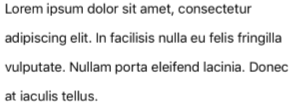
以下示例演示了如何在 Label 上设置 LineHeight 属性:
<Label Text="Lorem ipsum dolor sit amet, consectetur adipiscing elit. In facilisis nulla eu felis fringilla vulputate. Nullam porta eleifend lacinia. Donec at iaculis tellus."
       LineBreakMode="WordWrap"
       LineHeight="1.8" />
以下屏幕截图显示了将 Label.LineHeight 属性设置为 1.8 的结果:
显示 HTML
重要
在 Label 中显示 HTML 仅限于基础平台所支持的 HTML 标记。 例如,Android 仅支持 HTML 标记的子集,侧重于块级元素的基本样式和格式设置(如 <span> 和 <p>)。 对于更复杂的 HTML 呈现,请考虑使用 WebView 或 FormattedText。
Label 类具有 TextType 属性,该属性确定 Label 对象应显示纯文本还是 HTML 文本。 此属性应设置为 TextType 枚举的其中一个成员:
因此,Label 对象可以通过将 TextType 属性设置为 Html,并将 Text 属性设置为 HTML 字符串来显示 HTML:
Label label = new Label
{
    Text = "This is <span style=\"color:red;\"><strong>HTML</strong></span> text.",
    TextType = TextType.Html
};
在上面的示例中,HTML 中的双引号字符必须使用 \ 符号进行转义。
在 XAML 中,由于会对 < 和 > 符号进行额外转义,HTML 字符串可能变得不可读:
<Label Text="This is <span style="color:red"><strong>HTML</strong></span> text."
TextType="Html" />
或者,为了提高可读性,可以在 CDATA 部分中内联 HTML:
<Label TextType="Html">
<![CDATA[
<Label Text="This is <span style="color:red"><strong>HTML</strong></span> text."
]]>
</Label>
在此示例中,Text 属性设置为 CDATA 部分中内联的 HTML 字符串。 这是因为 Text 属性是 Label 类的 ContentProperty。
修饰文本
通过将 TextDecorations 属性设置为一个或多个 TextDecorations 枚举成员,可将下划线和删除线文本修饰应用于 Label 对象:
NoneUnderlineStrikethrough
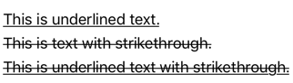
以下示例演示了如何设置 TextDecorations 属性:
<Label Text="This is underlined text." TextDecorations="Underline"  />
<Label Text="This is text with strikethrough." TextDecorations="Strikethrough" />
<Label Text="This is underlined text with strikethrough." TextDecorations="Underline, Strikethrough" />
等效 C# 代码如下:
Label underlineLabel = new Label { Text = "This is underlined text.", TextDecorations = TextDecorations.Underline };
Label strikethroughLabel = new Label { Text = "This is text with strikethrough.", TextDecorations = TextDecorations.Strikethrough };
Label bothLabel = new Label { Text = "This is underlined text with strikethrough.", TextDecorations = TextDecorations.Underline | TextDecorations.Strikethrough };
以下屏幕截图显示了应用于 Label 实例的 TextDecorations 枚举成员:
转换文本
Label 可以通过将 TextTransform 属性设置为 TextTransform 枚举的值来转换存储在 Text 属性中的文本的大小写。 此枚举有四个值:
None指示不会转换文本。Default指示将使用平台的默认行为。 这是TextTransform属性的默认值。Lowercase指示文本将被转换为小写。Uppercase指示文本将被转换为大写。
以下示例展示了如何将文本转换为大写:
<Label Text="This text will be displayed in uppercase."
       TextTransform="Uppercase" />
使用格式化文本
Label 公开一个 FormattedText 属性以允许在同一视图中呈现包含多种字体和颜色的文本。 FormattedText 属性的类型为 FormattedString,它包含一个或多个通过 Spans 属性设置的 Span 实例。
注意
无法在 Span 中显示 HTML。
Span 定义以下属性:
BackgroundColor,类型为 Color,表示范围背景的颜色。CharacterSpacing,类型为double,用于设置所显示文本中字符之间的间距。FontAttributes,类型为FontAttributes,用于确定文本样式。FontAutoScalingEnabled,类型为bool,用于定义文本是否反映操作系统中设置的缩放首选项。 此属性的默认值为true。string,类型的FontFamily定义字体系列。FontSize,类型为double,用于定义字体大小。LineHeight,类型为double,用于指定显示文本时应用于默认行高的乘数。Style,类型为 Style,是要应用于范围的样式。Text,类型为string,用于定义显示为 Span 内容的文本。TextColor,类型为 Color,用于定义所显示文本的颜色。TextDecorations,类型为TextDecorations,用于指定可应用的文本修饰符(下划线和删除线)。TextTransform,类型为TextTransform,用于指定所显示文本的大小写。
这些属性由 BindableProperty 对象提供支持,表示它们可以是数据绑定的目标,并可以设置样式。
注意
Span.LineHeight 属性对 Windows 没有影响。
此外,GestureRecognizers 属性可用于定义手势识别器的集合,这些手势识别器将响应 Span 上的手势。
下面的 XAML 示例将演示由三个 Span 实例组成的 FormattedText 属性:
<Label LineBreakMode="WordWrap">
    <Label.FormattedText>
        <FormattedString>
            <Span Text="Red Bold, " TextColor="Red" FontAttributes="Bold" />
            <Span Text="default, " FontSize="14">
                <Span.GestureRecognizers>
                    <TapGestureRecognizer Command="{Binding TapCommand}" />
                </Span.GestureRecognizers>
            </Span>
            <Span Text="italic small." FontAttributes="Italic" FontSize="12" />
        </FormattedString>
    </Label.FormattedText>
</Label>
等效 C# 代码如下:
FormattedString formattedString = new FormattedString ();
formattedString.Spans.Add (new Span { Text = "Red bold, ", TextColor = Colors.Red, FontAttributes = FontAttributes.Bold });

Span span = new Span { Text = "default, " };
span.GestureRecognizers.Add(new TapGestureRecognizer { Command = new Command(async () => await DisplayAlert("Tapped", "This is a tapped Span.", "OK")) });
formattedString.Spans.Add(span);
formattedString.Spans.Add (new Span { Text = "italic small.", FontAttributes = FontAttributes.Italic, FontSize = 14 });

Label label = new Label { FormattedText = formattedString };
下面的屏幕截图显示了生成的 Label,其中包含三个 Span 对象:

Span 还可以响应添加到跨度的 GestureRecognizers 集合中的任何手势。 例如,在上面的示例中,TapGestureRecognizer 已添加到第二个 Span 中。 因此,点击此 Span 时,TapGestureRecognizer 将通过执行 Command 属性定义的 ICommand 进行响应。 有关点击手势识别的详细信息,请参阅识别点击手势。
创建超链接
可以使用以下方法将 Label 和 Span 实例显示的文本转换为超链接:
- 设置 Label 或 Span 的
TextColor和TextDecoration属性。 - 将 TapGestureRecognizer 添加到 Label 或 Span 的
GestureRecognizers集合中,其Command属性绑定到 ICommand,并且其CommandParameter属性包含要打开的 URL。 - 定义将由 TapGestureRecognizer 执行的 ICommand。
- 编写将由 ICommand 执行的代码。
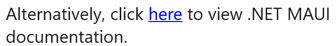
以下示例显示了 Label,其内容由多个 Span 对象设置:
<Label>
    <Label.FormattedText>
        <FormattedString>
            <Span Text="Alternatively, click " />
            <Span Text="here"
                  TextColor="Blue"
                  TextDecorations="Underline">
                <Span.GestureRecognizers>
                    <TapGestureRecognizer Command="{Binding TapCommand}"
                                          CommandParameter="https://learn.microsoft.com/dotnet/maui/" />
                </Span.GestureRecognizers>
            </Span>
            <Span Text=" to view .NET MAUI documentation." />
        </FormattedString>
    </Label.FormattedText>
</Label>
在此示例中,第一个和第三个 Span 实例包含文本,而第二个 Span 实例表示可点击的超链接。 它的文本颜色设置为蓝色,并且具有下划线文本修饰。 这会创建超链接的外观,如以下屏幕截图所示:
当点击超链接时,TapGestureRecognizer 将通过执行由其 Command 属性定义的 ICommand 来响应。 此外,CommandParameter 属性指定的 URL 将作为参数传递给 ICommand。
XAML 页的代码隐藏包含 TapCommand 实现:
using System.Windows.Input;

public partial class MainPage : ContentPage
{
    // Launcher.OpenAsync is provided by Essentials.
    public ICommand TapCommand => new Command<string>(async (url) => await Launcher.OpenAsync(url));

    public MainPage()
    {
        InitializeComponent();
        BindingContext = this;
    }
}
TapCommand 执行 Launcher.OpenAsync 方法,将 TapGestureRecognizer.CommandParameter 属性值作为参数传递。 Launcher.OpenAsync 方法将在 Web 浏览器中打开 URL。 因此,总体效果是,当在页面上点击超链接时,会出现一个 Web 浏览器,并导航到与该超链接关联的 URL。
创建可重用的超链接类
在你每次需要在应用中使用超链接时,如果使用前述的创建超链接的方法,则需要编写重复的代码。 但是,Label 和 Span 类都可以通过子类化来创建 HyperlinkLabel 和 HyperlinkSpan 类,并在其中添加手势识别器和文本格式代码。
以下示例显示了 HyperlinkSpan 类:
public class HyperlinkSpan : Span
{
    public static readonly BindableProperty UrlProperty =
        BindableProperty.Create(nameof(Url), typeof(string), typeof(HyperlinkSpan), null);

    public string Url
    {
        get { return (string)GetValue(UrlProperty); }
        set { SetValue(UrlProperty, value); }
    }

    public HyperlinkSpan()
    {
        TextDecorations = TextDecorations.Underline;
        TextColor = Colors.Blue;
        GestureRecognizers.Add(new TapGestureRecognizer
        {
            // Launcher.OpenAsync is provided by Essentials.
            Command = new Command(async () => await Launcher.OpenAsync(Url))
        });
    }
}
HyperlinkSpan 类定义 Url 属性和关联的 BindableProperty,而构造函数设置超链接外观和将会在点击超链接时做出响应的 TapGestureRecognizer。 点击 HyperlinkSpan 时,TapGestureRecognizer 将通过执行 Launcher.OpenAsync 方法在 Web 浏览器中打开 Url 属性指定的 URL。
可以通过向 XAML 添加类的实例来使用 HyperlinkSpan 类:
<ContentPage xmlns="http://schemas.microsoft.com/dotnet/2021/maui"
             xmlns:x="http://schemas.microsoft.com/winfx/2009/xaml"
             xmlns:local="clr-namespace:HyperlinkDemo"
             x:Class="HyperlinkDemo.MainPage">
    <StackLayout>
        ...
        <Label>
            <Label.FormattedText>
                <FormattedString>
                    <Span Text="Alternatively, click " />
                    <local:HyperlinkSpan Text="here"
                                         Url="https://learn.microsoft.com/dotnet/" />
                    <Span Text=" to view .NET documentation." />
                </FormattedString>
            </Label.FormattedText>
        </Label>
    </StackLayout>
</ContentPage>
反馈
即将发布:在整个 2024 年,我们将逐步淘汰作为内容反馈机制的“GitHub 问题”,并将其取代为新的反馈系统。 有关详细信息,请参阅:https://aka.ms/ContentUserFeedback。
提交和查看相关反馈