布局
.NET Multi-platform App UI (.NET MAUI) 布局类允许在应用程序中排列 UI 控件并对其进行分组。 选择布局类需要了解布局如何定位其子元素,以及布局如何调整其子元素的大小。 此外,可能还需要嵌套布局来创建所需的布局。
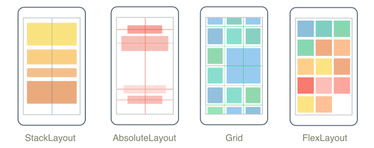
StackLayout
StackLayout 在水平或垂直方向上组织一维堆栈中的元素。 该 Orientation 属性指定元素的方向,默认方向为 Vertical。 StackLayout 通常用于在页面上排列 UI 的子部分。
以下 XAML 演示如何创建包含三个 Label 对象的垂直 StackLayout:
<StackLayout Margin="20,35,20,25">
    <Label Text="The StackLayout has its Margin property set, to control the rendering position of the StackLayout." />
    <Label Text="The Padding property can be set to specify the distance between the StackLayout and its children." />
    <Label Text="The Spacing property can be set to specify the distance between views in the StackLayout." />
</StackLayout>
在 StackLayout 中,如果未显式设置某元素的大小,则该元素将展开以填充可用宽度,如果 Orientation 属性设置为 Horizontal,则填充可用高度。
StackLayout 通常用作包含其他子布局的父布局。 但是,不应使用 StackLayout 通过 StackLayout 对象的组合来重现 Grid 布局。 以下代码显示了此错误做法的示例:
<ContentPage xmlns="http://schemas.microsoft.com/dotnet/2021/maui"
             xmlns:x="http://schemas.microsoft.com/winfx/2009/xaml"
             x:Class="Details.HomePage"
             Padding="0,20,0,0">
    <StackLayout>
        <StackLayout Orientation="Horizontal">
            <Label Text="Name:" />
            <Entry Placeholder="Enter your name" />
        </StackLayout>
        <StackLayout Orientation="Horizontal">
            <Label Text="Age:" />
            <Entry Placeholder="Enter your age" />
        </StackLayout>
        <StackLayout Orientation="Horizontal">
            <Label Text="Occupation:" />
            <Entry Placeholder="Enter your occupation" />
        </StackLayout>
        <StackLayout Orientation="Horizontal">
            <Label Text="Address:" />
            <Entry Placeholder="Enter your address" />
        </StackLayout>
    </StackLayout>
</ContentPage>
这比较浪费,因为会执行不需要的布局计算。 相反,可用通过使用 Grid 更好地实现所需的布局。
有关详细信息,请参阅 StackLayout。
HorizontalStackLayout
HorizontalStackLayout 在一维水平堆栈中组织子视图,是相较于 StackLayout 性能更高的替代方法。 HorizontalStackLayout 通常用于在页面上排列 UI 的子部分。
以下 XAML 演示如何创建包含不同子视图的 HorizontalStackLayout:
<HorizontalStackLayout Margin="20">
   <Rectangle Fill="Red"
              HeightRequest="30"
              WidthRequest="30" />
   <Label Text="Red"
          FontSize="18" />
</HorizontalStackLayout>
在 HorizontalStackLayout 中,如果未显式设置某元素的大小,则该元素会展开以填充可用高度。
有关详细信息,请参阅 HorizontalStackLayout。
VerticalStackLayout
VerticalStackLayout 在一维垂直堆栈中组织子视图,是比 StackLayout 性能更高的替代方案。 VerticalStackLayout 通常用于在页面上排列 UI 的子部分。
以下 XAML 演示如何创建包含三个 Label 对象的 VerticalStackLayout:
<VerticalStackLayout Margin="20,35,20,25">
    <Label Text="The VericalStackLayout has its Margin property set, to control the rendering position of the VerticalStackLayout." />
    <Label Text="The Padding property can be set to specify the distance between the VerticalStackLayout and its children." />
    <Label Text="The Spacing property can be set to specify the distance between views in the VerticalStackLayout." />
</VerticalStackLayout>
在 VerticalStackLayout 中,如果未显式设置某元素的大小,则该元素会展开以填充可用宽度。
有关详细信息,请参阅 VerticalStackLayout。
网格
Grid 用于显示行和列中的元素,这些元素可以有比例大小或绝对大小。 可使用 RowDefinitions 和 ColumnDefinitions 属性指定网格的行和列。
要定位特定 Grid 单元格中的元素,请使用 Grid.Column 和 Grid.Row 附加属性。 要使元素跨多个行和列,请使用 Grid.RowSpan 和 Grid.ColumnSpan 附加属性。
注意
不应将 Grid 布局与表混淆,该布局也不用于显示表格数据。
以下 XAML 演示如何创建包含两行两列的 Grid:
<Grid>
    <Grid.RowDefinitions>
        <RowDefinition Height="50" />
        <RowDefinition Height="50" />
    </Grid.RowDefinitions>
    <Grid.ColumnDefinitions>
        <ColumnDefinition Width="Auto" />
        <ColumnDefinition />
    </Grid.ColumnDefinitions>
    <Label Text="Column 0, Row 0"
           WidthRequest="200" />
    <Label Grid.Column="1"
           Text="Column 1, Row 0" />
    <Label Grid.Row="1"
           Text="Column 0, Row 1" />
    <Label Grid.Column="1"
           Grid.Row="1"
           Text="Column 1, Row 1" />
</Grid>
在此示例中,大小调整的工作原理如下:
- 每行的显式高度为 50 个独立于设备的单位。
- 第一列的宽度设置为
Auto,因此满足其子列所需的宽度。 在本例中,其宽度为 200 个与设备无关的单位以满足第一个 Label 的宽度。
可以使用自动调整大小在列或行中分配空间,从而使列和行的大小适合其内容。 可通过将 RowDefinition 的高度或 ColumnDefinition 的宽度设置为 Auto 来达成此目的。 按比例调整大小还可以用于按加权比例在网格的行和列之间分配可用空间。 可以通过将 RowDefinition 的高度或 ColumnDefinition 的宽度设置为使用 * 运算符的值来达成此目的。
注意
尽量确保将尽可能少的行和列设置为 Auto 大小。 每个自动调整大小的行或列都会导致布局引擎执行额外布局计算。 应在可能时使用固定大小的行和列。 或者,将行和列设置为使用 GridUnitType.Star 枚举值按比例占用空间量。
有关详细信息,请参阅网格。
FlexLayout
FlexLayout 类似于 StackLayout,它在堆栈中水平或垂直显示子元素。 但是,如果单个行或列中容纳太多元素,则 FlexLayout 也可以换行其子元素,并且还可以更精细地控制其子元素的大小、方向和对齐方式。
以下 XAML 演示如何创建在单个列中显示其视图的 FlexLayout:
<FlexLayout Direction="Column"
            AlignItems="Center"
            JustifyContent="SpaceEvenly">
    <Label Text="FlexLayout in Action" />
    <Button Text="Button" />
    <Label Text="Another Label" />
</FlexLayout>
在此示例中,布局的工作方式如下:
Direction属性设置为Column,这将导致 FlexLayout 的子项排列在单列项中。AlignItems属性设置为Center,这将使每个项水平居中。JustifyContent属性设置为SpaceEvenly,这将在所有项之间、第一个项上方和最后一个项下方平均分配所有剩余的垂直空间。
有关详细信息,请参阅 FlexLayout。
AbsoluteLayout
AbsoluteLayout 用于使用显式值或相对于布局大小的值来定位元素和调整元素大小。 位置由子级的左上角相对于 AbsoluteLayout 的左上角指定。
AbsoluteLayout 应视为特殊用途的布局,仅在你可以设置子级的大小或元素的大小不影响其他子级的位置时使用。 此布局的标准用法是创建覆盖层,该覆盖层使用其他控件覆盖页面,可能是为了防止用户与页面上的常规控件交互。
重要
HorizontalOptions 和 VerticalOptions 属性对 AbsoluteLayout 的子级不起作用。
在 AbsoluteLayout 中,AbsoluteLayout.LayoutBounds 附加的属性用于指定元素的水平位置、垂直位置、宽度和高度。 此外,AbsoluteLayout.LayoutFlags 附加属性指定了如何解释布局边界。
以下 XAML 显示如何在 AbsoluteLayout 中排列元素:
<AbsoluteLayout Margin="40">
    <BoxView Color="Red"
             AbsoluteLayout.LayoutFlags="PositionProportional"
             AbsoluteLayout.LayoutBounds="0.5, 0, 100, 100"
             Rotation="30" />
    <BoxView Color="Green"
             AbsoluteLayout.LayoutFlags="PositionProportional"
             AbsoluteLayout.LayoutBounds="0.5, 0, 100, 100"
             Rotation="60" />
    <BoxView Color="Blue"
             AbsoluteLayout.LayoutFlags="PositionProportional"
             AbsoluteLayout.LayoutBounds="0.5, 0, 100, 100" />
</AbsoluteLayout>
在此示例中,布局的工作方式如下:
- 每个 BoxView 都具有 100x100 的显式大小,并显示在相同的位置(水平居中)。
- 红色 BoxView 旋转 30 度,绿色 BoxView 旋转 60 度。
- 在每个 BoxView 上,
AbsoluteLayout.LayoutFlags附加属性设置为PositionProportional,表示该位置与考虑宽度和高度后的剩余空间成正比。
注意
应尽可能避免使用 AbsoluteLayout.AutoSize 属性,因为它将导致布局引擎执行额外的布局计算。
有关详细信息,请参阅 AbsoluteLayout。
BindableLayout
BindableLayout 允许从 Layout 类派生的任何布局类通过绑定到项集合来生成其内容,并可选择使用 DataTemplate 设置每个项的外观。
通过将可绑定布局的 ItemsSource 属性设置为实现 IEnumerable 的任何集合,并将其附加到 Layout 派生的类,可用数据填充可绑定布局。 通过将 BindableLayout.ItemTemplate 附加属性设置为 DataTemplate,可以定义可绑定布局中每个项的外观。
下面的 XAML 显示如何将 StackLayout 绑定到项集合,并使用 DataTemplate 定义它们的外观:
<StackLayout BindableLayout.ItemsSource="{Binding User.TopFollowers}"
             Orientation="Horizontal">
    <BindableLayout.ItemTemplate>
        <DataTemplate>
            <Image Source="{Binding}"
                   Aspect="AspectFill"
                   WidthRequest="44"
                   HeightRequest="44" />
        </DataTemplate>
    </BindableLayout.ItemTemplate>
</StackLayout>
仅当要显示的项集合较小且不需要滚动和选择时,才应使用可绑定布局。
有关详细信息,请参阅 BindableLayout。
自定义布局
在 .NET MAUI 中,布局类派生自抽象 Layout 类。 此类将跨平台布局和度量委托给布局管理器类。 每个布局管理器类实现 ILayoutManager 接口,该接口指定 Measure 必须提供该接口和 ArrangeChildren 实现:
- 实现 Measure 调用 IView.Measure 布局中的每个视图,并返回给定约束的布局的总大小。
- 实现 ArrangeChildren 确定每个视图应放置在布局边界内的位置,并调用 Arrange 每个视图及其相应的边界。 返回值是布局的实际大小。
.NET MAUI 的布局具有预定义的布局管理器来处理其布局。 但是,有时必须使用 .NET MAUI 不提供的布局来组织页面内容。 这可以通过编写自己的自定义布局来实现。 有关详细信息,请参阅 自定义布局。
输入透明度
每个可视元素都有一个 InputTransparent 可绑定属性,用于定义元素是否可以接收输入。 它的默认值是 false,确保元素可以接收输入。 当元素上的此属性为 true 时,该元素将不会接收任何输入。 相反,输入将传递给元素后面可见的任何元素。
所有布局都从 Layout 类派生,它有一个 CascadeInputTransparent 可绑定属性,用于控制子元素是否继承布局的输入透明度。 其默认值为 true,确保在布局类上将 InputTransparent 属性设置为 true 将导致布局中的所有元素不接收任何输入。
反馈
即将发布:在整个 2024 年,我们将逐步淘汰作为内容反馈机制的“GitHub 问题”,并将其取代为新的反馈系统。 有关详细信息,请参阅:https://aka.ms/ContentUserFeedback。
提交和查看相关反馈