用于双屏检测的 CSS 视区段媒体查询
跨 CSSmedia功能可用于测试输出设备是双屏 (还是可折叠) ,浏览器视区跨越两个显示区域。 环境变量 还可用于计算屏幕上的可见区域,如果它们之间有任何) ,则铰链区域 (。
此 API 在 Microsoft Edge 版本 97 及更新版本中可用。
视区段
用于声明浏览器跨水平或垂直铰链时样式的 CSS 语法:
@media (horizontal-viewport-segments: <count>) { }
@media (vertical-viewport-segments: <count>) { }
对于 Surface Duo,将匹配双屏显示的值包括:
horizontal-viewport-segments: 2
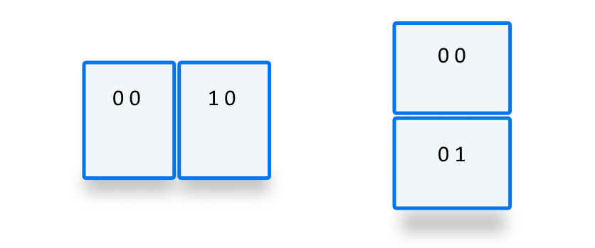
- 描述浏览器视区跨单个折叠 (两个显示区域) 和折叠姿势垂直时的状态。 此值在双纵向 (宽) 模式下与 Surface Duo 匹配。
vertical-viewport-segments: 2
- 描述浏览器视区跨越单个折叠 (两个显示区域) 和折叠姿势水平的状态。 此值在双横向 (高) 模式中匹配 Surface Duo。
此示例 CSS 代码片段演示如何使用 -viewport-segments 媒体功能在 Surface Duo 上应用样式:
@media (horizontal-viewport-segments: 2) {
   /* styles applied in double-portrait (wide) mode */
   /* matches Figure 1. below */
}
@media (vertical-viewport-segments: 2) {
   /* styles applied in double-landscape (tall) mode */
   /* matches Figure 2. below */
}

CSS 环境变量
Web 开发人员可以利用浏览器定义的环境变量来获取显示区域 (或区域) 的几何图形,并在) 时计算模糊的铰链 (区域的几何图形。 可以使用) 最左端段坐标 (使用以下环境变量定义查询每个视区的属性:
env(viewport-segment-width <x> <y>);
env(viewport-segment-height <x> <y>);
env(viewport-segment-top <x> <y>);
env(viewport-segment-left <x> <y>);
env(viewport-segment-bottom <x> <y>);
env(viewport-segment-right <x> <y>);
坐标是从左上角段分配的:
这些值可用于推断铰链区域的坐标:
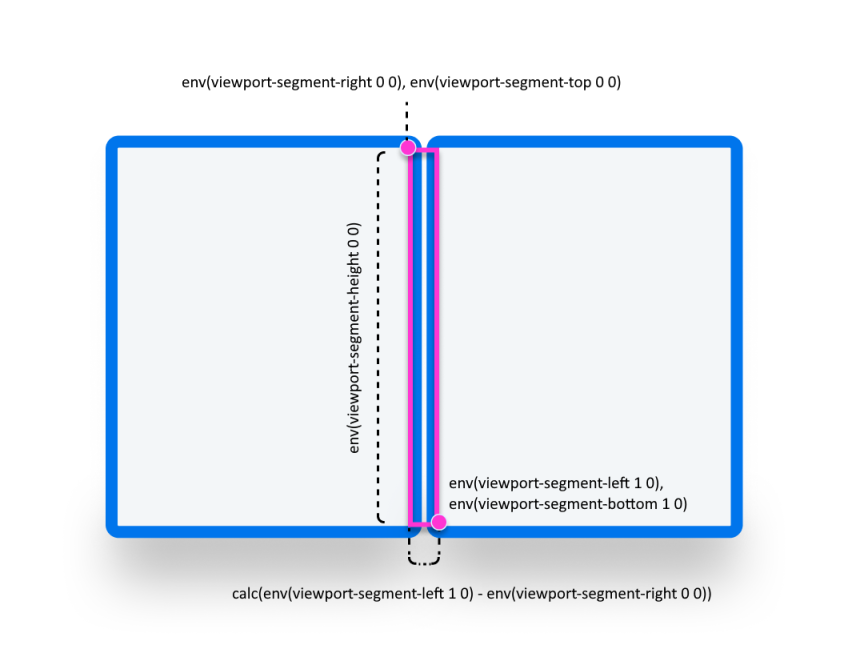
/* double-portrait */
env(viewport-segment-right 0 0);      /* hinge left */
env(viewport-segment-left 1 0);       /* hinge right*/
calc(env(viewport-segment-left 1 0) - env(viewport-segment-right 0 0))
                                      /* hinge width */
/* double-landscape */
env(viewport-segment-bottom 0 0);     /* hinge top */
env(viewport-segment-top 0 1);        /* hinge bottom */
calc(env(viewport-segment-top 0 1) - env(viewport-segment-bottom 0 0))
                                      /* hinge height */
示例
Basic
创建响应式页面,其中 <body> 背景色设置为 yellow 在任何姿势的手机和 green 双屏设备上。
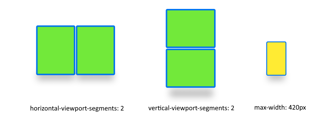
/* maximum width of our customers phones is 420px */
/* spanning: none is optional in this case */
@media (max-width: 420px) {
   body {
      background-color: yellow;
   }
}

/* Separating media features with comma `,` is equivalent to the logical operation OR  */
@media (horizontal-viewport-segments: 2), (vertical-viewport-segments: 2) {
   body {
      background-color: green;
   }
}
Flexbox
使用 flexbox 创建可识别空白的两列布局,其中第一列包含可滚动说明,第二列包含图像。

要创建此布局的 HTML 和 CSS 如下所示:
   <body>
      <article class="article">
         ...
      </article>
      <figure class="figure">
         <img src="/sydney-opera-house.jpg"
               alt="Sydney Opera House">
      </figure>
   </body>
body {
   height: 100vh;
   display: flex;
}

.article {
   /* grow: no, shrink: no, basis: fold-left */
   flex: 0 0 env(viewport-segment-right 0 0);

   /* equals to margin-right when writing mode is left-to-right (english)  */
   /* equals to margin-left when writing mode is right-to-left (arabic, hebrew)  */
   /* this will prevent content from being rendered behind the device mask */
   margin-inline-end: calc(env(viewport-segment-left 1 0) - env(viewport-segment-right 0 0)) ; /* hinge width */

   overflow-y: scroll;
}

.figure {
   /* fill the rest of the space */
   flex: 1;

   margin: 0;
   overflow: hidden;
}

.figure img {
   height: 100%;
}