Visualizing Huge Data Sets: An Example from the U.S. Census
Important
This content is being retired and may not be updated in the future. The support for Machine Learning Server will end on July 1, 2022. For more information, see What's happening to Machine Learning Server?
By combining the power and flexibility of the open-source R language with the fast computations and rapid access to huge datasets provided by RevoScaleR, it is easy and efficient to not only do fine-grained calculations “on the fly” for plotting, but to visually drill down into these patterns.
This example focuses on a basic demographic pattern: in general, more boys than girls are born and the death rate is higher for males at every age. So, typically we observe a decline in the ratio of males to females as age increases.
Important! Since Microsoft R Client can only process datasets that fit into the available memory, chunking is not supported. When run locally with R Client, the
blocksPerReadargument is ignored and all data must be read into memory. When working with Big Data, this may result in memory exhaustion. You can work around this limitation when you push the compute context to a Machine Learning Server instance.
Examining the Data
We can examine this pattern in the United States using the 5% Public Use Microdata Sample (PUMS) of the 2000 United States Census, stored in an .xdf file of about 12 gigabytes.[1] Using the rxGetInfo function, we can get a quick summary of the data set:
#  Visualizing Huge Data Sets: An Example from the U.S. Census
#  Examining the Data

bigDataDir <- "C:/MRS/Data"
bigCensusData <- file.path(bigDataDir,"CensusUS5Pct2000.xdf")
rxGetInfo(bigCensusData)

	File name: C:\MRS\Data\CensusUS5Pct2000.xdf
	Number of observations: 14058983
	Number of variables: 264
	Number of blocks: 98
	Compression type: zlib
It contains over 14 million rows, has 264 variables, and has been stored in 98 data blocks in the .xdf file.
First let’s use the rxCube function to count the number of males and females for each age, using the weighting variable provided by the census bureau. We’ll read in the data in chunks of 15 blocks, or about 2 million rows at a time.
ageSex <- rxCube(~F(age):sex, pweights = "perwt", data = bigCensusData,
blocksPerRead = 15)
The
blocksPerReadargument is ignored if run locally using R Client. Learn more...
In the computation, we’re treating age as a categorical variable so we’ll get counts for each age. Since we’ll be converting this factor data back to integers on a regular basis, we’ll write a function to do the conversion:
factoi <- function(x)
{
	as.integer(levels(x))[x]
}
We can now write a simple function in R to take the counts information returned from rxCube and do the arithmetic to compute the sex ratio for each age.
getSexRatio <- function(ageSex)
{
	ageSexDF <- as.data.frame(ageSex)
	sexRatioDF <- subset(ageSexDF, sex == 'Male')
	names(sexRatioDF)[names(sexRatioDF) == 'Counts'] <- 'Males'
	sexRatioDF$sex <- NULL
	females <- subset(ageSexDF, sex == 'Female')
	sexRatioDF$Females <- females$Counts
	sexRatioDF$age <- factoi(sexRatioDF$F_age)
	sexRatioDF <- subset(sexRatioDF, Females > 0 & Males > 0 & age <=90)
	sexRatioDF$SexRatio <- sexRatioDF$Males/sexRatioDF$Females
	return(sexRatioDF)
}
It returns a data frame with the counts for Males and Females, the SexRatio, and age for all groups in which there are positive counts for both Males and Females. Ages over 90 are also excluded.
Let’s use that function and then plot the results:
sexRatioDF <- getSexRatio(ageSex)
rxLinePlot(SexRatio~age, data = sexRatioDF,
	xlab = "Age", ylab = "Sex Ratio",
	main = "Figure 1: Sex Ratio by Age, U.S. 2000 5% Census")
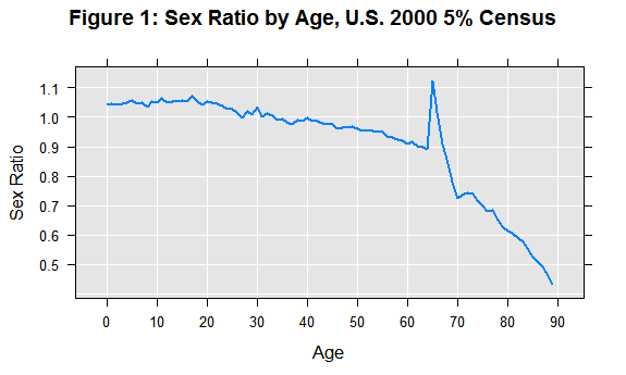
The graph shows the expected downward trend at the younger ages. But look at what happens at the age of 65! At the age of 65, there are suddenly about 12 men for every 10 women.
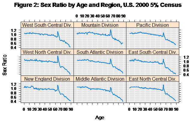
We can quickly drill down, and do the same computation for each region:
ageSex <- rxCube(~F(age):sex:region, pweights = "perwt", data = bigCensusData,
blocksPerRead = 15)
sexRatioDF <- getSexRatio(ageSex)
rxLinePlot(SexRatio~age|region, data = sexRatioDF,
	xlab = "Age", ylab = "Sex Ratio",
		main = "Figure 2: Sex Ratio by Age and Region, U.S. 2000 5% Census")
We see the unlikely “spike” at age 65 in all regions:
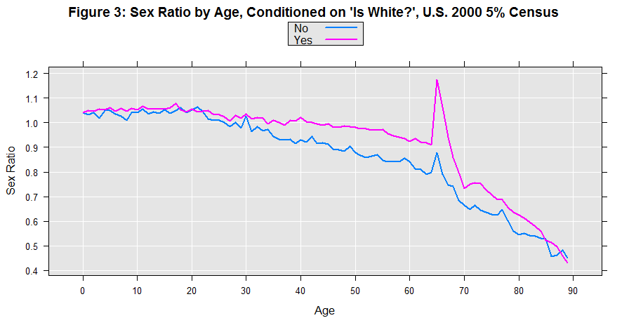
Let’s try looking at ethnicity, comparing whites with non-whites.
ageSex <- rxCube(~F(age):sex:racwht, pweights = "perwt", data = bigCensusData,
	blocksPerRead = 15)
sexRatioDF <- getSexRatio(ageSex)
rxLinePlot(SexRatio~age, groups = racwht, data = sexRatioDF,
	xlab = "Age", ylab = "Sex Ratio",
main = "Figure 3: Sex Ratio by Age, Conditioned on 'Is White?', U.S. 2000 5% Census")
There are interesting differences between the two groups, but again there is the familiar spike at age 65 in both cases.
How about comparing married people with those not living with a spouse? We can create a temporary variable using the transform argument to do this computation:
ageSex <- rxCube(~F(age):sex:married, pweights = "perwt", data = bigCensusData,
	transforms = list(married = factor(marst == 'Married, spouse present',
		levels = c(FALSE, TRUE), labels = c("No Spouse", "Spouse Present"))),
	blocksPerRead = 15)
sexRatioDF <- getSexRatio(ageSex)
rxLinePlot(SexRatio~age, groups = married, data = sexRatioDF,
	xlab="Age", ylab = "Sex Ratio",
main="Figure 4: Sex Ratio by Age, Living/Not Living with Spouse, U.S. 2000 5% Census")
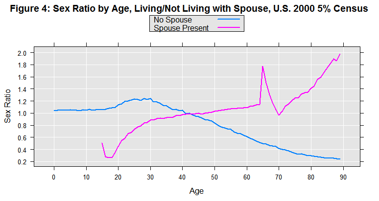
First, notice that the spike at age 65 is absent for unmarried people. But also look at the very different trends. For married 20 year-olds, there are about 5 men for every 10 women, but for married 60 year-olds, there would be about 11 men for every 10 women. This may at first seem counter-intuitive, but it’s consistent with the notion that men tend to marry younger women. Let’s explore that next.
Extending the Analysis
We’d like to compare the ages of men with ages of their wives. This is more complicated than the earlier computations because the spouse’s age is stored in a different record in the data file. To handle this, we’ll create a new data set using RevoScaleR’s data step functionality with a transformation function. This transformation function makes use of RevoScaleR’s ability to go back and read additional rows from an .xdf file as it is reading through it in chunks. It also uses internal variables that are provided inside a transformation function: .rxStartRow, which is the row number from the original data set for the first row of the chunk of data being processed; .rxReadFileName gives the name of the file being read. It first checks the spouse location for the relative position of the spouse in the data set. It then determines which of the observations have spouses in the previous, current, or next chunk of data. Then, in each of the three cases, it looks up the spouse information and adds it to the original observation.
#  Extending the Analysis

spouseAgeTransform <- function(data)
{
	# Use internal variables
	censusUS2000 <- .rxReadFileName
	startRow <- .rxStartRow

	# Calculate basic information about input data chunk
	numRows <- length(data$sploc)
	endRow <- startRow + numRows - 1

	# Create a new variable. A spouse is present if the spouse locator
	# (relative position of spouse in data) is positive
	data$hasSpouse <- data$sploc > 0

	# Create variables for spouse information
	spouseVars <- c("age", "incwage", "sex")
	data$spouseAge <- rep.int(NA_integer_, numRows)
	data$spouseIncwage <- rep.int(NA_integer_, numRows)
	data$sameSex <- rep.int(NA, numRows)

	# Create temporary row numbers for this block
	rowNum <- seq_len(numRows)
	# Find the temporary row number for the spouse
	spouseRow <- rep.int(NA_integer_, numRows)
	if (any(data$hasSpouse))
	{
		spouseRow[data$hasSpouse] <-
			rowNum[data$hasSpouse] +
			data$sploc[data$hasSpouse] - data$pernum[data$hasSpouse]
	}

	##################################################################
	# Handle possibility that spouse is in previous or next chunk
	# Create a variable indicating if the spouse is in the previous,
		# current, or next chunk
	blockBreaks <- c(-.Machine$integer.max, 0, numRows, .Machine$integer.max)
	blockLabels <- c("previous", "current", "next")
	spouseFlag <- cut(spouseRow, breaks = blockBreaks, labels = blockLabels)
	blockCounts <- tabulate(spouseFlag, nbins = 3)
	names(blockCounts) <- blockLabels

	# At least one spouse in previous chunk
	if (blockCounts[["previous"]] > 0)
	{
		# Go back to the original data set and read the
		# required rows in the previous chunk
		needPreviousRows <- 1 - min(spouseRow, na.rm = TRUE)
		previousData <- rxDataStep(inData = censusUS2000,
			startRow = startRow - needPreviousRows,
			numRows = needPreviousRows, varsToKeep = spouseVars,
			returnTransformObjects = FALSE, reportProgress = 0)

		# Get the spouse locations
		whichPrevious <- which(spouseFlag == "previous")
		spouseRowPrev <- spouseRow[whichPrevious] + needPreviousRows

		# Set the spouse information for everyone with a spouse
		# in the previous chunk
		data$spouseAge[whichPrevious] <- previousData$age[spouseRowPrev]
		data$spouseIncwage[whichPrevious] <- previousData$incwage[spouseRowPrev]
		data$sameSex[whichPrevious] <-
			data$sex[whichPrevious] == previousData$sex[spouseRowPrev]
	}

	# At least one spouse in current chunk
	if (blockCounts[["current"]] > 0)
	{
		# Get the spouse locations
		whichCurrent <- which(spouseFlag == "current")
		spouseRowCurr <- spouseRow[whichCurrent]

		# Set the spouse information for everyone with a spouse
		# in the current chunk
		data$spouseAge[whichCurrent] <- data$age[spouseRowCurr]
		data$spouseIncwage[whichCurrent] <- data$incwage[spouseRowCurr]
		data$sameSex[whichCurrent] <-
			data$sex[whichCurrent] == data$sex[spouseRowCurr]
	}

	# At least one spouse in next chunk
	if (blockCounts[["next"]] > 0)
	{
		# Go back to the original data set and read the
		# required rows in the next chunk
		needNextRows <- max(spouseRow, na.rm=TRUE) - numRows
		nextData <- rxDataStep(inData = censusUS2000, startRow = endRow+1,
			numRows = needNextRows, varsToKeep = spouseVars,
			returnTransformObjects = FALSE, reportProgress = 0)

		# Get the spouse locations
		whichNext <- which(spouseFlag == "next")
		spouseRowNext <- spouseRow[whichNext] - numRows

		# Set the spouse information for everyone with a spouse
		# in the next block
		data$spouseAge[whichNext] <- nextData$age[spouseRowNext]
		data$spouseIncwage[whichNext] <- nextData$incwage[spouseRowNext]
		data$sameSex[whichNext] <-
			data$sex[whichNext] == nextData$sex[spouseRowNext]
	}

	# Now caculate age difference
	data$ageDiff <- data$age - data$spouseAge
	data
}
We can test the transform function by reading in a small number of rows of data. First we will read in a chunk that has a spouse in the previous block and a spouse in the next block, and call the transform function. We will repeat this, expanding the chunk of data to include both spouses, and double check to make sure the results are the same for the equivalent rows:
varsToKeep=c("age", "region", "incwage", "racwht", "nchild", "perwt", "sploc",
	"pernum", "sex")
testDF <- rxDataStep(inData=bigCensusData, numRows = 6, startRow=9,
	varsToKeep = varsToKeep, returnDTransformObjects=FALSE)
.rxStartRow <- 9
.rxReadFileName <- bigCensusData
newTestDF <- as.data.frame(spouseAgeTransform(testDF))
.rxStartRow <- 8
testDF2 <- rxDataStep(inData=bigCensusData, numRows = 8, startRow=8,
	varsToKeep = varsToKeep, returnTransformObjects=FALSE)
newTestDF2 <- as.data.frame(spouseAgeTransform(testDF2))
newTestDF[,c("age", "incwage", "sploc", "hasSpouse" ,"spouseAge", "ageDiff")]
newTestDF2[,c("age", "incwage", "sploc", "hasSpouse" ,"spouseAge", "ageDiff")]

	  > newTestDF[,c("age", "incwage", "sploc", "hasSpouse" ,"spouseAge", "ageDiff")]
		age incwage sploc hasSpouse spouseAge ageDiff
	  1  46    1000     1      TRUE        43       3
	  2  16       0     0     FALSE        NA      NA
	  3  14      NA     0     FALSE        NA      NA
	  4   7      NA     0     FALSE        NA      NA
	  5  19    1500     0     FALSE        NA      NA
	  6  62   42600     2      TRUE        55       7


	  > newTestDF2[,c("age", "incwage", "sploc", "hasSpouse" ,"spouseAge", "ageDiff")]
		age incwage sploc hasSpouse spouseAge ageDiff
	  1  43  150000     2      TRUE        46      -3
	  2  46    1000     1      TRUE        43       3
	  3  16       0     0     FALSE        NA      NA
	  4  14      NA     0     FALSE        NA      NA
	  5   7      NA     0     FALSE        NA      NA
	  6  19    1500     0     FALSE        NA      NA
	  7  62   42600     2      TRUE        55       7
	  8  55       0     1      TRUE        62      -7
To create the new data set, we’ll use the transformation function with rxDataStep. Observations for males living with female spouses will be written to a new data .xdf file named spouseCensus2000.xdf. It will include information about the age of their spouse.
The
blocksPerReadargument is ignored if run locally using R Client. Learn more...
spouseCensusXdf <- "spouseCensus2000"
rxDataStep(inData = bigCensusData, outFile=spouseCensusXdf,
	varsToKeep=c("age", "region", "incwage", "racwht", "nchild", "perwt"),
	transformFunc = spouseAgeTransform,
	transformVars = c("age", "incwage","sploc", "pernum", "sex"),
	rowSelection = sex == 'Male' & hasSpouse == 1 & sameSex == FALSE &
		age <= 90,
	blocksPerRead = 15, overwrite=TRUE)
Now for each husband age we can compute the distribution of spouse age. Then, after converting age back to an integer, we can plot the age difference by age of husband:
ageDiffData <- rxCube(ageDiff~F(age) , pweights="perwt", data = spouseCensusXdf,
	returnDataFrame = TRUE, blocksPerRead = 15)
ageDiffData$ownAge <- factoi(ageDiffData$F_age)
rxLinePlot(ageDiff~ownAge,  data = ageDiffData,
	xlab="Age of Husband", ylab = "Age Difference (Husband-Wife)",
main="Figure 5: Age Difference of Spouses Living Together, U.S. 2000 5% Census")
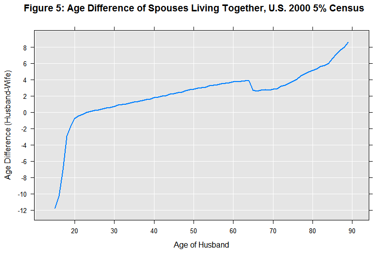
Beginning at ages in the early 20’s, men tend to be married to younger women. The age difference increases as men get older. But beginning at age 65, our smooth trend stops and we see more erratic behavior, suggesting that our data has misinformation about ages of spouses within households at age 65 and above.
With our new data set we can also calculate the counts for each combination of husband’s age and wife’s age:
aa <- rxCube(~F(age):F(spouseAge), pweights = "perwt", data = spouseCensusXdf,
	returnDataFrame = TRUE, blocksPerRead = 7)
A level plot is a good way to visualize the results, where the color indicates the count of each category of combination of husband’s and wife’s age.
# Convert factors to integers
aa$age <- factoi(aa$F_age)
aa$spouseAge <- factoi(aa$F_spouseAge)

# Do a level plot showing the counts for husbands aged 40 to 60
ageCompareSubset <- subset(aa, age >= 40 & age <= 60 & spouseAge >= 30 & spouseAge <= 65)
levelplot(Counts~age*spouseAge, data=ageCompareSubset,
	xlab="Age of Husband", ylab = "Age of Wife",
main="Figure 6: Counts by Age (40-60) and Spouse Age, U.S. 2000 5% Census")
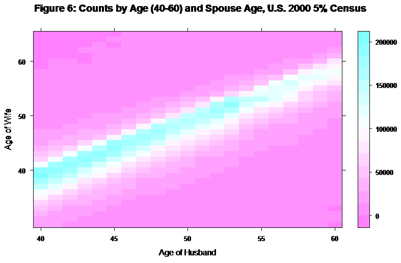
In the level plot, there is a very clear pattern with the mode of the relative age of wife dropping gradually as the age of husband increases. Now, repeat with husbands aged 60 to 80.
ageCompareSubset <- subset(aa, age >= 60 & age <= 80 & spouseAge >= 50 & spouseAge <= 75)
levelplot(Counts~age*spouseAge, data = ageCompareSubset,
	xlab = "Age of Husband", ylab = "Age of Wife",
	main ="Figure 7: Counts by Age(60-80)and Spouse Age , U.S. 2000 5% Census")
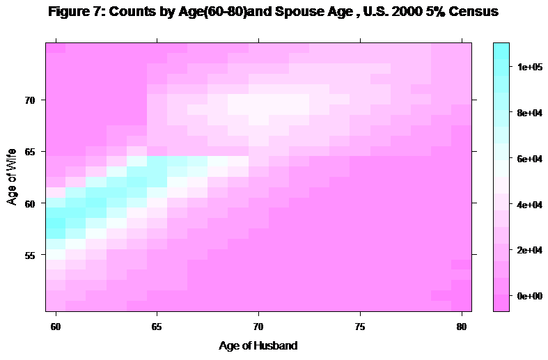
This shows a different story. Notice that there are very few men in the 60 to 80 age range married to 65 year-old women, and in particular, there are very few 65-year-old men married to 65-year-old women. To examine this further, we can look at line plots of the distributions of wife’s ages for men ages 62 to 67:
ageCompareSubset <- subset(aa, age > 61 & age < 68 & spouseAge > 50 &
	spouseAge < 85)
rxLinePlot(Counts~spouseAge, groups = age, data = ageCompareSubset,
	xlab = "Age of Wife", ylab = "Counts",
	lineColor = c("Blue4", "Blue2", "Blue1", "Red2", "Red3", "Red4"),
main = "Figure 8: Ages of Wives (> 45) for Husband's Ages 62 to 67, U.S. 2000 5% Census")
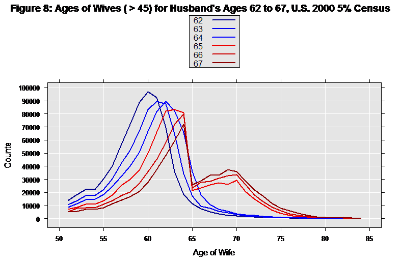
The blue lines show husbands ages 62 through 64. The mode of the wife’s age is a couple of years younger than the husband, and we have a reasonable looking distribution in both tails. But starting at age 65, with the red lines, we have a very different pattern. It appears that when husbands reach the age of 65 they begin to leave (or lose) their 65-year-old wives in droves – and marry older women. This certainly makes one suspicious of the data. In fact, it turns out the aberration in the data was introduced by disclosure avoidance techniques applied to the data by the census bureau.