从 JSLink 迁移到 SharePoint 框架扩展
自 Microsoft SharePoint 2013 起,在 Microsoft 365 和 SharePoint Online 基础之上生成的大多数企业解决方案都利用字段和列表视图的 JSLink 属性来自定义字段呈现。
在 SharePoint Online 和 SharePoint Server 2019 的“新式”UI 中,大部分自定义项不再可用。 幸运的是,SharePoint 框架扩展可以在“新式”UI 中实现类似功能。
本教程介绍了如何将旧式“经典”自定义迁移到基于 SharePoint 框架扩展的新模型。
注意
若要详细了解如何生成 SharePoint 框架扩展,请参阅 SharePoint 框架扩展概述。
首先,介绍一下 SharePoint 框架扩展的开发选项:
- 应用程序自定义工具:通过将自定义 HTML 元素和客户端代码添加到“新式”页面的预定义占位符来扩展 SharePoint 的本地“新式”UI。 有关应用程序自定义工具的详细信息,请参阅生成第一个 SharePoint 框架扩展(Hello World第 1 部分)。
- 命令集:将自定义编辑控制块 (ECB) 菜单项或自定义按钮添加到列表或库的列表视图的命令栏。 可以将任何客户端操作关联到这些命令。 有关命令集的详细信息,请参阅生成第一个 ListView 命令集扩展。
- 字段自定义工具:使用自定义 HTML 元素和客户端代码自定义列表视图中字段的呈现。 有关字段自定义工具的详细信息,请参阅生成第一个字段自定义工具扩展。
在本文中,最有用的选项是字段自定义工具扩展。
假设使用的是 SharePoint Online,并且自定义列表中包含“Color”自定义字段。此字段的类型为 Choice,可取值如下:Red、Green、Blue、Yellow。 假设有呈现自定义列表 Web 部件的列表视图的 JSLink 属性自定义值。
在下面的代码片段中,可以看到 JavaScript 代码由 JSLink 属性 (customColorRendering.js) 引用。
// Define a namespace for the custom rendering code
var customJSLinkRendering = customJSLinkRendering || {};

// Define a function that declare the custom rendering rules for the target list view
customJSLinkRendering.CustomizeFieldRendering = function () {

  // Define a custom object to configure the rendering template overrides
  var customRenderingOverride = {};
  customRenderingOverride.Templates = {};
  customRenderingOverride.Templates.Fields =
  {
    // Declare the custom rendering function for the 'View' of field 'Color'
    'Color':
    {
      'View': customJSLinkRendering.RenderColorField
    }
  };

  // Register the custom rendering template
  SPClientTemplates.TemplateManager.RegisterTemplateOverrides(customRenderingOverride);
};

// Declare the custom rendering function for the 'View' of field 'Color'
customJSLinkRendering.RenderColorField = function (context)
{
  var colorField = context.CurrentItem.Color;

  // Declare a local variable to hold the output color
  var color = '';

  // Evaluate the values of the 'Color' field and render it accordingly
  switch (colorField)
  {
    case 'Red':
      color = 'red';
      break;
    case 'Green':
      color = 'green';
      break;
    case 'Blue':
      color = 'blue';
      break;
    case 'Yellow':
      color = 'yellow';
      break;
    default:
      color = 'white';
      break;
  }

  // Render the output for the 'Color' field
  return "<div style='float: left; width: 20px; height: 20px; margin: 5px; border: 1px solid rgba(0,0,0,.2);background:" + color + "' />";
};

// Invoke the custom rendering function
customJSLinkRendering.CustomizeFieldRendering();
下面的屏幕截图还展示了如何在列表视图 Web 部件中配置 JSLink 属性。
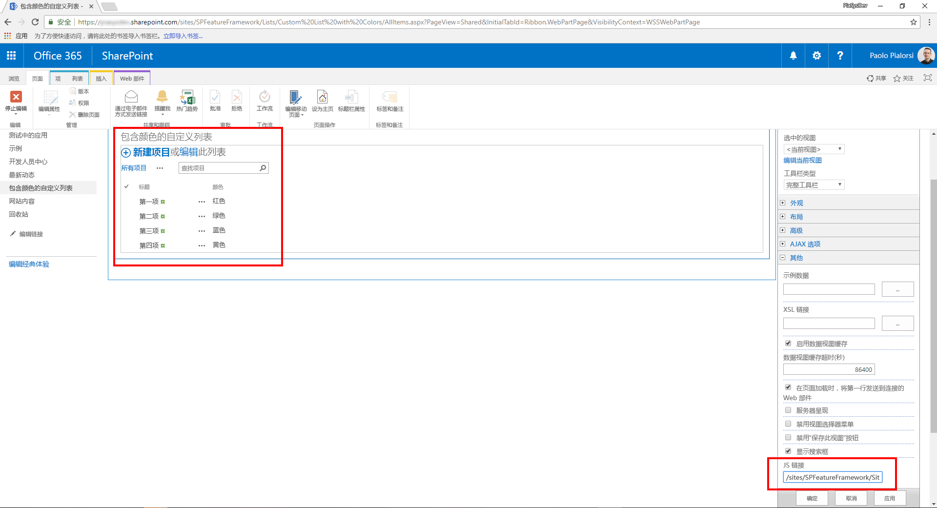
如果将 JavaScript 文件上传到了网站资产库中,JSLink 属性的值可以是 "~site/SiteAssets/customColorRendering.js"。
可以了解列表自定义呈现的工作原理。
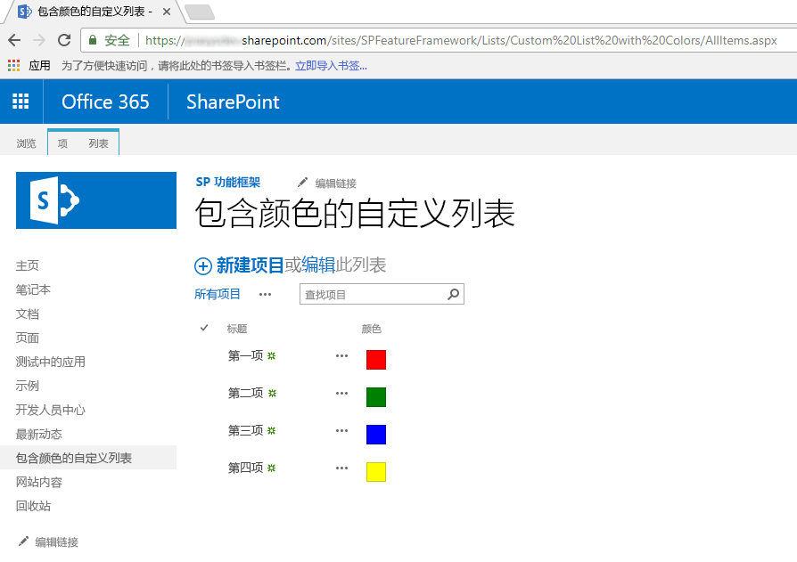
可以看到,“颜色”字段呈现彩色框,其中填充了在项一级选择的颜色。
注意
若要在“经典”网站中预配这种解决方案,最终可以使用 PnP 预配模板,它能够一次性同时预配包含自定义字段的列表和 JSLink 属性。
若要将上一解决方案迁移到 SharePoint 框架,请参阅以下步骤。
新建 SharePoint 框架解决方案
在控制台中,为项目新建文件夹:
md spfx-custom-field-extension转到项目文件夹:
cd spfx-custom-field-extension在项目文件夹中,运行 SharePoint Framework Yeoman 生成器,以搭建新的 SharePoint Framework 项目:
yo @microsoft/sharepoint出现提示时,请输入以下值(为下面省略的所有提示选择默认选项):
- 解决方案名称是什么?:spfx-custom-field-extension
- 要创建哪种类型的客户端组件?:扩展
- 要创建哪种类型的客户端扩展? 字段自定义工具
- 字段自定义工具的名称是什么? CustomColorField
- 要使用哪个模板?:无 JavaScript 框架
启动 Visual Studio Code(或选定代码编辑器),并开始开发解决方案。 若要启动 Visual Studio Code,可以执行下面的语句。
code .
使用 JavaScript 定义新字段自定义工具
为了重现 JSLink 自定义字段呈现的相同行为,需要在新 SharePoint 框架解决方案中使用客户端代码,从而实现相同的逻辑。 若要完成此任务,请执行以下步骤。
按以下路径打开文件,./src/extensions/customColorField/CustomColorFieldFieldCustomizer.manifest.json。 复制
id属性的值,并将它存储到安全位置上,因为稍后将需要用到它。打开文件 ./src/extensions/customColorField/CustomColorFieldFieldCustomizer.ts,并根据以下代码片段编辑内容:
import { Log } from '@microsoft/sp-core-library';
import { override } from '@microsoft/decorators';
import {
  BaseFieldCustomizer,
  IFieldCustomizerCellEventParameters
} from '@microsoft/sp-listview-extensibility';

import * as strings from 'CustomColorFieldFieldCustomizerStrings';
import styles from './CustomColorFieldFieldCustomizer.module.scss';

/**
* If your field customizer uses the ClientSideComponentProperties JSON input,
* it will be deserialized into the BaseExtension.properties object.
* You can define an interface to describe it.
*/
export interface ICustomColorFieldFieldCustomizerProperties {
  // This is an example; replace with your own property
  sampleText?: string;
}

const LOG_SOURCE: string = 'CustomColorFieldFieldCustomizer';

export default class CustomColorFieldFieldCustomizer
extends BaseFieldCustomizer<ICustomColorFieldFieldCustomizerProperties> {

  @override
  public onInit(): Promise<void> {
    // Add your custom initialization to this method.  The framework will wait
    // for the returned promise to resolve before firing any BaseFieldCustomizer events.
    Log.info(LOG_SOURCE, 'Activated CustomColorFieldFieldCustomizer with properties:');
    Log.info(LOG_SOURCE, JSON.stringify(this.properties, undefined, 2));
    Log.info(LOG_SOURCE, `The following string should be equal: "CustomColorFieldFieldCustomizer" and "${strings.Title}"`);
    return Promise.resolve();
  }

  @override
  public onRenderCell(event: IFieldCustomizerCellEventParameters): void {

    var colorField = event.fieldValue;

    // Declare a local variable to hold the output color
    var color = '';

    // Evaluate the values of the 'Color' field and render it accordingly
    switch (colorField)
    {
      case 'Red':
        color = 'red';
        break;
      case 'Green':
        color = 'green';
        break;
      case 'Blue':
        color = 'blue';
        break;
      case 'Yellow':
        color = 'yellow';
        break;
      default:
        color = 'white';
        break;
    }

    // Render the output for the 'Color' field
    event.domElement.innerHTML = "<div style='float: left; width: 20px; height: 20px; margin: 5px; border: 1px solid rgba(0,0,0,.2);background:" + color + "' />";
  }

  @override
  public onDisposeCell(event: IFieldCustomizerCellEventParameters): void {
    // This method should be used to free any resources that were allocated during rendering.
    // For example, if your onRenderCell() called ReactDOM.render(), then you should
    // call ReactDOM.unmountComponentAtNode() here.
    super.onDisposeCell(event);
  }
}
可以看到,
onRenderCell()方法的内容几乎与JSLink实现中的旧RenderColorField()方法相同。 唯一区别在于:- 若要检索当前字段值,需要读取
onRenderCell()方法的输入参数的event.fieldValue属性。 - 若要返回自定义 HTML 代码以呈现字段,需要将值分配给 event.domElement 对象的 innerHTML
innerHTML属性,event.domElement该对象表示字段呈现的输出 HTML 容器。
除较小的更改之外,可以重用几乎与之前相同的 JavaScript 代码。
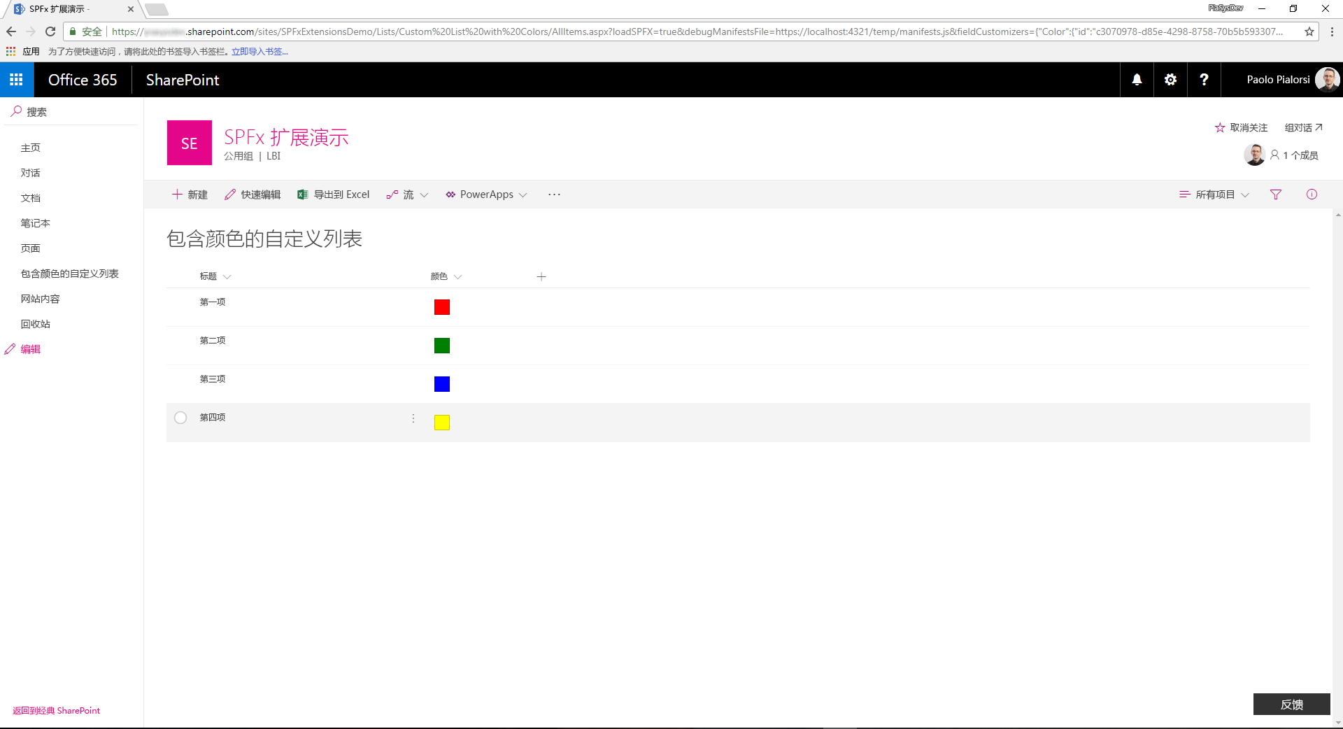
下图展示了所生成的输出。
- 若要检索当前字段值,需要读取
在调试模式下测试解决方案
返回到控制台窗口,并运行下面的命令,以生成解决方案,并运行本地 Node.js 服务器来托管它。
gulp serve --nobrowser打开常用浏览器,并转到“新式”列表,其中包含“选项”类型的“颜色”自定义字段,值选项与之前相同(分别为“红色”、“绿色”、“蓝色”、“黄色”)。 最终可以使用在“经典”网站中创建的列表,只需使用新的“新式”体验即可查看。 现在,将以下查询字符串参数追加到 AllItems.aspx 网页 URL 中。
?loadSPFX=true&debugManifestsFile=https://localhost:4321/temp/manifests.js&fieldCustomizers={"Color":{"id":"c3070978-d85e-4298-8758-70b5b5933076"}}在此查询字符串中,将 GUID 替换为从 CustomColorFieldFieldCustomizer.manifest.json 文件保存的
id值,Color 属性名称是指要自定义的字段名称。 如果你愿意,还可以提供自定义配置对象,以 JSON 格式进行序列化,作为字段自定义工具构造的附加参数。请注意,出于安全考虑,在执行页面请求时,可能会看到警告消息框(标题为“允许调试脚本?”),提示是否同意通过 localhost 运行代码。 若要在本地调试和测试解决方案,必须通过选择“加载调试脚本”同意这样做。
注意
或者,你可以在项目的 config/serve.json 文件中创建服务配置条目,以自动创建调试查询字符串参数,如以下文档中所述:在新式 SharePoint 页面上调试 SharePoint 框架解决方案
使用 TypeScript 定义新字段自定义工具
现在可以将 JavaScript 代码替换为 TypeScript,从而受益于 TypeScript 的完全类型化方法。
打开文件 ./src/extensions/customColorField/CustomColorFieldFieldCustomizer.module.scss。 此文件是 Sass CSS,表示字段自定义工具的 UI 样式。 将 SCSS 文件的内容替换为以下内容。
.CustomColorField {
  .cell {
    float: left;
    width: 20px;
    height: 20px;
    margin: 5px;
    border: 1px solid rgba(0,0,0,.2);
  }

  .cellRed {
    background: red;
  }

  .cellGreen {
    background: green;
  }

  .cellBlue {
    background: blue;
  }

  .cellYellow {
    background: yellow;
  }

  .cellWhite {
    background: white;
  }
}
将
onRenderCell()方法实现替换为以下代码片段。@override public onRenderCell(event: IFieldCustomizerCellEventParameters): void { // Read the current field value let colorField: String = event.fieldValue; // Add the main style to the field container element event.domElement.classList.add(styles.CustomColorField); // Get a reference to the output HTML let fieldHtml: HTMLDivElement = event.domElement.firstChild as HTMLDivElement; // Add the standard style fieldHtml.classList.add(styles.cell); // Add the colored style switch(colorField) { case "Red": fieldHtml.classList.add(styles.cellRed); break; case "Green": fieldHtml.classList.add(styles.cellGreen); break; case "Blue": fieldHtml.classList.add(styles.cellBlue); break; case "Yellow": fieldHtml.classList.add(styles.cellYellow); break; default: fieldHtml.classList.add(styles.cellWhite); break; } }请注意,新方法实现使用完整键入的方法,并将“cell”
cellCSS 类分配给当前字段元素的 DIV 元素子级,同时使用另一个自定义 CSS 类基于DIV该字段的当前选定值定义 DIVDIV的目标颜色。在调试模式下,再次运行字段自定义工具,并查看结果。
打包和托管解决方案
如果对结果感到满意,就可以准备打包解决方案,并将它托管在实际宿主基础结构中。 生成捆绑包和程序包前,需要声明 XML 功能框架文件来预配扩展。
查看功能框架元素
在代码编辑器中,打开 /sharepoint/assets/elements.xml 文件。 应按照下面的代码片段编辑此文件。
<?xml version="1.0" encoding="utf-8"?>
<Elements xmlns="http://schemas.microsoft.com/sharepoint/">
    <Field ID="{40475661-efaf-447a-a220-c992b20ec1c3}"
           Name="SPFxColor"
           DisplayName="Color"
           Title="Color"
           Type="Choice"
           Required="FALSE"
           Group="SPFx Columns"
           ClientSideComponentId="c3070978-d85e-4298-8758-70b5b5933076">
    </Field>
</Elements>
可以看到,它类似于 SharePoint 功能框架文件,不同之处在于它定义采用字段类型
Choice的自定义Field元素。此元素使用ClientSideComponentId属性引用字段自定义工具的id,并引用ClientSideComponentProperties属性来配置扩展所需的自定义配置属性。打开文件 ./config/package-solution.json。 在此文件中,可以看到
assets部分包含对 elements.xml 文件的引用。{ "$schema": "https://developer.microsoft.com/json-schemas/spfx-build/package-solution.schema.json", "solution": { "name": "spfx-custom-field-extension-client-side-solution", "id": "ab0fbbf8-01ba-4633-8498-46cfd5652619", "version": "1.0.0.0", "features": [{ "title": "Application Extension - Deployment of custom action.", "description": "Deploys a custom action with ClientSideComponentId association", "id": "090dc976-878d-44fe-8f8e-ac603d094aa1", "version": "1.0.0.0", "assets": { "elementManifests": [ "elements.xml" ] } }] }, "paths": { "zippedPackage": "solution/spfx-custom-field-extension.sppkg" } }
捆绑、打包和部署解决方案
接下来,需要将解决方案包捆绑和打包到应用程序目录中。 若要完成此任务,请执行以下步骤。
为 SharePoint Online 租户准备和部署解决方案:
执行下列任务,以捆绑解决方案。 这将创建项目的发布版本:
gulp bundle --ship执行下列任务来打包解决方案。 此命令在 sharepoint/solution 文件夹中创建 *.sppkg 包。
gulp package-solution --ship将新建的客户端解决方案包上传或拖放到租户上的应用程序目录中,再选择“部署”按钮。
安装并运行解决方案
打开浏览器,并转到任意目标“新式”网站。
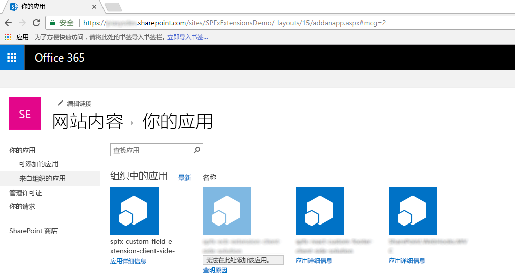
转到“网站内容”页,并选择添加新“应用”。
在“来自组织的应用”中,选择安装新应用,以浏览应用程序目录中的解决方案。
选择“spfx-custom-field-extension-client-side-solution”解决方案,并在目标网站上安装它。
应用安装完成后,新建自定义列表,编辑列表设置,并通过现有网站列添加新列。 选择“SPFx 列”列组,并添加“颜色”字段。
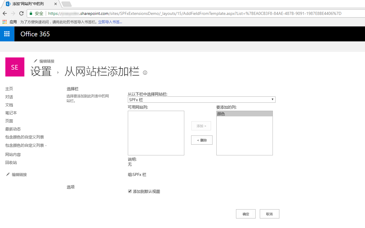
编辑添加的字段,并配置一些颜色值(如“红色”、“绿色”、“蓝色”、“黄色”),再保存字段设置。
向列表添加一些项,并在列表视图中查看输出。 看起来应如以下屏幕截图所示。
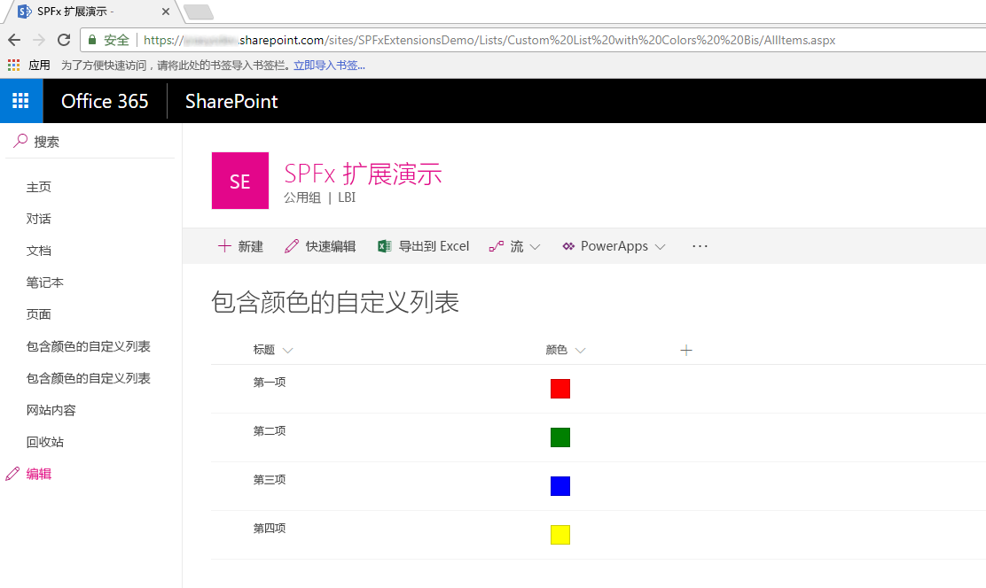
尽享使用 SharePoint 框架扩展生成的全新字段自定义工具!