AnimationSet
The AnimationSet type represents an animation schedule, effectively representing an AnimationBuilder instance via XAML code. It can contain any number of animations or activities, exposes methods to start and stop an animation, and events to be notified when an animation has started or is completed. Like AnimationBuilder, AnimationSet instances can also be shared (e.g. in a ResourceDictionary) and then be used to start animation schedules on multiple UI elements. It can also be directly attached to a parent UI element, via the Explicit.Animations attached property.
Platform APIs:
AnimationSet, AnimationBuilder,Explicit,ITimeline,IActivity,AnimationScope,AnimationStartedTriggerBehavior,AnimationCompletedTriggerBehavior,StartAnimationAction,StopAnimationAction
How it works
Each set can contain any number of animation scopes and individual nodes, which can be either animations or "activities":
- Animation types are a mapping in XAML for the various APIs exposed by the
AnimationBuilderclass. They are available as both "default" animations that are ready to use and "custom" animations that can be fully configured. Each animation type also supports using keyframes in addition to just defining the starting and final values. - Activities on the other hand are a way to interleave an animation schedule with all sorts of custom logic, such as triggering other animations or running arbitrary code (eg. to update a visual state while an animation is running).
These two types of animation nodes implement several interfaces (such as ITimeline and IActivity) which make this system extremely customizable and extensible for users as well for their own scenarios.
Here is how a simple animation can be declared in XAML. In this case we are using x:Name so that we can reference it in code behind to start it when the button is clicked. The animation is also directly attached to the Button, so we can start it directly by calling the Start() method, without the need to specify the target element to animate.
<!--A simple animation using default animation types-->
<Button Content="Click me!">
    <animations:Explicit.Animations>
        <animations:AnimationSet x:Name="FadeInAnimation">
            <animations:OpacityAnimation From="0" To="1"/>
            <animations:TranslationAnimation From="-20,0,0" To="0"/>
        </animations:AnimationSet>
    </animations:Explicit.Animations>
</Button>
By default, animations target the Composition layer as it provides the best performance possible. It is also possible to explicitly target the XAML layer too though, which can enable things such as animating the color of a brush used to display some text in a Button. Here is an example where we use this functionality, together with explicit keyframes to have more fine-grained control over the animation to run:
<!--An animation set using a scope and explicit keyframes-->
<Button Content="Click me!" Foreground="White">
    <animations:Explicit.Animations>
        <animations:AnimationSet x:Name="FadeInAnimation">
            <animations:AnimationScope Duration="0:0:1" EasingType="Sine">
                <animations:OpacityAnimation From="0" To="1"/>
                <animations:ColorAnimation Target="(Button.Foreground).(SolidColorBrush.Color)" Layer="Xaml">
                    <animations:ColorKeyFrame Key="0.0" Value="White"/>
                    <animations:ColorKeyFrame Key="0.5" Value="Orange"/>
                    <animations:ColorKeyFrame Key="0.8" Value="Green" EasingType="Linear"/>
                    <animations:ColorKeyFrame Key="1.0" Value="White" EasingType="Cubic" EasingMode="EaseOut"/>
                </animations:ColorAnimation>
            </animations:AnimationScope>
        </animations:AnimationSet>
    </animations:Explicit.Animations>
</Button>
Keyframes (both when declared in C# and in XAML) can also use an expression animation when they are being used in an animation targeting the Composition layer. This provides additional control over the animation values and allows consumers to create dynamic animations that can adapt to the current state of the target element. Here is an example:
<!--Keyframes can use expressions as well (on the Composition layer)-->
<Button Content="Click me!">
    <animations:Explicit.Animations>
        <animations:AnimationSet x:Name="RotationAnimation">
            <animations:RotationInDegreesAnimation>
                <animations:ScalarKeyFrame Key="0.0" Value="0"/>
                <animations:ScalarKeyFrame Key="1.0" Expression="Lerp(-180, 180, this.Target.Opacity)"/>
            </animations:RotationInDegreesAnimation>
        </animations:AnimationSet>
    </animations:Explicit.Animations>
</Button>
Sequential mode
Another feature of the AnimationSet type is the IsSequential property which configures the way top-level elements (animations, activities, and scopes) within the animation are handled.
When this property is set to true each top-level node will be executed sequentially and only move to the following one when the previous completes (and the animation has not been cancelled). This can be used in conjunction with the various IActivity objects to create custom animation schedules that combine multiple animations running on different UI elements, with all the synchronization still done entirely from XAML. It is also helpful when combined with an AnimationScope in order to more easily parse the timeline of events within an animation when creating and modifying them.
Here is an example that showcases both the sequential mode for animations as well as the ability to combine animations and activities in the same schedule, and how different animations (even on different UI elements) can be combined and interleaved by using the available APIs:
<!--This set first runs a scope with three animations and waits for its completion.
    Then, an activity is used to trigger another animation on its attached parent.
    When that completes as well, the last animation in this set will be executed.-->
<Button Content="Click me!" Foreground="White">
    <animations:Explicit.Animations>
        <animations:AnimationSet x:Name="SequentialAnimation" IsSequential="True">
            <animations:AnimationScope>
                <animations:ScaleAnimation From="1" To="1.2"/>
                <animations:TranslationAnimation From="-20,0,0" To="0"/>
                <animations:OpacityAnimation From="0" To="1"/>
            </animations:AnimationScope>
            <animations:StartAnimationActivity Animation="{x:Bind AnotherAnimation}"/>
            <animations:ScaleAnimation To="1"/>
        </animations:AnimationSet>
    </animations:Explicit.Animations>
</Button>

<!--This rectangle will wiggle left and right when the activity is reached in the
    sequential animation schedule for the button above. When this animation set
    completes, the one that invoked it will resume playing normally.-->
<Rectangle Height="80" Width="120" Fill="Green">
    <animations:Explicit.Animations>
        <animations:AnimationSet x:Name="AnotherAnimation">
            <animations:TranslationAnimation Duration="0:0:1" From="0" To="0">
                <animations:Vector3KeyFrame Key="0.3" Value="-20,0,0"/>
                <animations:Vector3KeyFrame Key="0.6" Value="20,0,0"/>
            </animations:TranslationAnimation>
        </animations:AnimationSet>
    </animations:Explicit.Animations>
</Rectangle>
The same functionality with respect to cancellation applies to AnimationSet as well: each individual invocation on an UI element internally gets its own cancellation token, which can be used to stop a running animation by invoking the Stop() method or one of its overloads. The same token is also forwarded to all invoked activities in the schedule, so stopping an animation set will also automatically stop all linked animations and activities as well.
Here's an example of how all these various explicit animations can be combined together (including some of the new effect animations too):

Behaviors
If you are also referencing the Microsoft.Toolkit.Uwp.UI.Behaviors package, it will be possible to also use behaviors and actions to better support the new APIs, such as by automatically triggering an animation when a given event is raised, entirely from XAML. There are four main types being introduced in this package that interoperate with the Animation APIs:
AnimationStartedTriggerBehaviorandAnimationCompletedTriggerBehavior: these are custom triggers that can be used to executeIAction-s when anAnimationSetstarts or completes. All the built-inIActionobjects can be used from the Behaviors package, as well as custom ones as well.StartAnimationAction: anIActionobject that can be used within behaviors to easily start a target animation, either with an attached UI element or with an explicit target to animate.StopAnimationAction: anIActionobject that can be used within behaviors to easily stop a target animation, either with an attached UI element or with an explicit target to animate.
Here is an example that shows how these new APIs can be used together:
<Button>
    <!--Use StartAnimationAction to trigger the animation on click-->
    <Interactivity:Interaction.Behaviors>
        <Interactions:EventTriggerBehavior EventName="Click">
            <behaviors:StartAnimationAction Animation="{x:Bind ScaleAnimation}" />
        </Interactions:EventTriggerBehavior>
    </Interactivity:Interaction.Behaviors>
    <animations:Explicit.Animations>
        <animations:AnimationSet x:Name="ScaleAnimation">
            <animations:ScaleAnimation From="1" To="1.2"/>

            <!--Use AnimationEndBehavior to invoke a command when the animation ends-->
            <Interactivity:Interaction.Behaviors>
                <behaviors:AnimationEndBehavior>
                    <Interactions:InvokeCommandAction Command="{x:Bind ViewModel.MyCommand}"/>
                </behaviors:AnimationEndBehavior>
            </Interactivity:Interaction.Behaviors>
        </animations:AnimationSet>
    </animations:Explicit.Animations>
</Button>
This makes it possible to also not having to name the target UI element, to register the event handler in code behind, and in many cases to even name the AnimationSet instance at all, if it doesn't need to be referenced by other animations at all. The resulting code is all in XAML, with no need for code behind at all!
Effect animations
Lastly, the AnimationSet class can also directly animate Composition/Win2D effects. To gain access to this feature, you will need to also reference the Microsoft.Toolkit.Uwp.UI.Media. This package includes some special animation types that can be plugged in into an AnimationSet instance and used to animate individual effects within a custom effects graph. This can then be used either from a PipelineBrush or from an inline graph attached to a UI element through the PipelineVisualFactory type. All these effect animations are powered by the same AnimationBuilder type behind the scenes, and can facilitate creating complex animations on specific effects within a graph.
Here is an example of how the new PipelineVisualFactory type can be combined with these effect animations:
<Button>
    <!--Behavior to trigger the animation on click-->
    <Interactivity:Interaction.Behaviors>
        <Interactions:EventTriggerBehavior EventName="Click">
            <behaviors:StartAnimationAction Animation="{x:Bind MyAnimationSet}" />
        </Interactions:EventTriggerBehavior>
    </Interactivity:Interaction.Behaviors>

    <!--VisualFactory to create and attach a custom Win2D/Composition pipeline-->
    <media:UIElementExtensions.VisualFactory>
        <media:PipelineVisualFactory Source="{media:BackdropSource}">
            <media:BlurEffect x:Name="ImageBlurEffect" Amount="32" IsAnimatable="True"/>
            <media:SaturationEffect x:Name="ImageSaturationEffect" Value="0" IsAnimatable="True"/>
            <media:ExposureEffect x:Name="ImageExposureEffect" Amount="0" IsAnimatable="True"/>
        </media:PipelineVisualFactory>
    </media:UIElementExtensions.VisualFactory>

    <!--AnimationSet mixing UI element animations and effect animations-->
    <animations:Explicit.Animations>
        <animations:AnimationSet x:Name="MyAnimationSet">
            <animations:AnimationScope Duration="0:0:5" EasingMode="EaseOut">
                <animations:ScaleAnimation From="1.1" To="1"/>
                <animations:BlurEffectAnimation From="32" To="0" Target="{x:Bind ImageBlurEffect}"/>
                <animations:SaturationEffectAnimation From="0" To="1" Target="{x:Bind ImageSaturationEffect}"/>
                <animations:ExposureEffectAnimation From="1" To="0" Target="{x:Bind ImageExposureEffect}"/>
            </animations:AnimationScope>
        </animations:AnimationSet>
    </animations:Explicit.Animations>

    <!--Button content here...-->
</Button>
Here we are setting the IsAnimatable property for the effects we want to animate after creating the brush. This is necessary because Win2D/Composition effects do not support animation by default, and additional setup is required when creating a Composition brush to enable this functionality. Effects in a pipeline are not just all configured as being animatable by default both in order to reduce the overhead, and because there is a limit on the number of effects that can be animated in a single brush. Making this more advanced functionality opt-in for users ensures that it will still be possible to animate effects even within very large pipelines, without incurring into issues due to this limit.
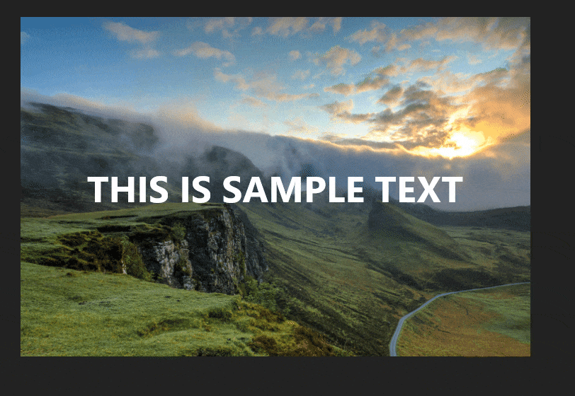
And here is the final result from the code above, with an image and some text as content:
Examples
You can find more examples in the sample app.
反馈
即将发布:在整个 2024 年,我们将逐步淘汰作为内容反馈机制的“GitHub 问题”,并将其取代为新的反馈系统。 有关详细信息,请参阅:https://aka.ms/ContentUserFeedback。
提交和查看相关反馈