Xamarin.Forms 传送页
 下载示例
下载示例Xamarin.Forms CarouselPage 页面就像一个库,用户可从一侧轻扫到另一侧以浏览内容页面。 本文演示如何使用 CarouselPage 浏览页集合。
重要
CarouselView 取代了 CarouselPage并提供一个可供用户轻扫浏览一系列项的可滚动布局。 有关 CarouselView 的详细信息,请参阅 Xamarin.Forms CarouselView。
以下屏幕截图显示每个平台上的 CarouselPage:
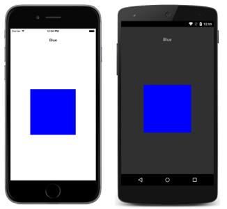
每个平台上的 CarouselPage 布局完全相同。 可以通过从右向左轻扫的方式在集合中向前浏览页面,也可以通过从左向右轻扫的方式在集合中向后浏览页面。 以下屏幕截图显示 CarouselPage 实例中的第一页:
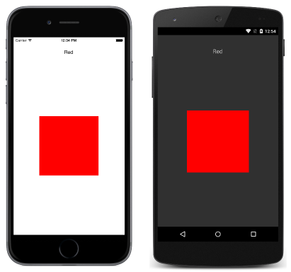
从右向左轻扫以移动到第二个页面,如以下屏幕截图中所示:
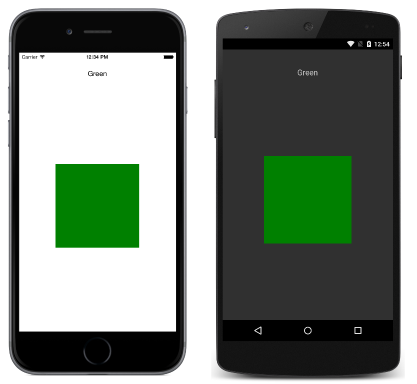
再次从右向左轻扫会移动到第三个页面上,而从左向右轻扫则返回到前一页面。
注意
CarouselPage 不支持 UI 虚拟化。 因此,如果 CarouselPage 包含太多子元素,可能会影响性能。
如果 CarouselPage 嵌入到 FlyoutPage 的 Detail 页,则 FlyoutPage.IsGestureEnabled 属性应设置为 false,以防止 CarouselPage 和 FlyoutPage 之间的手势冲突。
有关 CarouselPage 的详细信息,请参阅 Charles Petzold 所著的 Xamarin.Forms 书籍的第 25 章。
创建 CarouselPage
可以使用两种方法创建 CarouselPage:
- 使用子
ContentPage实例集合填充CarouselPage。 - 将集合分配给
ItemsSource属性并将DataTemplate分配给ItemTemplate属性以返回集合中对象的ContentPage实例。
使用这两种方法,CarouselPage 将依次显示每个页面,轻扫交互会移动到要显示的下一个页面。
注意
CarouselPage 仅可以使用 ContentPage 实例或 ContentPage 派生类填充。
使用页集合填充 CarouselPage
下面的 XAML 代码示例演示显示三个 ContentPage 实例的 CarouselPage:
<CarouselPage xmlns="http://xamarin.com/schemas/2014/forms"
              xmlns:x="http://schemas.microsoft.com/winfx/2009/xaml"
              x:Class="CarouselPageNavigation.MainPage">
    <ContentPage>
        <ContentPage.Padding>
          <OnPlatform x:TypeArguments="Thickness">
              <On Platform="iOS, Android" Value="0,40,0,0" />
          </OnPlatform>
        </ContentPage.Padding>
        <StackLayout>
            <Label Text="Red" FontSize="Medium" HorizontalOptions="Center" />
            <BoxView Color="Red" WidthRequest="200" HeightRequest="200" HorizontalOptions="Center" VerticalOptions="CenterAndExpand" />
        </StackLayout>
    </ContentPage>
    <ContentPage>
        ...
    </ContentPage>
    <ContentPage>
        ...
    </ContentPage>
</CarouselPage>
下面的代码示例介绍了 C# 中的等效 UI:
public class MainPageCS : CarouselPage
{
    public MainPageCS ()
    {
        Thickness padding;
        switch (Device.RuntimePlatform)
        {
            case Device.iOS:
            case Device.Android:
                padding = new Thickness(0, 40, 0, 0);
                break;
            default:
                padding = new Thickness();
                break;
        }

        var redContentPage = new ContentPage {
            Padding = padding,
            Content = new StackLayout {
                Children = {
                    new Label {
                        Text = "Red",
                        FontSize = Device.GetNamedSize (NamedSize.Medium, typeof(Label)),
                        HorizontalOptions = LayoutOptions.Center
                    },
                    new BoxView {
                        Color = Color.Red,
                        WidthRequest = 200,
                        HeightRequest = 200,
                        HorizontalOptions = LayoutOptions.Center,
                        VerticalOptions = LayoutOptions.CenterAndExpand
                    }
                }
            }
        };
        var greenContentPage = new ContentPage {
            Padding = padding,
            Content = new StackLayout {
                ...
            }
        };
        var blueContentPage = new ContentPage {
            Padding = padding,
            Content = new StackLayout {
                ...
            }
        };

        Children.Add (redContentPage);
        Children.Add (greenContentPage);
        Children.Add (blueContentPage);
    }
}
每个 ContentPage 只显示特定颜色的 Label 和该颜色的 BoxView。
使用模板填充 CarouselPage
下面的 XAML 代码示例演示通过将 DataTemplate 分配给 ItemTemplate 属性来构造 CarouselPage,以返回集合中对象的页面:
<CarouselPage xmlns="http://xamarin.com/schemas/2014/forms"
              xmlns:x="http://schemas.microsoft.com/winfx/2009/xaml"
              x:Class="CarouselPageNavigation.MainPage">
    <CarouselPage.ItemTemplate>
        <DataTemplate>
            <ContentPage>
                <ContentPage.Padding>
                  <OnPlatform x:TypeArguments="Thickness">
                    <On Platform="iOS, Android" Value="0,40,0,0" />
                  </OnPlatform>
                </ContentPage.Padding>
                <StackLayout>
                    <Label Text="{Binding Name}" FontSize="Medium" HorizontalOptions="Center" />
                    <BoxView Color="{Binding Color}" WidthRequest="200" HeightRequest="200" HorizontalOptions="Center" VerticalOptions="CenterAndExpand" />
                </StackLayout>
            </ContentPage>
        </DataTemplate>
    </CarouselPage.ItemTemplate>
</CarouselPage>
通过在代码隐藏文件的构造函数中设置 ItemsSource 属性,使用数据填充 CarouselPage:
public MainPage ()
{
    ...
    ItemsSource = ColorsDataModel.All;
}
以下代码示例演示了在 C# 中创建的等效 CarouselPage:
public class MainPageCS : CarouselPage
{
    public MainPageCS ()
    {
        Thickness padding;
        switch (Device.RuntimePlatform)
        {
            case Device.iOS:
            case Device.Android:
                padding = new Thickness(0, 40, 0, 0);
                break;
            default:
                padding = new Thickness();
                break;
        }

        ItemTemplate = new DataTemplate (() => {
            var nameLabel = new Label {
                FontSize = Device.GetNamedSize (NamedSize.Medium, typeof(Label)),
                HorizontalOptions = LayoutOptions.Center
            };
            nameLabel.SetBinding (Label.TextProperty, "Name");

            var colorBoxView = new BoxView {
                WidthRequest = 200,
                HeightRequest = 200,
                HorizontalOptions = LayoutOptions.Center,
                VerticalOptions = LayoutOptions.CenterAndExpand
            };
            colorBoxView.SetBinding (BoxView.ColorProperty, "Color");

            return new ContentPage {
                Padding = padding,
                Content = new StackLayout {
                    Children = {
                        nameLabel,
                        colorBoxView
                    }
                }
            };
        });

        ItemsSource = ColorsDataModel.All;
    }
}
每个 ContentPage 只显示特定颜色的 Label 和该颜色的 BoxView。