PageLinkDesign type
Important
The finance and operations (Dynamics 365) mobile app and platform have been deprecated. For more information, see Removed or deprecated platform features.
Pagelink design object type.
Hierarchy
Design
└─ PageLinkDesign
Index
Properties
- alignItems
- alignSelf
- background
- bindings
- border
- color
- excludeContext
- flexFlow
- flexSize
- fontSize
- fontWeight
- hideArrow
- icon
- justifyItems
- label
- labelPosition
- name
- navigation
- padding
- showCount
- style
- type
Properties
alignItems
alignItems: string (optional)
This property is an alias for the CSS property "align-items". Please refer to this web page for documentation on the "align-items" property.
Inherited from Design.alignItems
alignSelf
alignSelf: string (optional)
background
background: string (optional)
Sets the background color.
If "theme" is used, then the color will match the app's theme color.
bindings
bindings: any (optional)
border
border: "none" | "solid" | "left" | "right" | "top" | "bottom" (optional)
The border behavior of a control. This property will not be inherited by the children.
color
color: string (optional)
The foreground color of the container.
This will modify the color of all headers, items, labels, and icons within the container.
Consider setting the background color at the same time as necessary when setting this attribute.
Note: if color is set to "theme", the theme color of the app will be used.
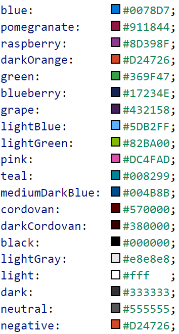
The following colors are available:

excludeContext
excludeContext: boolean (optional)
flexFlow
flexFlow: string (optional)
Specifying this property makes the component a flex container component. This property is an alias for the CSS property "flex-flow". Please refer to this web page for documentation on the "flex-flow" property.
flexSize
flexSize: string (optional)
One number or two numbers written as a string. For example, "(size to grow) [(size-to-shrink)]" to accommodate available space in the immediate flex container. This property is an alias for the CSS property "flex". Please refer to this web page for documentation on the "flex" property.
fontSize
fontSize: "medium" | "xx-small" | "x-small" | "small" | "large" | "x-large" | "xx-large" (optional)
The proportional text size
fontWeight
fontWeight: "normal" | "bold" (optional)
Normal or bold text.
Inherited from Design.fontWeight
hideArrow
hideArrow: boolean (optional)
Allows an arrow ( > ) on a default styled navigation control to be hidden.
By default, arrows are present in a navigation control.
This property can only be added through the design object.
icon
icon: string (optional)
Name of the icon that is displayed in the pagelink control. Here is a list of available icons.
justifyItems
justifyItems: "flex-start" | "flex-end" | "center" | "space-between" (optional)
This property is an alias for the CSS property "justify-content". Please refer to this web page for documentation on the "justify-content" property.
Inherited from Design.justifyItems
label
label: string (optional)
labelPosition
labelPosition: "stacked" | "hidden" | "inline" (optional)
Determines how a label is positioned, if at all. By default, labelPosition is set to stacked.
Inherited from Design.labelPosition
name
name: string (optional)
navigation
navigation: NavigationArgs (optional)
Navigation object of the pagelink.
padding
padding: "none" | "small" | "std" (optional)
Allows specifying the component's padding behavior. A component will inherit the padding behavior specified by its parent container components.
showCount
showCount: boolean (optional)
If true, shows a count of the records present in the list on the target page. This property is only suitable when the navigation target is a Page which contains on a List control.
style
style: string (optional)
Determines the visual style of the pagelink control. Options:
- "inline": takes up the full width its container, with the label in-line with the icon
- "button": takes up only as much width as needed by the label, with the label below the icon
type
type: ControlType (optional)
The type of the control as a string.
Feedback
Coming soon: Throughout 2024 we will be phasing out GitHub Issues as the feedback mechanism for content and replacing it with a new feedback system. For more information see: https://aka.ms/ContentUserFeedback.
Submit and view feedback for