Exercise - Use StackLayout to build a user interface
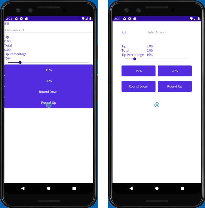
In this exercise, you use nested StackLayout containers to arrange the views in your User Interface (UI). The first screenshot shows the layout implemented by the starter project, and the second one shows the layout for the completed project. Your job is to use StackLayout containers and LayoutOptions to turn the starter project into the completed version.
Explore the starter solution
The starter solution contains a fully functional tip calculator app. Start by exploring the UI to understand what the app does.
Using Visual Studio, open the starter solution in the exercise2/TipCalculator folder in the repo that you cloned at the start of the previous exercise.
Build and run the app on your preferred operating system.
Enter a number into the text box and use the app to see how it works.
Experiment with the tip amount buttons and the slider.
When you're finished, close the app.
Open MainPage.xaml. Notice that all the views are placed into one
VerticalStackLayout, as shown by the following XAML markup:<ContentPage xmlns="http://schemas.microsoft.com/dotnet/2021/maui" xmlns:x="http://schemas.microsoft.com/winfx/2009/xaml" xmlns:local="clr-namespace:TipCalculator" x:Class="TipCalculator.MainPage"> <VerticalStackLayout> <Label Text="Bill" /> <Entry x:Name="billInput" Placeholder="Enter Amount" Keyboard="Numeric" /> <Label Text="Tip" /> <Label x:Name="tipOutput" Text="0.00" /> <Label Text="Total" /> <Label x:Name="totalOutput" Text="0.00" /> <Label Text="Tip Percentage" /> <Label x:Name="tipPercent" Text="15%" /> <Slider x:Name="tipPercentSlider" Minimum="0" Maximum="100" Value="15" /> <Button Text="15%" Clicked="OnNormalTip" /> <Button Text="20%" Clicked="OnGenerousTip" /> <Button x:Name="roundDown" Text="Round Down" /> <Button x:Name="roundUp" Text="Round Up" /> </VerticalStackLayout> </ContentPage>
Fix the UI
Now that you saw the app run, you can make it look better by adding HorizontalStackLayout containers. The goal is to make the app look like the screenshot at the start of the lab.
Open the MainPage.xaml file.
Add
40units of padding and10units of spacing to theVerticalStackLayout:<VerticalStackLayout Padding="40" Spacing="10">Add a
HorizontalStackLayoutto group theLabelthat says Bill with theEntryfield below it. Set theSpacingproperty to10.Set the
WidthRequestof the BillLabelto100and theVerticalOptionsproperty toCenter. These changes ensure that the label is aligned vertically with theEntryfield.<HorizontalStackLayout Spacing="10"> <Label Text="Bill" WidthRequest="100" VerticalOptions="Center"/> <Entry ... /> </HorizontalStackLayout>Add another
HorizontalStackLayoutto group theLabelthat says Tip with theLabelnamed tipOutput. Set theSpacingproperty to10, and theMarginproperty to0,20,0,0.Set the
WidthRequestof the TipLabelto100<HorizontalStackLayout Margin="0,20,0,0" Spacing="10"> <Label Text="Tip" WidthRequest="100" /> <Label .../> </HorizontalStackLayout>Use a
HorizontalStackLayoutto group theLabelthat says Total with theLabelnamed totalOutput. Set theSpacingproperty to10.Set the
WidthRequestof the TotalLabelto100<HorizontalStackLayout Spacing="10"> <Label Text="Total" WidthRequest="100" /> <Label .../> </HorizontalStackLayout>Add another
HorizontalStackLayoutto group theLabelthat says Tip Percentage with theLabelnamed tipPercent.Set the
VerticalOptionsproperty of thisHorizontalStackLayouttoEndand set theSpacingproperty to10:Set the
WidthRequestof the Tip PercentageLabelto100<HorizontalStackLayout VerticalOptions="End" Spacing="10"> <Label Text="Tip Percentage" WidthRequest="100"/> <Label ... /> </HorizontalStackLayout>Use a
HorizontalStackLayoutto group theButtonwith the caption 15% and theButtonwith the caption 20%.Set the
Marginproperty of thisStackLayoutto0,20,0,0, and theSpacingproperty to10:<HorizontalStackLayout Margin="0,20,0,0" Spacing="10"> <Button Text="15%" ... /> <Button Text="20%" ... /> </HorizontalStackLayout>Add a final
HorizontalStackLayoutto group theButtonwith the caption, Round Down and theButtonwith the caption, Round Up.. Set theMarginproperty of thisStackLayoutto0,20,0,0, and theSpacingproperty to10:<HorizontalStackLayout Margin="0,20,0,0" Spacing="10"> <Button ... Text="Round Down" /> <Button ... Text="Round Up" /> </HorizontalStackLayout>On all four button controls, set the
HorizontalOptionsproperty toCenterand theWidthRequestproperty to150. For example:<Button Text="15%" WidthRequest="150" HorizontalOptions="Center" ... />
The complete XAML markup for the content page should look like this:
<?xml version="1.0" encoding="utf-8" ?>
<ContentPage xmlns="http://schemas.microsoft.com/dotnet/2021/maui"
             xmlns:x="http://schemas.microsoft.com/winfx/2009/xaml"
             xmlns:local="clr-namespace:TipCalculator"
             x:Class="TipCalculator.MainPage">

    <VerticalStackLayout Padding="40" Spacing="10">

        <HorizontalStackLayout Spacing="10">
            <Label Text="Bill" WidthRequest="100" VerticalOptions="Center" />
            <Entry x:Name="billInput" Placeholder="Enter Amount" Keyboard="Numeric" />
        </HorizontalStackLayout>

        <HorizontalStackLayout Margin="0,20,0,0" Spacing="10">
            <Label Text="Tip"  WidthRequest="100" />
            <Label x:Name="tipOutput" Text="0.00" />
        </HorizontalStackLayout>

        <HorizontalStackLayout Spacing="10">
            <Label Text="Total" WidthRequest="100"/>
            <Label x:Name="totalOutput" Text="0.00" />
        </HorizontalStackLayout>

        <HorizontalStackLayout VerticalOptions="End" Spacing="10">
            <Label Text="Tip Percentage" WidthRequest="100"/>
            <Label x:Name="tipPercent" Text="15%" />
        </HorizontalStackLayout>

        <Slider x:Name="tipPercentSlider" Minimum="0" Maximum="100" Value="15" />

        <HorizontalStackLayout Margin="0,20,0,0" Spacing="10">
            <Button Text="15%" Clicked="OnNormalTip" WidthRequest="150" HorizontalOptions="Center"/>
            <Button Text="20%" Clicked="OnGenerousTip"  WidthRequest="150" HorizontalOptions="Center"/>
        </HorizontalStackLayout>

        <HorizontalStackLayout Margin="0,20,0,0" Spacing="10">
            <Button x:Name="roundDown" Text="Round Down" WidthRequest="150" HorizontalOptions="Center"/>
            <Button x:Name="roundUp"   Text="Round Up" WidthRequest="150" HorizontalOptions="Center"/>
        </HorizontalStackLayout>

    </VerticalStackLayout>

</ContentPage>
Examine the results
Run the app again and look at the differences in the UI. Verify that the controls are aligned correctly, and are properly sized and spaced.
You used VerticalStackLayout and HorizontalStackLayout containers to improve the aesthetics of an existing UI. These layouts are the simplest layout panels, but are powerful enough to produce a reasonable UI.