Specify the size of a view
Designing a user interface that's consistent across multiple devices is difficult because devices can be different sizes and have different pixel densities. Think about the different devices that are available: mobile, tablet, desktop, and so on. How do we create a user interface that looks similar on each?
.NET MAUI provides layout panels to help you build consistent user interfaces. The layout panel is responsible for sizing and positioning the views of its children. In this unit, you learn how the layout system works in .NET MAUI. Especially, we look at how views are sized by default and how to request a specific size and position for a view at runtime.
What is a layout panel?
A layout panel is a .NET MAUI container that holds a collection of child views and determines their size and position. The layout panels automatically recalculate when the app size changes; for example, when the user rotates the device.
Note
The term view or child view refers to a control placed on a layout panel. A view can be a label, a button, an entry field, or any other type of visual element supported by .NET MAUI.
.NET MAUI has multiple layout panels that you can choose from. Each panel manages its child views differently. The following illustration shows a conceptual overview of some of the most common options.
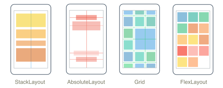
StackLayout: arranges its child views in a single row or column. In addition toStackLayout, there's also a new optimizedVerticalStackLayoutandHorizontalStackLayoutwhen you don't need to change orientation.AbsoluteLayout: arranges its child views by using x and y coordinates.Grid: arranges its child views in cells that are created from the intersection of rows and columns.FlexLayout: arranges its child views like aStackLayoutexcept that you can wrap them if they don't fit into a single row or column.
Note
There is also a fifth type of layout panel called a RelativeLayout, which enables you to specify how to arrange child views relative to each other. You should use the FlexLayout control instead of RelativeLayout because it performs better. RelativeLayout is included in .NET MAUI for backwards compatibility with older Xamarin apps.
The typical process for building a .NET MAUI page is to create a layout panel and then add child views to it. When you add a view to a layout, you can influence the size and position of it. However, the panel has the final say based on its internal layout algorithms.
Before you look at how to request a specific size for a view, let's see how the layout system sizes views by default.
Default size of a view
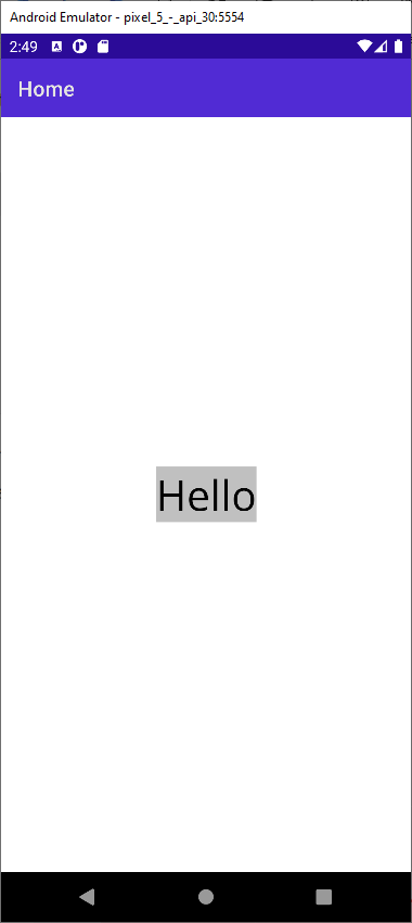
If you don't specify the size of a view, it grows automatically to be exactly large enough to fit around its content. For example, consider this XAML:
<Label
    Text="Hello"
    BackgroundColor="Silver"
    VerticalOptions="Center"
    HorizontalOptions="Center"
    FontSize="40"/>
This example defines a label to display the word Hello on a silver background. Because you're not specifying the size, the label is automatically sized to fit around the word Hello. The following image shows the label rendered on an Android device:
Note
You can set the background color of the label to help you determine how large it is at runtime. This is a good debugging technique to keep in mind as you build your UI.
Specify the size of a view
When you build a UI, it's common to want to control the size of a view. For example, imagine you're building a sign-in page and you want the sign-in button to be exactly half the width of the screen. If you used the default sizing for a view, your button would only be the size of the text Sign in. That size isn't large enough, so you need to specify the size yourself.
The View base class defines two properties that influence the size of a view: WidthRequest and HeightRequest. WidthRequest lets you specify the width, and HeightRequest lets you specify the height. Both properties are of type double.
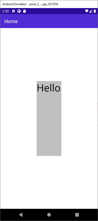
Here's an example that shows how to specify a label's width and height in XAML:
<Label
    Text="Hello"
    BackgroundColor="Silver"
    VerticalOptions="Center"
    HorizontalOptions="Center"
    WidthRequest="100"
    HeightRequest="300"
    FontSize="40"/>
The result looks like this:
Note
The label is still centered, although the text for the label isn't in the center of the label.
One thing that's worth noting is the names of these properties. Both properties contain the word request. This word means the layout panel might not respect them at runtime. The layout panel reads these values during its sizing calculations and tries to accommodate the requests if it can. If there's not enough space, the layout panel is allowed to ignore the values.
Size units
When you set WidthRequest and HeightRequest, you use literal values like 100. At the .NET MAUI level, these values don't have units. They're not points or pixels. They're just values of type double. .NET MAUI passes these values to the underlying operating system at runtime. It's the operating system that provides the context needed to determine what the numbers mean:
- On iOS, the values are called points.
- On Android, they're density-independent pixels.
Rendered size of a view
Because it's up to the layout panel to determine the size of a view, you can't use WidthRequest and HeightRequest to tell you the actual size at runtime. For example, imagine you set WidthRequest to 100 for your label but the panel doesn't have enough space to satisfy the request. Instead, the panel gives your label a width of 80. At this point, if you check the value of the WidthRequest property, it says 100 even though the rendered value is 80.
To solve this problem, the View base class defines two other properties called Width and Height. These properties are of type double and represent the rendered width and height of a view. Use the Width and Height properties whenever you retrieve the size of a view.
Specify the position of a view
You also need to set the position of a view. For example, recall that in the sign-in page example you wanted to size the sign-in button to be half the width of the screen. Because the sign-in button isn't the full width of the screen, there's some space available to move it around. You could position it on the left side, on the right side, or in the center of the screen.
The View base class has two properties that you use to set the position of a view: VerticalOptions and HorizontalOptions. These settings influence how the view is positioned within the rectangle allocated for it by the layout panel. You can specify that you want the view to align to one of the four edges of the rectangle. Or, that you want it to occupy the entire rectangle.
Specifying a value for VerticalOptions or HorizontalOptions is more challenging than setting the size because they're of type LayoutOptions.
What is the LayoutOptions type?
LayoutOptions is a C# type that encapsulates two layout preferences, Alignment and Expands. Both properties are related to positioning, but they're not related to each other. Here's what the definition of the type looks like:
public struct LayoutOptions
{
    public LayoutAlignment Alignment { get; set; }
    public bool Expands { get; set; }
    ...
}
Next, we look more closely at Alignment because it's the most common and intuitive layout option.
What is the LayoutAlignment enumeration?
LayoutAlignment is an enumeration that contains four values: Start, Center, End, and Fill. You can use these values to control how the child view is positioned within the rectangle given to it by its layout panel. For example, consider the following code and Android screenshot:
<StackLayout>
    <Label Text="Start" HorizontalOptions="Start" BackgroundColor="Silver" FontSize="40" />
    <Label Text="Center" HorizontalOptions="Center" BackgroundColor="Silver"  FontSize="40" />
    <Label Text="End" HorizontalOptions="End" BackgroundColor="Silver"  FontSize="40"/>
    <Label Text="Fill" HorizontalOptions="Fill" BackgroundColor="Silver"  FontSize="40"/>
</StackLayout>
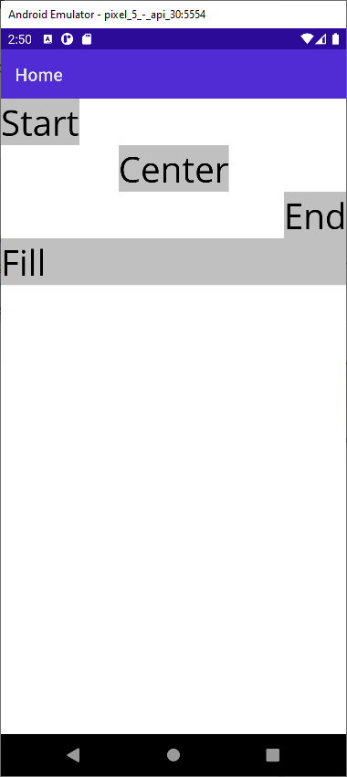
The example uses a vertical StackLayout so each child view is given a row. HorizontalOptions determines the view's position within its row.
What is Expands?
The second property of the LayoutOptions struct is Expands. The Expands property is a bool that in Xamarin.forms allowed a view in a StackLayout to request extra space if any is available. This property is now obsolete and is no longer used in .NET MAUI. Later, we explore how to achieve the same type of expanding in the unit on Grid layout.