Data binding and lists
So far, you've only used data binding to display and edit the properties of a single object. In this lesson, you'll apply data binding concepts to display a collection of objects. To make things simple, these objects will be colors. More specifically, they'll be multiple instances of the ColorDescriptor class.
1. Create the ColorDescriptor class
Let's create a class to represent a color. Right-click the DatabindingSample project in Solution Explorer, select Add / Class, and enter ColorDescriptor as the class name. Select Add to create the class.
ColorDescriptor contains two properties: the color itself as a Windows.UI.Color object, and a color name. It also has a constructor that fills these properties, a ToString() method that displays the color's name, and hex values for the R, G, and B color components. Here's the entire ColorDescriptor class.
using Windows.UI;

namespace DatabindingSample
{
    public class ColorDescriptor : ObservableObject
    {
        public ColorDescriptor(Color color, string name)
        {
            Color = color;
            Name = name;
        }

        public Color Color { get; private set; }

        public string Name { get; private set; }

        public override string ToString()
        {
            return $"{Name} (#{Color.R:X2}{Color.G:X2}{Color.B:X2})";
        }
    }
}
Replace the default contents of the ColorDescriptor.cs file with the preceding code.
2. Create the ColorList.xaml page
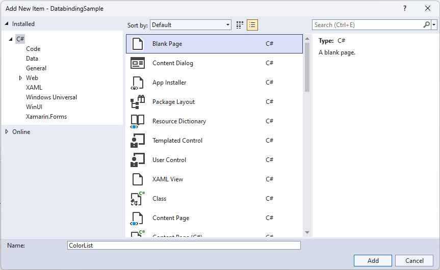
To display the color list, we'll use a new XAML page. Right-click the DatabindingSample project in Solution Explorer, and select Add / New Item. Choose Blank Page from the list of available items, and then enter ColorList as the name. Select Add to create the page.
3. Set the startup page
Now if you launch the application, it opens with the MainPage page. Because you're going to be working with the newly created ColorList.xaml page, it'd be nice to have that as the starting page. To make it happen, open App.xaml.cs, and find the line that navigates to MainPage.
rootFrame.Navigate(typeof(MainPage), e.Arguments);
Replace MainPage with ColorList, and verify that the ColorList page is launched when you start the app (press F5 or select Debug / Start Debugging).
4. Create the logic for the color list
We'll continue the previously introduced best practice of creating a separate logic for the new page. So, go ahead and create a new class, called ColorListLogic.
Right-click the DatabindingSample project in Solution Explorer, select Add / Class, and then enter ColorListLogic as the class' name. Select Add to create the class, and paste the following into the file:
using System.Collections.Generic;
using System.Collections.ObjectModel;

using Windows.UI;

namespace DatabindingSample
{
    public class ColorListLogic : ObservableObject
    {
        public List<ColorDescriptor> LotsOfColors { get; private set; }

        public ColorListLogic()
        {
            LotsOfColors = new List<ColorDescriptor>
            {
               new ColorDescriptor(Colors.Red, "red"),
               new ColorDescriptor(Colors.White, "white"),
               new ColorDescriptor(Colors.Green, "green"),
               new ColorDescriptor(Colors.Yellow, "yellow"),
               new ColorDescriptor(Colors.Blue, "blue"),
               new ColorDescriptor(Colors.Black, "black")
            };

        }
    }
}
The ColorListLogic class is very simple (for now). It has a property called LotsOfColors, which is a List of ColorDescriptor objects. The list is filled with some colors in the class' constructor. And that's it.
5. Display the colors in a ListBox
The next step is to display the colors in our app. First, let's make the ColorListLogic accessible from XAML. Open up ColorList.xaml.cs, and add this to the ColorList class:
public ColorListLogic Logic { get; } = new ColorListLogic();
We're using the same syntax here as we did for MainPageLogic earlier. It creates a get-only property, and initializes its value to a newly created ColorListLogic object.
Next, open ColorList.xaml and add the following XAML inside the Grid element.
<ListBox ItemsSource="{x:Bind Logic.LotsOfColors}"
         Margin="20"
         Width="200"
         HorizontalAlignment="Left"
         VerticalAlignment="Top"/>
The interesting part here is the ItemsSource attribute. As the name suggests, it provides the source of the items displayed in the ListBox. And it's simply bound to the ColorListLogic's LotsOfColors property.
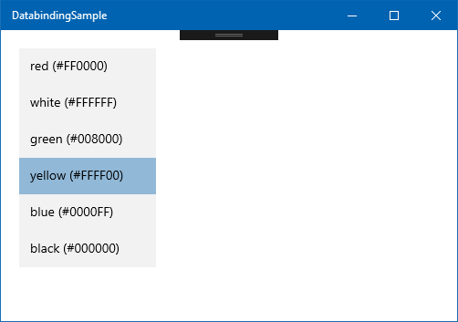
If you run the app now, it shows the colors in a ListBox! But it's not too nice to look at. The ListBox seems to have invoked the ToString() method of the ColorDescriptors stored in the LotsOfColors list.
6. Define a template for the items
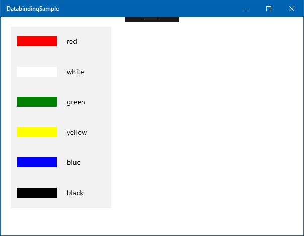
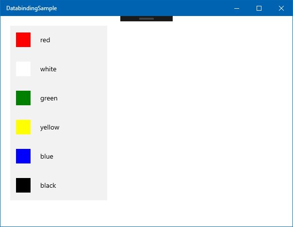
It'd be nice to have a template that shows the actual color stored in the ColorDescriptor.Color property, and its name. Something like this:

To code this in XAML, we can put a colored Rectangle and a TextBlock in a StackPanel.
<StackPanel Orientation="Horizontal">
    <Rectangle Width="80" Height="20">
        <Rectangle.Fill>
            <SolidColorBrush Color="Blue"/>
        </Rectangle.Fill>
    </Rectangle>
    <TextBlock Text="blue" Margin="20, 10, 0, 10"/>
</StackPanel>
This is one of the strengths of XAML and data binding. Almost every complex visual is based off of templates that you can redefine. To use the preceding StackPanel as a template, we need to put it inside a DataTemplate. A DataTemplate needs to define a DataType, which is the type of data the template can be applied to. In our case, it is the ColorDescriptor class. So, the DataTemplate looks like this:
<DataTemplate x:DataType="local:ColorDescriptor">
    <!-- template content comes here -->
</DataTemplate>
How data is rendered in a ListBox (and lots of other controls) is controlled by its ItemTemplate, which should be set to the DataTemplate. There are multiple ways to do this. In this lesson, we'll simply define the DataTemplate inside the ListBox, with the following syntax:
<ListBox ...>
    <ListBox.ItemsSource>
        <DataTemplate ...>
            ...
        </DataTemplate>
    </ListBox.ItemsSource>
</ListBox>
Later, you'll see how a DataTemplate can be reused in multiple places by defining it as a resource.
Now the whole ListBox looks like this (if you haven't followed along, replace the entire <ListBox> tag with the following XAML):
<ListBox ItemsSource="{x:Bind Logic.LotsOfColors}"
         Margin="20"
         Width="200"
         HorizontalAlignment="Left"
         VerticalAlignment="Top">
    <ListBox.ItemTemplate>
        <DataTemplate x:DataType="local:ColorDescriptor">
            <StackPanel Orientation="Horizontal">
                <Rectangle Width="80"
                           Height="20">
                    <Rectangle.Fill>
                        <SolidColorBrush Color="{x:Bind Color}"/>
                    </Rectangle.Fill>
                </Rectangle>
                <TextBlock Text="{x:Bind Name}"
                           Margin="20, 10, 0, 10"/>
            </StackPanel>
        </DataTemplate>
    </ListBox.ItemTemplate>
</ListBox>
Note that because every item in the ListBox corresponds to a ColorDescriptor object, you only need to define the bindings inside the template within the context of this class. The compiler even checks that the Logic.LotsOfColors contains ColorDescriptor objects, and that ColorDescriptor.Color and ColorDescriptor.Name exist and are of the right type.
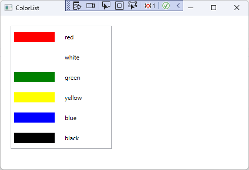
7. Run the app
Run the app now by pressing F5 or by selecting Debug / Start Debugging in the menu. You should see the color list in all its glory.
If you launch an XAML app in debug mode, you can take advantage of live XAML editing. You don't even need to stop the app or press save. Just change the XAML, and most of your changes are reflected instantly on the running app. Try it now. Change the Width and Height of the Rectangle inside the data template to 30, thus turning the color rectangles into squares.
This is called XAML Hot Reload, and it can be useful for fine-tuning the layout and animations in your app.
Summary
This lesson showed you the basics of displaying multiple items in a ListBox. There are other controls available for similar purposes, such as ItemsControl, ListView, and GridView. But the basic principles are the same: bind your list (IEnumerable, List<>) of objects to the ItemsSource property, and define DataTemplates to control how the individual list items are displayed and behave. You can also redefine the layout of these items, and even the look of the container controls themselves (although this is beyond the scope of this module).
Note that the code never had to deal with the ListBox itself. It just created a collection of business objects (ColorDescriptor), and the XAML runtime took care of expanding the template for every item.
The next lesson illustrates how you can select items from a ListBox or a dropdown, and change the content of lists from code so that adding and removing elements are reflected on the UI.
So far, you've only used data binding to display and edit the properties of a single object. In this lesson, you'll apply data binding concepts to display a collection of objects. To make things simple, these objects will be colors. More specifically, they'll be multiple instances of a ColorDescriptor class.
1. Create the ColorDescriptor class
Let's create the class to represent a color. Right-click the DatabindingSampleWPF project in Solution Explorer, select Add / Class, and enter ColorDescriptor as the class name. Select Add to create the class.
ColorDescriptor contains two properties: the color itself as a System.Windows.Media.Color object, and a color name. It also has a constructor that sets these properties, a ToString() method that displays the color's name, and hex values for the R, G, and B color components. Here's the entire ColorDescriptor class.
using System.Windows.Media;

namespace DatabindingSampleWPF
{
    public class ColorDescriptor : ObservableObject
    {
        public ColorDescriptor(Color color, string name)
        {
            Color = color;
            Name = name;
        }

        public Color Color { get; private set; }

        public string Name { get; private set; }

        public override string ToString()
        {
            return $"{Name} (#{Color.R:X2}{Color.G:X2}{Color.B:X2})";
        }
    }
}
Replace the default contents of the ColorDescriptor.cs file with the preceding code.
2. Create the ColorList.xaml page
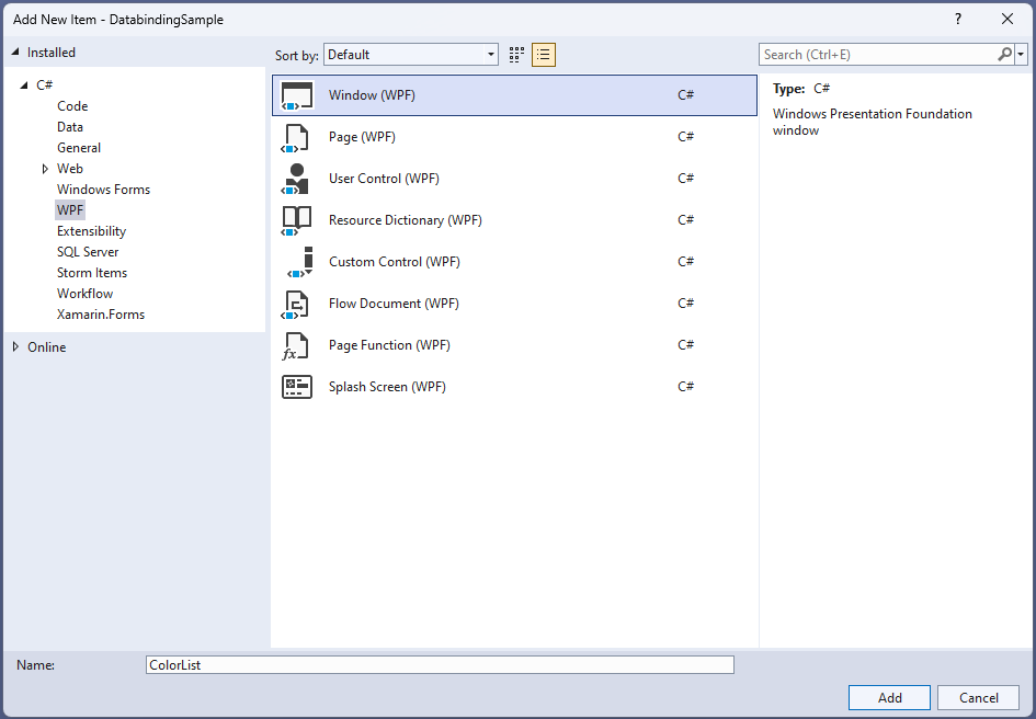
To display the color list, we'll use a new XAML file. Right-click the DatabindingSampleWPF project in Solution Explorer, and select Add / New Item. Choose Window (WPF) from the list of available items, and then enter ColorList as the name. Select Add to create the page.
3. Set the startup XAML file
Now if you launch the application, it opens with MainWindow. Because you're going to be working with the newly created ColorList.xaml, it'd be nice to have that display on startup. To make it happen, open App.xaml, and find the StratupUri attribute of the root Application element.
StartupUri="MainWindow.xaml"
Replace MainWindow with ColorList, and verify that the ColorList is shown when you start the app (press F5 or select Debug / Start Debugging).

4. Create the DataContext for the color list
We'll continue the previously introduced best practice of creating a separate DataContext class for the new XAML window. So, we'll go ahead and create a new class, called ColorListDataContext.
Right-click the DatabindingSample project in Solution Explorer, select Add / Class, and then enter ColorListDataContext as the class' name. Select Add to create the class, and paste the following into the file:
using System.Collections.ObjectModel;
using System.Collections.Generic;
using System.Windows.Media;

namespace DatabindingSampleWPF
{
    public class ColorListDataContext: ObservableObject
    {
        public List<ColorDescriptor> LotsOfColors { get; private set; }

        public ColorListDataContext()
        {
            LotsOfColors = new List<ColorDescriptor>
            {
               new ColorDescriptor(Colors.Red, "red"),
               new ColorDescriptor(Colors.White, "white"),
               new ColorDescriptor(Colors.Green, "green"),
               new ColorDescriptor(Colors.Yellow, "yellow"),
               new ColorDescriptor(Colors.Blue, "blue"),
               new ColorDescriptor(Colors.Black, "black")
            };
        }
    }
}
The ColorListDataContext class is very simple (for now). It has a property called LotsOfColors, which is a List of ColorDescriptor objects. The list is filled with some colors in the class' constructor. And that's it.
5. Display the colors in a ListBox
The next step is to display the colors in our app. As before, we need to create an instance of the ColorListDataContext class in ColorList.xaml, and set it as the DataContext for the entire window. Open up ColorList.xaml, and add this right after the <Window ...> tag:
<Window.DataContext>
    <local:ColorListDataContext/>
</Window.DataContext>
You need to compile the code at this point, so that the XAML designer can resolve the newly defined ColorListDataContext class.
Then, copy the following XAML markup inside the <Grid> tag:
<ListBox ItemsSource="{Binding LotsOfColors}"
         Margin="20"
         Width="200"
         HorizontalAlignment="Left"
         VerticalAlignment="Top"/>
The interesting part here is the ItemsSource attribute. As the name suggests, it provides the source of the items displayed in the ListBox. And it's simply bound to the ColorListDataContext's LotsOfColors property.
If you run the app now, it shows the colors in a ListBox! But it's not too nice to look at. The ListBox seems to have invoked the ToString() method of the ColorDescriptors stored in the LotsOfColors list.

6. Define a template for the items
It'd be nice to have a template that shows the actual color stored in the ColorDescriptor.Color property and its name. Something like this:
To code this in XAML, we can put a colored Rectangle and a TextBlock in a StackPanel.
<StackPanel Orientation="Horizontal">
    <Rectangle Width="80" Height="20">
        <Rectangle.Fill>
            <SolidColorBrush Color="Blue"/>
        </Rectangle.Fill>
    </Rectangle>
    <TextBlock Text="blue" Margin="20, 10, 0, 10"/>
</StackPanel>
This is one of the strengths of XAML and data binding. Almost every complex visual is based off of templates that you can redefine. To use the above StackPanel as a template, we need to put it inside a DataTemplate:
<DataTemplate>
    <!-- template content comes here -->
</DataTemplate>
How data is rendered in a ListBox (and lots of other controls) is controlled by its ItemTemplate, which should be set to the DataTemplate above. There are multiple ways to do this. In this lesson, we'll simply define the DataTemplate inside the ListBox, with the following syntax:
<ListBox ...>
    <ListBox.ItemsSource>
        <DataTemplate ...>
            ...
        </DataTemplate>
    </ListBox.ItemsSource>
</ListBox>
Later, you will see how a DataTemplate can be reused in multiple places by defining it as a resource.
Now, the markup for the entire ListBox looks like this (if you haven't followed along, replace the entire <ListBox> element with the following XAML):
<ListBox ItemsSource="{Binding LotsOfColors}"
         Margin="20"
         Width="200"
         HorizontalAlignment="Left"
         VerticalAlignment="Top">
    <ListBox.ItemTemplate>
        <DataTemplate>
            <StackPanel Orientation="Horizontal">
                <Rectangle Width="80"
                           Height="20">
                    <Rectangle.Fill>
                        <SolidColorBrush Color="{Binding Color}"/>
                    </Rectangle.Fill>
                </Rectangle>
                <TextBlock Text="{Binding Name}"
                           Margin="20, 10, 0, 10"/>
            </StackPanel>
        </DataTemplate>
    </ListBox.ItemTemplate>
</ListBox>
Note that because every item in the ListBox corresponds to a ColorDescriptor object, you only need to define the bindings inside the template within the context of this class.
7. Run the app
You should immediately see the color list in Visual Studio. Just to make sure, run the app now by pressing F5 or by selecting Debug / Start Debugging in the menu.
If you launch an XAML app in debug mode, you can take advantage of live XAML editing. You don't even need to stop the app or press save. Just change the XAML, and most of your changes are reflected instantly on the running app. Try it now. Change the Width and Height of the Rectangle inside the data template to 30, thus turning the color rectangles into squares.

This is called XAML Hot Reload, and it can be useful for fine-tuning the layout and animations in your app.
Summary
This lesson walked through the basics of displaying multiple items in a ListBox. There are other controls available for similar purposes, such as ItemsControl, ListView, and GridView. But the basic principles are the same: bind your list (IEnumerable, List<>) of objects to the ItemsSource property, and define a DataTemplate to control how the individual list items are displayed and behave. You can also redefine the layout of these items, and even the look of the container controls themselves (although this is beyond the scope of this module).
Note that the logic code never had any knowledge of the ListBox control. It just created a collection of business objects (ColorDescriptor), and the XAML runtime handled the rendering of the template for each item.
The next lesson illustrates how you can select items from a ListBox or a ComboBox, and change the content of lists from code so that adding and removing elements is reflected on the UI.