Visualize report data part 2
Video 16: Visualizing Report Data - Part 3
In this 4-minute video, Peter Myers and Chris Finlan introduce the data visualization templates.
Note
Unlike flexible grid layouts, the visualization is fixed in dimensions.
The Insert ribbon tab contains six templates to visualize data:
- Chart
- Gauge
- Map
- Data bar
- Sparkline
- Indicator
Tip
Your students may know these visualizations by different names so take a moment to describe or show each of the templates.
View the video here.
https://www.youtube.com/embed/dliLsRvQB-c
Video 17: Visualizing Report Data - Part 4
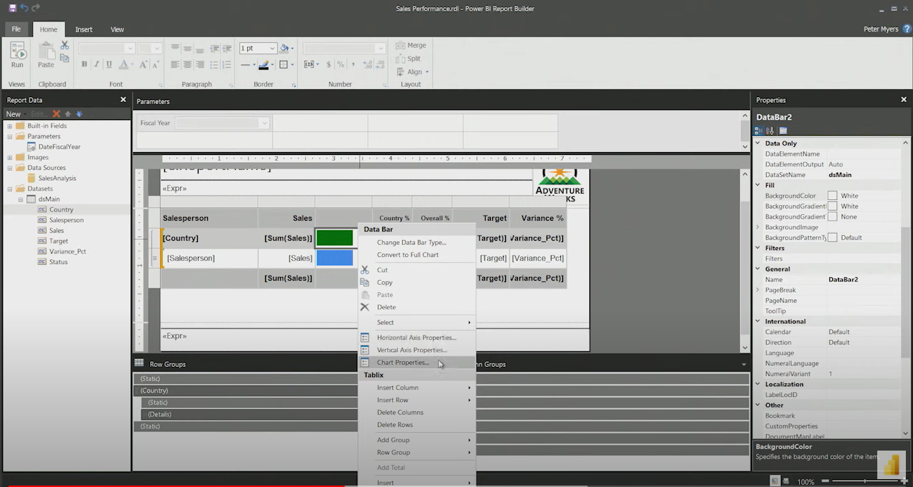
In this 8-minute video, Peter Myers and Chris Finlan demonstrate adding data bars and indicators to the table report.
Caution
At 3-minutes into the video, the discussion of a chart inside a text box is a major area of confusion for new visualization developers.
View the video here.
https://www.youtube.com/embed/5yHxuRRP_eU