Exercise - Support tablet and desktop screen sizes
Note
.NET MAUI is the next evolution of Xamarin and what we recommend you develop mobile and desktop apps with, and you can learn more about .NET MAUI in several training modules. This Xamarin training module will not be maintained going forward.
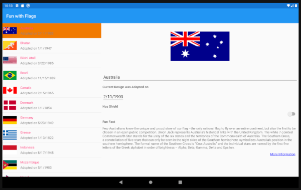
In this exercise, we're going to adapt the display for larger screen sizes like tablets and desktops. TwoPaneView can set the two panes to specific widths or proportionally, and we can use the same navigation strategy as for dual-screen display.
We'll continue with the solution from the previous exercise. If you don't already have it, you can open the solution from the exercise3 > start folder in your copy of the cloned or downloaded exercise repo in Visual Studio.
Detect larger screens
We can use the Xamarin.Forms Device class to detect whether the app is running on a large screen.
Add the following code to AllFlagsPage.xaml.cs:
bool DeviceIsBigScreen => (Device.Idiom == TargetIdiom.Tablet) || (Device.Idiom == TargetIdiom.Desktop);
Update layout and navigation
In AllFlagsPage.xml update the XAML
TwoPaneViewelement to include proportional sizes for the two panes:<dualScreen:TwoPaneView x:Name="twoPaneView" Pane1Length="1*" Pane2Length="2*"><!--proportional layout 1/3 for list, 2/3 for details-->These properties do not apply when the mode configuration is set to
SinglePane, because only one pane is visible; and they do not apply on a Surface Duo, because the two panes are sized to fit the two screens.Open AllFlagsPage.xaml.cs.
Update
ListView_FlagTappedso that the navigation is not used when the app is running on a large screen, by changing theifclause to!DeviceIsSpanned && !DeviceIsBigScreen. The method should look like this:async void ListView_ItemTapped(object sender, ItemTappedEventArgs e) { if (!DeviceIsSpanned && !DeviceIsBigScreen) { // use Navigation only on phone-size single-screens await this.Navigation.PushAsync(new FlagDetailsPage()); } }Change the
UpdateLayoutsmethodifclause toDeviceIsSpanned || DeviceIsBigScreenso that theLeftRight/TopBottomconfiguration is used for both spanned and large screens. When the device has a large screen, the two panes will be sized proportionally due to the XAML attributes we added previously.void UpdateLayouts() { if (DeviceIsSpanned || DeviceIsBigScreen) { // two panes: side by side // ... remainder of method unchangedRun the app on a tablet or desktop computer supported by Xamarin.Forms, and the layout will adapt to resemble the dual-screen size-by-side appearance:
