Tutorial: Create an R-powered Power BI visual
As a developer you can create your own Power BI visuals. These visuals can be used by you, your organization or by third parties.
This article is a step by step guide for creating an R-powered visual for Power BI.
In this tutorial, you learn how to:
- Create an R-powered visual
- Edit the R-script in Power BI Desktop
- Add libraries to the dependencies file of the visual
- Add a static property
Prerequisites
- A Power BI Pro account. Sign up for a free trial before you begin.
- An R engine. You can download one free from many locations, including the Microsoft R Open download page and the CRAN Repository. For more information, see Create Power BI visuals using R.
- Power BI Desktop.
- Windows PowerShell version 4 or later for Windows users OR the Terminal for OSX users.
Get started
Prepare some sample data for the visual. You can save these values to an Excel database or a .csv file and import it into Power BI Desktop.
MonthNo Total Units 1 2303 2 2319 3 1732 4 1615 5 1427 6 2253 7 1147 8 1515 9 2516 10 3131 11 3170 12 2762 To create a visual, open PowerShell or Terminal, and run the following command:
pbiviz new rVisualSample -t rvisualThis command creates a new folder for the rVisualSample visual. The structure is based on the
rvisualtemplate. It creates a file called script.r in the root folder of the visual. This file holds the R-script that is run to generate the image when the visual is rendered. You can create your R-script in Power BI Desktop.From the newly created
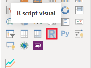
rVisualSampledirectory run the following command:pbiviz startIn Power BI Desktop, select R script visual:
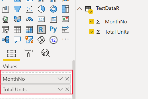
Assign data to the developer visual by dragging MonthNo and Total units to Values for the visual.
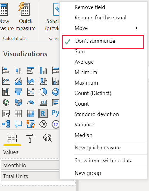
Set the aggregation type of Total units to Don't summarize.
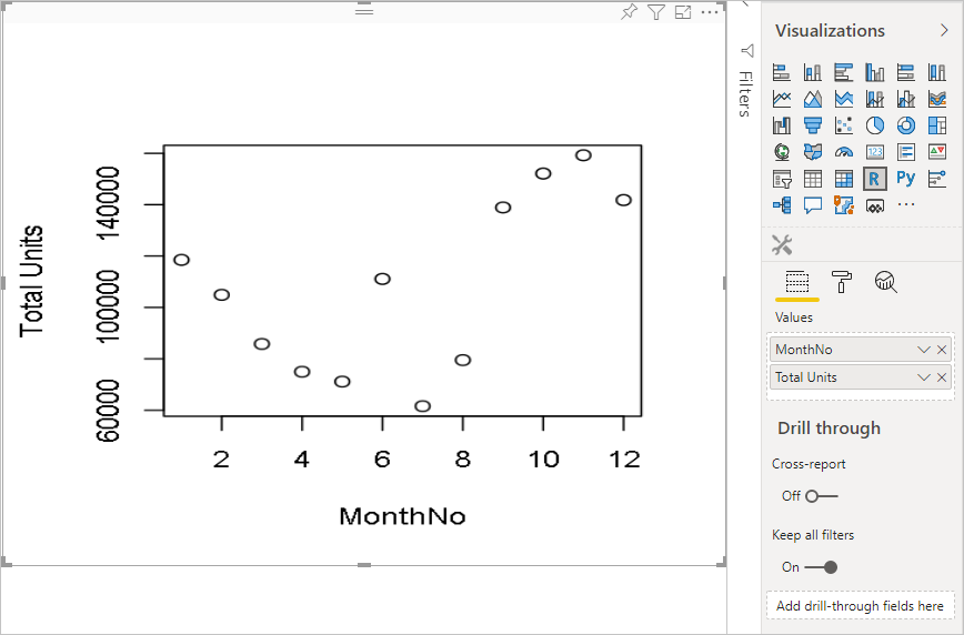
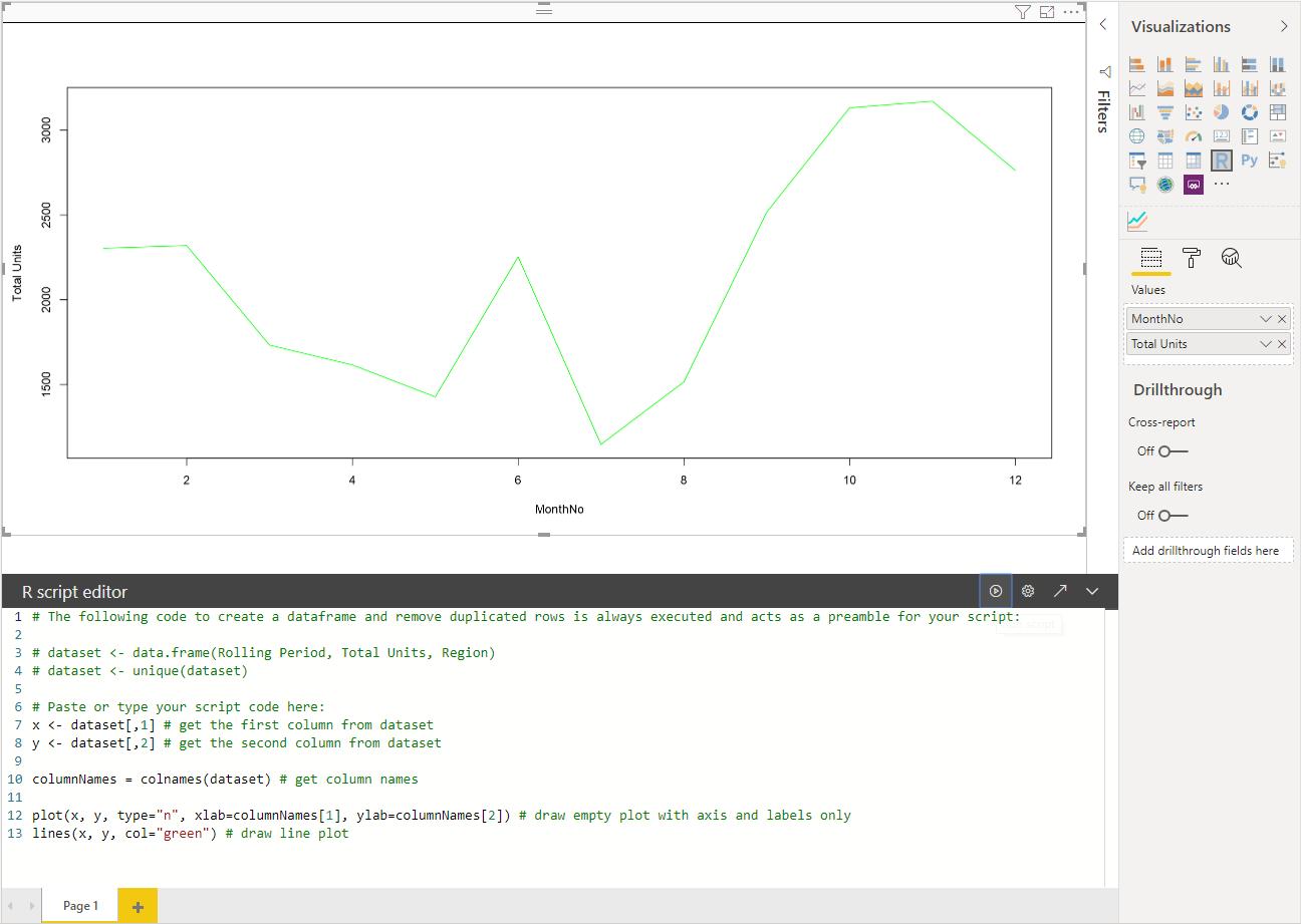
From the R-script editor in your Power BI Desktop, type the following:
plot(dataset)This command creates a scatter chart using the values in the semantic model as input.
Select the Run script icon to see the result.
Edit the R Script
The R-script can be modified to create other types of visuals. Let's create a line chart next.
Paste the following R code into the R script editor.
x <- dataset[,1] # get the first column from semantic model
y <- dataset[,2] # get the second column from semantic model

columnNames = colnames(dataset) # get column names

plot(x, y, type="n", xlab=columnNames[1], ylab=columnNames[2]) # draw empty plot with axis and labels only
lines(x, y, col="green") # draw line plot
Select the Run script icon to see the result.
When your R-script is ready, copy it to the
script.rfile located in the root directory of your visual project.In the capabilities.json file, change the
dataRoles:nameto dataset, and set thedataViewMappingsinput to dataset.{ "dataRoles": [ { "displayName": "Values", "kind": "GroupingOrMeasure", "name": "dataset" } ], "dataViewMappings": [ { "scriptResult": { "dataInput": { "table": { "rows": { "select": [ { "for": { "in": "dataset" } } ], "dataReductionAlgorithm": { "top": {} } } } }, ... } } ], }Add the following code to support resizing the image in the src/visual.ts file.
  public onResizing(finalViewport: IViewport): void {
      this.imageDiv.style.height = finalViewport.height + "px";
      this.imageDiv.style.width = finalViewport.width + "px";
      this.imageElement.style.height = finalViewport.height + "px";
      this.imageElement.style.width = finalViewport.width + "px";
  }
Add libraries to visual package
The corrplot package creates a graphical display of a correlation matrix. For more information about corrplot, see An Introduction to corrplot Package.
Add the
corrplotlibrary dependency to thedependencies.jsonfile. Here is an example of the file content:{ "cranPackages": [ { "name": "corrplot", "displayName": "corrplot", "url": "https://cran.r-project.org/web/packages/corrplot/" } ] }Now you can start using the corrplot package in your
script.rfile.library(corrplot) corr <- cor(dataset) corrplot(corr, method="circle", order = "hclust")The result of using
corrplotpackage looks like this example: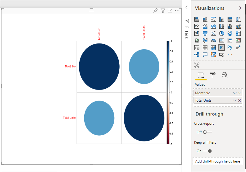
Add a static property to the property pane
Now that we have a basic corrplot visual, let's add properties to the property pane that allow the user to change the look and feel to the visual.
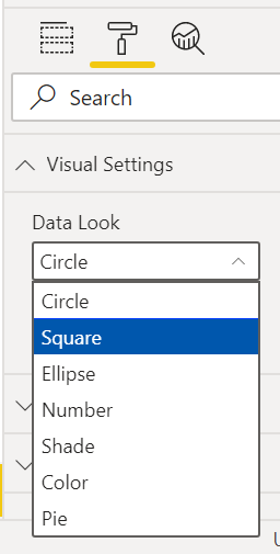
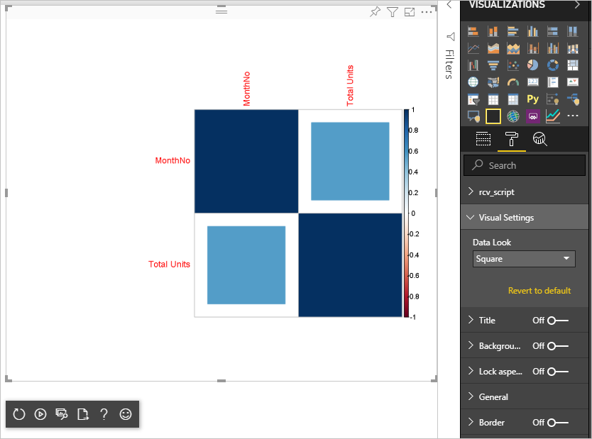
We use the method argument to configure the shape of the data points. The default script uses a circle. Modify your visual to let the user choose between several options.
Define an
objectcalled settings in the capabilities.json file and give it the following properties."settings": { "properties": { "method": { "type": { "enumeration": [ { "value": "circle" }, { "value": "square" }, { "value": "ellipse" }, { "value": "number" }, { "value": "shade" }, { "value": "color" }, { "value": "pie" } ] } } } }Open the src/settings.ts file. Create a
VisualCardSettingsclass with the public propertiesmethod,name,displayNameandslicesas shown in the code box bellow.import ItemDropdown = formattingSettings.ItemDropdown; const methodOptions = [ { displayName: "Circle", value: "circle" }, { displayName: "Square", value: "square" }, { displayName: "Ellipse", value: "ellipse" }, { displayName: "Number", value: "number" }, { displayName: "Shade", value: "shade" }, { displayName: "Color", value: "color" }, { displayName: "Pie", value: "pie" } ] class VisualCardSettings extends FormattingSettingsCard { method: FormattingSettingsSlice = new ItemDropdown({ name: "method", displayName: "Method", items: methodOptions, value: methodOptions[0] }); name: string = "settings"; displayName: string = "Settings"; slices: Array<FormattingSettingsSlice> = [this.method]; }After these steps, you can change the property of the visual.
Finally, the R-script must have a default property. If the user doesn't change the property value (in this case, the shape setting), the visual uses this value.
For R runtime variables for the properties, the naming convention is
<objectname>_<propertyname>, in this case,settings_method.Run the following R-script:
library(corrplot)
corr <- cor(dataset)

if (!exists("settings_method"))
{
    settings_method = "circle";
}

corrplot(corr, method=settings_method, order = "hclust")
Package and import your visual
Now you can package the visual and import it to any Power BI report.
Fill in the
displayName,supportUrl,description, author'snameandemail, and any other important information in thepbivis.jsonfile.If you want to change the visual's icon on the visualization pane, replace the icon.png file in the assets folder.
From the root directory of your visual run:
pbiviz packageFor more information on packaging your visual see Packaging the custom visual
Import the visual's pbiviz file to any Power BI report. See Import a visual file from your local computer into Power BI for instructions on how to do this.
Your final visual looks like the following example:
Related content
Feedback
Coming soon: Throughout 2024 we will be phasing out GitHub Issues as the feedback mechanism for content and replacing it with a new feedback system. For more information see: https://aka.ms/ContentUserFeedback.
Submit and view feedback for