Basic concepts for designers in the Power BI service
The aim of this article is to familiarize you with the Power BI service: what the different elements are, how they work together, and how you can work with them. Before reading this article, we recommend that you sign up for the Power BI service and add some data so that you can follow along. If you don't have your own reports yet, install one of the Power BI samples.
Note
This article describes concepts and building blocks from the point of view of a user of the Power BI service. To learn about Power BI Desktop, see Power BI Desktop.
As a designer or creator, one typical workflow is to start in Power BI Desktop where you create content such as reports, apps, and dataflows. When you publish this content to workspaces in the Power BI service, you share them with colleagues. In the Power BI service, you and your colleagues collaborate on content by continuing to modify and add content and sharing with others.
Power BI concepts
The major building blocks of Power BI are: reports, workbooks, semantic models, dataflows, dashboards, and apps. These building blocks are often referred to collectively as content. They're all organized into workspaces, and created in capacities.

It's important to understand licenses, capacities, and workspaces before we dig into the building blocks, so let's start there.
Licenses and subscriptions
Several things determine the extent of what you can do in Power BI.
- Which license you have (free, Pro, or Premium Per User)
- If your organization has a subscription for Premium capacity and if content is stored in that Premium capacity
- The workspace role that you're assigned
The combination of these three things determines whether you're a creator or a consumer, whether you can share your content with others or access shared content, if you can use advanced features such as subscribing and exporting, and much more.
Users with Pro and Premium Per User (PPU) licenses can create, share, and use advanced features of Power BI. If their organization has a Premium capacity subscription, Pro and PPU users can invite free users to workspaces saved in Premium capacity. With permissions to content in Premium capacity, free users can also create, collaborate, share, and use advanced features of Power BI. The extent of what a user can do in a workspace depends on the role that user is assigned. The options are: Admin, Member, Contributor, and Viewer.
Licenses and subscriptions are complex topics and only described at a high level in this article. For more information, visit these articles.
Capacities
A capacity is a set of resources (storage, processor, and memory) used to host and deliver your Power BI content. Capacities are either shared or reserved. A shared capacity is shared with other Microsoft customers, while a reserved capacity is reserved for a single customer. Reserved capacities require a subscription, and are fully described in Managing Premium capacities.
By default, workspaces are created in a shared capacity. In shared capacity, workloads run on computational resources shared with other customers. As the capacity must share resources, limitations are imposed to ensure "fair play," such as the maximum model size (1 GB) and maximum daily refresh frequency (eight times per day).
As described in the Licenses and subscriptions section of this article, content in Premium capacity can be shared with free users.
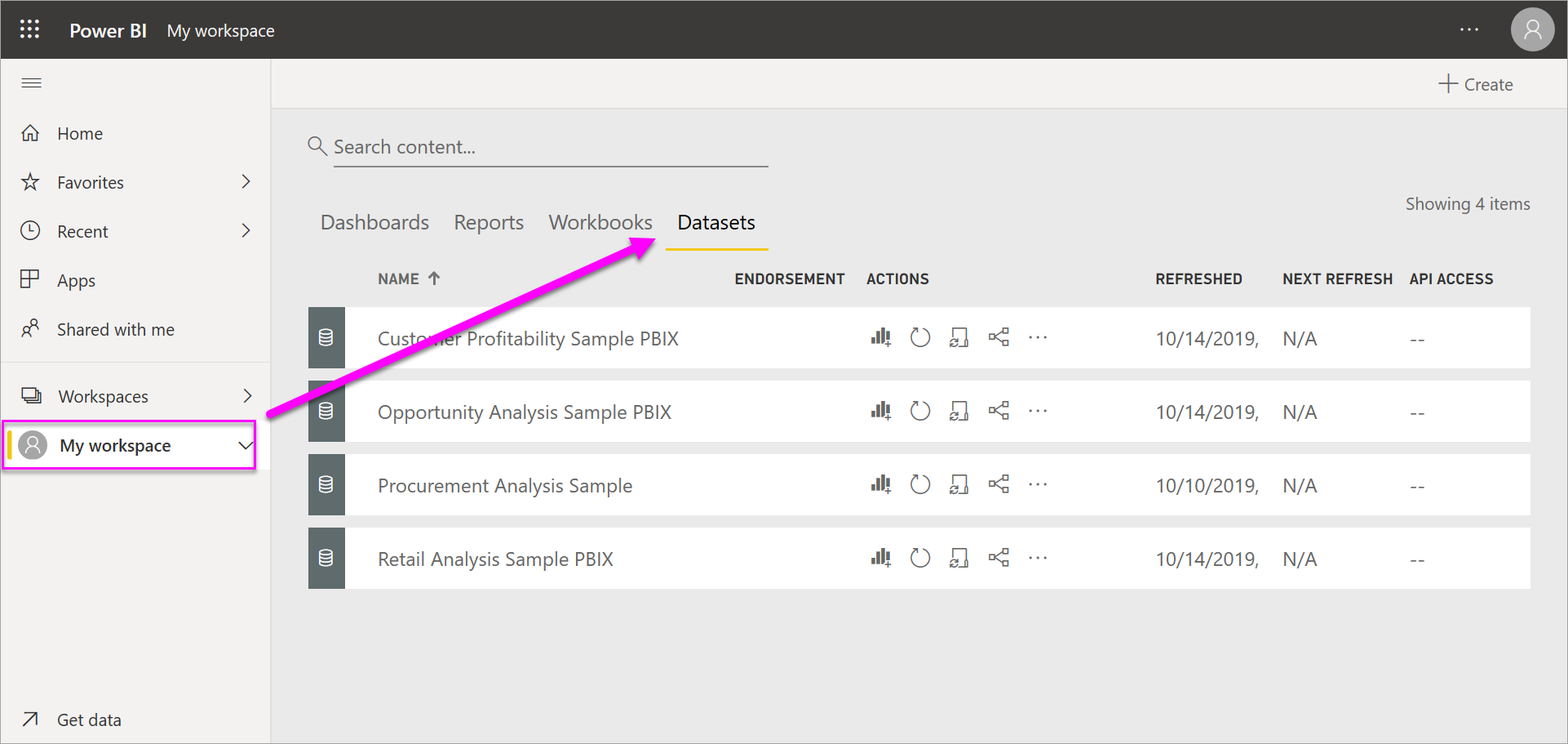
Workspaces
Workspaces are created in capacities. Essentially, they're containers for dashboards, reports, apps, workbooks, semantic models, dataflows, and other content in Power BI.
When you open a workspace, the included content is listed under the Name tab. In this example, the Q1 Modern Insights workspace has three reports, one dashboard, and one scorecard. To open the report page, dashboard, or scorecard, select it.

There are two types of workspaces: My workspace and workspaces.
My workspace is the personal workspace for any Power BI customer to work with your own content. Only you have access to your My workspace. If you want to collaborate on dashboards and reports, or create an app, then you want to work in a different type of workspace.
Workspaces are used to collaborate and share content with colleagues. You can add colleagues to your workspaces and collaborate on dashboards, reports, apps, workbooks, and semantic models. With one exception, each workspace member needs a Power BI Pro or Premium Per User (PPU) license to share and collaborate. The exception is if the content is saved in a Premium capacity. In a Premium capacity, you can share content with users who have free licenses. For more information, see the Licenses and subscriptions section of this article.
For more information about workspaces, see Create a workspace in Power BI.
For more information about licenses, see Power BI service per-user and capacity-based licenses.
Workspaces are also the places where you create, publish, and manage apps for your organization. Think of workspaces as staging areas and containers for the content that makes up a Power BI app. To learn about apps, see the Apps section of this article.
For more information about sharing in general, see Ways to collaborate and share in Power BI.
Now, on to the Power BI building blocks.
Reports
A Power BI report is one or more pages of visualizations such as line charts, maps, and treemaps. Visualizations are also called visuals. All of the visualizations in a single report come from a single semantic model. Reports can be created from scratch by you and your colleagues, and can be shared with you directly, in a workspace, or as part of an app. Sometimes Power BI creates them for you when you connect to datasets from Excel, Power BI Desktop, databases, and SaaS applications. For example, when you connect to an SaaS application, Power BI imports a prebuilt report.
There are two modes to view and interact with reports: Reading view and Editing view. When you open a report, it opens in Reading view. If you have edit permissions, then you see Edit report in the upper-left corner, and you can view the report in Editing view. If a report is in a workspace, everyone with an admin, member, or contributor role can edit it. They have access to all of the exploring, designing, building, and sharing capabilities of Editing view for that report. The people they share the report with can explore and interact with the report in Reading view but can't edit or share unless they're given a role in the workspace and have the necessary license type.
ONE report...
Is created using data from one semantic model
Is contained in a single workspace.
Is associated with zero or more dashboards within that workspace. Tiles pinned from that one report can appear on multiple dashboards.

Dig deeper into reports
Semantic models
A semantic model is a collection of data that you import or connect to. Power BI Desktop lets you connect to and import all sorts of semantic models and bring all of it together in one place. Semantic models can also source data from dataflows.
Note
The work you do in the Power BI service doesn't change the underlying semantic model.
Semantic models are associated with workspaces, and a single semantic model can be part of many workspaces. When you open a workspace, the associated semantic models are listed. Each listed semantic model is a source of data available for one or more reports, and the semantic model can contain data that comes from one or more sources. Some examples are: an Excel workbook on OneDrive, or an on-premises SSAS (SQL Server Analysis Services) tabular dataset, or a Salesforce dataset. There are many different data sources supported, and we're adding new ones all the time. See the list of dataset types that you can use with Power BI.
Semantic models added by one workspace member are available to the other workspace members with an Admin, Member, or Contributor role. Semantic models aren't available to members with a Viewer role.
In the following example, we selected My workspace and then filtered for Semantic models.
ONE semantic model...
Can be used over and over in one or in many workspaces.
Can be used in many different reports.
Visualizations from that one semantic model can display on many different dashboards.

Semantic models can be refreshed, renamed, explored, and removed. Use a semantic model to create a report from scratch or by running quick insights. To see which reports and dashboards are already using a semantic model, with the report open select See related content. To explore a semantic model, select it. What you're actually doing is opening the semantic model in the report editor, where you can really start exploring the data by creating visualizations.
Dig deeper into semantic models
- Connect to or import a semantic model
- Semantic models in the Power BI service
- Semantic model modes in the Power BI service
- What is Power BI Premium?
- Get samples for Power BI
Now, let's move on to the next building block, dashboards.
Dashboards
A dashboard is a single canvas of zero or more tiles. Dashboards can only be created and viewed in the Power BI service. They aren't available in Power BI Desktop. The tiles that appear on a dashboard are specifically put there by a report creator or designer.
You can create a dashboard by pinning tiles on the dashboard from a report, Q&A, other dashboards, Excel, SSRS, and more. Even entire report pages can be pinned to a dashboard. A special type of tile called a widget is added directly onto the dashboard. Examples of widget tiles are videos, URLs, and images.
There are many ways to add tiles to your dashboard; too many to be covered in this overview article. For more information, see Intro to dashboard tiles for Power BI designers.

Why do people create dashboards? Here are just some of the reasons:
- To see, in one glance, all the information needed to make decisions.
- To monitor the most-important information about your business.
- To ensure all colleagues are on the same page, viewing and using the same information.
- To monitor the health of a business or product or business unit or marketing campaign, and more.
- To create a personalized view of a larger dashboard with only the metrics that matter to you.
When you open a workspace, the associated dashboards are listed along with other included content.

To open a dashboard, select it. If you own the dashboard, you also have edit access to the underlying semantic models and reports. If the dashboard was shared with you, the actions you can take depend on the permissions assigned by the owner.
ONE dashboard...
Is associated with a single workspace.
Can display visualizations from many different semantic models.
Can display visualizations from many different reports.
Can display visualizations pinned from other tools (for example, Excel).

Dig deeper into dashboards
- Create a Power BI dashboard from a report
- Create a copy of a dashboard in Power BI service
- Optimize a dashboard for mobile phones - Power BI
Apps
An app is a collection of dashboards and reports built to deliver key metrics to the Power BI consumers in your organization. Apps are interactive, but consumers can't edit them. App consumers, the colleagues who have access to the apps, don't necessarily need Pro or Premium Per User (PPU) licenses. An app can have permissions that are different than the permissions set on a workspace. This capability makes it easier for designers to manage permissions on an app.
Apps are an easy way for designers to share many types of content at one time. App designers create dashboards and reports and then bundle them together into an app. The designers share or publish the app to a location where colleagues can access it. It's easier to find and install content in the Power BI service or on a mobile device when it's organized together as an app. After users install an app, they don't have to remember the names of several dashboards or reports because they're all together in one app.
When you open an app, you're presented with a dashboard or a report. If the app opens a dashboard, that might be all you need. But if you want to access the underlying report for a particular dashboard tile, select the tile to open the report. Keep in mind though that not all tiles are pinned from reports. Selecting a tile usually opens a report, but may also open a URL, a video, or a natural language Q&A query. You can open any of the underlying report pages by selecting them from the list on the left.

Dig deeper into apps
Dataflows
A dataflow helps you combine data from disparate sources. They're often used in complex or larger projects. Dataflows are configured in Power BI Desktop with a dedicated connector to the source of the data. The configuration done in Desktop allows the data to be ingested and used in reports. When you connect to a dataflow, your semantic model can use the previously prepared data and business logic, promoting a single source of the truth and data reusability. Dataflows use the extensive collection of Microsoft Purview Data Connectors, enabling the ingestion of data from on-premises and cloud-based data sources.
Dataflows are created and managed only in workspaces (but not My workspace), and they're stored as entities in the Common Data Model (CDM) in Azure Data Lake Storage Gen2. Typically, they're scheduled to refresh on a recurring basis to store up-to-date data. They're great for preparing data for use, and potential reuse, by your semantic models.
A dataflow can be consumed in the following three ways:
- Create a linked table from the dataflow to allow another dataflow author to use the data.
- Create a semantic model from the dataflow to allow a user to utilize the data to create reports.
- Create a connection from external tools that can read from the CDM (Common Data Model) format.

Dig deeper into dataflows
- To learn how to create dataflows, see Creating a dataflow
- Introduction to dataflows and self-service data prep
Workbooks
Workbooks are a special type of semantic model. If you read the previous Semantic models section, you know almost all you need to know about workbooks. But you might be wondering why sometimes Power BI classifies an Excel workbook as a semantic model and other times as a workbook.
When you use data from Excel files, you can choose to either Import or Connect to the file. When you choose Connect, your workbook appears in Power BI just like it would in Excel Online. But, unlike Excel Online, you have some great features to help you pin elements from your worksheets right to your dashboards.
You can't edit your workbook in Power BI. If you need to make some changes, you can select Edit, and then choose to edit your workbook in Excel Online or open it in Excel on your computer. Any changes you make are saved to the workbook on OneDrive.
Dig deeper into workbooks
Navigate the Power BI service
We covered licenses and subscriptions, capacities, workspaces, apps, and building blocks. Let's bring it together for a quick tour of the Power BI service.
The first image displays Power BI Home in the Power BI service. The second image displays a dashboard in the Power BI service. Some UI elements are the same whether you're on Home or interacting with content such as a dashboard.


1. Navigation pane
Use the nav pane to locate and move between your workspaces and the Power BI building blocks: dashboards, reports, apps, workbooks, and semantic models.
Zoom out to see all of the nav pane options. Or select the ellipses (...) to display a flyout menu.

- Add data or data sources by selecting Create.
- Open or manage favorite content, recent content, or content shared with you by selecting Browse.
- Explore the semantic models in your org to find the data that suits your needs by selecting OneLake data hub.
- View, open, or delete an app by selecting Apps.
- Track key business metrics by selecting Metrics.
- Access Power BI training and samples by selecting Learn.
- Display and open your collaborative workspaces by selecting Workspaces.
- Display and open your personal workspace by selecting My workspaces.
2. Canvas
On Home, the canvas displays options for navigating to content. On the dashboard example, the canvas area displays tiles. If for example, we opened the report editor, the canvas area would display a report page instead.

To learn more about the Home screen, see Power BI Home. To learn more about the dashboard canvas, see Dashboards.
3. Icons in the black header bar
The icons in the upper right corner are your resource for settings, notifications, downloads, getting help, and providing feedback to the Power BI team. Selecting the round photo icon opens your Account manager.
![]()
In the upper left corner, your current location is displayed along with the Microsoft logo. It's not always easy to figure out where you are in Power BI and what content is active. So Power BI shows you this information in the upper header bar. Select Microsoft to navigate to your Power BI Home screen. Home is often a great place to start since it provides alternate paths to all of your content.
Also in the header bar is the Microsoft 365 app launcher. With the app launcher, your Microsoft 365 apps are easily available with one click. From here, you can quickly launch your email, documents, calendar, and more.

4. Search field
Use the global search bar to find Power BI content by keyword, title, owner name, and more.
5. Labeled icons in the menu bar
![]()
This area of the screen contains more options for interacting with your content (in this example, with the dashboard). Besides the labeled icons you can see, selecting More options (…) reveals even more choices for interacting with whatever content is currently active.
6. Q&A question box
One way to explore your data is to ask a question and let Power BI Q&A give you an answer, in the form of a visualization. Q&A can be used to add content to a dashboard or report.
Q&A looks for an answer in the semantic models connected to the dashboard. A connected semantic model is one that has at least one tile pinned to that dashboard.

As soon as you start to type your question, Q&A takes you to the Q&A page. As you type, Q&A helps you ask the right question and find the best answer with rephrasings, autofill, suggestions, and more. When you have a visualization (answer) you like, pin it to your dashboard. For more information, see Q&A introduction.
Related content
Feedback
Coming soon: Throughout 2024 we will be phasing out GitHub Issues as the feedback mechanism for content and replacing it with a new feedback system. For more information see: https://aka.ms/ContentUserFeedback.
Submit and view feedback for