Voortgang bijhouden met diagram op basis van status en trendquery's
Azure DevOps Services | Azure DevOps Server 2022 - Azure DevOps Server 2019
U kunt snel de status van de werkzaamheden bekijken door de resultaten van een platte query weer te geven. Verschillende grafiekweergaven, zoals cirkel-, kolom-, draai- of trendweergaven, worden ondersteund. Grafieken ondersteunen het weergeven van een aantal werkitems of een som van waarden voor geselecteerde numerieke velden, zoals verhaalpunten, inspanning of resterende hoeveelheid werk. Groepeer werk op staat, toegewezen aan of ander door het systeem gedefinieerd of aangepast veld.
In dit artikel leert u hoe u de volgende taken uitvoert:
- Een platte-lijstquery maken ter ondersteuning van uw grafiek
- Een grafiek op basis van query's maken en delen
- Een status-cirkel-, kolom-, staaf- of draaigrafiek maken
- Een trendgrafiek maken
- Een grafiek toevoegen aan een dashboard
Notitie
In dit artikel wordt beschreven hoe u querygrafieken voor werktracering configureert. Zie Grafieken toevoegen aan een dashboard als u bestaande querygrafieken wilt toevoegen aan dashboards. Zie Een grafiek configureren voor werkitemswidget voor werkitems voor informatie over het configureren van een grafiek voor werkitemswidget.
Zie Over dashboards, grafieken, rapporten en widgets voor een overzicht van alle werktraceringsgrafieken en in-contextrapporten.
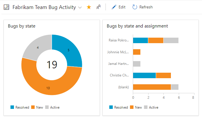
In de volgende afbeelding ziet u bijvoorbeeld twee verschillende grafieken die zijn gemaakt op basis van dezelfde platte query. In het cirkeldiagram worden de 19 bugs gegroepeerd op status en in het staafdiagram worden de bugs gegroepeerd op toewijzing en hun huidige status.
Vereisten
Vereisten waaraan moet worden voldaan, zijn het hebben van basistoegang of hoger en het maken van een platte lijstquery. Alleen platte query's ondersteunen grafieken.
Als u de grafiek wilt toevoegen aan een dashboard, moet u de query opslaan onder de map Gedeelde query's en het dashboard maken waar u de grafiek wilt toevoegen.
- Als u een querygrafiek wilt maken, moet u Basic-toegang of hoger hebben. Gebruikers met toegang tot belanghebbenden kunnen geen grafieken weergeven of maken op de pagina Query's , maar ze kunnen grafieken bekijken die zijn toegevoegd aan een teamdashboard. Zie Snelzoekgids voor toegang van belanghebbenden voor meer informatie.
- Als u een grafiek wilt toevoegen aan een dashboard, moet u de query opslaan in een map Gedeelde query's . Hiervoor moet u machtigingen krijgen om query's onder een map op te slaan. Zie Machtigingen instellen voor query's en querymappen om machtigingen te krijgen die zijn verleend.
- Als u een querygrafiek wilt toevoegen aan een teamdashboard, moet u lid zijn van het team of lid zijn van de beveiligingsgroep Project Beheer istrators.
- Als u een querygrafiek wilt toevoegen aan een projectdashboard, moet u het dashboard hebben gemaakt of machtigingen hebben gekregen om het dashboard te bewerken of lid zijn van de beveiligingsgroep Project Beheer istrators.
- Als u een querygrafiek wilt weergeven die is toegevoegd aan een dashboard, moet u leesmachtigingen hebben voor de onderliggende query. Als deze machtiging is geweigerd, wordt de widget weergegeven met een widget kan het bericht niet worden geladen .
Notitie
Gebruikers met toegang tot belanghebbenden voor een openbaar project hebben volledige toegang tot grafiekfuncties, net zoals gebruikers met basistoegang . Zie Snelzoekgids voor toegang van belanghebbenden voor meer informatie.
- Als u een querygrafiek wilt maken, moet u Basic-toegang of hoger hebben. Gebruikers met toegang tot belanghebbenden kunnen geen grafieken weergeven of maken op de pagina Query's , maar ze kunnen grafieken bekijken die zijn toegevoegd aan een teamdashboard. Zie Snelzoekgids voor toegang van belanghebbenden voor meer informatie.
- Als u een grafiek wilt toevoegen aan een dashboard, moet u de query opslaan in een map Gedeelde query's . Hiervoor moet u machtigingen krijgen om query's onder een map op te slaan. Zie Machtigingen instellen voor query's en querymappen om machtigingen te krijgen die zijn verleend.
- Als u een querygrafiek wilt toevoegen aan een teamdashboard, moet u lid zijn van het team of lid zijn van de beveiligingsgroep Project Beheer istrators.
- Als u een querygrafiek wilt weergeven die is toegevoegd aan een dashboard, moet u leesmachtigingen hebben voor de onderliggende query. Als deze machtiging is geweigerd, wordt de widget weergegeven met een widget kan het bericht niet worden geladen .
Zie Dashboardmachtigingen instellen voor meer informatie over dashboardmachtigingen.
Een platte lijstquery maken
Wanneer u een query maakt ter ondersteuning van uw grafiek, volgt u deze richtlijnen.
- Selecteer altijd de platte lijst met het querytype werkitems . Andere querytypen worden niet ondersteund voor grafieken. Zie Een query definiëren, Een platte-lijstquery definiëren voor meer informatie.
- Voeg deze velden toe aan een querycomponent of aan de kolomopties die u in de grafiek wilt gebruiken. U kunt grafieken groeperen op elk veld, behalve datum/tijd, vrije tekst en tagvelden. Bijvoorbeeld:
- Als u wilt groeperen op status, neemt u het veld Status op
- Als u wilt groeperen op werktoewijzingen, neemt u het veld Toegewezen aan op
- Als u wilt groeperen op sprints of iteraties, neemt u het iteratiepad op
- Als u wilt groeperen op team, voegt u het veld Naam van het knooppunt van het knooppunt van het gebiedspad toe
- Als u wilt groeperen op een aangepast veld, neemt u dit op.
- Als u een numerieke kolom wilt optellen, neemt u het bijbehorende veld op in de querycomponent of kolomopties. Zie Query op een numeriek veld voor meer voorbeelden van grafieken die zijn gemaakt op basis van numerieke velden.
- Als u van plan bent om uw query toe te voegen aan een dashboard, slaat u uw query op als een gedeelde query.
- U kunt grafieken niet groeperen op de volgende veldgegevenstypen:
- Id
- Datum/tijd, zoals Gemaakte datum, Gewijzigde datum
- Tekst zonder opmaak, zoals Titel
- Rtf-tekst, zoals beschrijving, stappen voor opnieuw proberen
- Tags (U kunt een query filteren met behulp van tags, maar u kunt geen tags gebruiken om de grafiek te configureren).
Notitie
U kunt een grafiek op basis van query's niet groeperen op tags, maar u kunt een widget Grafiek voor werkitems groeperen op tags die u aan een dashboard toevoegt, zoals beschreven in Een grafiek configureren voor werkitemswidget.
- U kunt grafieken niet groeperen op de volgende veldgegevenstypen:
- Id
- Datum/tijd, zoals Gemaakte datum, Gewijzigde datum
- Tekst zonder opmaak, zoals Titel
- Rtf-tekst, zoals beschrijving, stappen voor opnieuw proberen
- Tags (U kunt een query filteren met behulp van tags, maar u kunt geen tags gebruiken om de grafiek te configureren).
Weergave van gebieden en iteraties
Wanneer u Gebiedspad of Iteratiepad selecteert, wordt alleen het bladknooppunt weergegeven in de grafiek. Het bladknooppunt is het laatste knooppunt van het volledige pad. Is bijvoorbeeld Phone het leaf-knooppunt van FabrikamFiber/Fabrikam Website/Phone. Als uw query een gemengd niveau met bladknooppunten bevat, geeft de grafiek mogelijk geen verwachte resultaten weer.
Selecteer het veld Naam van knooppunt, het bladknooppunt van het gebiedspad, om te zien of dit de resultaten verbetert.
Grafieken worden weergegeven in browsers die SVG (Scalable Vector Graphics) ondersteunen. Ondersteunde browsers zijn Onder andere Microsoft Edge, Internet Explorer 9 en latere versies, Chrome, Firefox en Safari op Mac. Grafieken zijn niet geoptimaliseerd voor mobiele beeldschermen of aanraakschermen.
Notitie
Internet Explorer wordt niet meer ondersteund voor Azure DevOps Services, noch voor Azure DevOps Server 2020.1.
Sorteren op waarde of label
In de meeste grafieken kunt u kiezen hoe u de gegevens wilt sorteren. U kunt sorteren op waarde of label en oplopend of aflopend selecteren.
- Waarde: hiermee sorteert u gegevens op de numerieke waarde
- Label: Sorteert op het label dat is geselecteerd voor het groeperen van de gegevens.
Beperkte weergave van reeksen
Wanneer een grafiek meer dan acht of 12 items in de gegevensreeks bevat, worden waarden in de 9- of 13-plus-items samengevoegd in een set met het label 'overige'? Als u echter de grafiekgrootte verhoogt via de configureerbare widget op een dashboard, kunt u de reekslimiet verhogen.
Beschikbaarheid van grafieken
- Grafieken die zijn opgeslagen onder Gedeelde query's , kunnen worden weergegeven door alle teamleden, behalve leden met toegang tot belanghebbenden en kunnen worden toegevoegd aan dashboards.
- Grafieken die u maakt voor query's in de map Mijn query's zijn alleen zichtbaar voor u.
- U kunt de URL van een grafiekpagina kopiëren en per e-mail verzenden om deze te delen met een projectlid.
- Zie Teststatus bijhouden om vergelijkbare grafieken voor tests te maken.
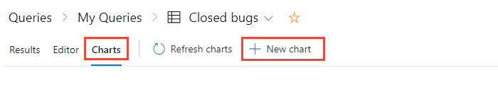
Een grafiek op basis van query's maken
Open vanuit Query's de grafiekeditor voor een platte lijstquery. U moet deel uitmaken van de groep Inzenders om grafieken te maken.
Als u toegang hebt tot belanghebbenden , worden de koppelingen grafieken en nieuwe grafieken niet weergegeven.
Selecteer het grafiektype en het veld voor het groeperen van waarden. Wanneer u cirkel-, staaf- en kolomdiagrammen gebruikt, selecteert u één veld om het aantal werkitems weer te geven.
Als u het gewenste veld niet ziet in de vervolgkeuzelijst Groeperen op, voegt u het veld toe als kolom aan de query en slaat u de query op. De aggregatieopties zijn ook afhankelijk van de velden die worden gebruikt in de query of de velden die zijn geselecteerd in de kolomopties.
Als u een foutbericht ontvangt wanneer u de grafiekeditor sluit, moet u Basic-toegang aanvragen.
Als u de resultaten wilt sorteren, selecteert u Waarde of Label als sorteeroptie en vervolgens oplopend of aflopend.
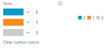
Als u een kleur wilt wijzigen, selecteert u een kleur in de reeks kleurenkiezers.
Grafieken worden automatisch bijgewerkt wanneer u de query bewerkt of de queryresultaten vernieuwt.
Een cirkeldiagram toevoegen
Gebruik een cirkeldiagram om groepspercentages met zes of minder categorieën weer te geven. Goede voorbeelden van cirkeldiagrammen zijn:
- Status van actieve bugs, groeperen op status
- Status van gebruikersverhaal, groeperen op status
- Voortgang van gebruikersverhaal, groeperen op Voltooid, Wordt uitgevoerd of Knippen
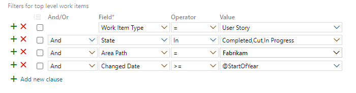
Met de volgende query worden gebruikersverhalen bijvoorbeeld gefilterd op basis van de status voor Knippen, Wordt uitgevoerd en Voltooid sinds het begin van het jaar.
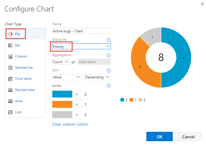
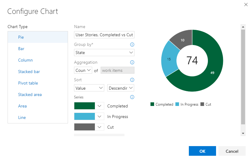
De configuratie van het cirkeldiagram wordt weergegeven in de volgende afbeelding.
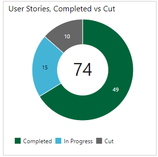
De gecombineerde query- en grafiekconfiguratie leveren het volgende cirkeldiagram op.
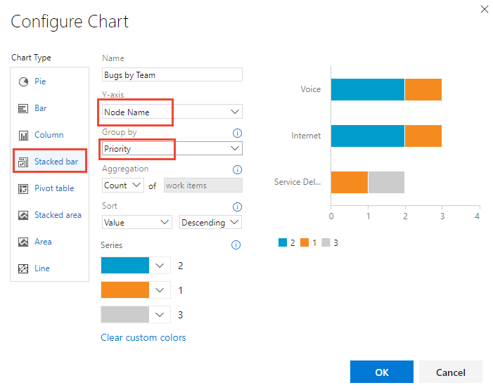
Een gestapeld staafdiagram toevoegen
Met een gestapeld staafdiagram kunt u de voortgang van twee veldwaarden bijhouden. De naam van het knooppunt geeft het laatste blad weer binnen een gebiedspad. Gebruik deze optie als u gegevens in teams wilt weergeven en elk knooppunt overeenkomt met een team.
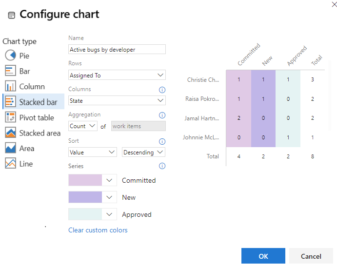
Een draaitabel toevoegen
In de draaitabel wordt een tabel met configureerbare rijen en kolommen weergegeven, met kolommen met een telling van werkitems of een som van een numeriek veld. Kies een draaitabel wanneer u wilt vergelijken tussen gebieden waarop het werk wordt uitgevoerd.
In de volgende afbeelding ziet u een voorbeeld van actieve bugs die zijn toegewezen aan ontwikkelaars en hun huidige status.
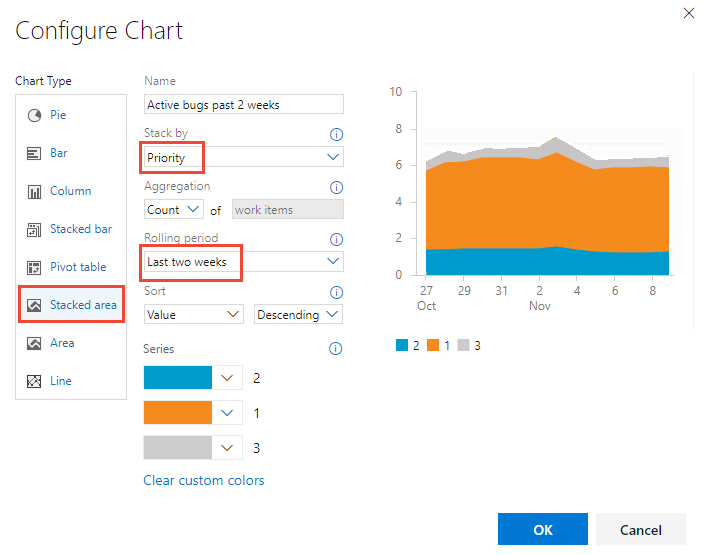
Een trendgrafiek toevoegen
Met trenddiagrammen kunt u de voortgang in de loop van de tijd bekijken. U kunt een doorlopende periode selecteren, variërend van de afgelopen week tot het afgelopen jaar.
Trendgegevens worden geëxtraheerd uit het gegevensarchief voor het bijhouden van werk. Net als bij de meeste gegevensarchieven is het schema van de relationele database ontworpen en geoptimaliseerd voor de online transactionele verwerking van gegevens. Wanneer het hulpprogramma of de invoegtoepassing een activiteit uitvoert, schrijft het de meest recente informatie naar het operationele archief. Daarom veranderen gegevens in het operationele archief voortdurend en worden bijgewerkt, en alle gegevens zijn actueel.
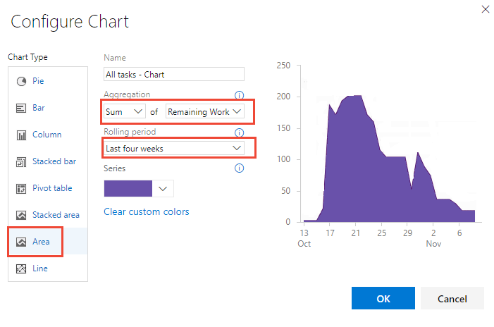
Een Burndown-grafiek toevoegen
Burndown-grafieken zijn handig om te bepalen hoe snel het werk vordert op basis van een numerieke veldwaarde, zoals verhaalpunten, inspanning of resterend werk, of op een telling van werkitems.
Als u een burndown-grafiek wilt maken, moet u het numerieke veld toevoegen dat u aan uw query wilt toevoegen. Als u een burndowngrafiek van taken wilt weergeven, selecteert u de operator Som voor Resterende hoeveelheid werk.
Naast burndowngrafieken op basis van query's kunt u een burndown- of burnupwidget configureren.
Grafiek toevoegen aan een dashboard
Een grafiek die aan een dashboard wordt toegevoegd, wordt toegevoegd via de toevoeging van een widget Grafiek voor Werkitems . U kunt de grafiek toevoegen aan een dashboard, zoals wordt weergegeven in de volgende procedure, of door de widget Grafiek voor werkitems rechtstreeks toe te voegen. Zie Een grafiek configureren voor werkitemswidget voor meer informatie.
Tip
Alle querygrafieken zijn beperkt in grootte. Grafieken die aan een dashboard worden toegevoegd, kunnen echter opnieuw worden aangepast en opnieuw worden geconfigureerd door de widget Grafiek voor werkitems te openen die wordt gebruikt om ze weer te geven.
- Selecteer het
 actiespictogram voor de grafiek die u wilt toevoegen en selecteer Toevoegen aan dashboard.
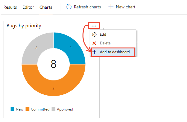
De menuoptie Toevoegen aan dashboard is alleen beschikbaar voor query's die zijn opgeslagen in een map Gedeelde query's .
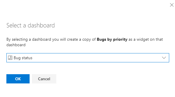
Selecteer in het dialoogvenster dat wordt geopend het dashboard waaraan u de grafiek wilt toevoegen.
Zie Widgets en grafieken toevoegen aan een dashboard als u andere typen grafieken wilt toevoegen, zoals testresultaten en samenvattingsgrafieken.
Op query's gebaseerde grafieken versus door Excel gegenereerde Draaigrafiek s
Op query's gebaseerde grafieken genereren gegevens uit het gegevensarchief voor het bijhouden van werkitems en geven daarom de meest recente gegevens weer. Excel Draaigrafiek toegang tot gegevens die zijn gepubliceerd in de Analysis Services-kubus, die standaard elke twee uur wordt vernieuwd. Voor Excel-grafieken is de projectverzameling van uw project geconfigureerd met SQL Server Reporting Services en Analysis Services.
Verwante artikelen:
- Voorbeeldquerygrafieken
- Een grafiek configureren voor werkitemswidget
- Veelgestelde vragen over Azure DevOps-dashboards, -grafieken en -rapporten
- Cumulatief stroomdiagram
- Teamsnelheid
- Sprint burndown weergeven/configureren
- Teststatus bijhouden
- Widgets en grafiek toevoegen aan een dashboard
- Widgetcatalogus
Feedback
Binnenkort beschikbaar: In de loop van 2024 zullen we GitHub-problemen geleidelijk uitfaseren als het feedbackmechanisme voor inhoud en deze vervangen door een nieuw feedbacksysteem. Zie voor meer informatie: https://aka.ms/ContentUserFeedback.
Feedback verzenden en weergeven voor