View Microsoft Teams utilization in Power BI using CQD data
The Teams Usage report is available as part of our downloadable Power BI query templates for CQD.
This report lets you see how (and how much) your users are using Microsoft Teams by accessing Teams Call Quality Dashboard (CQD) data. These reports are intended to be a centralized location that both administrators and business leaders can quickly go to for this data. We advise not relying on this data for concrete numbers due to the nature of call quality telemetry.
The Teams Usage Power BI report consists of two primary reports: Call Count Summary and Audio Minutes Summary. The Daily Usage, Regional Audio Details, Conference Details and User List reports come into play when a user takes advantage of the drill-down reports, noted in the descriptions below.
Note
Building and subnet data must be populated to provide regional and network filtering capabilities.
Call Count Summary Report
The main page (Call Count Summary) immediately provides the number of audio, video and screen sharing sessions over the last 30 and 90 days as noted in the section title. The data initially displayed is for the organization as a whole. You can filter the data by using the slicer dropdown options on the left side of the page.
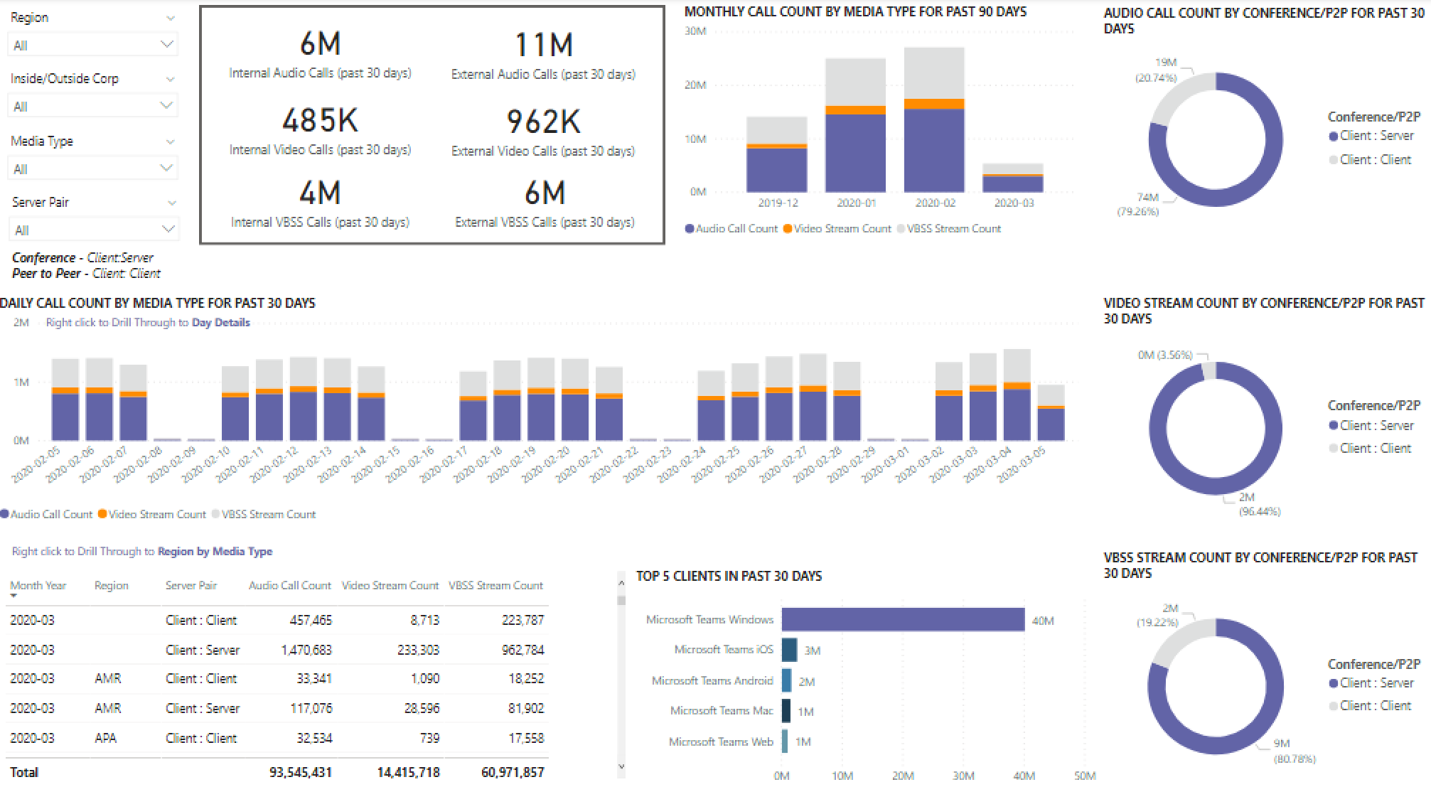
To the right of the slicer dropdowns, the number of calls by media type is broken down to an internal/external view over the past 30 days. We can see through the above screenshot that there are more calls happening from outside organizational locations.
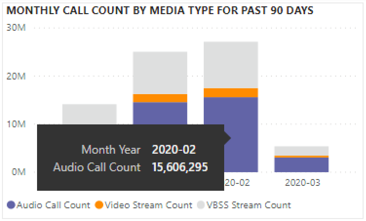
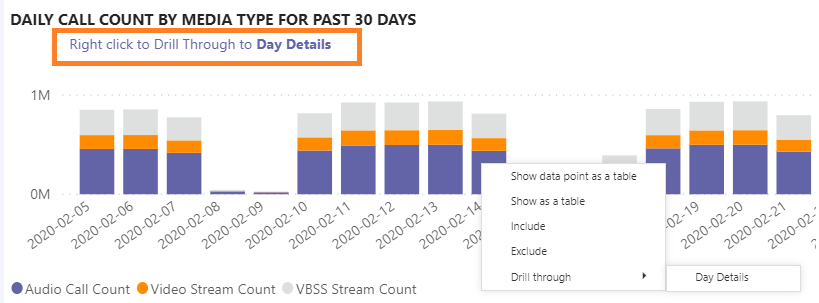
To the right of the media type count box, we have the Monthly Call Count by Media Type for the last 90 days. You can display the count for a previous month or the current month to date, providing usage trend information.
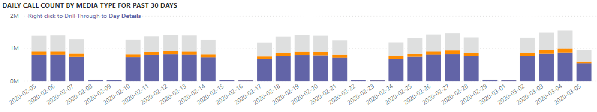
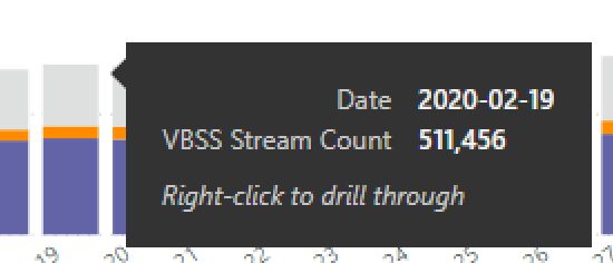
The middle graph functions as the 90-day graph does, however it provides a daily usage view for the past 30 days and allows a user to select and drill down into details for a specific day.
On the bottom left section of the page, you'll find a table providing total values for each media type over the past year.
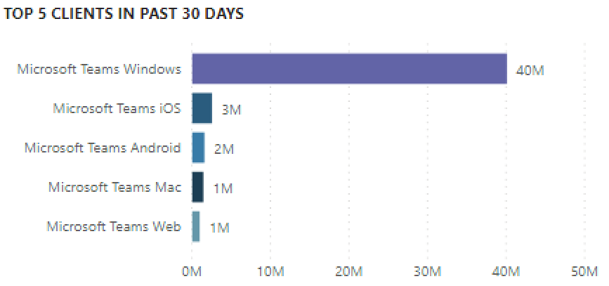
To the right of the table, a bar chart shows clients with the most use (calls/streams) for the past 30 days.
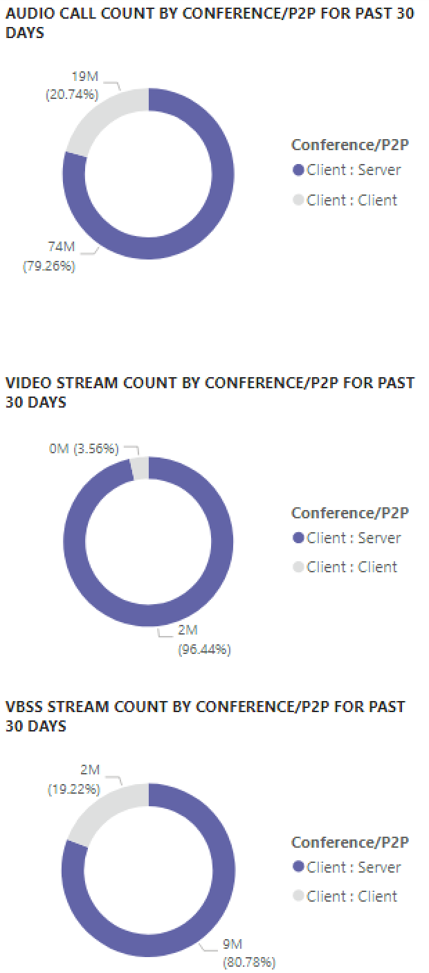
The last set of charts for this page show each media type individually, with a breakdown showing conference and P2P usage. The charts below show that there is a significantly higher number of conference usages as compared to P2P.
Audio Minutes Summary Report
The Audio Minutes usage report provides the total minute usage through a few different views.
The thirty-day usage summary is shown next to the slicers as text boxes. The top number shows the thirty-day total, with internal and external breakdowns below that.
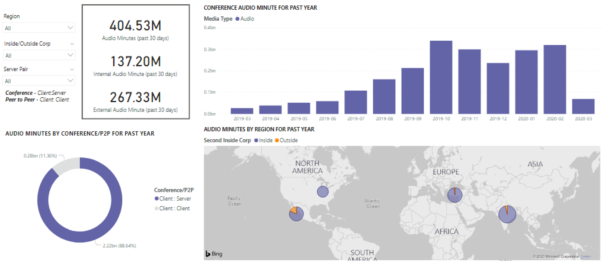
The top right bar graph provides a yearlong view of conference audio usage. Hover over the month to show the conference audio minutes.
To show the difference in P2P and conference audio, the bottom left chart takes all audio for the past year and breaks it up between the two types.
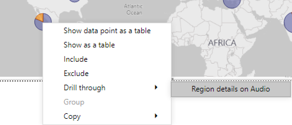
The last chart for the Audio minutes page shows audio minute usage on a global map overlay. This chart will only work if building and subnet data is uploaded to the tenant. You can drill into the pie chart overlay on the map, subsequently providing regional audio usage.
Drill-through capabilities
As previously noted, users can drill into the daily and regional usage reports.
Daily Usage
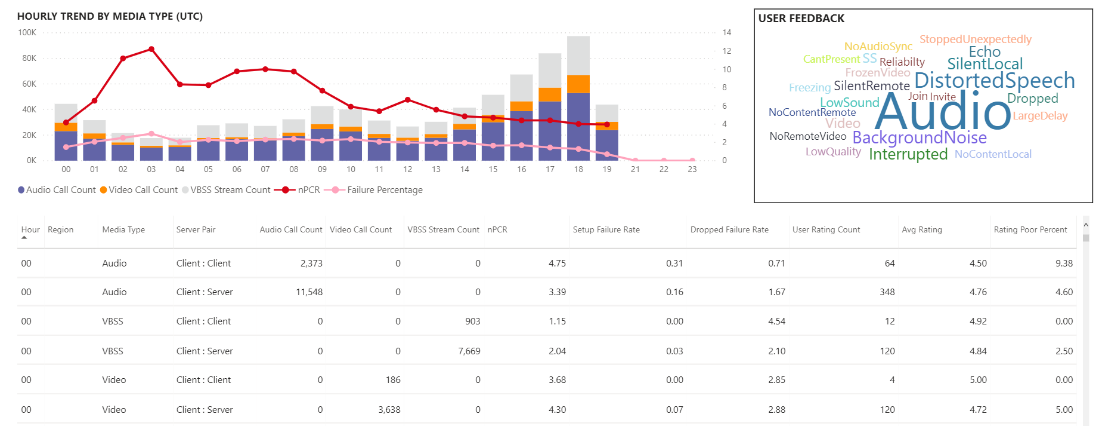
The Daily Usage report allows an administrator to identify peak consumption periods through the course of a day. In addition to usage, we're also able to capture overall user sentiment and feedback for that day.
The Daily usage report displays the number of Audio, Video and Screen shares for the selected day with the added ability to differentiate between internal and external connectivity. A Conference and Peer to Peer breakdown is to the immediate right of the modality total box. The top right of the report provides a list of conferences with their associated ID and participants for the day. The conference list provides down an additional drill to the Conference Details report as well.
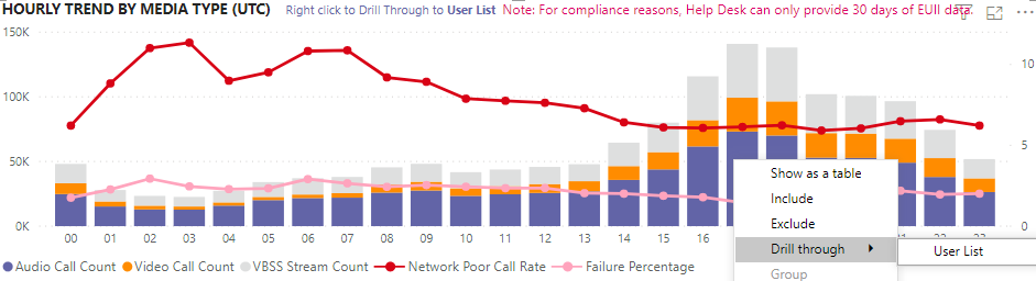
The bar graph in the center area allows the user to identify peak consumption periods through the course of a day. Users may drill down into the hour represented on the graph, which will present the User List report for the hour.
To the right of the bar graph, User Feedback is presented in a visual format. User feedback provides insight that can be used to identify potential issues.
The bottom table provides a range of metrics for the day. Poor percentages along with failure rates can provide an administrator with potential areas of improvement. Each hour can also be selected individually as shown below.
This data can be used to identify regions having problems during peak consumption times.
Select the column for that day to display metrics for that hour.
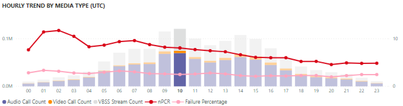
The table below the chart will display the metrics for that hour. This can be sorted by any column header; however, we would be interested in finding problematic areas.
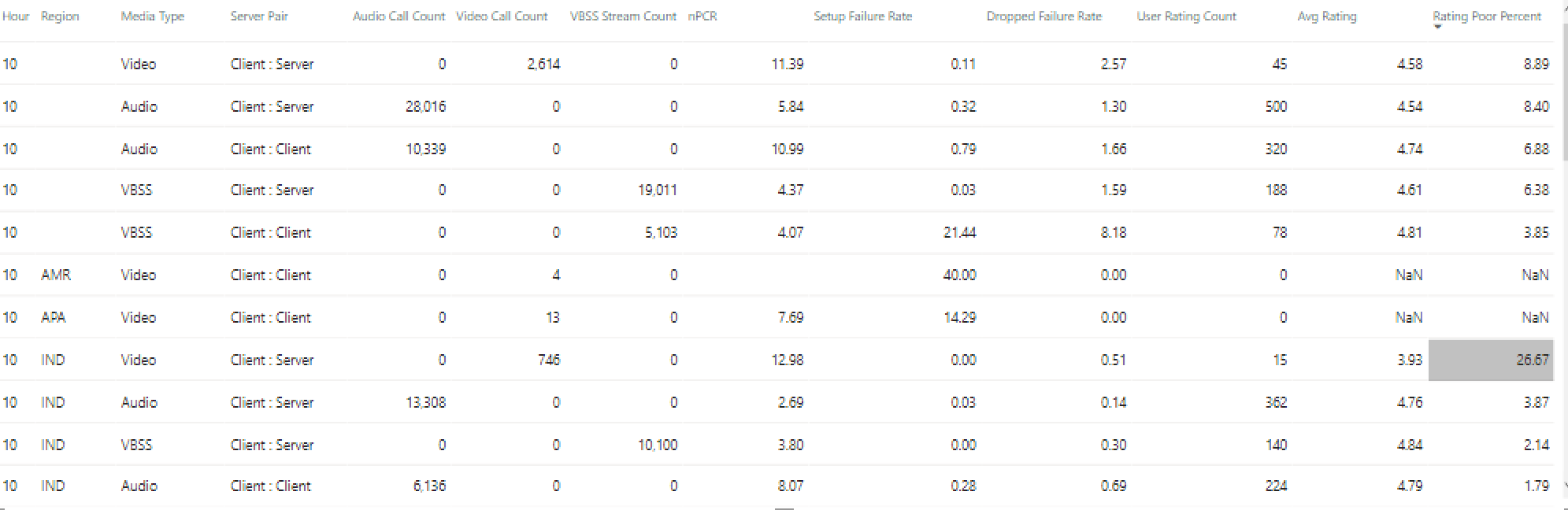
We see that the IND region is experiencing poor video performance in conferences during this time frame. After, the CQD QER Microsoft reports can be used to narrow down the problematic location as the region and time frame has been identified.
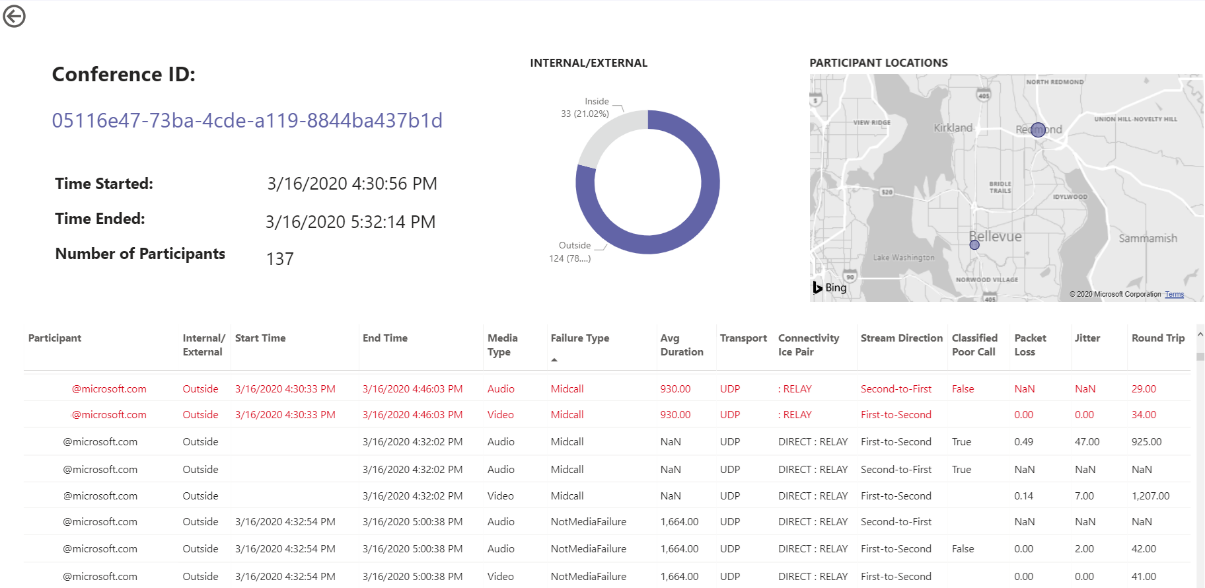
Conference Details
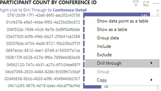
The Conference Details report provides additional insight for meetings, from an attendee list, to the media types used during the session.
Select a conference the participant bar in the conference ID chart on the Daily usage page to drill down into the conference details.

We can see the participants in the conference and all the pertinent information down to packet loss and jitter to assist with potential troubleshooting efforts in the bottom table.
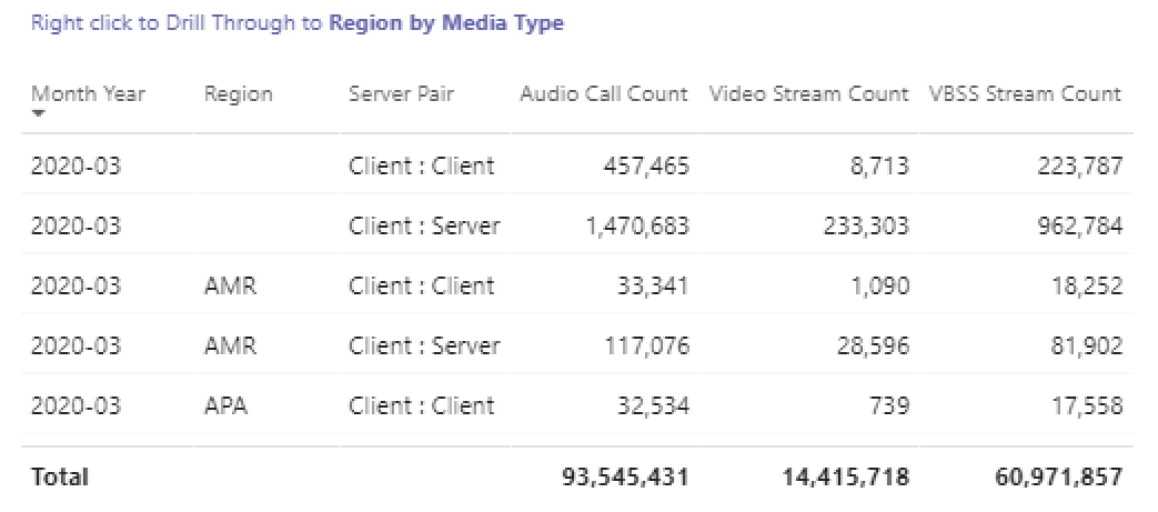
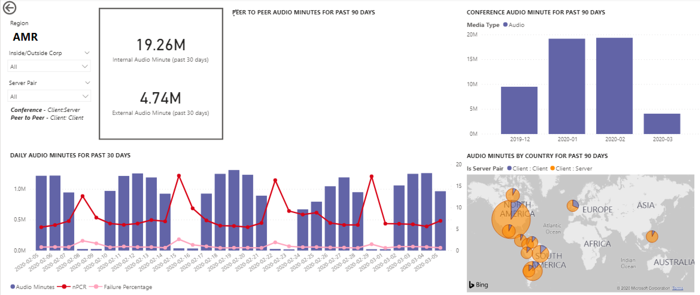
Regional Audio Details
The Regional Audio Details drill down specifically shows the audio minute usage for the selected region. Users with access to CQD can see usage trends for both P2P and conference audio within the selected region.
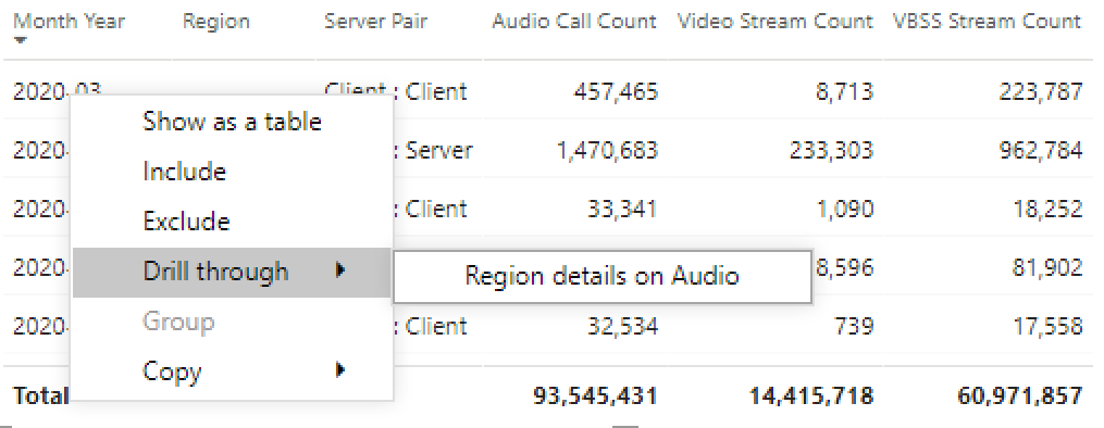
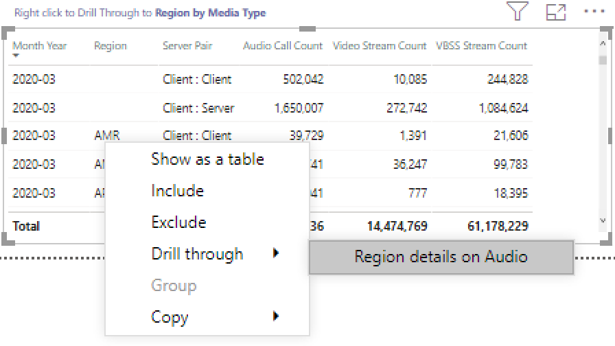
On the Call Count Summary page, drill-through to as specific region through the table.
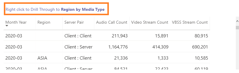
Select the row with the region additional information is needed for.
The data trends show a significant number of minutes being used on the internal network, with conferencing far surpassing P2P use.
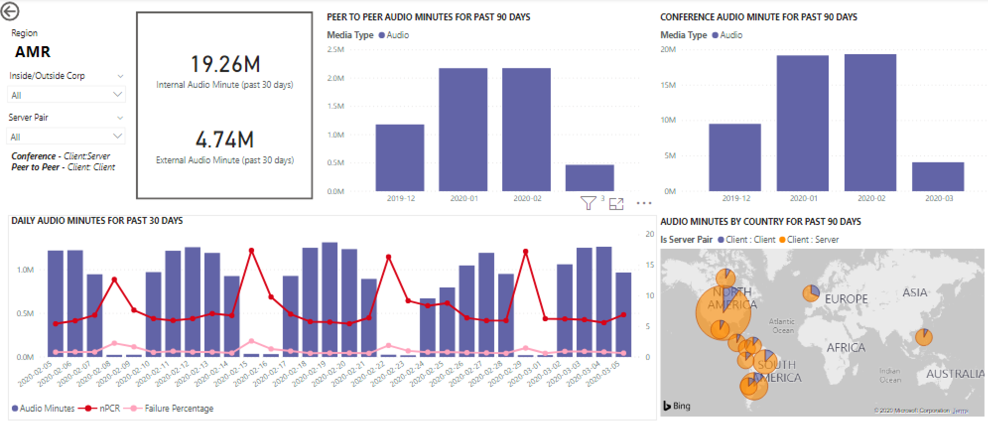
The regional audio trend can be used to show how users are impacted by external influences in the world. Specifically, right now, we would expect to see the external usage for the EMEA and APAC regions to increase with people being asked to work remotely.
User List
The User List drill down provides, as one might expect, user specific information for a specific hour selected by the person viewing the report. The User List report is accessible through a drill-down in the Hourly Trends graph on the Daily Usage report. Right click on the hour additional information is needed for and select Drill through and User List, as shown below.
The User List report shows internal/external connectivity through the doughnut chart in the top center of the page. We can see that there is a large amount of participation from Outside the corporate network in the below image.
The top right of the graph shows the number of calls made by each user within that hour.
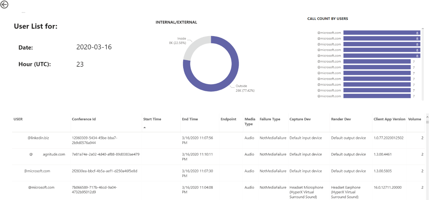
The bottom table provides detailed information for the sessions each user participated in during that hour. The Failure Type column is useful in determining what caused a call to drop. The Capture and Render Device columns are useful in identifying why a call was reported having poor quality.
Related topics
Dimensions and measures available in Call Quality Dashboard
Stream Classification in Call Quality Dashboard
Set up Skype for Business Call Analytics
Use Call Analytics to troubleshoot poor call quality
Opinia
Dostępne już wkrótce: W 2024 r. będziemy stopniowo wycofywać zgłoszenia z serwisu GitHub jako mechanizm przesyłania opinii na temat zawartości i zastępować go nowym systemem opinii. Aby uzyskać więcej informacji, sprawdź: https://aka.ms/ContentUserFeedback.
Prześlij i wyświetl opinię dla