标题栏自定义
Windows 为每个窗口提供一个默认标题栏,并支持对其进行自定义以匹配应用的个性。 默认标题栏附带了一些标准组件和核心功能,例如拖动窗口和调整窗口大小。
有关自定义应用标题栏、可接受的标题栏区域内容和推荐的 UI 模式的指导,请参阅标题栏设计一文。
注意
本文将介绍如何为使用 UWP 和 WinUI 2 的应用程序自定义标题栏。 有关使用 Windows 应用 SDK 和 WinUI 3 的应用程序,请参阅适用于 Windows 应用 SDK 的标题栏自定义。
如果正在考虑将 UWP 应用程序迁移到 Windows 应用 SDK,请查看我们的窗口化功能迁移指南。 请参阅窗口化功能迁移,以了解更多信息。
- 适用于:UWP/WinUI 2
- 重要 API:ApplicationView.TitleBar 属性、ApplicationViewTitleBar 类、CoreApplicationViewTitleBar 类
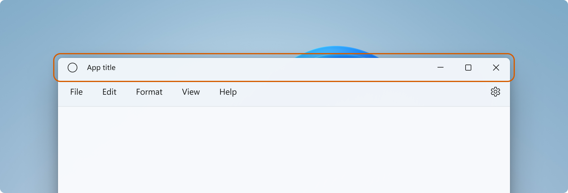
标题栏组件
此列表描述了标准标题栏的组件。
- 标题栏矩形
- 标题文本
- 系统菜单 - 通过单击应用图标或右键单击标题栏来访问
- 标题控件
- 最小化按钮
- 最大化/还原按钮
- “关闭”按钮
在 UWP 应用程序中,可以使用 ApplicationView 和 CoreApplicationView 类的成员来自定义标题栏。 可以使用多个 API,根据所需的自定义级别逐步修改标题栏的外观。
注意
用于 UWP 应用程序中的辅助窗口的 Windows.UI.WindowManagement.AppWindow 类不支持标题栏自定义。 要自定义使用辅助窗口的 UWP 应用程序的标题栏,请按照使用 ApplicationView 显示多个视图中的说明使用 ApplicationView。
自定义标题栏的程度
可将两个级别的自定义应用于标题栏:对默认标题栏应用轻微修改,或将应用画布扩展到标题栏区域并提供完全自定义的内容。
简单
对于简单的自定义,例如更改标题栏颜色,可以在应用程序窗口的标题栏对象上设置属性,以指定要用于标题栏元素的颜色。 在此情况下,系统仍对标题栏的所有其他方面负责,例如绘制应用标题和定义拖动区域。
完全
另一个选项将隐藏默认的标题栏,并将其替换为你自己的自定义内容。 例如,你可以在标题栏区域中放置文本、搜索框或自定义菜单。 还需要使用此选项将材料背景(如 Mica)扩展到标题栏区域中。
当选择进行完全自定义时,你需要负责将内容放到标题栏区域中,并且能够定义你自己的拖动区域。 标题控件(系统关闭、最小化和最大化按钮)仍然可用并由系统处理,但应用标题等元素则不可用。 你需要根据应用的需求自行创建这些元素。
简单自定义
如果只想自定义标题栏颜色或图标,可以在应用程序窗口的标题栏对象上设置属性。
Title
默认情况下,标题栏将应用程序的显示名称显示为窗口标题。 可以在 Package.appxmanifest 文件中设置此显示名称。
要将自定义文本添加到标题,请将 ApplicationView.Title 属性设置为一个文本值,如下所示。
public MainPage()
{
    this.InitializeComponent();

    ApplicationView.GetForCurrentView().Title = "Custom text";
}
此文本将添加到窗口标题的前面,标题将显示为自定义文本 - 应用程序显示名称。 要显示不含应用程序显示名称的自定义标题,必须替换默认的标题栏,如完全自定义部分中所示。
颜色
此示例展示了如何获取 ApplicationViewTitleBar 的一个实例以及如何设置它的颜色属性。
可以在应用程序的 OnLaunched 方法 (App.xaml.cs) 中、在调用 Window.Activate 之后或者在应用程序的第一页中放置此代码。
// using Windows.UI;
// using Windows.UI.ViewManagement;

var titleBar = ApplicationView.GetForCurrentView().TitleBar;

// Set active window colors
titleBar.ForegroundColor = Colors.White;
titleBar.BackgroundColor = Colors.Green;
titleBar.ButtonForegroundColor = Colors.White;
titleBar.ButtonBackgroundColor = Colors.SeaGreen;
titleBar.ButtonHoverForegroundColor = Colors.White;
titleBar.ButtonHoverBackgroundColor = Colors.DarkSeaGreen;
titleBar.ButtonPressedForegroundColor = Colors.Gray;
titleBar.ButtonPressedBackgroundColor = Colors.LightGreen;

// Set inactive window colors
titleBar.InactiveForegroundColor = Colors.Gainsboro;
titleBar.InactiveBackgroundColor = Colors.SeaGreen;
titleBar.ButtonInactiveForegroundColor = Colors.Gainsboro;
titleBar.ButtonInactiveBackgroundColor = Colors.SeaGreen;
设置标题栏颜色时需要注意以下几点:
- 按钮背景颜色不会应用于关闭按钮的悬停和按下状态。 对于这些状态,关闭按钮始终使用系统定义的颜色。
- 将颜色属性设置为
null会将其重置为默认系统颜色。 - 无法设置透明颜色。 将忽略颜色的 alpha 通道。
Windows 的用户可以选择将所选主题色应用于标题栏。 如果要设置任何标题栏颜色,我们建议显式设置所有颜色。 这可确保不会因为用户定义的颜色设置而出现意外的颜色组合。
完全自定义
当你选择进行标题栏完全自定义时,应用的客户端区域会进行扩展以覆盖整个窗口,包括标题栏区域。 你负责绘制整个窗口和对其进行输出处理进行绘制和输入处理(标题按钮除外,它们仍由窗口提供)。
要隐藏默认的标题栏并将内容扩展到标题栏区域中,请将 ExtendViewIntoTitleBar 设置为 true。 可以在应用程序的 OnLaunched 方法 (App.xaml.cs) 或者应用程序的第一页中设置此属性。
此示例将展示如何获取 CoreApplicationViewTitleBar,并将 ExtendViewIntoTitleBar 属性设置为 true。
using Windows.ApplicationModel.Core;

public MainPage()
{
    this.InitializeComponent();

    // Hide default title bar.
    var coreTitleBar = CoreApplication.GetCurrentView().TitleBar;
    coreTitleBar.ExtendViewIntoTitleBar = true;
}
提示
当关闭并重启应用程序时,会保留此设置。 在 Visual Studio 中,如果将 ExtendViewIntoTitleBar 设置为 true,然后希望还原默认值,则应显式将其设置为 false 并运行应用程序,以覆盖持久化设置。
标题栏内容和拖动区域
当应用扩展到标题栏区域时,你将负责定义和管理标题栏的 UI。 这通常至少包括指定标题文本和拖动区域。 标题栏的拖动区域定义了用户可以单击和拖动以移动窗口的位置。 这也是用户可以右键单击以显示系统菜单的位置。
要详细了解可接受的标题栏内容和建议的 UI 模式,请参阅标题栏设计。
可以调用 Window.SetTitleBar 方法并传入一个用来定义拖动区域的 UIElement,以指定拖动区域。 (UIElement 通常是一个包含其他元素的面板。)必须将 ExtendViewIntoTitleBar 属性设置为 true,对 SetTitleBar 进行的调用才能产生任何效果。
下面将介绍如何将内容的 Grid 设置为可拖动的标题栏区域。 此代码将显示在 XAML 中,并在应用程序的第一页中进行代码隐藏。
<Grid x:Name="AppTitleBar" Background="Transparent">
    <!-- Width of the padding columns is set in LayoutMetricsChanged handler. -->
    <!-- Using padding columns instead of Margin ensures that the background
         paints the area under the caption control buttons (for transparent buttons). -->
    <Grid.ColumnDefinitions>
        <ColumnDefinition x:Name="LeftPaddingColumn" Width="0"/>
        <ColumnDefinition/>
        <ColumnDefinition x:Name="RightPaddingColumn" Width="0"/>
    </Grid.ColumnDefinitions>
    <Image Source="Assets/WindowIcon.png"
           Grid.Column="1"
           HorizontalAlignment="Left"
           Width="16" Height="16"
           Margin="8,0,0,0"/>
    <TextBlock x:Name="AppTitleTextBlock"
               Text="App title"
               Style="{StaticResource CaptionTextBlockStyle}"
               Grid.Column="1"
               VerticalAlignment="Center"
               Margin="28,0,0,0"/>
</Grid>
public MainPage()
{
    this.InitializeComponent();

    var coreTitleBar = CoreApplication.GetCurrentView().TitleBar;
    coreTitleBar.ExtendViewIntoTitleBar = true;

    // Set XAML element as a drag region.
    Window.Current.SetTitleBar(AppTitleBar);
}
默认情况下,系统标题栏将应用程序的显示名称显示为窗口标题。 可以在 Package.appxmanifest 文件中设置显示名称。 你可以获取此值并将其用于自定义标题栏中,如下所示。
AppTitleTextBlock.Text = AppInfo.Current.DisplayInfo.DisplayName;
重要
指定的拖动区域需要能够接受命中测试。 默认情况下,某些 UI 元素(例如 Grid)在没有为其设置背景时不会参与命中测试。 这意味着,对于某些元素,可能需要设置一个透明背景画笔。 请参阅 VisualTreeHelper.FindElementsInHostCoordinates 上的备注,以了解更多信息。
例如,如果将一个网格定义为拖动区域,请设置 Background="Transparent" 以使其可以拖动。
此网格不可拖动(但其中的可见元素可以拖动):<Grid x:Name="AppTitleBar">。
此网格看似同样不可拖动,但整个网格可以拖动:<Grid x:Name="AppTitleBar" Background="Transparent">。
交互式内容
可以将交互式控件(如按钮、菜单或搜索框)放在应用顶部,以便它们显示在标题栏中。 不过,必须遵循几条规则,以确保交互式元素接收用户输入,同时仍然允许用户移动窗口。
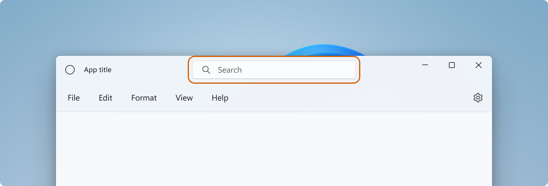
- 必须调用 SetTitleBar,以便将一个区域定义为可拖动的标题栏区域。 否则,系统会在页面顶部设置默认的拖动区域。 随后,系统将处理对此区域的所有用户输入,并阻止输入到达控件。
- 将交互式控件放到对(具有更高 z 顺序的)SetTitleBar 的调用所定义的拖动区域上。 不要将交互式控件设置为传递给
SetTitleBar的 UIElement 的子项。 将元素传递给SetTitleBar之后,系统会将它视为系统标题栏,并处理指向此元素的所有指针输入。
在这里,AutoSuggestBox 元素的 z 顺序高于 AppTitleBar,因此它会接收用户输入。
<Grid>
    <Grid.RowDefinitions>
        <RowDefinition Height="48"/>
        <RowDefinition/>
    </Grid.RowDefinitions>
    <Grid x:Name="AppTitleBar" Background="Transparent">
        <!-- Width of the padding columns is set in LayoutMetricsChanged handler. -->
        <!-- Using padding columns instead of Margin ensures that the background
             paints the area under the caption control buttons (for transparent buttons). -->
        <Grid.ColumnDefinitions>
            <ColumnDefinition x:Name="LeftPaddingColumn" Width="0"/>
            <ColumnDefinition/>
            <ColumnDefinition x:Name="RightPaddingColumn" Width="0"/>
        </Grid.ColumnDefinitions>
        <Image Source="Assets/WindowIcon.png"
               Grid.Column="1"
               HorizontalAlignment="Left"
               Width="16" Height="16"
               Margin="8,0,0,0"/>
        <TextBlock x:Name="AppTitleTextBlock"
                   Text="App title"
                   Style="{StaticResource CaptionTextBlockStyle}"
                   Grid.Column="1"
                   VerticalAlignment="Center"
                   Margin="28,0,0,0"/>
    </Grid>

    <!-- This control has a higher z-order than AppTitleBar,
         so it receives user input. -->
    <AutoSuggestBox QueryIcon="Find"
                    PlaceholderText="Search"
                    HorizontalAlignment="Center"
                    Width="260" Height="32"/>
</Grid>
系统标题按钮
系统会为系统标题按钮(最小化、最大化/还原和关闭)保留应用窗口的左上角或右上角。 系统会保留对标题按钮区域的控制,以保证提供最少功能来拖动、最小化、最大化和关闭窗口。 系统为从左到右的语言在右上角绘制关闭按钮,为从右到左的语言在左上角绘制该按钮。
可以在标题控件区域(如应用背景)下绘制内容,但不应放置任何你期望用户能够与之交互的 UI。 它不会收到任何输入,因为标题控件的输入由系统处理。
上一示例中的这些行显示了 XAML 中定义标题栏的填充列。 使用填充列而不是边距可确保背景绘制标题控件按钮下的区域(适用于透明按钮)。 同时使用左右填充列可确保标题栏在从右到左和从左到右两种布局中都会正常运行。
<Grid.ColumnDefinitions>
    <ColumnDefinition x:Name="LeftPaddingColumn" Width="0"/>
    <ColumnDefinition/>
    <ColumnDefinition x:Name="RightPaddingColumn" Width="0"/>
</Grid.ColumnDefinitions>
标题控件区域的维度和位置由 CoreApplicationViewTitleBar 类传达,以使你能够在标题栏 UI 的布局中将它考虑在内。 每侧保留区域的宽度由 SystemOverlayLeftInset 或 SystemOverlayRightInset 属性提供,它的高度由 Height 属性提供。
可以处理 LayoutMetricsChanged 事件,以响应标题按钮大小的变化。 例如,如果应用程序的布局从从左到右更改为从右到左,就可能发生这种情况。 处理此事件,以验证和更新取决于标题栏大小的 UI 元素位置。
此示例将展示如何调整标题栏的布局,以考虑标题栏指标的变化。 AppTitleBar、LeftPaddingColumn 和 RightPaddingColumn 在之前显示的 XAML 中声明。
private void CoreTitleBar_LayoutMetricsChanged(CoreApplicationViewTitleBar sender, object args)
{
    // Get the size of the caption controls and set padding.
    LeftPaddingColumn.Width = new GridLength(coreTitleBar.SystemOverlayLeftInset);
    RightPaddingColumn.Width = new GridLength(coreTitleBar.SystemOverlayRightInset);
}
标题按钮中的颜色和透明度
将应用内容扩展到标题栏区域时,可以将标题按钮的背景设为透明,以便让应用背景显示出来。 通常将背景设置为 Colors.Transparent 才能实现完全透明度。 对于部分透明,请为你将属性设置的颜色设置 alpha 通道。
这些标题栏属性可以是透明的:
- ButtonBackgroundColor
- ButtonHoverBackgroundColor
- ButtonPressedBackgroundColor
- ButtonInactiveBackgroundColor
所有其他颜色属性将继续忽略 alpha 通道。 如果将 ExtendViewIntoTitleBar 设置为 false,则所有 ApplicationViewTitleBar 颜色属性将始终忽略 alpha 通道。
按钮背景色不适用于“关闭”按钮的“悬停”和“按下”状态。 对于这些状态,关闭按钮始终使用系统定义的颜色。
提示
Mica 是一种令人愉快的材料,有助于区分位于焦点的窗口。 建议将其作为 Windows 11 中长期活动窗口的背景。 如果在窗口的工作区中应用了 Mica,则可以将其扩展到标题栏区域,并将标题按钮设为透明,以便 Mica 显示出来。 有关详细信息,请参阅 Mica 材料。
当窗口处于非活动状态时,将标题栏变暗
应当清晰显示窗口何时处于活动状态,何时处于非活动状态。 至少应更改标题栏中文本、图标和按钮的颜色。
处理 CoreWindow.Activated 事件,以确定窗口的激活状态,并根据需要更新标题栏 UI。
public MainPage()
{
    ...
    Window.Current.CoreWindow.Activated += CoreWindow_Activated;
}

private void CoreWindow_Activated(CoreWindow sender, WindowActivatedEventArgs args)
{
    UISettings settings = new UISettings();
    if (args.WindowActivationState == CoreWindowActivationState.Deactivated)
    {
        AppTitleTextBlock.Foreground =
            new SolidColorBrush(settings.UIElementColor(UIElementType.GrayText));
    }
    else
    {
        AppTitleTextBlock.Foreground =
            new SolidColorBrush(settings.UIElementColor(UIElementType.WindowText));
    }
}
重置标题栏
可以调用 SetTitleBar,以便在应用程序运行时切换到新的标题栏元素。 还可以将 null 作为参数传递给 SetTitleBar,并将 ExtendViewIntoTitleBar 设置为 false 以还原默认的系统标题栏。
显示和隐藏标题栏
如果向应用添加对全屏或紧凑覆盖模式的支持,则当应用在这些模式之间切换时可能需要更改标题栏。
当应用在全屏或平板模式(仅 Windows 10)下运行时,系统将隐藏标题栏和标题控制按钮。 但是,用户可以调用标题栏,以使其以覆盖形式显示在应用的 UI 顶部。
可以处理 CoreApplicationViewTitleBar.IsVisibleChanged 事件,以便在隐藏或调用标题栏时收到通知,并根据需要显示或隐藏自定义标题栏内容。
此示例演示如何处理 IsVisibleChanged 事件以显示和隐藏前面示例中的 AppTitleBar 元素。
public MainPage()
{
    this.InitializeComponent();

    var coreTitleBar = CoreApplication.GetCurrentView().TitleBar;

    // Register a handler for when the title bar visibility changes.
    // For example, when the title bar is invoked in full screen mode.
    coreTitleBar.IsVisibleChanged += CoreTitleBar_IsVisibleChanged;
}

private void CoreTitleBar_IsVisibleChanged(CoreApplicationViewTitleBar sender, object args)
{
    if (sender.IsVisible)
    {
        AppTitleBar.Visibility = Visibility.Visible;
    }
    else
    {
        AppTitleBar.Visibility = Visibility.Collapsed;
    }
}
注意
只有当应用程序支持时,才能进入全屏模式。 请参阅 ApplicationView.IsFullScreenMode,以了解更多信息。 平板模式(仅 Windows 10)是受支持的硬件上的 Windows 10 中的一个用户选项,可供用户选择在平板模式下运行任何应用程序。
应做事项和禁止事项
- 务必清楚地显示窗口何时处于活动状态,何时处于非活动状态。 至少要更改标题栏中文本、图标和按钮的颜色。
- 请务必在应用画布的上边缘定义拖动区域。 匹配系统标题栏的位置会便于用户查找。
- 务必定义一个拖动区域,以匹配应用画布上的可视标题栏(如果有)。
完全自定义示例
此示例显示了“完全自定义”部分中介绍的所有代码。
<Page
    x:Class="WinUI2_ExtendedTitleBar.MainPage"
    xmlns="http://schemas.microsoft.com/winfx/2006/xaml/presentation"
    xmlns:x="http://schemas.microsoft.com/winfx/2006/xaml"
    xmlns:local="using:WinUI2_ExtendedTitleBar"
    xmlns:d="http://schemas.microsoft.com/expression/blend/2008"
    xmlns:mc="http://schemas.openxmlformats.org/markup-compatibility/2006"
    mc:Ignorable="d"
    xmlns:muxc="using:Microsoft.UI.Xaml.Controls"
    muxc:BackdropMaterial.ApplyToRootOrPageBackground="True">
    <Grid>
        <Grid.RowDefinitions>
            <RowDefinition Height="48"/>
            <RowDefinition/>
        </Grid.RowDefinitions>
        <Grid x:Name="AppTitleBar" Background="Transparent">
            <!-- Width of the padding columns is set in LayoutMetricsChanged handler. -->
            <!-- Using padding columns instead of Margin ensures that the background
                 paints the area under the caption control buttons (for transparent buttons). -->
            <Grid.ColumnDefinitions>
                <ColumnDefinition x:Name="LeftPaddingColumn" Width="0"/>
                <ColumnDefinition/>
                <ColumnDefinition x:Name="RightPaddingColumn" Width="0"/>
            </Grid.ColumnDefinitions>
            <Image Source="Assets/WindowIcon.png"
                   Grid.Column="1"
                   HorizontalAlignment="Left"
                   Width="16" Height="16"
                   Margin="8,0,0,0"/>
            <TextBlock x:Name="AppTitleTextBlock"
                       Text="App title"
                       Style="{StaticResource CaptionTextBlockStyle}"
                       Grid.Column="1"
                       VerticalAlignment="Center"
                       Margin="28,0,0,0"/>
        </Grid>

        <!-- This control has a higher z-order than AppTitleBar,
             so it receives user input. -->
        <AutoSuggestBox QueryIcon="Find"
                        PlaceholderText="Search"
                        HorizontalAlignment="Center"
                        Width="260" Height="32"/>

        <muxc:NavigationView Grid.Row="1"
                             IsBackButtonVisible="Collapsed"
                             IsSettingsVisible="False">
            <StackPanel>
                <TextBlock Text="Content"
                           Style="{ThemeResource TitleTextBlockStyle}"
                           Margin="12,0,0,0"/>
            </StackPanel>
        </muxc:NavigationView>
    </Grid>
</Page>
public MainPage()
{
    this.InitializeComponent();

    // Hide default title bar.
    CoreApplicationViewTitleBar coreTitleBar =
        CoreApplication.GetCurrentView().TitleBar;
    coreTitleBar.ExtendViewIntoTitleBar = true;

    // Set caption buttons background to transparent.
    ApplicationViewTitleBar titleBar =
        ApplicationView.GetForCurrentView().TitleBar;
    titleBar.ButtonBackgroundColor = Colors.Transparent;

    // Set XAML element as a drag region.
    Window.Current.SetTitleBar(AppTitleBar);

    // Register a handler for when the size of the overlaid caption control changes.
    coreTitleBar.LayoutMetricsChanged += CoreTitleBar_LayoutMetricsChanged;

    // Register a handler for when the title bar visibility changes.
    // For example, when the title bar is invoked in full screen mode.
    coreTitleBar.IsVisibleChanged += CoreTitleBar_IsVisibleChanged;

    // Register a handler for when the window activation changes.
    Window.Current.CoreWindow.Activated += CoreWindow_Activated;
}

private void CoreTitleBar_LayoutMetricsChanged(CoreApplicationViewTitleBar sender, object args)
{
    // Get the size of the caption controls and set padding.
    LeftPaddingColumn.Width = new GridLength(coreTitleBar.SystemOverlayLeftInset);
    RightPaddingColumn.Width = new GridLength(coreTitleBar.SystemOverlayRightInset);
}

private void CoreTitleBar_IsVisibleChanged(CoreApplicationViewTitleBar sender, object args)
{
    if (sender.IsVisible)
    {
        AppTitleBar.Visibility = Visibility.Visible;
    }
    else
    {
        AppTitleBar.Visibility = Visibility.Collapsed;
    }
}

 private void CoreWindow_Activated(CoreWindow sender, WindowActivatedEventArgs args)
 {
     UISettings settings = new UISettings();
     if (args.WindowActivationState == CoreWindowActivationState.Deactivated)
     {
         AppTitleTextBlock.Foreground =
            new SolidColorBrush(settings.UIElementColor(UIElementType.GrayText));
     }
     else
     {
         AppTitleTextBlock.Foreground =
            new SolidColorBrush(settings.UIElementColor(UIElementType.WindowText));
     }
 }
相关文章
反馈
即将发布:在整个 2024 年,我们将逐步淘汰作为内容反馈机制的“GitHub 问题”,并将其取代为新的反馈系统。 有关详细信息,请参阅:https://aka.ms/ContentUserFeedback。
提交和查看相关反馈