自定义 ListView 单元格外观
 下载示例
下载示例Xamarin.FormsListView 类用于呈现可滚动列表。可以通过使用 ViewCell 元素来自定义这些列表。 ViewCell 元素可以显示文本和图像、指示 true/false 状态,以及接收用户输入。
内置单元格
Xamarin.Forms 附带适用于许多应用程序的内置单元格:
TextCell控件用于显示文本,带有可选的第二行,用于详细文本。ImageCell控件与TextCell类似,但在文本左侧包含图像。SwitchCell控件用于呈现和捕获开/关或 true/false 状态。EntryCell控件用于呈现用户可以编辑的文本数据。
SwitchCell 和 EntryCell 控件更常在 TableView 上下文中使用。
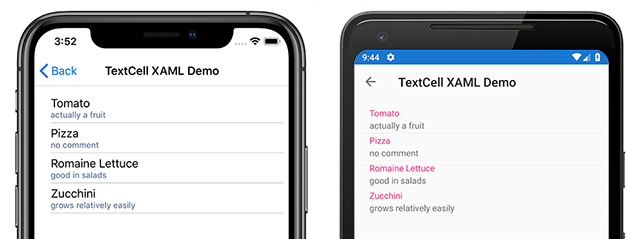
TextCell
TextCell 是用于显示文本的单元格,用户可以选择将第二行作为详细文本。 以下屏幕截图显示 iOS 和 Android 上的 TextCell 项:
TextCell 在运行时呈现为本机控件,因此与自定义 ViewCell 相比,性能非常好。 TextCells 是可自定义的,允许你设置以下属性:
Text– 第一行显示的文本,采用大字体。Detail– 第一行下方显示的文本,字体较小。TextColor– 文本颜色。DetailColor– 详细信息文本的颜色
以下屏幕截图显示了具有自定义颜色属性的 TextCell 项:

ImageCell
ImageCell 与 TextCell 一样,可用于显示文本和次要详细信息文本,并通过使用每个平台的本机控件提供出色的性能。 ImageCell 与 TextCell 的不同之处在于它在文本左侧显示图像。
以下屏幕截图显示 iOS 和 Android 上的 ImageCell 项:
需要以视觉对象方式显示数据列表(例如联系人或电影列表)时,ImageCell 非常有用。 ImageCell 是可自定义的,允许你设置:
Text– 第一行显示的文本,采用大字体Detail– 第一行下方显示的文本,字体较小TextColor– 文本颜色DetailColor– 详细信息文本的颜色ImageSource– 要显示在文本旁边的图像
以下屏幕截图显示了具有自定义颜色属性的 ImageCell 项:
自定义单元格
自定义单元格允许你创建内置单元格不支持的单元格布局。 例如,你可能希望显示一个有两个权重相等的标签的单元格。 TextCell 是不够的,因为 TextCell 有一个较小的标签。 大多数单元格自定义都会添加额外的只读数据(例如额外的标签、图像或其他显示信息)。
所有自定义单元格都必须派生自 ViewCell(所有内置单元格类型使用的基类)。
Xamarin.Forms 在 ListView 控件上提供缓存行为,这可以提高某些类型的自定义单元格的滚动性能。
以下屏幕截图显示了自定义单元格示例:

XAML
可以使用以下 XAML 创建上一个屏幕截图中显示的自定义单元格:
<?xml version="1.0" encoding="UTF-8"?>
<ContentPage xmlns="http://xamarin.com/schemas/2014/forms"
xmlns:x="http://schemas.microsoft.com/winfx/2009/xaml"
x:Class="demoListView.ImageCellPage">
    <ContentPage.Content>
        <ListView  x:Name="listView">
            <ListView.ItemTemplate>
                <DataTemplate>
                    <ViewCell>
                        <StackLayout BackgroundColor="#eee"
                        Orientation="Vertical">
                            <StackLayout Orientation="Horizontal">
                                <Image Source="{Binding image}" />
                                <Label Text="{Binding title}"
                                TextColor="#f35e20" />
                                <Label Text="{Binding subtitle}"
                                HorizontalOptions="EndAndExpand"
                                TextColor="#503026" />
                            </StackLayout>
                        </StackLayout>
                    </ViewCell>
                </DataTemplate>
            </ListView.ItemTemplate>
        </ListView>
    </ContentPage.Content>
</ContentPage>
XAML 的工作原理如下:
- 自定义单元格嵌套在
DataTemplate内,而后者又位于ListView.ItemTemplate内。 这与使用任何内置单元格的过程相同。 ViewCell是自定义单元格的类型。DataTemplate元素的子元素必须属于或派生自ViewCell类。- 在
ViewCell内,布局可由任何 Xamarin.Forms 布局进行管理。 在此示例中,布局由StackLayout管理,后者允许自定义背景色。
注意
StackLayout 的任何可绑定属性都可以绑定在自定义单元格内。 但是,XAML 示例中未显示此功能。
代码
还可以在代码中创建自定义单元格。 首先,必须创建一个派生自 ViewCell 的自定义类:
public class CustomCell : ViewCell
    {
        public CustomCell()
        {
            //instantiate each of our views
            var image = new Image ();
            StackLayout cellWrapper = new StackLayout ();
            StackLayout horizontalLayout = new StackLayout ();
            Label left = new Label ();
            Label right = new Label ();

            //set bindings
            left.SetBinding (Label.TextProperty, "title");
            right.SetBinding (Label.TextProperty, "subtitle");
            image.SetBinding (Image.SourceProperty, "image");

            //Set properties for desired design
            cellWrapper.BackgroundColor = Color.FromHex ("#eee");
            horizontalLayout.Orientation = StackOrientation.Horizontal;
            right.HorizontalOptions = LayoutOptions.EndAndExpand;
            left.TextColor = Color.FromHex ("#f35e20");
            right.TextColor = Color.FromHex ("503026");

            //add views to the view hierarchy
            horizontalLayout.Children.Add (image);
            horizontalLayout.Children.Add (left);
            horizontalLayout.Children.Add (right);
            cellWrapper.Children.Add (horizontalLayout);
            View = cellWrapper;
        }
    }
在页面构造函数中,ListView 的 ItemTemplate 属性设置为一个指定了 CustomCell 类型的 DataTemplate:
public partial class ImageCellPage : ContentPage
    {
        public ImageCellPage ()
        {
            InitializeComponent ();
            listView.ItemTemplate = new DataTemplate (typeof(CustomCell));
        }
    }
绑定上下文更改
绑定到自定义单元格类型的 BindableProperty 实例时,显示 BindableProperty 值的 UI 控件应使用 OnBindingContextChanged 替代来设置要在每个单元格中显示的数据,而不应使用单元格构造函数,如以下代码示例所示:
public class CustomCell : ViewCell
{
    Label nameLabel, ageLabel, locationLabel;

    public static readonly BindableProperty NameProperty =
        BindableProperty.Create ("Name", typeof(string), typeof(CustomCell), "Name");
    public static readonly BindableProperty AgeProperty =
        BindableProperty.Create ("Age", typeof(int), typeof(CustomCell), 0);
    public static readonly BindableProperty LocationProperty =
        BindableProperty.Create ("Location", typeof(string), typeof(CustomCell), "Location");

    public string Name
    {
        get { return(string)GetValue (NameProperty); }
        set { SetValue (NameProperty, value); }
    }

    public int Age
    {
        get { return(int)GetValue (AgeProperty); }
        set { SetValue (AgeProperty, value); }
    }

    public string Location
    {
        get { return(string)GetValue (LocationProperty); }
        set { SetValue (LocationProperty, value); }
    }
    ...

    protected override void OnBindingContextChanged ()
    {
        base.OnBindingContextChanged ();

        if (BindingContext != null)
        {
            nameLabel.Text = Name;
            ageLabel.Text = Age.ToString ();
            locationLabel.Text = Location;
        }
    }
}
当 BindingContextChanged 事件触发时,将调用 OnBindingContextChanged 替代,以响应 BindingContext 属性值的更改。 因此,当 BindingContext 更改时,显示 BindableProperty 值的 UI 控件应设置其数据。 请注意,应检查 BindingContext 中是否有 null 值,因为该值可由 Xamarin.Forms 设置以进行垃圾回收,从而导致调用 OnBindingContextChanged 替代。
也可将 UI 控件绑定到 BindableProperty 实例来显示其值,这样就无需替代 OnBindingContextChanged 方法了。
注意
替代 OnBindingContextChanged 时,请确保调用基类的 OnBindingContextChanged 方法,以便注册的委托接收 BindingContextChanged 事件。
在 XAML 中,可以将自定义单元格类型绑定到数据,如以下代码示例所示:
<ListView x:Name="listView">
    <ListView.ItemTemplate>
        <DataTemplate>
            <local:CustomCell Name="{Binding Name}" Age="{Binding Age}" Location="{Binding Location}" />
        </DataTemplate>
    </ListView.ItemTemplate>
</ListView>
这会将 CustomCell 实例中的 Name、Age 和 Location 可绑定属性绑定到基础集合中每个对象的 Name、Age 和 Location 属性。
下面的代码示例介绍了 C# 中的等效绑定:
var customCell = new DataTemplate (typeof(CustomCell));
customCell.SetBinding (CustomCell.NameProperty, "Name");
customCell.SetBinding (CustomCell.AgeProperty, "Age");
customCell.SetBinding (CustomCell.LocationProperty, "Location");

var listView = new ListView
{
    ItemsSource = people,
    ItemTemplate = customCell
};
在 iOS 和 Android 上,如果 ListView 正在回收元素且自定义单元格使用自定义呈现器,则自定义呈现器必须正确实现属性更改通知。 在单元格被重复使用的情况下,当绑定上下文更新为可用单元格的绑定上下文时,它们的属性值会更改,并引发 PropertyChanged 事件。 有关详细信息,请参阅自定义 ViewCell。 有关单元格回收的详细信息,请参阅缓存策略。