Xamarin.Forms TableView
 下载示例
下载示例TableView 是一个视图,用于显示可滚动的数据或选项列表,其中有些行不共享同一模板。 与 ListView 不同,TableView 没有 ItemsSource 的概念,因此必须手动将项添加为子项。

用例
TableView 在以下情况下很有用:
- 呈现设置列表;
- 在表单中收集数据,或
- 显示以不同方式在不同行中呈现的数据(例如数字、百分比和图像)。
TableView 处理在有吸引力的部分滚动和排布行,这是上述方案的常见需求。 TableView 控件使用每个平台的基础等效视图(如果可用),为每个平台创建原生外观。
结构
TableView 中的元素组织成多个部分。 TableView 的根是 TableRoot,它是一个或多个 TableSection 实例的父项。 每个 TableSection 由一个标题以及一个或多个 ViewCell 实例组成:
<TableView Intent="Settings">
    <TableRoot>
        <TableSection Title="Ring">
            <SwitchCell Text="New Voice Mail" />
            <SwitchCell Text="New Mail" On="true" />
        </TableSection>
    </TableRoot>
</TableView>
等效 C# 代码如下:
Content = new TableView
{
    Root = new TableRoot
    {
        new TableSection("Ring")
        {
          // TableSection constructor takes title as an optional parameter
          new SwitchCell { Text = "New Voice Mail" },
          new SwitchCell { Text = "New Mail", On = true }
        }
    },
    Intent = TableIntent.Settings
};
外观
TableView 公开 Intent 属性,该属性可以设置为任何 TableIntent 枚举成员:
Data– 显示数据条目时使用。 请注意,ListView 可能是用于滚动数据列表的更好选择。Form– 当 TableView 充当表单时使用。Menu– 在呈现选项菜单时使用。Settings– 在显示配置设置列表时使用。
选择的 TableIntent 值可能会影响 TableView 在每个平台上的显示方式。 即使没有明显的差异,最佳做法也是选择与你打算使用表的方式最匹配的 TableIntent。
此外,可以通过将 TextColor 属性设置为 Color 来更改针对每个 TableSection 显示的文本颜色。
内置单元格
Xamarin.Forms 随附了用于收集和显示信息的内置单元格。 尽管 ListView 和 TableView 可以使用所有相同的单元格,但 SwitchCell 和 EntryCell 与 TableView 方案最相关。
有关 TextCell 和 ImageCell 的详细介绍,请参阅 ListView 单元格外观。
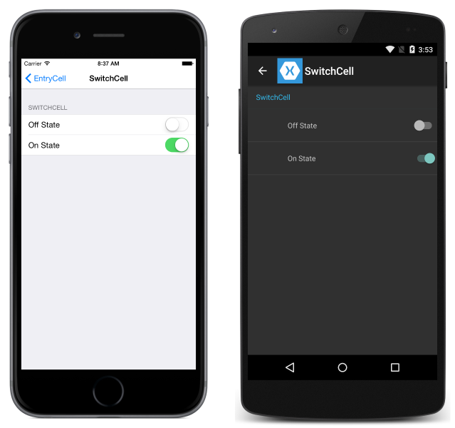
SwitchCell
SwitchCell 是用于呈现和捕获开/关或 true/false 状态的控件。 它定义以下属性:
Text– 显示在开关旁边的文本。On– 开关显示为打开还是关闭。OnColor– 处于开位的开关的Color。
所有这些属性都可绑定。
SwitchCell 还公开 OnChanged 事件,使你可以响应单元格的状态变化。
EntryCell
当你需要显示用户可编辑的文本数据时,EntryCell 非常有用。 它定义以下属性:
Keyboard– 编辑时要显示的键盘。 针对数值、电子邮件、电话号码等数据提供了选项。请参阅 API 文档。Label– 显示在文本输入字段左侧的标签文本。LabelColor– 标签文本的颜色。Placeholder– 当输入字段为 null 或为空时显示在输入字段中的文本。 此文本在开始输入文本时会消失。Text– 输入字段中的文本。HorizontalTextAlignment– 文本的水平对齐方式。 值为 center、left 或 right aligned。 请参阅 API 文档。VerticalTextAlignment– 文本的垂直对齐方式。 值为Start、Center或End。
EntryCell 还公开 Completed 事件,当用户在编辑文本期间单击键盘上的“完成”按钮时会触发该事件。

自定义单元格
当内置单元格不够时,可以使用自定义单元格以对应用有意义的方式呈现和捕获数据。 例如,你可能想要显示一个滑块以允许用户选择图像的不透明度。
所有自定义单元格都必须派生自 ViewCell(所有内置单元格类型使用的基类)。
下面是自定义单元格的示例:
以下示例显示了用于创建上面屏幕截图中的 TableView 的 XAML:
<?xml version="1.0" encoding="UTF-8"?>
<ContentPage xmlns="http://xamarin.com/schemas/2014/forms"
             xmlns:x="http://schemas.microsoft.com/winfx/2009/xaml"
             x:Class="DemoTableView.TablePage"
             Title="TableView">
      <TableView Intent="Settings">
          <TableRoot>
              <TableSection Title="Getting Started">
                  <ViewCell>
                      <StackLayout Orientation="Horizontal">
                          <Image Source="bulb.png" />
                          <Label Text="left"
                                 TextColor="#f35e20" />
                          <Label Text="right"
                                 HorizontalOptions="EndAndExpand"
                                 TextColor="#503026" />
                      </StackLayout>
                  </ViewCell>
              </TableSection>
          </TableRoot>
      </TableView>
</ContentPage>
等效 C# 代码如下:
var table = new TableView();
table.Intent = TableIntent.Settings;
var layout = new StackLayout() { Orientation = StackOrientation.Horizontal };
layout.Children.Add (new Image() { Source = "bulb.png"});
layout.Children.Add (new Label()
{
    Text = "left",
    TextColor = Color.FromHex("#f35e20"),
    VerticalOptions = LayoutOptions.Center
});
layout.Children.Add (new Label ()
{
    Text = "right",
    TextColor = Color.FromHex ("#503026"),
    VerticalOptions = LayoutOptions.Center,
    HorizontalOptions = LayoutOptions.EndAndExpand
});
table.Root = new TableRoot ()
{
    new TableSection("Getting Started")
    {
        new ViewCell() {View = layout}
    }
};
Content = table;
TableView 下的根元素是 TableRoot,紧靠在 TableRoot 下面有一个 TableSection。 ViewCell 直接在 TableSection 下定义,StackLayout 用于管理自定义单元格的布局,不过在此处可以使用任何布局。
行高
TableView 类有两个可用于更改单元格行高的属性:
RowHeight– 将每行的高度设置为int。HasUnevenRows– 如果设置为true,则行具有不同的高度。 请注意,将此属性设置为true时,会自动计算行高并由 Xamarin.Forms 应用。
当 TableView 中的单元格内容高度发生更改时,Android 和通用 Windows 平台 (UWP) 上的行高也会隐式更新。 但是,在 iOS 上,必须通过将 HasUnevenRows 属性设置为 true 并调用 Cell.ForceUpdateSize 方法来强制更新。
以下 XAML 示例显示了包含 ViewCell 的 TableView:
<ContentPage ...>
    <TableView ...
               HasUnevenRows="true">
        <TableRoot>
            ...
            <TableSection ...>
                ...
                <ViewCell x:Name="_viewCell"
                          Tapped="OnViewCellTapped">
                    <Grid Margin="15,0">
                        <Grid.RowDefinitions>
                            <RowDefinition Height="Auto" />
                            <RowDefinition Height="Auto" />
                        </Grid.RowDefinitions>
                        <Label Text="Tap this cell." />
                        <Label x:Name="_target"
                               Grid.Row="1"
                               Text="The cell has changed size."
                               IsVisible="false" />
                    </Grid>
                </ViewCell>
            </TableSection>
        </TableRoot>
    </TableView>
</ContentPage>
点击 ViewCell 时,将执行 OnViewCellTapped 事件处理程序:
void OnViewCellTapped(object sender, EventArgs e)
{
    _target.IsVisible = !_target.IsVisible;
    _viewCell.ForceUpdateSize();
}
OnViewCellTapped 事件处理程序显示或隐藏 ViewCell 中的第二个 Label,并通过调用 Cell.ForceUpdateSize 方法显式更新单元格的大小。
以下屏幕截图显示了点击之前的单元格:

以下屏幕截图显示了点击之后的单元格:

重要
如果过度使用此功能,则性能降低的可能性很大。