Porting Windows Phone Silverlight XAML and UI to UWP
The previous topic was Troubleshooting.
The practice of defining UI in the form of declarative XAML markup translates extremely well from Windows Phone Silverlight to Universal Windows Platform (UWP) apps. You'll find that large sections of your markup are compatible once you've updated system Resource key references, changed some element type names, and changed "clr-namespace" to "using". Much of the imperative code in your presentation layer—view models, and code that manipulates UI elements—will also be straightforward to port.
A first look at the XAML markup
The previous topic showed you how to copy your XAML and code-behind files into your new Windows 10 Visual Studio project. One of the first issues you might notice highlighted in the Visual Studio XAML designer is that the PhoneApplicationPage element at the root of your XAML file is not valid for a Universal Windows Platform (UWP) project. In the previous topic, you saved a copy of the XAML files that Visual Studio generated when it created the Windows 10 project. If you open that version of MainPage.xaml, you'll see that at the root is the type Page, which is in the Windows.UI.Xaml.Controls namespace. So, you can change all <phone:PhoneApplicationPage> elements to <Page> (don't forget property element syntax) and you can delete the xmlns:phone declaration.
For a more general approach to finding the UWP type that corresponds to a Windows Phone Silverlight type, you can refer to Namespace and class mappings.
XAML namespace prefix declarations
If you use instances of custom types in your views—perhaps a view model instance or a value converter—then you will have XAML namespace prefix declarations in your XAML markup. The syntax of these differs between Windows Phone Silverlight and the UWP. Here are some examples:
    xmlns:ContosoTradingCore="clr-namespace:ContosoTradingCore;assembly=ContosoTradingCore"
    xmlns:ContosoTradingLocal="clr-namespace:ContosoTradingLocal"
Change "clr-namespace" to "using" and delete any assembly token and semi-colon (the assembly will be inferred). The result looks like this:
    xmlns:ContosoTradingCore="using:ContosoTradingCore"
    xmlns:ContosoTradingLocal="using:ContosoTradingLocal"
You may have a resource whose type is defined by the system:
    xmlns:System="clr-namespace:System;assembly=mscorlib"
    /* ... */
    <System:Double x:Key="FontSizeLarge">40</System:Double>
In the UWP, omit the "System" prefix declaration and use the (already declared) "x" prefix instead:
<x:Double x:Key="FontSizeLarge">40</x:Double>
Imperative code
Your view models are one place where there's imperative code that references UI types. Another place is any code-behind files that directly manipulate UI elements. For example, you might find that a line of code like this one doesn't compile yet:
return new BitmapImage(new Uri(this.CoverImagePath, UriKind.Relative));
BitmapImage is in the System.Windows.Media.Imaging namespace in Windows Phone Silverlight, and a using directive in the same file allows BitmapImage to be used without namespace qualification as in the snippet above. In a case like this, you can right-click the type name (BitmapImage) in Visual Studio and use the Resolve command on the context menu to add a new namespace directive to the file. In this case, the Windows.UI.Xaml.Media.Imaging namespace is added, which is where the type lives in the UWP. You can remove the System.Windows.Media.Imaging using directive, and that will be all it takes to port code like that in the snippet above. When you're done, you'll have removed all Windows Phone Silverlight namespaces.
In simple cases like this, where you're mapping the types in an old namespace to the same types in a new one, you can use Visual Studio's Find and Replace command to make bulk changes to your source code. The Resolve command is a great way of discovering a type's new namespace. As another example, you can replace all "System.Windows" with "Windows.UI.Xaml". That will essentially port all using directives and all fully-qualified type names that refer to that namespace.
Once all the old using directives are removed and the new ones added, you can use Visual Studio's Organize Usings command to sort your directives and remove unused ones.
Sometimes, fixing imperative code will be as minor as changing a parameter's type. Other times, you will need to use Windows Runtime APIs instead of .NET APIs for Windows Runtime 8.x apps. To identify which APIs are supported, use the rest of this porting guide in combination with .NET for Windows Runtime 8.x apps overview and the Windows Runtime reference.
And, if you just want to get to the stage where your project builds, you can comment or stub out any non-essential code. Then iterate, one issue at a time, and refer to the following topics in this section (and the previous topic: Troubleshooting), until any build and runtime issues are ironed-out and your port is complete.
Adaptive/responsive UI
Because your Windows 10 app can run on a potentially wide range of devices—each with its own screen size and resolution—you'll want to go beyond the minimal steps to port your app and you'll want to tailor your UI to look its best on those devices. You can use the adaptive Visual State Manager feature to dynamically detect window size and to change layout in response, and an example of how to do that is shown in the section Adaptive UI in the Bookstore2 case study topic.
Alarms and Reminders
Code using the Alarm or Reminder classes should be ported to use the BackgroundTaskBuilder class to create and register a background task, and display a toast at the relevant time. See Background processing and Toasts.
Animation
As a preferred alternative to keyframe animations and from/to animations, the UWP animation library is available to UWP apps. These animations have been designed and tuned to run smoothly, to look great, and to make your app appear as integrated with Windows as the built-in apps do. See Quickstart: Animating your UI using library animations.
If you do use keyframe animations or from/to animations in your UWP apps, then you may want to understand the distinction between independent and dependent animations that the new platform has introduced. See Optimize animations and media. Animations that run on the UI thread (ones that animate layout properties, for example) are known as dependent animations, and when run on the new platform, they will have no effect unless you do one of two things. You can either re-target them to animate different properties, such as RenderTransform, thereby making them independent. Or you can set EnableDependentAnimation="True" on the animation element in order to confirm your intention to run an animation that cannot be guaranteed to run smoothly. If you use Blend for Visual Studio to author new animations, then that property will be set for you where necessary.
Back button handling
In a Windows 10 app, you can use a single approach to handling the back button and it will work on all devices. On mobile devices, the button is provided for you as a capacitive button on the device, or as a button in the shell. On a desktop device, you add a button to your app's chrome whenever back-navigation is possible within the app, and this appears in the title bar for windowed apps or in the task bar for Tablet mode (Windows 10 only). The back button event is a universal concept across all device families, and buttons implemented in hardware or in software raise the same BackRequested event.
The example below works for all device families and it is good for cases where the same processing applies to all pages, and where you needn't confirm navigation (for example, to warn about unsaved changes).
   // app.xaml.cs

    protected override void OnLaunched(LaunchActivatedEventArgs e)
    {
        [...]

        Windows.UI.Core.SystemNavigationManager.GetForCurrentView().BackRequested += App_BackRequested;
        rootFrame.Navigated += RootFrame_Navigated;
    }

    private void RootFrame_Navigated(object sender, NavigationEventArgs e)
    {
        Frame rootFrame = Window.Current.Content as Frame;

        // Note: On device families that have no title bar, setting AppViewBackButtonVisibility can safely execute
        // but it will have no effect. Such device families provide a back button UI for you.
        if (rootFrame.CanGoBack)
        {
            Windows.UI.Core.SystemNavigationManager.GetForCurrentView().AppViewBackButtonVisibility =
                Windows.UI.Core.AppViewBackButtonVisibility.Visible;
        }
        else
        {
            Windows.UI.Core.SystemNavigationManager.GetForCurrentView().AppViewBackButtonVisibility =
                Windows.UI.Core.AppViewBackButtonVisibility.Collapsed;
        }
    }

    private void App_BackRequested(object sender, Windows.UI.Core.BackRequestedEventArgs e)
    {
        Frame rootFrame = Window.Current.Content as Frame;

        if (rootFrame.CanGoBack)
        {
            rootFrame.GoBack();
        }
    }
There's also a single approach for all device families for programmatically exiting the app.
Windows.UI.Xaml.Application.Current.Exit();
Binding, and compiled bindings with {x:Bind}
The topic of binding includes:
- Binding a UI element to "data" (that is, to the properties and commands of a view model)
- Binding a UI element to another UI element
- Writing a view model that is observable (that is, it raises notifications when a property value changes and when the availability of a command changes)
All of these aspects are largely still supported, but there are namespace differences. For example, System.Windows.Data.Binding maps to Windows.UI.Xaml.Data.Binding, System.ComponentModel.INotifyPropertyChanged maps to Windows.UI.Xaml.Data.INotifyPropertyChanged, and System.Collections.Specialized.INotifyPropertyChanged maps to Windows.UI.Xaml.Interop.INotifyCollectionChanged.
Windows Phone Silverlight app bars and app bar buttons can't be bound like they can in a UWP app. You may have imperative code that constructs your app bar and its buttons, binds them to properties and localized strings, and handles their events. If so, you now have the option to port that imperative code by replacing it with declarative markup bound to properties and commands, and with static resource references, thus making your app incrementally safer and more maintainable. You can use Visual Studio or Blend for Visual Studio to bind and style UWP app bar buttons just like any other XAML element. Note that in a UWP app the type names you use are CommandBar and AppBarButton.
The binding-related features of UWP apps currently have the following limitations:
- There is no built-in support for data-entry validation and the IDataErrorInfo and INotifyDataErrorInfo interfaces.
- The Binding class does not include the extended formatting properties available in Windows Phone Silverlight. However, you can still implement IValueConverter to provide custom formatting.
- The IValueConverter methods take language strings as parameters instead of CultureInfo objects.
- The CollectionViewSource class does not provide built-in support for sorting and filtering, and grouping works differently. For more info, see Data binding in depth and the Data binding sample.
Although the same binding features are still largely supported, Windows 10 offers the option of a new and more performant binding mechanism called compiled bindings, which use the {x:Bind} markup extension. See Data Binding: Boost Your Apps' Performance Through New Enhancements to XAML Data Binding, and the x:Bind Sample.
Binding an Image to a view model
You can bind the Image.Source property to any property of a view model that's of type ImageSource. Here's a typical implementation of such a property in a Windows Phone Silverlight app:
    // this.BookCoverImagePath contains a path of the form "/Assets/CoverImages/one.png".
    return new BitmapImage(new Uri(this.CoverImagePath, UriKind.Relative));
In a UWP app, you use the ms-appx URI scheme. So that you can keep the rest of your code the same, you can use a different overload of the System.Uri constructor to put the ms-appx URI scheme in a base URI and append the rest of the path onto that. Like this:
    // this.BookCoverImagePath contains a path of the form "/Assets/CoverImages/one.png".
    return new BitmapImage(new Uri(new Uri("ms-appx://"), this.CoverImagePath));
That way, the rest of the view model, the path values in the image path property, and the bindings in the XAML markup, can all stay exactly the same.
Controls, and control styles/templates
Windows Phone Silverlight apps use controls defined in the Microsoft.Phone.Controls namespace and the System.Windows.Controls namespace. XAML UWP apps use controls defined in the Windows.UI.Xaml.Controls namespace. The architecture and design of XAML controls in the UWP is virtually the same as Windows Phone Silverlight controls. But, some changes have been made to improve the set of available controls and to unify them with Windows apps. Here are specific examples.
| Control name | Change |
|---|---|
| ApplicationBar | The Page.TopAppBar property. |
| ApplicationBarIconButton | The UWP equivalent is the Glyph property. PrimaryCommands is the content property of CommandBar. The XAML parser interprets an element's inner xml as the value of its content property. |
| ApplicationBarMenuItem | The UWP equivalent is the AppBarButton.Label set to the menu item text. |
| ContextMenu (in the Windows Phone Toolkit) | For a single selection fly-out, use Flyout. |
| ControlTiltEffect.TiltEffect class | Animations from the UWP animation library are built into the default Styles of the common controls. See the Animating pointer actions. |
| LongListSelector with grouped data | The Windows Phone Silverlight LongListSelector functions in two ways, which can be used in concert. First, it is able to display data that is grouped by a key, for example, a list of names grouped by initial letter. Second, it is able to "zoom" between two semantic views: the grouped list of items (for example, names), and a list of just the group keys themselves (for example, initial letters). With the UWP, you can display grouped data with the Guidelines for list and grid view controls. |
| LongListSelector with flat data | For performance reasons, in the case of very long lists, we recommended LongListSelector instead of a Windows Phone Silverlight list box even for flat, non-grouped data. In a UWP app, GridView are preferred for long lists of items whether or not the data are amenable to grouping. |
| Panorama | The Windows Phone Silverlight Panorama control maps to the Guidelines for hub controls in Windows Runtime 8.x apps and Guidelines for the hub control. Note that a Panorama control wraps around from the last section to the first, and its background image moves in parallax relative to the sections. Hub sections do not wrap around, and parallax is not used. |
| Pivot | The UWP equivalent of the Windows Phone Silverlight Pivot control is Windows.UI.Xaml.Controls.Pivot. It is available for all device families. |
Note The PointerOver visual state is relevant in custom styles/templates in Windows 10 apps, but not in Windows Phone Silverlight apps. There are other reasons why your existing custom styles/templates may not be appropriate for Windows 10 apps, including system resource keys you are using, changes to the sets of visual states used, and performance improvements made to the Windows 10 default styles/templates. We recommend that you edit a fresh copy of a control's default template for Windows 10 and then re-apply your style and template customization to that.
For more info on UWP controls, see Controls by function, Controls list, and Guidelines for controls.
Design language in Windows 10
There are some differences in design language between Windows Phone Silverlight apps and Windows 10 apps. For all the details, see Design. Despite the design language changes, our design principles remain consistent: be attentive to detail but always strive for simplicity through focusing on content not chrome, fiercely reducing visual elements, and remaining authentic to the digital domain; use visual hierarchy especially with typography; design on a grid; and bring your experiences to life with fluid animations.
Localization and globalization
For localized strings, you can re-use the .resx file from your Windows Phone Silverlight project in your UWP app project. Copy the file over, add it to the project, and rename it to Resources.resw so that the lookup mechanism will find it by default. Set Build Action to PRIResource and Copy to Output Directory to Do not copy. You can then use the strings in markup by specifying the x:Uid attribute on your XAML elements. See Quickstart: Using string resources.
Windows Phone Silverlight apps use the CultureInfo class to help globalize an app. UWP apps use MRT (Modern Resource Technology), which enables the dynamic loading of app resources (localization, scale, and theme) both at runtime and in the Visual Studio design surface. For more information, see Guidelines for files, data, and globalization.
The ResourceContext.QualifierValues topic describes how to load device family-specific resources based on the device family resource selection factor.
Media and graphics
As you read about UWP media and graphics, bear in mind that the Windows design principles encourage a fierce reduction of anything superfluous, including graphical complexity and clutter. Windows design is typified by clean and clear visuals, typography, and motion. If your app follows the same principles, then it will seem more like the built-in apps.
Windows Phone Silverlight has a RadialGradientBrush type which is not present in the UWP, although other Brush types are. In some cases, you will be able to get a similar effect with a bitmap. Note that you can create a radial gradient brush with Direct2D in a Microsoft DirectX and XAML C++ UWP.
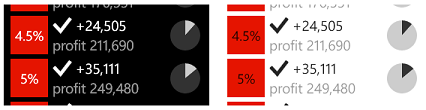
Windows Phone Silverlight has the System.Windows.UIElement.OpacityMask property, but that property is not a member of the UWP UIElement type. In some cases, you will be able to get a similar effect with a bitmap. And you can create an opacity mask with Direct2D in a Microsoft DirectX and XAML C++ UWP app. But, a common use case for OpacityMask is to use a single bitmap that adapts to both light and dark themes. For vector graphics, you can use theme-aware system brushes (such as the pie charts illustrated below). But, to make a theme-aware bitmap (such as the check marks illustrated below), requires a different approach.
In a Windows Phone Silverlight app, the technique is to use an alpha mask (in the form of a bitmap) as the OpacityMask for a Rectangle filled with the foreground brush:
    <Rectangle Fill="{StaticResource PhoneForegroundBrush}" Width="26" Height="26">
        <Rectangle.OpacityMask>
            <ImageBrush ImageSource="/Assets/wpsl_check.png"/>
        </Rectangle.OpacityMask>
    </Rectangle>
The most straightforward way to port this to a UWP app is to use a BitmapIcon, like this:
<BitmapIcon UriSource="Assets/winrt_check.png" Width="21" Height="21"/>
Here, winrt_check.png is an alpha mask in the form of a bitmap just as wpsl_check.png is, and it could very well be the same file. However, you may want to provide several different sizes of winrt_check.png to be used for different scaling factors. For more info on that, and for an explanation of the changes to the Width and Height values, see View or effective pixels, viewing distance, and scale factors in this topic.
A more general approach, which is appropriate if there are differences between the light and dark theme form of a bitmap, is to use two image assets—one with a dark foreground (for light theme) and one with a light foreground (for dark theme). For further details about how to name this set of bitmap assets, see Tailor your resources for language, scale, and other qualifiers. Once a set of image files are correctly named, you can refer to them in the abstract, using their root name, like this:
<Image Source="Assets/winrt_check.png" Stretch="None"/>
In Windows Phone Silverlight, the UIElement.Clip property can be any shape that you can express with a Geometry and is typically serialized in XAML markup in the StreamGeometry mini-language. In the UWP, the type of the Clip property is RectangleGeometry, so you can only clip a rectangular region. Allowing a rectangle to be defined using mini-language would be too permissive. So, to port a clipping region in markup, replace the Clip attribute syntax and make it into property element syntax similar to the following:
    <UIElement.Clip>
        <RectangleGeometry Rect="10 10 50 50"/>
    </UIElement.Clip>
Note that you can use arbitrary geometry as a mask in a layer with Direct2D in a Microsoft DirectX and XAML C++ UWP app.
Navigation
When you navigate to a page in a Windows Phone Silverlight app, you use a Uniform Resource Identifier (URI) addressing scheme:
NavigationService.Navigate(new Uri("/AnotherPage.xaml", UriKind.Relative)/*, navigationState*/);
In a UWP app, you call the Frame.Navigate method and specify the type of the destination page (as defined by the x:Class attribute of the page's XAML markup definition):
    // In a page:
    this.Frame.Navigate(typeof(AnotherPage)/*, parameter*/);

    // In a view model, perhaps inside an ICommand implementation:
    var rootFrame = Windows.UI.Xaml.Window.Current.Content as Windows.UI.Xaml.Controls.Frame;
    rootFrame.Navigate(typeof(AnotherPage)/*, parameter*/);
You define the startup page for a Windows Phone Silverlight app in WMAppManifest.xml:
<DefaultTask Name="_default" NavigationPage="MainPage.xaml" />
In a UWP app, you use imperative code to define the startup page. Here's some code from App.xaml.cs that illustrates how:
if (!rootFrame.Navigate(typeof(MainPage), e.Arguments))
URI mapping and fragment navigation are URI navigation techniques, and so they are not applicable to UWP navigation, which is not based on URIs. URI mapping exists in response to the weakly-typed nature of identifying a target page with a URI string, which leads to fragility and maintainability issues should the page move to a different folder and hence to a different relative path. UWP apps use type-based navigation, which is strongly-typed and compiler-checked, and does not have the problem that URI mapping solves. The use case for fragment navigation is to pass along some context to the target page so that the page can cause a particular fragment of its content to be scrolled into view, or otherwise displayed. The same goal can be achieved by passing a navigation parameter when you call the Navigate method.
For more info, see Navigation.
Resource key reference
The design language has evolved for Windows 10 and consequently certain system styles have changed, and many system resource keys have been removed or renamed. The XAML markup editor in Visual Studio highlights references to resource keys that can't be resolved. For example, the XAML markup editor will underline a reference to the style key PhoneTextNormalStyle with a red squiggle. If that isn't corrected, then the app will immediately terminate when you try to deploy it to the emulator or device. So, it's important to attend to XAML markup correctness. And you will find Visual Studio to be a great tool for catching such issues.
Also, see Text, below.
Status bar (system tray)
The system tray (set in XAML markup with shell:SystemTray.IsVisible) is now called the status bar, and it is shown by default. You can control its visibility in imperative code by calling the Windows.UI.ViewManagement.StatusBar.ShowAsync and HideAsync methods.
Text
Text (or typography) is an important aspect of a UWP app and, while porting, you may want to revisit the visual designs of your views so that they are in harmony with the new design language. Use these illustrations to find the UWP TextBlock system styles that are available. Find the ones that correspond to the Windows Phone Silverlight styles you used. Alternatively, you can create your own universal styles and copy the properties from the Windows Phone Silverlight system styles into those.
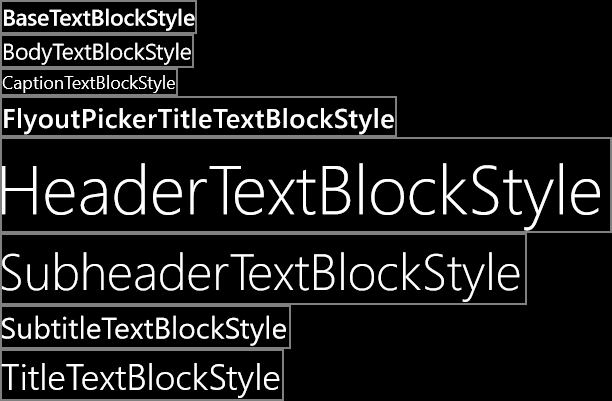
System TextBlock styles for Windows 10 apps
In a Windows Phone Silverlight app, the default font family is Segoe WP. In a Windows 10 app, the default font family is Segoe UI. As a result, font metrics in your app may look different. If you want to reproduce the look of your Windows Phone Silverlight text, you can set your own metrics using properties such as LineHeight and LineStackingStrategy. For more info, see Guidelines for fonts and Design UWP apps.
Theme changes
For a Windows Phone Silverlight app, the default theme is dark by default. For Windows 10 devices, the default theme has changed, but you can control the theme used by declaring a requested theme in App.xaml. For example, to use a dark theme on all devices, add RequestedTheme="Dark" to the root Application element.
Tiles
Tiles for UWP apps have behaviors similar to Live Tiles for Windows Phone Silverlight apps, although there are some differences. For example, code that calls the Microsoft.Phone.Shell.ShellTile.Create method to create secondary tiles should be ported to call SecondaryTile.RequestCreateAsync. Here is a before-and-after example, first the Windows Phone Silverlight version:
    var tileData = new IconicTileData()
    {
        Title = this.selectedBookSku.Title,
        WideContent1 = this.selectedBookSku.Title,
        WideContent2 = this.selectedBookSku.Author,
        SmallIconImage = this.SmallIconImageAsUri,
        IconImage = this.IconImageAsUri
    };

    ShellTile.Create(this.selectedBookSku.NavigationUri, tileData, true);
And the UWP equivalent:
    var tile = new SecondaryTile(
        this.selectedBookSku.Title.Replace(" ", string.Empty),
        this.selectedBookSku.Title,
        this.selectedBookSku.ArgumentString,
        this.IconImageAsUri,
        TileSize.Square150x150);

    await tile.RequestCreateAsync();
Code that updates a tile with the Microsoft.Phone.Shell.ShellTile.Update method, or the Microsoft.Phone.Shell.ShellTileSchedule class, should be ported to use the TileUpdateManager, TileUpdater, TileNotification, and/or ScheduledTileNotification classes.
For more info on tiles, toasts, badges, banners, and notifications, see Creating tiles and Working with tiles, badges, and toast notifications. For specifics about sizes of visual assets used for UWP Tiles, see Tile and toast visual assets.
Toasts
Code that displays a toast with the Microsoft.Phone.Shell.ShellToast class should be ported to use the ToastNotificationManager, ToastNotifier, ToastNotification, and/or ScheduledToastNotification classes. Note that on mobile devices, the consumer-facing term for "toast" is "banner".
See Working with tiles, badges, and toast notifications.
View or effective pixels, viewing distance, and scale factors
Windows Phone Silverlight apps and Windows 10 apps differ in the way they abstract the size and layout of UI elements away from the actual physical size and resolution of devices. A Windows Phone Silverlight app uses view pixels to do this. With Windows 10, the concept of view pixels has been refined into that of effective pixels. Here's an explanation of that term, what it means, and the extra value it offers.
The term "resolution" refers to a measure of pixel density and not, as is commonly thought, pixel count. "Effective resolution" is the way the physical pixels that compose an image or glyph resolve to the eye given differences in viewing distance and the physical pixel size of the device (pixel density being the reciprocal of physical pixel size). Effective resolution is a good metric to build an experience around because it is user-centric. By understanding all the factors, and controlling the size of UI elements, you can make the user's experience a good one.
To a Windows Phone Silverlight app, all phone screens are exactly 480 view pixels wide, without exception, no matter how many physical pixels the screen has, nor what its pixel density or physical size is. This means that an Image element with Width="48" will be exactly one tenth of the width of the screen of any phone that can run the Windows Phone Silverlight app.
To a Windows 10 app, it is not the case that all devices are some fixed number of effective pixels wide. That's probably obvious, given the wide range of devices that a UWP app can run on. Different devices are a different number of effective pixels wide, ranging from 320 epx for the smallest devices, to 1024 epx for a modest-sized monitor, and far beyond to much higher widths. All you have to do is continue to use auto-sized elements and dynamic layout panels as you always have. There will also be some cases where you'll set the properties of your UI elements to a fixed size in XAML markup. A scale factor is automatically applied to your app depending on what device it runs on and the display settings made by the user. And that scale factor serves to keep any UI element with a fixed size presenting a more-or-less constant-sized touch (and reading) target to the user across a wide variety of screen sizes. And together with dynamic layout your UI won't merely optically scale on different devices, it will instead do what's necessary to fit the appropriate amount of content into the available space.
Because 480 was formerly the fixed width in view pixels for a phone-sized screen, and that value is now typically smaller in effective pixels, a rule of thumb is to multiply any dimension in your Windows Phone Silverlight app markup by a factor of 0.8.
So that your app has the best experience across all displays, we recommend that you create each bitmap asset in a range of sizes, each suitable for a particular scale factor. Providing assets at 100%-scale, 200%-scale, and 400%-scale (in that priority order) will give you excellent results in most cases at all the intermediate scale factors.
Note If, for whatever reason, you cannot create assets in more than one size, then create 100%-scale assets. In Microsoft Visual Studio, the default project template for UWP apps provides branding assets (tile images and logos) in only one size, but they are not 100%-scale. When authoring assets for your own app, follow the guidance in this section and provide 100%, 200%, and 400% sizes, and use asset packs.
If you have intricate artwork, then you may want to provide your assets in even more sizes. If you're starting with vector art, then it's relatively easy to generate high-quality assets at any scale factor.
We don't recommend that you try to support all of the scale factors, but the full list of scale factors for Windows 10 apps is 100%, 125%, 150%, 200%, 250%, 300%, and 400%. If you provide them, the Store will pick the correct-sized asset(s) for each device, and only those assets will be downloaded. The Store selects the assets to download based on the DPI of the device.
For more info, see Responsive design 101 for UWP apps.
Window size
In your UWP app, you can specify a minimum size (both width and height) with imperative code. The default minimum size is 500x320epx, and that's also the smallest minimum size accepted. The largest minimum size accepted is 500x500epx.
   Windows.UI.ViewManagement.ApplicationView.GetForCurrentView().SetPreferredMinSize
        (new Size { Width = 500, Height = 500 });
The next topic is Porting for I/O, device, and app model.
Related topics
Feedback
Coming soon: Throughout 2024 we will be phasing out GitHub Issues as the feedback mechanism for content and replacing it with a new feedback system. For more information see: https://aka.ms/ContentUserFeedback.
Submit and view feedback for