Training
Module
Customize layout in .NET MAUI XAML pages - Training
Create consistent user interfaces across different devices by using StackLayout and Grid.
This browser is no longer supported.
Upgrade to Microsoft Edge to take advantage of the latest features, security updates, and technical support.
Note
Access to this page requires authorization. You can try signing in or changing directories.
Access to this page requires authorization. You can try changing directories.
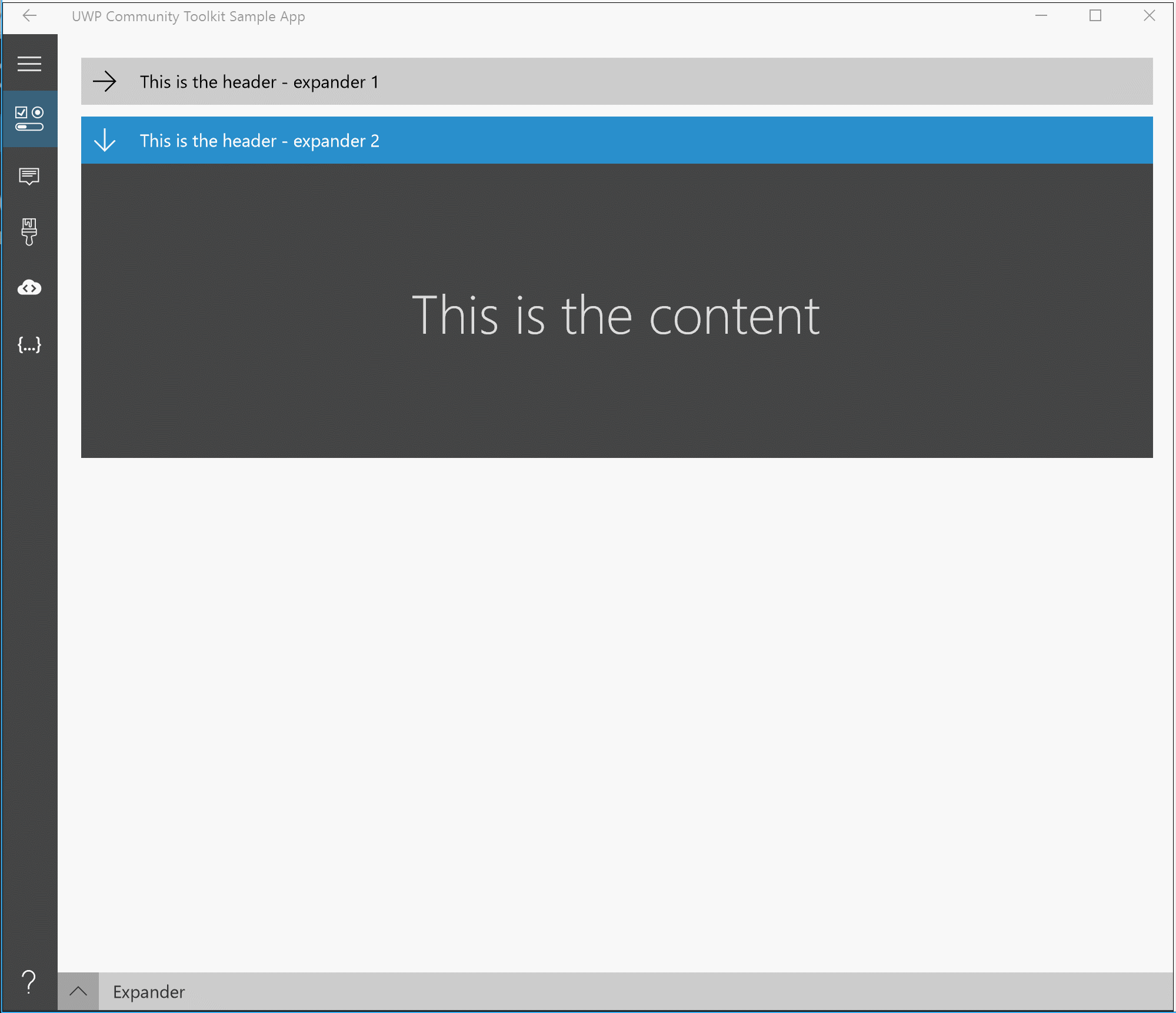
The Expander control provides an expandable container to host any content. It is a specialized form of a HeaderedContentControl
You can show or hide this content by interacting with the Header.
<Page ...
     xmlns:controls="using:Microsoft.Toolkit.Uwp.UI.Controls"/>

<controls:Expander Header="Header of the expander" Foreground="White"
                   Background="Gray" IsExpanded="True">
  <!-- Expander content -->
</controls:Expander>
| Property | Type | Description |
|---|---|---|
| ContentOverlay | UIElement | Specifies alternate content to show when the Expander is collapsed. |
| ExpandDirection | ExpandDirection | Specifies the direction of where expanded content should be displayed in relation to the header. |
| HeaderStyle | Style | Specifies an alternate style template for the ToggleButton header control. |
| IsExpanded | bool | Indicates if the Expander is currently open or closed. The default is False. |
| Events | Description |
|---|---|
| Collapsed | Fires when the expander is closed |
| Expanded | Fires when the expander is opened |
The ContentOverlay property can be used to define the content to be shown when the Expander is collapsed
<controls:Expander Header="Header">
  <Grid>
    <TextBlock Text="Expanded content" />
  </Grid>

  <controls:Expander.ContentOverlay>
    <Grid MinHeight="250">
      <TextBlock Text="Collapsed content" />
    </Grid>
  </controls:Expander.ContentOverlay>
</controls:Expander>
The ExpandDirection property can take 4 values that will expand the content based on the selected direction:
Down - from top to bottom (default)Up - from bottom to topRight - from left to rightLeft - from right to leftAllows creating an alternate style for the entire Expander header including the arrow symbol, in contrast to the HeaderTemplate which can control the content next to the arrow.
For instance to remove the header entirely from the Expander:
  <Page.Resources>
    <Style x:Key="NoExpanderHeaderStyle" TargetType="ToggleButton">
      <Setter Property="Visibility" Value="Collapsed"/>
    </Style>
  </Page.Resources>

  <controls:Expander HeaderStyle="{StaticResource NoExpanderHeaderStyle}" IsExpanded="True">
    <TextBlock Text="My Content"/>
  </controls:Expander>
Expander Sample Page Source. You can see this in action in the Windows Community Toolkit Sample App.
Expander XAML File is the XAML template used in the toolkit for the default styling.
| Device family | Universal, 10.0.16299.0 or higher |
|---|---|
| Namespace | Microsoft.Toolkit.Uwp.UI.Controls |
| NuGet package | Microsoft.Toolkit.Uwp.UI.Controls |
Training
Module
Customize layout in .NET MAUI XAML pages - Training
Create consistent user interfaces across different devices by using StackLayout and Grid.
Events
May 19, 6 PM - May 23, 12 AM
Calling all developers, creators, and AI innovators to join us in Seattle @Microsoft Build May 19-22.
Register today